List of fonts: Difference between revisions
Rodmjorgeh (talk | contribs) m (→Rodin NTLG) |
(→Super Mario 256: This one is weird because they used the official font for all lines except one...) |
||
| (515 intermediate revisions by 28 users not shown) | |||
| Line 1: | Line 1: | ||
{{image|more=yes|Illustrate all fonts listed}} | {{image|more=yes|Illustrate all fonts listed}} | ||
This is a list of '''typefaces''' used in games and related media within the ''[[Super Mario (franchise)|Super Mario]]'' franchise. | This is a list of '''typefaces''' and '''fonts''' used in games and related media within the ''[[Super Mario (franchise)|Super Mario]]'' franchise. | ||
==Internal and related designs== | ==Internal and related designs== | ||
===Classic ''Super Mario'' | ===Classic ''Super Mario'' font=== | ||
[[File:FontExamp1.png|thumb|Comparison of the two versions]] | [[File:FontExamp1.png|thumb|Comparison of the two versions]] | ||
The first ''Super Mario'' font is an uneven sans serif typeface designed by [[Nintendo]] in 1988. It is used for the logos and, later, interfaces of ''[[Super Mario (franchise)|Super Mario]]'' games from ''[[Super Mario Bros. 3]]'' to ''[[Mario & Sonic at the London 2012 Olympic Games]]''. | The first ''Super Mario'' font is an uneven sans-serif typeface designed by [[Nintendo]] in 1988. It is used for the logos and, later, interfaces of ''[[Super Mario (franchise)|Super Mario]]'' games from ''[[Super Mario Bros. 3]]'' to ''[[Mario & Sonic at the London 2012 Olympic Games]]''. | ||
Though mostly the same, a second version of the font was designed following the release of ''[[Super Mario 64]]'', which would take over as the primary version from then on. It lacked a fully defined character set, which led to many different interpretations. In particular, the font does not have a consistent design for Japanese hiragana, katakana, or kanji. This remained the case for the font even after the overhaul, likely inciting the shift over to the modern ''Super Mario'' font. | Though mostly the same, a second version of the font was designed following the release of ''[[Super Mario 64]]'', which would take over as the primary version from then on. It lacked a fully defined character set, which led to many different interpretations. In particular, the font does not have a consistent design for Japanese hiragana, katakana, or kanji. This remained the case for the font even after the overhaul, likely inciting the shift over to the modern ''Super Mario'' font. | ||
Used in tandem with other fonts throughout the 2000's, it was fully replaced with the modern font with the release of ''[[Super Mario 3D Land]]'', being last seen on the logo for ''[[Mario & Sonic at the London 2012 Olympic Games (Nintendo 3DS)|Mario & Sonic at the London 2012 Olympic Games]]'', albeit an [[ | Used in tandem with other fonts throughout the 2000's, it was fully replaced with the modern font with the release of ''[[Super Mario 3D Land]]'', being last seen on the logo for ''[[Mario & Sonic at the London 2012 Olympic Games (Nintendo 3DS)|Mario & Sonic at the London 2012 Olympic Games]]'', albeit an [[list of Paper Mario: Sticker Star pre-release and unused content|early]] logo for ''[[Paper Mario: Sticker Star]]'' used a design partially based on this typeface before being changed to the modern ''Super Mario'' typeface for the final release.{{br}} | ||
<gallery> | <gallery> | ||
Mario_Series_Logo.svg | Mario_Series_Logo.svg | ||
| Line 22: | Line 20: | ||
{{br}} | {{br}} | ||
===Modern ''Super Mario'' | ===Modern ''Super Mario'' font=== | ||
{{multiple image | {{multiple image | ||
|direction=vertical | |direction=vertical | ||
|image1=Mario series alternate.svg | |image1=Mario series alternate.svg | ||
|width1=256 | |width1=256 | ||
|caption1=The current ''[[Super Mario (series)|Super Mario]]'' logo introduced in ''Super Mario 3D Land'' uses the modern ''Super Mario'' typeface. | |caption1=The current ''[[Super Mario (series)|Super Mario]]'' logo introduced in ''Super Mario 3D Land'' uses the modern ''Super Mario'' typeface. | ||
|image2=Nintendo Jobs Site Mario Font Illustration.jpg | |image2=Nintendo Jobs Site Mario Font Illustration.jpg | ||
|width2=256 | |width2=256 | ||
|caption2=Demonstration. | |caption2=Demonstration. | ||
}} | }} | ||
The modern ''Super Mario'' typeface is an uneven sans-serif typeface designed by Nintendo in the early 2010s. It was experimented with by Nintendo in the lead up to the release of the [[Nintendo 3DS]] and [[Wii U]], with the first use of the modern font appearing in the North American spine art of ''[[Super Mario Galaxy 2]]''. Early versions appeared in games such as ''[[Mario Sports Mix]]'' and the Japanese logo of ''[[Donkey Kong Country Returns]]'', featuring a character set closer to the classic font. The font in its current form was officially introduced with the release of ''Super Mario 3D Land'' in 2011 and has since become the singular ''Super Mario'' typeface, used for logos, menus, HUDs, and other text across the ''Super Mario'' franchise. | |||
The modern ''Super Mario'' typeface is an uneven sans serif typeface designed by Nintendo in the early 2010s. It was experimented with by Nintendo in the lead up to the release of the [[Nintendo 3DS]] and [[Wii U]], with the first use of the modern font appearing in the spine art of ''[[Super Mario Galaxy 2]]''. Early versions appeared in games such as ''[[Mario Sports Mix]]'', featuring a character set closer to the classic font. The font in its current form was officially introduced with the release of '' | |||
The font is officially called "MARIO Font" and was created in collaboration with Fontworks, a foundry whose fonts are often used in Nintendo games. Unlike the previous font, this font has full character sets for hiragana and katakana, as well as some kanji and Cyrillic characters. The font has been revised at least three times; the latest revision of the font is version 3.203, revised on August 20, 2019.<ref name="mariofont">[https://github.com/yell0wsuit/MARIOFont MARIO Font GitHub repository]</ref> | The font is officially called "MARIO Font" and was created in collaboration with Fontworks, a foundry whose fonts are often used in Nintendo games. Unlike the previous font, this font has full character sets for hiragana and katakana, as well as some kanji and Cyrillic characters. The font has been revised at least three times; the latest revision of the font is version 3.203, revised on August 20, 2019.<ref name="mariofont">[https://github.com/yell0wsuit/MARIOFont MARIO Font GitHub repository]</ref> | ||
<gallery> | <gallery> | ||
Msmixlogo.png|''Mario Sports Mix'' logo with the early version | Msmixlogo.png|''Mario Sports Mix'' logo with the early version | ||
| Line 62: | Line 56: | ||
===Modern ''Super Mario Bros.'' typeface=== | ===Modern ''Super Mario Bros.'' typeface=== | ||
The modern ''Super Mario Bros.'' typeface is first seen in ''[[New Super Mario Bros.]]''. This is based on the in-game logo for ''[[Super Mario Bros.]]'', which was in turn used as the logotype for the ''[[Super Mario All-Stars]]'' version of ''Super Mario Bros.'', as well as ''[[Super Mario Bros. Deluxe]]'' | The modern ''Super Mario Bros.'' typeface is first seen in ''[[New Super Mario Bros.]]''. This is based on the in-game logo for ''[[Super Mario Bros.]]'', which was in turn used as the logotype for the ''[[Super Mario All-Stars]]'' version of ''Super Mario Bros.'', as well as ''[[Super Mario Bros. Deluxe]]''. | ||
It is geometrical with vertical stems with circular joints for shapes such as "A" and "M" and horizontal strokes that end before meeting left-hand vertical stems. A small version of its glyphs is used for the "SUPER" text in games using the ''Super Mario Bros.'' name, and ''[[Super Mario Bros. Wonder]]'' introduces a lowercase set of characters for the font. | |||
Other than every ''New Super Mario Bros.'' game logo as well as ''[[Puzzle & Dragons: Super Mario Bros. Edition]]'' and ''[[Super Mario Run]]'', it is also seen in ''[[Mario Super Sluggers]]'' and ''Super Mario Bros. Wonder'' for display text, as well as in ''WarioWare Gold'' for the [[Super Pyoro]] logo and ''[[The Super Mario Bros. Movie]]'' for the [[Super Mario Bros. Plumbing]] logo. A similar font is used for the logos for Mario Club, [[1-UP Studio]] and [[Nintendo Cube]]. | |||
<gallery> | <gallery> | ||
New Super Mario Bros..svg|''New Super Mario Bros.'' | New Super Mario Bros..svg|''New Super Mario Bros.'' | ||
| Line 75: | Line 70: | ||
{{br}} | {{br}} | ||
===Classic HUD | ===Classic HUD font=== | ||
{{multiframe|[[File:Mario Classic HUD Typeface.png|250px]]|All characters in the font|size=250|bg=gray}} | {{multiframe|[[File:Mario Classic HUD Typeface.png|250px]]|All characters in the font|size=250|bg=gray}} | ||
This design was used from '' | This design was used from ''Super Mario 64'' until ''Mario and Sonic at the London 2012 Olympic Games'' for the Nintendo 3DS (although the lowercase "s" is used in "Yoshi's" in the logo for [[Yoshi's Fruit Cart]] in ''Nintendo Land''), appearing throughout games on the [[Nintendo 64]], [[Nintendo GameCube|GameCube]], and [[Wii]]. Some of its distinct features are the pointed, obelisk-shaped "A", the flat, wide "E", and the overall stocky, top-larger-than-bottom measures, giving it a more whimsical appearance if compared to earlier ''Super Mario'' typefaces, which were designed in the opposite way. | ||
This typeface was primarily used for in-game text outside of dialogue (i.e HUDs and menus). Given the lack of standardization on the first ''Super Mario'' typeface, this one was also often used for placeholder logos, at times when new characters for the first font could not be drawn. It was also used for the logo of ''[[Super Mario Sunshine]]'', ''[[Super Princess Peach]]'' and ''[[Dance Dance Revolution: Mario Mix]]''. | |||
<gallery> | <gallery> | ||
MarioMiniSM64.png|''Super Mario 64'' "Press Start" screen | MarioMiniSM64.png|''Super Mario 64'' "Press Start" screen | ||
Super Mario Sunshine NA logo.png|''Super Mario Sunshine'' logo | Super Mario Sunshine NA logo.png|''Super Mario Sunshine'' logo | ||
Yoshi's UG JP logo.jpg|''[[Yoshi Topsy-Turvy]]'' Japanese logo | Yoshi's UG JP logo.jpg|''[[Yoshi Topsy-Turvy]]'' Japanese logo | ||
Logo SPP.png|''Super Princess Peach'' logo | |||
DDRMM Logo.png|''Dance Dance Revolution: Mario Mix'' logo | |||
Galaxy Logo V1.png|Preliminary logo for ''[[Super Mario Galaxy]]'' | Galaxy Logo V1.png|Preliminary logo for ''[[Super Mario Galaxy]]'' | ||
SMG The End.png|''Super Mario Galaxy'' "The End" screen | SMG The End.png|''Super Mario Galaxy'' "The End" screen | ||
SMG2 Yoshi Star Welcome.png|''Super Mario Galaxy 2'' | |||
SportsMix1.png|''Mario Sports Mix'' | SportsMix1.png|''Mario Sports Mix'' | ||
</gallery> | </gallery> | ||
{{br}} | {{br}} | ||
===''Paper Mario'' | ===''Paper Mario'' font=== | ||
A design similar to the classic HUD design above, used for in-game display text in ''[[Paper Mario (series)|Paper Mario]]'' games up to '' | A design similar to the classic HUD design above, used for in-game display text in ''[[Paper Mario (series)|Paper Mario]]'' games up to ''Paper Mario: Sticker Star''. | ||
<gallery> | <gallery> | ||
Timed Hit.png|''Paper Mario'' | Timed Hit.png|''Paper Mario'' | ||
Mario Story New Game 1.png | |||
Mario Story New Game 2.png | |||
Paper Mario New Game.png | |||
Paper Mario New Game Europe.png | |||
PMTTYDPrologueTitle.png|''Paper Mario: The Thousand-Year Door'' | PMTTYDPrologueTitle.png|''Paper Mario: The Thousand-Year Door'' | ||
Paper Mario RPG New Game 1.png | |||
Paper Mario RPG New Game 2.png | |||
Name the Yoshi! Screen PMTTYD.png | |||
SPM Game Over.png|''Super Paper Mario'' | SPM Game Over.png|''Super Paper Mario'' | ||
Super Paper Mario New Game.png | |||
MariovsBowserPMSS.png|''Paper Mario: Sticker Star'' | MariovsBowserPMSS.png|''Paper Mario: Sticker Star'' | ||
Letter P TTYD.png|[[The Letter "p"]], an item in ''Paper Mario: The Thousand-Year Door'' | |||
</gallery> | </gallery> | ||
{{br}} | {{br}} | ||
| Line 105: | Line 109: | ||
===''Super Mario Maker'' typeface=== | ===''Super Mario Maker'' typeface=== | ||
[[File:Super Mario Maker - Logo 01.svg|thumb|200px|''Super Mario Maker'' logo uses the ''Super Mario Maker'' font.]] | [[File:Super Mario Maker - Logo 01.svg|thumb|200px|''Super Mario Maker'' logo uses the ''Super Mario Maker'' font.]] | ||
The ''Super Mario Maker'' font is a geometric sans serif typeface first designed by Nintendo in 2015. It is used for the interface in ''[[Super Mario Maker]]'', ''[[Super Mario Maker for Nintendo 3DS]]'', and ''[[Super Mario Maker 2]]''. The initial variant of the font was titled "MARIO30th" and lacked lowercase characters. It was revised in 2018 to include lowercase letters; this new version is named "MARIOMAKER". The latest revision of the font is version 1.3, revised on November 28, 2018.<ref name="mariofont"/ | The ''Super Mario Maker'' font is a geometric sans-serif typeface first designed by Nintendo in 2015. It is used for the interface in ''[[Super Mario Maker]]'', ''[[Super Mario Maker for Nintendo 3DS]]'', and ''[[Super Mario Maker 2]]''. It is also used for the logo for ''[[Super Mario Bros. 30th Anniversary]]''. The initial variant of the font was titled "MARIO30th" and lacked lowercase characters. It was revised in 2018 to include lowercase letters; this new version is named "MARIOMAKER". The latest revision of the font is version 1.3, revised on November 28, 2018.<ref name="mariofont"/> | ||
{{br}} | {{br}} | ||
===Mario Party Textbox=== | ===Mario Party Textbox=== | ||
[[File:Welcome to Mushroom Village! MP1.png|thumb|right]] | |||
'''{{conjectural|Mario Party Textbox}}''' is used for the interface in the English version of ''[[Mario Party]]''. | '''{{conjectural|Mario Party Textbox}}''' is used for the interface in the English version of ''[[Mario Party]]''. | ||
{{br}} | |||
===Mario Party Textbox FR/DE=== | ===Mario Party Textbox FR/DE=== | ||
| Line 135: | Line 126: | ||
===Mario Party 4-7 Textbox=== | ===Mario Party 4-7 Textbox=== | ||
{{multiframe|[[File:MP4-7 Textbox Font.png|240px]]|All characters in the font|size=240|bg=black}} | |||
'''{{conjectural|Mario Party 4-7 Textbox}}''' is, as the name implies, used for the interface in Western versions of ''[[Mario Party 4]]'', ''[[Mario Party 5|5]]'', ''[[Mario Party 6|6]]'', and ''[[Mario Party 7|7]]'', as well as ''[[Dance Dance Revolution: Mario Mix]]'' and the European version of ''[[Mario Party 8]]''. | '''{{conjectural|Mario Party 4-7 Textbox}}''' is, as the name implies, used for the interface in Western versions of ''[[Mario Party 4]]'', ''[[Mario Party 5|5]]'', ''[[Mario Party 6|6]]'', and ''[[Mario Party 7|7]]'', as well as ''[[Dance Dance Revolution: Mario Mix]]'' and the European version of ''[[Mario Party 8]]''. | ||
<gallery> | |||
LotteryBallGame1.png|''Mario Party 4'' | |||
DreamDepot MP5.png|''Mario Party 5'' | |||
PartyMode MP6.png|''Mario Party 6'' | |||
File:DRRMarioMixstory2.png|''Dance Dance Revolution: Mario Mix'' | |||
File:PartyCruise - MarioParty7.png|''Mario Party 7'' | |||
</gallery> | |||
{{br}} | |||
===Mario Party 8 Textbox=== | |||
{{multiframe|[[File:Mario Party 8 American Font.png|240px]]|All characters in the font|size=240|bg=black}} | |||
'''{{conjectural|Mario Party 8 Textbox}}''' is, as the name implies, used for the interface in the American version of ''Mario Party 8''. It is based on DF Pop Mix. | |||
<gallery> | <gallery> | ||
Get A Free Star from Goomba.png|''Mario Party 8'' | |||
</gallery> | </gallery> | ||
===Mario Party Hudson=== | |||
[[File:MP2 Results.png|thumb|right|''Mario Party 2'']] | |||
'''{{conjectural|Mario Party Hudson}}''' is used for large text in all [[Hudson Soft]]-developed ''[[Mario Party (series)|Mario Party]]'' installments, including text for [[Dice Block]] rolls, coin transactions, timers, board and minigame title cards, minigame announcements and HUD elements (such as placement and [[Star (Mario Party series)|Star]]/[[coin]] counts), among others. It appears much more sparingly in ''Mario Party 8'', used for dice rolls, coin transactions, in-scene text during minigames and in [[Puzzle Pillars]]. It is also used in ''Dance Dance Revolution: Mario Mix''. | |||
<gallery> | |||
MP Game Over.png|''Mario Party'' | |||
MP3 Mario Turn Start.png|''Mario Party 3'' | |||
Mini-Game Box 4-Player logo.png|''Mario Party 4'' | |||
Bowser Revolution Logo MP5.png|''Mario Party 5'' | |||
Party Mode Main Menu MP6.png|''Mario Party 6'' | |||
MPA Game Over.png|''Mario Party Advance'' | |||
WarioDanceOff.png|''Dance Dance Revolution: Mario Mix'' | |||
MP7 Windmillville Logo.png|''Mario Party 7'' | |||
PourtoScore.png|''Mario Party 8'' | |||
MPDS Bonus Stars Awards.png|''Mario Party DS'' | |||
</gallery> | |||
{{br}} | |||
===Super Mario 64/Mario Party Textbox JP=== | |||
'''{{conjectural|Super Mario 64/Mario Party Textbox JP}}''' is, as the name implies, used for the interface in the Japanese versions of ''Super Mario 64'' and the first seven games in the ''Mario Party'' series. However, in Western versions, it remains for the word "Using" in the Mushroom Bank in ''Mario Party'', for certain uses of numbers in ''Mario Party 2'', for entering a file name in ''Mario Party 3'', for the credits in both ''Mario Party 2'' and ''3'', and (in English only) for the "Point Total" and "Points Earned" text on the Decathlon Park leaderboard in ''Mario Party 6''. | |||
The GameCube-era variant of the font is less pixelated than the Nintendo 64-era variant. | |||
===''Mario Golf/Mario Tennis'' (Nintendo 64) typeface=== | |||
An uneven typeface is used in ''Mario Golf'' and ''Mario Tennis''. | |||
===''WarioWare'' typeface=== | |||
[[File:WarioWareSM Balloon.png|thumb|right|''WarioWare: Smooth Moves'']] | |||
A rounded typeface was used in the ''[[WarioWare (series)|WarioWare]]'' series from ''[[WarioWare, Inc.: Mega Microgame$!]]'' to ''[[WarioWare: D.I.Y. Showcase]]''. Despite no longer being used as the interface font by then, it was still used for the countdown of the [[Bomb (WarioWare series)|Bomb]] until ''[[WarioWare Gold]]'', and it was additionally used for the timer in [[Puck 'er Up]] in ''[[WarioWare: Get It Together!]]''. | |||
{{br}} | |||
===Geometrical ''WarioWare'' typeface=== | |||
[[File:SoundStudio WWSM.png|thumb|right|''WarioWare: Smooth Moves'']] | |||
A geometrical typeface was used in ''[[WarioWare, Inc.: Mega Party Game$!]]'', ''[[WarioWare: Smooth Moves]]'', and ''[[WarioWare: D.I.Y. Showcase]]''. | |||
{{br}} | {{br}} | ||
=== | ===''Donkey Konga'' typeface 1=== | ||
''' | A sans-serif display typeface was used in the ''[[Donkey Konga (series)|Donkey Konga]]'' series. | ||
===''Donkey Konga'' typeface 2=== | |||
An uneven typeface was used for the interface in the ''Donkey Konga'' series in western languages. | |||
===''Dr. Mario'' typeface=== | |||
An uneven sans-serif typeface was used in ''[[Dr. Mario Online Rx]]'' and ''[[Dr. Mario Express]]''. | |||
===''Super Mario Odyssey'' typeface=== | |||
A geometric sans-serif typeface was used for display text in ''Super Mario Odyssey'' and its corresponding Nintendo Sound Clock: Alarmo theme. | |||
===''Rabbids'' typeface=== | ===''Rabbids'' typeface=== | ||
A typeface | [[File:Edge victory.png|thumb|right]] | ||
A typeface used for the ''Rabbids'' series, officially named "Rabbids" and designed by OMSE Type, is used for the interface in ''[[Mario + Rabbids Sparks of Hope]]'' for display text in western and Russian languages. | |||
{{br}} | |||
===Super Mario 256=== | |||
'''Super Mario 256''' is a fanmade font designed to replicate the modern ''Super Mario'' typeface, and was created by DaFont user fsuarez913.<ref>[https://www.dafont.com/fsuarez913.d3946 fsuarez913 | dafont.com]. ''dafont.com''. Retrieved January 31, 2024. ([https://web.archive.org/web/20240201021618/https://www.dafont.com/fsuarez913.d3946 Archived] February 1, 2024, 02:16:18 UTC via Wayback Machine.)</ref> The typeface was first published online in 2012, and quickly became widespread.<ref>[https://www.dafont.com/font-comment.php?file=super_mario_256 Super Mario 256 - comments | dafont.com]. ''dafont.com''. Retrieved January 31, 2024. ([https://web.archive.org/web/20120718192826/https://www.dafont.com/font-comment.php?file=super_mario_256 Archived] July 18, 2012, 192826 UTC via Wayback Machine.)</ref> Compared to the font it imitates, Super Mario 256 is slightly bolder and wider, and several characters are drawn at different angles. | |||
Despite its nature as an unofficial fan project, Super Mario 256 has made its way into official media on multiple occasions. In particular, the covers for ''[[Super Mario Manga Mania]]'' and ''[[Super Mario Compact Disco|Super Mario Compact Disco – 35th Anniversary Edition]]'', the [[LEGO Super Mario|LEGO ''Super Mario'']] set "Nabbit at Toad's Shop", the logo for ''[[LEGO Super Mario Goal]]'' and the in-game score, a few social media advertisements for ''[[Super Mario 3D World]]'' and the [[Super Mario RPG (Nintendo Switch)|Nintendo Switch remake of ''Super Mario RPG'']], the European uploads of the ''[[Mario & Luigi: Brothership]]'' song "[[Yo-Ho, Bro!]]" except the Nintendo UK one,<ref>{{cite|author=Nintendo DE|date=November 27, 2024|url=https://www.youtube.com/watch?v=HYpR0wjzi0M|title=Yo Ho, Bro! Ein Schunkel-Shanty – Mario & Luigi: Brothership (Nintendo Switch)|publisher=YouTube|language=de|accessdate=November 27, 2024}} The typeface is used for the line "Mario and Lui—geez!"</ref> and the Japanese [[Square Enix]] strategy guide for ''Super Mario RPG'' on Nintendo Switch feature the typeface.<ref>{{cite|author=@MikeLuckas|date=January 31, 2024|title=Post|url=https://twitter.com/MikeLuckas/status/1752824058880905691|publisher=X|accessdate=February 9, 2024|archive= http://archive.today/LhiWy|archivedate=January 9, 2024, 17:50:57 UTC}}</ref> | |||
<gallery> | |||
Super Mario Manga Mania - Cover.jpg|The cover for ''Super Mario Manga Mania'' | |||
Super Mario Compact Disco 35th Anniversary Edition art.png|Album cover for ''Super Mario Compact Disco – 35th Anniversary Edition'' | |||
Things to do in SM3DW Cat Mario.jpg|Graphic promoting ''Super Mario 3D World'' | |||
LSM Nabbit at Toads Shop Expansion Set.png|LEGO ''Super Mario''. Super Mario 256 is seen in the sign reading "SHOP". | |||
SMRPG Switch profile card Mario.jpg|Character card promoting the ''Super Mario RPG'' remake | |||
LSMG Icon.jpg|Icon for ''LEGO Super Mario Goal'', using the font for the word "GOAL" | |||
</gallery> | |||
{{br}} | |||
===Chlorinap=== | |||
{{multiple image | |||
|width=128 | |||
|footer=Chlorinap in use in ''[[Mario vs. Donkey Kong 2: March of the Minis]]'' and its demo. | |||
|image1=MvDK2 B1 Victory.png | |||
|caption1="CONGRATULATIONS" | |||
|image2=MvDK2 Proto Thank You.png | |||
|caption2="Mario vs. Donkey Kong", "March of the Minis" | |||
}} | |||
'''Chlorinap''' is an unofficial font made to replicate the look of the classic ''Super Mario'' font, first published as early as 2005.<ref name="Chlorinap">DaFont. (2011) ''Chlorinap''. https://www.dafont.com/pt/chlorinap.font. Retrieved June 30, 2024.</ref> While the available font is outlined, a solid version of it is used in ''[[Mario vs. Donkey Kong 2: March of the Minis]]'' for the victory screen, and also in the end screen of the game's demo version. It is also used for some display text in ''[[Mario vs. Donkey Kong: Minis March Again!]]'' in western languages. | |||
{{br}} | |||
==Licensed and other external designs== | ==Licensed and other external designs== | ||
===!Baegmug-Jemogche=== | |||
'''!Baegmug-Jemogche''' ("!백묵-제목체", ''!baegmug-jemogche'') is a sans-serif typeface for Korean released by Baekmuk. It is used for the interface in the Korean version of ''Super Smash Bros. Brawl''. | |||
===Aachen=== | |||
[[File:VBWL-Logo.png|thumb|250px|Aachen, used on "''VIRTUAL BOY''" in the Japanese logo for ''[[Virtual Boy Wario Land]]'']] | |||
'''Aachen''' is a slab-serif typeface designed by Colin Brignall for {{wp|Letraset}}, first released in 1969.<ref name="Aachen">Fonts In Use. ''Aachen in use''. https://fontsinuse.com/typefaces/1585/aachen. Retrieved June 29, 2024.</ref> It is used for the logos in the following games: | |||
*''[[Mario Bros. (game)|Mario Bros.]]'' (European-exclusive [[Nintendo Classics]] re-release) | |||
*''[[Virtual Boy Wario Land]]'' (Japanese) | |||
*''[[Game & Watch Gallery]]'' (Australasian) | |||
*''[[Game & Watch Gallery 2]]'' (Australasian) | |||
*''[[Game & Watch Gallery 3]]'' (Australasian) | |||
It is also used in ''[[Super Mario Odyssey]]'' on the Football Uniform, and in ''[[Mario Kart 8]]'', ''[[Mario Kart Tour]]'' and ''[[Mario Kart 8 Deluxe]]'' on the logo of the [[List of sponsors debuting in Mario Kart 8 and Mario Kart 8 Deluxe#1-Up Fuel|1-Up Fuel]] and [[List of sponsors debuting in Mario Kart 8 and Mario Kart 8 Deluxe#Mario Super Motor Team|Mario Super Motor Team]] businesses. | |||
<gallery> | |||
Mario Bros Classic Serie DE.jpg|''Mario Bros.'' | |||
Game Boy Gallery 2 logo AU.png|''Game & Watch Gallery'' Australasian logo ("2") | |||
Game & Watch Gallery 2 Australian Logo.png|''Game & Watch Gallery 2'' Australasian logo ("3") | |||
SMO Football Uniform.png|''Super Mario Odyssey'' | |||
MK8-1UPFuel.png|''Mario Kart 8'' | |||
MK8-MarioSuperMotorTeam.png|''Mario Kart 8'' | |||
</gallery> | |||
{{br}} | |||
===Ad Lib=== | ===Ad Lib=== | ||
[[File:FireworksLMDM.PNG|thumb|200px|Ad Lib used in ''Luigi's Mansion: Dark Moon'']] | [[File:FireworksLMDM.PNG|thumb|200px|Ad Lib used in ''Luigi's Mansion: Dark Moon'']] | ||
'''{{wp|Ad Lib (typeface)|Ad Lib}}''' is an uneven sans serif typeface designed by Freeman Craw for the {{wp|American Type Founders}}, first released in 1961.<ref name="AdLib">Wikipedia. (2024). Ad Lib (typeface). https://en.wikipedia.org/wiki/Ad_Lib_(typeface). Retrieved June 13, 2024.</ref> It is used for the interface in the following games: | '''{{wp|Ad Lib (typeface)|Ad Lib}}''' is an uneven sans-serif typeface designed by Freeman Craw for the {{wp|American Type Founders}}, first released in 1961.<ref name="AdLib">Wikipedia. (2024). Ad Lib (typeface). https://en.wikipedia.org/wiki/Ad_Lib_(typeface). Retrieved June 13, 2024.</ref> It is used for the interface in the following games: | ||
*''[[Luigi's Mansion: Dark Moon]]'' | *''[[Luigi's Mansion: Dark Moon]]'' | ||
*''[[Luigi's Mansion 3]]'' | *''[[Luigi's Mansion 3]]'' | ||
*''[[Luigi's Mansion 2 HD]]'' | *''[[Luigi's Mansion 2 HD]]'' | ||
It is also used in the logo for ''WarioWare, Inc.: Mega Party Game$!'' as well as in the western instruction booklets for ''Mario Party 4'' and ''5''. | |||
<gallery> | |||
Wario Ware Inc Mega Party Game$.svg|Used for the "MEGA PARTY GAME$!" text | |||
</gallery> | |||
{{br}} | |||
===Adobe Caslon=== | |||
[[File:NLLoZBQLogo.png|thumb|"THE LEGEND OF ZELDA" set in Adobe Caslon]] | |||
'''Adobe Caslon''' is a serif typeface designed by Carol Twombly and William Caslon I for Adobe Type, first released in 1990.<ref name="AdobeCaslon">Fonts In Use. ''Adobe Caslon in use''. https://fontsinuse.com/typefaces/65/adobe-caslon. Retrieved September 8, 2024.</ref> It is used for the logo for The Legend of Zelda: Battle Quest in ''Nintendo Land''. | |||
{{br}} | |||
It is | ===Adobe Garamond=== | ||
'''Adobe Garamond''' is a serif typeface derived from Garamond designed by Robert Slimbach for Adobe Type, first released in 1989.<ref name="AdobeGaramond">Fonts In Use. ''Adobe Garamond in use''. https://fontsinuse.com/typefaces/4081/adobe-garamond. Retrieved September 21, 2024.</ref> It is used for the Japanese logo for ''[[Donkey Kong Country 2: Diddy's Kong Quest]]'', the European logo for ''[[Donkey Kong Land 2]]'', and the beta logo for ''Mario vs. Donkey Kong 2: March of the Minis''. | |||
====ITC Garamond==== | |||
'''ITC Garamond''' is a serif typeface derived from Garamond designed by Tony Stan for ITC, first released in 1975.<ref name="ITCGaramond">Fonts In Use. ''ITC Garamond in use''. https://fontsinuse.com/typefaces/1772/itc-garamond. Retrieved November 1, 2024.</ref> It is used for the [[List of Mario Sports Superstars amiibo cards|amiibo cards]] for ''Mario Sports Superstars''. | |||
===Adsans=== | |||
'''Adsans''' is a sans-serif typeface designed by {{wp|Walter Tracy}} for {{wp|Bitstream Inc.|Bitstream}}, first released in 1959.<ref name="Adsans">Fonts In Use. ''Adsans in use''. https://fontsinuse.com/typefaces/13121/adsans. Retrieved November 1, 2024.</ref> It is used for the interface in the following games: | |||
*''Dance Dance Revolution: Mario Mix'' (European languages)'' | |||
*''Donkey Kong Country Returns'' (European languages, including numbers in all regions) | |||
*''Donkey Kong Country Returns 3D'' (numbers) | |||
It is also used for the stage filter in the stage select screen and the "NEWCOMER" text in The Subspace Emissary in ''Super Smash Bros. Brawl''. | |||
===Allegro=== | |||
[[File:MK8-FuzzyBattery.png|thumb]] | |||
'''{{wp|Allegro (typeface)|Allegro}}''' is a serif typeface designed by {{wp|Hans Bohn}} for {{wp|Ludwig & Meyer}}, first released in 1936. It is used in ''Mario Kart 8'', ''Mario Kart Tour'' and ''Mario Kart 8 Deluxe'' on the logo for [[List of sponsors debuting in Mario Kart 8 and Mario Kart 8 Deluxe#Fuzzy Battery|Fuzzy Battery]]. | |||
{{br}} | |||
===Alternate Gothic=== | |||
'''Alternate Gothic''' is a sans-serif typeface designed by {{wp|Morris Fuller Benton}} and {{wp|Sol Hess}} for the American Type Founders, first released in 1903.<ref name="AlternateGothic">Fonts In Use. ''Alternate Gothic in use''. https://fontsinuse.com/typefaces/1591/alternate-gothic. Retrieved July 21, 2024.</ref> Alternate Gothic No2 is used for text for player names in ''Mario Party 4'' in western languages. It is also used for the North American and European/Australasian logos for ''[[Wario Land: Shake It!]]'' | |||
<gallery> | <gallery> | ||
Wario | WLSI Logo.png|''Wario Land: Shake It!'' ("SHAKE IT!") | ||
Wario Land Shake Dimension logo.png|''Wario Land: The Shake Dimension'' ("THE SHAKE DIMENSION") | |||
</gallery> | </gallery> | ||
===Amelia=== | |||
[[File:PMTTYD The Great Tree Punio Going Inside Secret Entrance.png|thumb|200px]] | |||
'''Amelia''' is a display typeface created by Stanley Davis circa 1964, later digitized and distributed by Linotype.<ref>Fonts In Use. ''Amelia in use''. https://fontsinuse.com/typefaces/1138/amelia. Retrieved July 21, 2024.</ref> It is used for the "SECRET ENTRANCE" sign at [[The Great Tree]] in the GameCube version of ''[[Paper Mario: The Thousand-Year Door]]''. | |||
{{br}} | {{br}} | ||
===American Text=== | ===American Text=== | ||
[[File:MK8D Tropical Bakery 2.png|thumb|right]] | [[File:MK8D Tropical Bakery 2.png|thumb|right|"Tropical Bakery" set in American Text.]] | ||
'''American Text''' is a {{wp|blackletter}} typeface designed by Morris Fuller Benton for the American Type Founders, first released in 1932.<ref name="AmericanText">Fonts In Use. ''American Text in | '''American Text''' is a {{wp|blackletter}} typeface designed by Morris Fuller Benton for the American Type Founders, first released in 1932.<ref name="AmericanText">Fonts In Use. ''American Text in use''. https://fontsinuse.com/typefaces/12501/american-text. Retrieved June 19, 2024.</ref> It is seen in ''Mario Kart 8'', ''Mario Kart 8 Deluxe'' and ''Mario Kart Tour'', where it is featured on the logotype for [[List of sponsors debuting in Mario Kart Wii#Tropical Bakery|Tropical Bakery]]. | ||
{{br}} | {{br}} | ||
===American Typewriter=== | ===American Typewriter=== | ||
'''{{wp|American Typewriter}}''' is a serif typeface designed by Joel Kaden and Tony Stan for {{wp|International Typeface Corporation|ITC}}, first released in 1974.<ref name="AmericanTypewriter">Wikipedia. (2024). American Typewriter. https://en.wikipedia.org/wiki/American_Typewriter. Retrieved June 13, 2024.</ref> It is used for the logos for the following games: | '''{{wp|American Typewriter}}''' is a slab-serif typeface designed by Joel Kaden and Tony Stan for {{wp|International Typeface Corporation|ITC}}, first released in 1974.<ref name="AmericanTypewriter">Wikipedia. (2024). American Typewriter. https://en.wikipedia.org/wiki/American_Typewriter. Retrieved June 13, 2024.</ref> It is used for the logos for the following games: | ||
*''[[Mario's Picross]]'' | *''[[Mario's Picross]]'' | ||
*''[[Dr. Mario: Miracle Cure]]'' (ITC American Typewriter Pro Bold) | *''[[Dr. Mario: Miracle Cure]]'' (ITC American Typewriter Pro Bold) | ||
<gallery> | <gallery> | ||
MariosPicrossArt4.png | MariosPicrossArt4.png | ||
| Line 180: | Line 308: | ||
===Anito=== | ===Anito=== | ||
[[File: | [[File:SMM-100MarioEasy-SMBEndingStandard.jpg|thumb|right|250px|''Super Mario Maker'']] | ||
'''Anito''' (アニト ''Anito'') is a rounded sans serif typeface designed by Yutaka Satō<ref name="YutakaSato">Fontworks. Yutaka Sato. https://en.fontworks.co.jp/company/designer/sato-y/. Retrieved June 15, 2024.</ref> for Type Labo, first released in 2001.<ref name="TypeLabo">Type Labo. https://www.type-labo.jp/. Retrieved June 15, 2024.</ref> It is used for the interface in ''Super Mario Maker''. The typeface was also used in the tentative logo for that game during E3 2014, then named ''Mario Maker''. | '''Anito''' (アニト ''Anito'') is a rounded sans-serif typeface designed by Yutaka Satō<ref name="YutakaSato">Fontworks. Yutaka Sato. https://en.fontworks.co.jp/company/designer/sato-y/. Retrieved June 15, 2024.</ref> for Type Labo, first released in 2001.<ref name="TypeLabo">Type Labo. https://www.type-labo.jp/. Retrieved June 15, 2024.</ref> It is used for the interface in ''Super Mario Maker''. The typeface was also used in the tentative logo for that game during E3 2014, then named ''Mario Maker''. | ||
<gallery> | |||
MM Logo.png|Tentative logo for ''Super Mario Maker'' | |||
</gallery> | |||
{{br}} | {{br}} | ||
===Antique Olive=== | ===Antique Olive=== | ||
'''{{wp|Antique Olive}}''' is a humanist sans-serif typeface designed by {{wp|Roger Excoffon}} for the {{wp|Fonderie Olive}}, first released between 1962 and 1966.<ref name="AntiqueOlive">Wikipedia. (2024) Antique Olive. https://en.wikipedia.org/wiki/Antique_Olive. Retrieved June 13, 2024.</ref> It is used in the logo for ''[[Yoshi Touch & Go]]'' (albeit with a modified "G" glyph) and ''[[Mario Tennis: Ultra Smash]]''. It is also used for description text in the North American [[Super Mario Advance 4: Super Mario Bros. 3 e-Reader cards|''Super Mario Advance 4: Super Mario Bros. 3'' e-Reader cards]]. | |||
'''{{wp|Antique Olive}}''' is a sans serif typeface designed by {{wp|Roger Excoffon}} for the {{wp|Fonderie Olive}}, first released between 1962 and 1966.<ref name="AntiqueOlive">Wikipedia. (2024) Antique Olive. https://en.wikipedia.org/wiki/Antique_Olive. Retrieved June 13, 2024.</ref> It is used in the logo for ''[[Mario Tennis: Ultra Smash]]''. | <gallery> | ||
SMA4 Pack-In Card.jpg|''Super Mario Advance 4: Super Mario Bros. 3'' e-Reader card | |||
Leafcard.jpg|''Super Mario Advance 4: Super Mario Bros. 3'' e-Reader card | |||
Logo YTG.png|''Yoshi Touch & Go'' logo ("Touch & Go") | |||
MTUS logo.png|''Mario Tennis: Ultra Smash'' ("ULTRA SMASH") | |||
</gallery> | |||
===Aokane=== | ===Aokane=== | ||
[[File:WWGIT Game Over Mona.jpg|thumb|right|''WarioWare: Get It Together!'']] | [[File:WWGIT Game Over Mona.jpg|thumb|right|''WarioWare: Get It Together!'']] | ||
'''Aokane''' (あおかね ''Aokane'') is a rounded sans serif typeface designed by Yoshiharu Ōsaki for Fontworks, first released in 2015.<ref name="Aokane">Fontworks. あおかね Std. https://lets.fontworks.co.jp/fonts/309. Retrieved June 15, 2024.</ref> It is used for the interface in ''[[Tetris 99]]'', | '''Aokane''' (あおかね ''Aokane'') is a rounded sans-serif typeface designed by Yoshiharu Ōsaki for Fontworks, first released in 2015.<ref name="Aokane">Fontworks. あおかね Std. https://lets.fontworks.co.jp/fonts/309. Retrieved June 15, 2024.</ref> It is used for the interface in ''[[Tetris 99]]'', text in WarioWatch in ''WarioWare Gold'', text in [[Mona]] and [[Penny]]'s stages in ''WarioWare: Get It Together!'', and text in the Pool-Party Panic stage in ''[[WarioWare: Move It!]]''. It is also used in the [[Paper Mario: The Thousand-Year Door (Nintendo Switch)|Nintendo Switch remake]] of ''Paper Mario: The Thousand-Year Door'' for the "SECRET ENTRANCE" sign at The Great Tree, replacing Amelia. It was also used for the POW Block text in an early model seen in concept art. | ||
{{br}} | {{br}} | ||
===A-OTF Folk Pro=== | ===A-OTF Folk Pro=== | ||
'''A-OTF Folk Pro''' is a sans serif typeface from Morisawa. It is used for the interface in ''[[Super Smash Bros. Melee]]'', ''[[Super Smash Bros. Brawl]]'', and ''[[Super Smash Bros. for Nintendo 3DS]]''/''[[Super Smash Bros. for Wii U|Wii U]]''. | [[File:TrophyGallery.png|thumb|right|''Super Smash Bros. Melee'']] | ||
'''A-OTF Folk Pro''' (A-OTF フォーク Pro ''A - OTF Fōku Pro'') is a geometric sans-serif typeface from Morisawa. It is used for the interface in ''[[Super Smash Bros. Melee]]'', ''[[Super Smash Bros. Brawl]]'', and ''[[Super Smash Bros. for Nintendo 3DS]]''/''[[Super Smash Bros. for Wii U|Wii U]]''. | |||
{{br}} | |||
===A-OTF Jun Pro=== | |||
'''A-OTF Jun Pro''' (A-OTF じゅん Pro ''A - OTF Jun Pro'') is a rounded sans-serif typeface from Morisawa. It is used for the difficulty slider in ''Super Smash Bros. Brawl''. | |||
===A-OTF Maru Folk Pro=== | |||
'''A-OTF Maru Folk Pro''' (A-OTF 丸フォーク Pro ''A - OTF Maru Fōku Pro'') is a geometric sans-serif typeface from Morisawa. It is used for the units for the distance in Home-Run Contest in ''Super Smash Bros. Brawl'', with a modified version being used for he "Wi-Fi" text in the Nintendo WFC button in the game's menu. | |||
===A-OTF Midashi Go MB31 Pro=== | |||
'''A-OTF Midashi Go MB31 Pro''' (A-OTF 见出ゴMB31 Pro ''A - OTF Midashi Go MB31 Pro'') is a sans-serif typeface from Morisawa. It is used for distance signs in Home-Run Contest in ''Super Smash Bros. Brawl''. | |||
===A-OTF Shin Go Pro=== | |||
[[File:BrawlWi-Fi.jpg|thumb|right]] | |||
'''A-OTF Shin Go Pro''' (A-OTF 新ゴ Pro ''A - OTF Shin Go Pro'') is a geometric sans-serif typeface from Morisawa. Its Latin characters are similar to Eurostile. It is used for the interface in ''Super Smash Bros. Brawl''. | |||
===A-OTF Shin Maru Go Pro=== | |||
'''A-OTF Shin Maru Go Pro''' (A-OTF 新丸ゴ Pro ''A - OTF Shinmarugo Pro'') is a rounded sans-serif typeface from Morisawa. It is used for the logo for Home-Run Contest in ''Super Smash Bros. Brawl''. | |||
===AR BiaosongGB=== | |||
'''AR BiaosongGB''' (文鼎大标宋简 ''Wén Dǐng Dà Biāo Sòng Jiǎn'') is a serif typeface for Simplified Chinese released by Arphic. It is used for the no controller screen in the Simplified Chinese version of ''Super Smash Bros.''. | |||
===AR HeitiGB=== | |||
'''AR HeitiGB ''' (文鼎中特黑简 ''Wén Dǐng Zhōng tè Hēi Jiǎn'') is a geometric sans-serif typeface for Simplified Chinese released by Arphic. It is used for the Random icon in the stage select screen in the Simplified Chinese version of ''Super Smash Bros.''. | |||
===AR XingKaiGB=== | |||
'''AR XingKaiGB''' (文鼎粗行楷体 ''Wén Dǐng Cū Xíng Kǎitǐ'') is a script typeface for Simplified Chinese released by Arphic. It is used for text in the Screen Adjust menu in the Simplified Chinese version of ''Super Smash Bros.''. | |||
===AR XinYiGB=== | |||
'''AR XinYiGB''' (文鼎新艺体简 ''Wén Dǐngxīn Yì Tǐ Jiǎn'') is a geometric sans-serif typeface for Simplified Chinese released by Arphic. It is used for the "START" text in the title screen of the Simplified Chinese version of ''Dr. Mario 64'', interface text for modes in the Simplified Chinese version of ''Mario Kart 64'', and display text in the Simplified Chinese version of ''Paper Mario''. It is also used for the logo for ''Mario Bros'' in the Simplified Chinese versions of the ''Super Mario Advance'' series. | |||
===AR YentiGB=== | |||
'''AR YentiGB''' (文鼎中特圆简 ''Wén Dǐng Zhōng Tè Yuán Jiǎn'') is a rounded sans-serif typeface for Simplified Chinese released by Arphic. It is used for the interface in the Simplified Chinese versions of ''Mario Kart 64'' and ''Dr. Mario 64'', as well as text in How to Play and some interface text in the Simplified Chinese version of ''Super Smash Bros.''. | |||
===Arial=== | ===Arial=== | ||
[[File:SSBM_Bonus.png|thumb|right|Arial Black, used for the "WINNER" and "Total" text.]] | [[File:SSBM_Bonus.png|thumb|right|Arial Black, used for the "WINNER" and "Total" text.]] | ||
'''{{wp|Arial}}''' is a sans serif typeface designed by Patricia Saunders and Robin Nicholas for {{wp|Monotype Imaging|Monotype}}, first released in 1981.<ref name="Arial">Wikipedia. (2024). Arial. https://en.wikipedia.org/wiki/Arial. Retrieved June 13, 2024.</ref> It was used for the HUD of [[List of New Super Mario Bros. Wii pre-release and unused content|the E3 preview of ''New Super Mario Bros. Wii'']]. | '''{{wp|Arial}}''' is a sans-serif typeface designed by Patricia Saunders and Robin Nicholas for {{wp|Monotype Imaging|Monotype}}, first released in 1981.<ref name="Arial">Wikipedia. (2024). Arial. https://en.wikipedia.org/wiki/Arial. Retrieved June 13, 2024.</ref> It was used for the HUD of [[List of New Super Mario Bros. Wii pre-release and unused content|the E3 preview of ''New Super Mario Bros. Wii'']]. | ||
Arial Black in ''[[Super Smash Bros. | Arial Black is used in ''Super Smash Bros. Melee'' for display text (with a modified 1 for the countdown), as well as some player names in ''Super Smash Bros. Brawl''. It is also used in the logos of ''[[Super Mario 64 DS]]'', ''[[Dr. Mario Express]]'', and the [[Game Boy Camera]] and [[Game Boy#Game Boy Printer|Game Boy Printer]], text in [[Mini-Game Stadium]] in ''Mario Party 2'', text in [[Mario's Puzzle Party]] in ''Mario Party 3'', the slot machine numbers in ''Mario Party 4'', the "OFF" text in the music selection artwork in ''Dr. Mario 64'' (and its Nintendo Puzzle Collection appearance) when the music options is set to it, the copyright text in the Simplified Chinese version of ''Super Smash Bros.'', the Candy's Dance Studio sign in the Game Boy Advance version of ''Donkey Kong Country'', text in Funky's Flights II and numbers in Cranky's Video Game Heroes in the Game Boy Advance version of ''Donkey Kong Country 2'', cutscene text in ''[[Mario vs. Donkey Kong]]'', text in the Shuffle minigames in ''Super Mario 64 DS'', text in the puzzle game in ''[[Mario & Luigi: Bowser's Inside Story]]'', and text in ''The Super Mario Bros. Movie''. A modified version is also used for the logo for the [[Game Boy Advance#Game Boy Advance SP|Game Boy Advance SP]] and the beta logo for ''[[Donkey Kong Barrel Blast]]''. It is also used for the logo for [[Next Level Games]]. It is also used for interface text in ''[[Nintendo Puzzle Collection]]'', with modifications for some of its appearances. | ||
In ''[[Mario Kart DS]]'' and ''[[Mario Kart Wii]]'', Arial Black is also used for the [[List of sponsors debuting in Mario Kart DS#Dangerous!!!|Dangerous!!!]] service logo. In ''[[Mario Kart Arcade GP]]'', it was used for the [[List of sponsors debuting in Mario Kart Arcade GP and Mario Kart Arcade GP 2#Mario Motors|Mario Motors]] advertisements. In ''[[Mario Kart Arcade GP 2]]'', it is used on the logos for the following businesses: | In ''[[Mario Kart DS]]'' and ''[[Mario Kart Wii]]'', Arial Black is also used for the [[List of sponsors debuting in Mario Kart DS#Dangerous!!!|Dangerous!!!]] service logo. In ''[[Mario Kart Arcade GP]]'', it was used for the [[List of sponsors debuting in Mario Kart Arcade GP and Mario Kart Arcade GP 2#Mario Motors|Mario Motors]] advertisements. In ''[[Mario Kart Arcade GP 2]]'', it is used on the logos for the following businesses: | ||
| Line 208: | Line 377: | ||
*Mario World (Arial Black) | *Mario World (Arial Black) | ||
*Yoshi Company (Arial Black) | *Yoshi Company (Arial Black) | ||
<gallery> | <gallery> | ||
Game Boy Camera logo.png|Game Boy Camera ("camera") | |||
Super Mario 64 DS logo.jpg|''Super Mario 64 DS'' ("DS") | |||
DSiLogoDr.Mario.png|''Dr. Mario Express'' ("Express") | |||
MKWII Dangerous!!!.png|"DANGEROUS!!!" | MKWII Dangerous!!!.png|"DANGEROUS!!!" | ||
MKAGP-MarioMotors.png|"MARIO MOTORS" | |||
DK Bongo Blast logo.png|''Donkey Kong Barrel Blast'' early logo for its GameCube iteration, ''DK Bongo Blast'' ("Bongo Blast") | |||
WarioSponsorMKAGP2.png|"Diamond City", "made in wario WARIO CAMPANY" | |||
Bowser Sponsor MKAGP2.png|"KING CASTLE", "DANGER" | |||
MarioSponsorMKAGP2.png|"MARIO WORLD" | |||
YoshiSponsorMKAGP2.png|"YOSHI COMPANY" | |||
</gallery> | </gallery> | ||
{{br}} | {{br}} | ||
===Arial Rounded=== | ====Arial Rounded==== | ||
{{multiple image | {{multiple image | ||
|width=120 | |width=120 | ||
|footer=Usage of Arial Rounded in ''[[Mario vs. Donkey Kong 2: March of the Minis]]''. | |footer=Usage of Arial Rounded in ''[[Mario vs. Donkey Kong 2: March of the Minis]]''. | ||
|image1=MvsDK2 Mushroom Mayhem.png | |image1=MvsDK2 Mushroom Mayhem.png | ||
|alt1=Mushroom Mayhem Floor screen | |alt1=Mushroom Mayhem Floor screen | ||
|caption1="Mushroom Mayhem" | |caption1="Mushroom Mayhem" | ||
|image2=ConstructionZone.png | |image2=ConstructionZone.png | ||
|caption2="CONSTRUCTION ZONE" | |caption2="CONSTRUCTION ZONE" | ||
|alt2=Construction Zone screen | |alt2=Construction Zone screen | ||
}} | }} | ||
'''Arial Rounded''' is a sans-serif typeface derived from Arial. It is used for interface text in ''[[Mario vs. Donkey Kong 2: March of the Minis]]''. | '''Arial Rounded''' is a sans-serif typeface derived from Arial. It is used for interface text in ''[[Nintendo Puzzle Collection]]'' and ''Mario vs. Donkey Kong 2: March of the Minis''. It is also used for the logo of ''[[Dr. Mario Online Rx]]''. | ||
<gallery> | |||
DrMarioOnlineRxLogoSprite.png|''Dr. Mario Online Rx'' ("online") | |||
</gallery> | |||
{{br}} | |||
===Arnold Böcklin=== | |||
[[File:MK8-UndeadMotors.png|thumb]] | |||
'''{{wp|Arnold Böcklin (typeface)|Arnold Böcklin}}''' is a serif typeface released in 1904 by the Otto Weisert foundry.<ref name="ArnoldBoecklin">Fonts In Use. ''Arnold Böcklin in Use''. https://fontsinuse.com/typefaces/1142/arnold-boecklin. Retrieved June 29, 2024.</ref> It is seen in ''Mario Kart 8'', ''Mario Kart Tour'' and ''Mario Kart 8 Deluxe'' on the logo for [[List of sponsors debuting in Mario Kart 8 and Mario Kart 8 Deluxe#Undead Motors|Undead Motors]]. | |||
{{br}} | |||
===Atomic Suck=== | |||
[[File:WFC Logo.svg|thumb|200px|right|Atomic Suck, used for the logo of Nintendo Wi-Fi Connection]] | |||
'''Atomic Suck''' is an uneven typeface designed by Don Synstelien for SynFonts, first released in 1995.<ref name="AtomicSuck">Fonts In Use. ''AtomicSuck in use''. https://fontsinuse.com/typefaces/14183/atomic-suck. Retrieved July 27, 2024.</ref> A modified version is used for the logo of [[Nintendo Wi-Fi Connection]]. | |||
{{br}} | {{br}} | ||
===Aurora Grotesk V=== | |||
'''Aurora Grotesk V''' is a sans-serif typeface designed by Wagner & Schmidt, first released in 1914.<ref name="AuroraGroteskV">Fonts In Use. ''Annonce / Aurora-Grotesk V in use''. https://fontsinuse.com/typefaces/13730/annonce-aurora-grotesk-v. Retrieved September 21, 2024.</ref> It is used for the Japanese logos of the ''Donkey Kong Country'' series (including its GBA remakes) and the Japanese logo of ''[[Donkey Kong Land]]''. It is also used for the ''Game & Watch: Mario's Cement Factory'' logo. | |||
<gallery> | |||
DKC - Japanese Logo.png|''Super Donkey Kong'' ("DONKEY KONG") | |||
JapnLogoDKL.png|''Super Donkey Kong GB'' ("DONKEY KONG", "GB") | |||
DKC2 logo Japanese.png|''Super Donkey Kong 2: Dixie & Diddy'' ("DONKEY KONG") | |||
Super Donkey Kong 3 logo.png|''Super Donkey Kong 3: Mysterious Kremis Islands'' ("DONKEY KONG") | |||
</gallery> | |||
{{br}} | |||
===Avenir Next=== | |||
[[File:Nintendo DSi logo.svg|thumb|200px|right|Avenir Next, used on the letter "i" in the Nintendo DSi logo]] | |||
'''{{wp|Avenir (typeface)#Avenir Next|Avenir Next}}''' is a geometric sans-serif typeface designed by {{wp|Adrian Frutiger}} Akira Kobayashi, for {{wp|Mergenthaler Linotype Company|Linotype}}, first released in 2003.<ref name="AvenirNext">Wikipedia. (2024). Avenir Next. https://en.wikipedia.org/wiki/Avenir_(typeface). Retrieved July 16, 2024.</ref> It is commonly used on the labels of Nintendo consoles and controllers as well as the text for button displays appearing in-game in various Mario games since the release of the [[Nintendo DS#Nintendo DS Lite|Nintendo DS Lite]]. It is also used for the SD Card image in the Wii's Photo Channel. Avenir Next Bold is used for the "i" in the [[Nintendo DSi]] logo and the "cube" in the second NDcube logo. A modified version with serifs is used for the ''Luigi's Mansion 2 HD'' logo. | |||
{{br}} | |||
===AZ Cut Script=== | |||
'''AZ Cut Script''' is a script typeface from Artist of Design, first released in 2011.<ref name="AZCutScript">Fonts In Use. ''AZ Cut Script in use''. https://fontsinuse.com/typefaces/14317/az-cut-script. Retrieved September 8, 2024.</ref> It is used for Spike's nametag in ''The Super Mario Bros. Movie''. | |||
===Baby Pop=== | ===Baby Pop=== | ||
[[File:WWGIT High Five.jpg|thumb|right|''WarioWare: Get It Together!'' High Five]] | [[File:WWGIT High Five.jpg|thumb|right|''WarioWare: Get It Together!'' High Five]] | ||
'''Baby Pop''' (ベビポップ ''Bebi Poppu'') is a Point of Purchase typeface from Fontworks, first released in 2015.<ref name="BabyPop">Fontworks. ベビポップ Std. https://lets.fontworks.co.jp/fonts/220. Retrieved June 15, 2024.</ref> It is used for text in the Variety Towers and the logo for [[High Five]] in ''WarioWare: Get It Together!''. | '''Baby Pop''' (ベビポップ ''Bebi Poppu'') is a Point of Purchase typeface from Fontworks, first released in 2015.<ref name="BabyPop">Fontworks. ベビポップ Std. https://lets.fontworks.co.jp/fonts/220. Retrieved June 15, 2024.</ref> It is used for text in [[Ashley]]'s stage and Pumpkin Panic in ''WarioWare Gold'', text in the Variety Towers and the logo for [[High Five]] in ''WarioWare: Get It Together!''. | ||
{{br}} | {{br}} | ||
===Baihushuang=== | |||
'''Baihushuang''' (白虎爽 ''Báihǔ Shuǎng'') is a script typeface from Koei Signworks. It is used for text in Kat & Ana's stage in ''WarioWare: Get It Together!''. | |||
===Banco=== | ===Banco=== | ||
| Line 244: | Line 448: | ||
'''{{wp|Banco (typeface)|Banco}}''' is a sans-serif display typeface designed by Roger Excoffon for the Founderie Olive, first released in 1951.<ref name="Banco">Wikipedia. (2024) Banco (typeface). https://en.wikipedia.org/wiki/Banco_(typeface). Retrieved June 21, 2024.</ref> It is used for the ''[[Super Mario Bros. Special]]'' logo on the boxart for the game. | '''{{wp|Banco (typeface)|Banco}}''' is a sans-serif display typeface designed by Roger Excoffon for the Founderie Olive, first released in 1951.<ref name="Banco">Wikipedia. (2024) Banco (typeface). https://en.wikipedia.org/wiki/Banco_(typeface). Retrieved June 21, 2024.</ref> It is used for the ''[[Super Mario Bros. Special]]'' logo on the boxart for the game. | ||
{{br}} | {{br}} | ||
===Bank Gothic=== | |||
'''Bank Gothic'' is a geometric sans-serif typeface designed by Morris Fuller Benton for the American Type Founders, first released between 1930 and 1933.<ref name="BankGothic">Wikipedia. (2024). Bank Gothic. https://en.wikipedia.org/wiki/Bank_Gothic. Retrieved July 19, 2024.</ref> Modified versions are used for the logos for the [[Game Boy Advance]] line, the [[Nintendo GameCube]], the [[Game Boy Player]], and the [[Nintendo DS]] and Nintendo 3DS lines. The regular version is used for the "GET CONNECTED" label on several GBA and GameCube boxarts, as well as the "WAVEBIRD" labeling in the GameCube WaveBird Wireless Controller. It is also used for the "CUBE" in the first NDcube logo. | |||
<gallery> | |||
GBAlogo.svg|Game Boy Advance ("ADVANCE") | |||
Nintendo GameCube logo alternate.svg|Nintendo GameCube ("GAMECUBE") | |||
Game Boy Player logo.svg|Game Boy Player ("PLAYER") | |||
DS Logo.svg|Nintendo DS ("NINTENDO") | |||
3DS Logo.svg|Nintendo 3DS ("NINTENDO") | |||
</gallery> | |||
===Basakoro=== | |||
'''Basakoro''' (バサころ ''Basa Koro'') is a script typeface from Koei Signworks. It is used for text in Kat & Ana's stage in ''WarioWare: Get It Together!''. | |||
===Bauhaus=== | ===Bauhaus=== | ||
'''{{wp|Bauhaus (typeface)|Bauhaus}}''' is a sans-serif typeface designed by Joe Taylor for FotoStar, first released in 1969.<ref name="Bauhaus">Wikipedia. (2024). Bauhaus (typeface). https://en.wikipedia.org/wiki/Bauhaus_(typeface). Retrieved June 13, 2024.</ref> It is used in the logo for [[amiibo]], as well as in the logos for the following games: | [[File:Amiibo Logo.svg|thumb|230px|right|]] | ||
'''{{wp|Bauhaus (typeface)|Bauhaus}}''' is a sans-serif typeface designed by Joe Taylor for FotoStar, first released in 1969.<ref name="Bauhaus">Wikipedia. (2024). Bauhaus (typeface). https://en.wikipedia.org/wiki/Bauhaus_(typeface). Retrieved June 13, 2024.</ref> It is used in the logo for [[amiibo]], the "new" in the Nintendo 3DS lineup, the logos for [[Virtual Console]], [[WiiWare]], and [[DSiWare]], as well as in the logos for the following games: | |||
*''[[Yoshi's Island: Super Mario Advance 3]]'' | *''[[Yoshi's Island: Super Mario Advance 3]]'' | ||
*''[[Nintendo Land]]'' | *''[[Nintendo Land]]'' | ||
*''[[Mini Mario & Friends: amiibo Challenge]]'' | *''[[Mini Mario & Friends: amiibo Challenge]]'' | ||
*''[[Mario Party: The Top 100]]'' (Bauhaus 93; modified) | |||
*''[[Super Mario Party]]'' (ITC Bauhaus Pro Bold; modified) | |||
*''[[Super Mario Party Jamboree]]'' (ITC Bauhaus Pro Bold; modified) | |||
It is also used for the HUD in ''[[Super Smash Bros.]]'' and text in the "SPECIAL ITEM" power-up cards of the Japanese ''Super Mario Advance 4: Super Mario Bros. 3'' e-Reader cards. | |||
it is also seen in | it is also seen in ''Mario Kart Tour'' and ''Mario Kart 8 Deluxe'' on the [[List of sponsors debuting in Mario Kart Wii#Green Fuel|Green Fuel]] advertisement posters. | ||
<gallery> | <gallery> | ||
Yoshis island logo.png| | SSBStockmatch.png|''Super Smash Bros.'' | ||
Nintendo Land.svg | Yoshis island logo.png|''Yoshi's Island: Super Mario Advance 3'' ("3") | ||
MM&FACAmericanLogo.png| | SMA4 JP 10-Item Set.jpg|''Super Mario Advance 4: Super Mario Bros. 3'' e-Reader card ("SPECIAL ITEM") | ||
Virtual Console.svg|Virtual Console | |||
WiiWare.svg|WiiWare ("Ware") | |||
DSiWare.svg|DSiWare ("Ware") | |||
Nintendo Land.svg|''Nintendo Land'' | |||
MM&FACAmericanLogo.png|''Mini Mario & Friends: amiibo Challenge'' ("CHALLENGE" lettering along with the "amiibo" logo) | |||
MPT100 Logo.png|''Mario Party: The Top 100'' ("THE TOP") | |||
Super Mario Party Logo.png|''Super Mario Party'' ("MARIO PARTY") | |||
MK8D Green Fuel.png|"Light Your Life" set in Bauhaus | |||
New Nintendo 3DS.svg|New Nintendo 3DS ("new") | |||
Super Mario Party Jamboree Logo.png|''Super Mario Party Jamboree'' ("MARIO PARTY") | |||
</gallery> | </gallery> | ||
===Beaufonte=== | |||
'''Beaufonte''' is a script typeface from the Morgan Sign Machine Company. It is used for the text for "Stage Select" and "Option" in ''Super Smash Bros.''. | |||
===Belwe Roman=== | ===Belwe Roman=== | ||
'''{{wp|Belwe Roman}}''' is a serif display typeface designed by {{wp|Georg Belwe}} for the {{wp|Schelter & Giesecke Type Foundry}}, first released in 1907.<ref name="Belwe">Wikipedia. (2024). Belwe Roman. https://en.wikipedia.org/wiki/Belwe_Roman. Retrieved June 21, 2024.</ref> It is seen in ''Mario Kart 8'' and ''Mario Kart 8 Deluxe'' in the logos for the following businesses: | |||
'''{{wp|Belwe Roman}}''' is a serif typeface designed by {{wp|Georg Belwe}} for the {{wp|Schelter & Giesecke Type Foundry}}, first released in 1907.<ref name="Belwe">Wikipedia. (2024). Belwe Roman. https://en.wikipedia.org/wiki/Belwe_Roman. Retrieved June 21, 2024.</ref> It is seen in ''Mario Kart 8'' and ''Mario Kart 8 Deluxe'' in the | *[[List of sponsors debuting in Mario Kart 8 and Mario Kart 8 Deluxe#Burning DK|Burning DK]] | ||
*[[List of sponsors debuting in Mario Kart Wii#Fun Flower|Fun Flower]] | |||
*[[List of sponsors debuting in Mario Kart 8 and Mario Kart 8 Deluxe#Luigi Gusters|Luigi Gusters]] | |||
*[[List of sponsors debuting in Mario Kart 8 and Mario Kart 8 Deluxe#W Wheel|W Wheel]] | |||
It is also used in the map in ''Super Mario Odyssey''. | |||
<gallery> | |||
MK8-BurningDK.png| | |||
MK8-FunFlower.png| | |||
MK8-LuigiGusters.png| | |||
MK8-WWheel.png| | |||
</gallery> | |||
{{br}} | {{br}} | ||
| Line 272: | Line 514: | ||
|align=right | |align=right | ||
}} | }} | ||
'''Berlin Sans''' is a sans serif typeface designed by David Berlow, {{wp|Lucian Bernhard}} and {{wp|Matthew Butterick}} for the {{wp|Font Bureau}} and FontFont, first released in 1992.<ref name="MatthewButterick">Wikipedia. (2024). Berlin Sans. https://en.wikipedia.org/wiki/Matthew_Butterick. Retrieved June 23, 2024.</ref><ref name="BerlinSansFontsInUse">Fonts In Use. ''Berlin Sans in Use''. https://fontsinuse.com/typefaces/2178/berlin-sans. Retrieved June 23, 2024.</ref> It is used in its heavier variants for the [[KONG Letters]], including [[DK's Tree House]]'s KONG sign in ''[[Donkey Kong Country (series)|Donkey Kong Country]]'' games starting with ''[[Donkey Kong Country Returns]]''. | '''Berlin Sans''' is a sans serif typeface designed by David Berlow, {{wp|Lucian Bernhard}} and {{wp|Matthew Butterick}} for the {{wp|Font Bureau}} and FontFont, first released in 1992.<ref name="MatthewButterick">Wikipedia. (2024). Berlin Sans. https://en.wikipedia.org/wiki/Matthew_Butterick. Retrieved June 23, 2024.</ref><ref name="BerlinSansFontsInUse">Fonts In Use. ''Berlin Sans in Use''. https://fontsinuse.com/typefaces/2178/berlin-sans. Retrieved June 23, 2024.</ref> It is used in its heavier variants for the [[KONG Letters]], including [[DK's Tree House]]'s KONG sign in ''[[Donkey Kong Country (series)|Donkey Kong Country]]'' games starting with ''[[Donkey Kong Country Returns]]''. It is also used for text in the opening cutscene for ''Mario vs. Donkey Kong 2: March of the Minis''. | ||
{{br}} | {{br}} | ||
===Berthold Block=== | |||
'''Berthold Block''' is a sans-serif typeface designed by Hermann Hoffmann for H. Berthold, first released in 1908.<ref name="BertholdBlock">Wikipedia. (2024). Berthold Block. https://en.wikipedia.org/wiki/Berthold_Block. Retrieved September 15, 2024.</ref> It is used for the logo for ''[[Wario Blast: Featuring Bomberman!]]''. | |||
===Binner=== | |||
'''Binner''' is a sans-serif typeface designed by Joseph W. Phinney for the American Type Founders, first released in 1899.<ref name="Binner">Fonts In Use. ''Binner in use''. https://fontsinuse.com/typefaces/4880/binner. Retrieved September 21, 2024.</ref> It is used for the ''Game & Watch: Donkey Kong Jr.'' logo. | |||
===Blackplotan=== | ===Blackplotan=== | ||
[[File:TSMBM Logo.png|thumb|180px|right|Blackplotan, used for the texts of "THE", "SUPER" and "MOVIE"]] | [[File:TSMBM Logo.png|thumb|180px|right|Blackplotan, used for the texts of "THE", "SUPER" and "MOVIE"]] | ||
'''Blackplotan''' is a sans-serif typeface designed by Situjuh Nazara for 7NTypes, first released in 2014.<ref name="Blackplotan">7NTypes. Blackplotan. https://7ntypes.com/blackplotan-font/. Retrieved June 20, 2024.</ref> It is used in the logo for '' | '''Blackplotan''' is a sans-serif typeface designed by Situjuh Nazara for 7NTypes, first released in 2014.<ref name="Blackplotan">7NTypes. Blackplotan. https://7ntypes.com/blackplotan-font/. Retrieved June 20, 2024.</ref> It is used in the logo for ''The Super Mario Bros. Movie''. | ||
{{br}} | |||
===Blippo=== | |||
:''Possible alternatives include: Bauhaus 93.'' | |||
{{br}} | |||
[[File:MKT 034CB.png|thumb]] | |||
'''Blippo''' is a sans-serif typeface designed by Joe Taylor as a facsimile of Bauhaus and first released by Fotostar in 1969.<ref name="Blippo">Fonts In Use. ''Blippo in use''. https://fontsinuse.com/typefaces/3801/blippo. Retrieved June 29, 2024.</ref> It is seen in ''Mario Kart Tour'' on the badge design for [[List of sponsors debuting in Mario Kart 8 and Mario Kart 8 Deluxe#Wendy's Car Interiors|Wendy's Car Interiors]]. | |||
{{br}} | |||
===Blue Global=== | |||
[[File:WarioWare Snapped logo.png|thumb|200px|right|Blue Global, used on "SNAPPED!" in the logo for ''WarioWare: Snapped!'']] | |||
'''Blue Global''' is a sans-serif typeface designed by Benoit Desprez for T-26, first released in 2001.<ref name="BlueGlobal">MyFonts. (2024). Blue Global. https://www.myfonts.com/collections/blue-global-font-t-26. Retrieved July 15, 2024.</ref> Blue Global Orbital is used for the logo for ''[[WarioWare: Snapped!]]''. | |||
{{br}} | {{br}} | ||
===Bodoni | ===Bodoni=== | ||
[[File: | [[File:DrMarioLogo.png|thumb|250px|right|Bodoni, used on the old international logo for the ''Dr. Mario'' series]] | ||
'''Bodoni | '''{{wp|Bodoni}}''' is a serif typeface designed by {{wp|Giambattista Bodoni}}.<ref name="Bodoni">Wikipedia. (2024). Bodoni. https://en.wikipedia.org/wiki/Bodoni. Retrieved July 26, 2024.</ref> A modified version is used for the international logo of the ''[[Dr. Mario (series)|Dr. Mario]]'' series until ''Dr. Mario Express''. | ||
{{br}} | {{br}} | ||
=== | ====Bodoni Poster==== | ||
''' | [[File:SMO Sticker - New Donk City.png|thumb]] | ||
'''{{wp|Bodoni#Poster Bodoni|Bodoni Poster}}'''<ref name="BodoniPosterMyFonts">My Fonts. Bodoni Poster. https://www.myfonts.com/collections/poster-bodoni-font-linotype. Retrieved June 21, 2024.</ref> or '''Poster Bodoni'''<ref name="ChaunceyHGriffith">Wikipedia. (2021). Chauncey H. Griffith. https://en.wikipedia.org/wiki/Chauncey_H._Griffith. Retrieved June 21, 2024.</ref> is a serif typeface designed by {{wp|Chauncey H. Griffith}}, released by Linotype in 1929.<ref name="ChaunceyHGriffith"></ref> | |||
It is used in ''Super Mario Odyssey'' for the logo of [[Metro Kingdom|New Donk City]] seen in the New Donk City Festival ad as well as its sticker. It is seen in ''Mario Kart Tour'' and ''Mario Kart 8 Deluxe'' on the poster for [[List of sponsors debuting in Mario Kart Tour#Chase!: Mario's Adventure|Chase!: Mario's Adventure]]. | |||
<gallery> | <gallery> | ||
File:MK8D Chase! Mario's Adventure.png|"CHASE!" set in Bodoni Poster in ''Mario Kart 8 Deluxe'' | |||
</gallery> | </gallery> | ||
{{br}} | |||
=== | ===Boink=== | ||
[[File: | [[File:YoshiUniversalGravitation logo.jpg|thumb|250px|right|Boink, used on "UNIVERSAL GRAVITATION" in the European/Australasian logo for ''Yoshi Topsy-Turvy'']] | ||
''' | '''Boink''' is an uneven sans-serif typeface designed by Robert Petrick for ITC, first released in 1994.<ref name="Boink">Fonts In Use. ''Boink in Use''. https://fontsinuse.com/typefaces/7958/boink. Retrieved July 24, 2024.</ref> It is used for the European/Australasian logo for ''[[Yoshi Topsy-Turvy]]''. | ||
{{br}} | |||
===Bookman Old Style=== | |||
'''{{wp|Bookman (typeface)|Bookman}}''' or '''Bookman Old Style''' is a serif typeface designed for {{wp|Miller & Richard}}, first released in 1869.<ref name="Bookman">Wikipedia. (2024). Bookman (typeface). https://en.wikipedia.org/wiki/Bookman_(typeface). Retrieved June 21, 2024.</ref> It is used for the [[Western Land]] logo and text within the board in ''Mario Party 2'', and the Bookman Bold font is used for the Peach Castle sponsor in ''Mario Kart Arcade GP 2''. | |||
<gallery> | <gallery> | ||
MP2 Western Land Logo.png|Western Land logo (''Mario Party 2'') | |||
PeachSponsorMKAGP2.png|Peach Castle (''Mario Kart Arcade GP 2''). | |||
</gallery> | </gallery> | ||
{{br}} | {{br}} | ||
====ITC Bookman==== | |||
'''{{wp|Bookman (typeface)#ITC Bookman|ITC Bookman}}''' is an alternative version of Bookman Old Style designed by {{wp|Ed Benguiat}} for ITC, first released in 1975.<ref name="ITCBookman">Wikipedia. (2024). Bookman (typeface). https://en.wikipedia.org/wiki/Bookman_(typeface). Retrieved June 19, 2024.</ref> It is a variant of {{wp|Bookman (typeface)|Bookman}} and is used in ''[[The Adventures of Super Mario Bros. 3]]'' for episode title cards, in its Bold variant. It is also used for the [[? Switch]] in ''Yoshi's Story''. | |||
===Broadway=== | ===Broadway=== | ||
'''{{wp|Broadway (typeface)|Broadway}}''' is a sans serif typeface designed by {{wp|Morris Fuller Benton}} for the American Type Founders, first released in 1928.<ref name="Broadway">Wikipedia. (2024). Broadway (typeface). https://en.wikipedia.org/wiki/Broadway_(typeface). Retrieved June 20, 2024.</ref> It is used for the display text of "SELECT GAME" in '' | '''{{wp|Broadway (typeface)|Broadway}}''' is a sans-serif display typeface designed by {{wp|Morris Fuller Benton}} for the American Type Founders, first released in 1928.<ref name="Broadway">Wikipedia. (2024). Broadway (typeface). https://en.wikipedia.org/wiki/Broadway_(typeface). Retrieved June 20, 2024.</ref> It is used for the display text of "SELECT GAME" in ''Super Mario All-Stars'' and the year headings in ''[[Super Mario 3D All-Stars]]'' on the game-selection screens. It is also used for ranked badges in ''Mario Kart Tour''. | ||
<gallery> | <gallery> | ||
SMAS Game selection menu screen.png|''Super Mario All-Stars'' | SMAS Game selection menu screen.png|''Super Mario All-Stars'' | ||
| Line 320: | Line 581: | ||
===Brush Script=== | ===Brush Script=== | ||
[[File:SMO Sticker - Forgotten Isle.png|thumb|180px|right]] | [[File:SMO Sticker - Forgotten Isle.png|thumb|180px|right|"Forgotten Isle" set in Brush Script.]] | ||
'''{{wp|Brush Script}}''' is a script typeface designed by Robert E. Smith for the American Type Founders, first released in 1942.<ref name="BrushScript">Wikipedia. (2024). Brush Script. https://en.wikipedia.org/wiki/Brush_Script. Retrieved June 19, 2024.</ref> It is used in '' | '''{{wp|Brush Script}}''' is a casual script typeface designed by Robert E. Smith for the American Type Founders, first released in 1942.<ref name="BrushScript">Wikipedia. (2024). Brush Script. https://en.wikipedia.org/wiki/Brush_Script. Retrieved June 19, 2024.</ref> | ||
It is used in ''Super Mario Odyssey'' on the [[Lost Kingdom|Forgotten Isle]] sticker. In ''Mario Kart 8'', ''Mario Kart Tour'' and ''Mario Kart 8 Deluxe'', it is seen in the logo for [[List of sponsors debuting in Mario Kart 8 and Mario Kart 8 Deluxe#Wario Billionaires|Wario Billionaires]]. | |||
<gallery> | |||
MK8-WarioBillionaires2.png|"Wario" in Brush Script in ''Mario Kart 8'' | |||
</gallery> | |||
{{br}} | |||
===Brushstroke 35=== | |||
'''Brushstroke 35''' is a script typeface used for the countdown on the bomb in Target Blast in ''Super Smash Bros. for Nintendo 3DS / Wii U''. | |||
===ByakkoSou=== | |||
'''ByakkoSou''' (白虎爽書 ''Báihǔ Shuǎng Shū'') is a script typeface from Koei Signworks. It is used for text in Duelius Maximus in ''WarioWare: Get It Together!''. A heavily modified version is also used for the logos for Duelius Maximus and Rising Star in said game. | |||
===Cafeteria=== | |||
[[File:DKC3-BoxBackLogo.png|thumb|250px|right|Cafeteria, used on "DIXIE'S KONG'S Double Trouble!"]] | |||
'''Cafeteria''' is a sans-serif typeface designed by Tobias Frere-Jones for Frere-Jones Type, first released in 1993.<ref name="Cafeteria">TypeNetwork. (2024). Cafeteria. https://store.typenetwork.com/foundry/frerejonestype/fonts/cafeteria. Retrieved July 26, 2024.</ref> It is used in the logo for ''[[Donkey Kong Country 3: Dixie Kong's Double Trouble!]]'' | |||
{{br}} | |||
===Calcite=== | |||
[[File:Striker Times Logo.png|thumb|left]] | |||
'''Calcite''' is a typeface designed by Akira Kobayashi for {{wp|Adobe Inc.|Adobe Type}}, first released in 2000.<ref name="Calcite">Fonts In Use. (2024). Calcite. https://fontsinuse.com/typefaces/3839/calcite. Retrieved July 18, 2024.</ref> Calcite Black is used for the logo of [[Striker Times]] in ''[[Mario Strikers Charged]]''. | |||
{{br}} | {{br}} | ||
===Cancun=== | ===Cancun=== | ||
[[File:PMTTYD Logo.jpg|thumb|180px|right|Cancun, used for the "THE THOUSAND-YEAR DOOR" text]] | [[File:PMTTYD Logo.jpg|thumb|180px|right|Cancun, used for the "THE THOUSAND-YEAR DOOR" text]] | ||
'''Cancun''' is a sans-serif typeface designed by Howard A. Trafton for Corel, first released in 1992.<ref name="Cancun">Fonts In Use. (2024). Cancun. https://fontsinuse.com/typefaces/32025/cancun. Retrieved June 20, 2024.</ref> It is used in the logo for '' | '''Cancun''' is a sans-serif typeface designed by Howard A. Trafton for Corel, first released in 1992.<ref name="Cancun">Fonts In Use. (2024). Cancun. https://fontsinuse.com/typefaces/32025/cancun. Retrieved June 20, 2024.</ref> It is used in the logo for ''Paper Mario: The Thousand-Year Door''. | ||
{{br}} | {{br}} | ||
===Carat=== | ===Carat=== | ||
'''Carat''' (カラット ''Karatto'') is a typeface from Fontworks, first released in 2010.<ref name="Carat">Fontworks. カラット Std. https://lets.fontworks.co.jp/fonts/158. Retrieved June 19, 2024.</ref> It is used for text in the | '''Carat''' (カラット ''Karatto'') is a typeface from Fontworks, first released in 2010.<ref name="Carat">Fontworks. カラット Std. https://lets.fontworks.co.jp/fonts/158. Retrieved June 19, 2024.</ref> It is used in the logo for WarioWatch, text in WarioWatch and Cruise Controls, and card letters in the Potluck Gang stage in ''WarioWare Gold'', as well as in [[Wario]]'s and [[Dribble & Spitz]]'s levels and in the Play-o-Pedia in ''WarioWare: Get It Together!'', and the logo for [[Galactic Conquest]] in ''WarioWare: Move It!''. | ||
<gallery> | <gallery> | ||
WWGIT Game Over.jpg|''WarioWare: Get It Together!'' Wario stage | WWGIT Game Over.jpg|''WarioWare: Get It Together!'' Wario stage | ||
| Line 338: | Line 619: | ||
</gallery> | </gallery> | ||
{{br}} | {{br}} | ||
===Catchup=== | |||
[[File:BabyBrosYoshisNewIsland.png|thumb|right|''Yoshi's New Island'']] | |||
'''Cathcup''' is an uneven sans-serif typeface from Bay Animation, first released in 1994. It is used for the interface in ''[[Yoshi's New Island]]'' in western languages. | |||
{{br}} | |||
===Cezanne=== | |||
'''Cezanne''' (セザンヌ ''Sezannu'') is a sans-serif typeface designed by Toshiyasu Satō for Fontworks, first released in 1993.<ref name="Cezanne">Fontworks. セザンヌ Pro. https://lets.fontworks.co.jp/fonts/81. Retrieved July 23, 2024.</ref> It is used for text in the [[Fire Emblem Awakening]] microgame in ''WarioWare Gold'' and text in Mona's stage in ''WarioWare: Get It Together!''. | |||
====New Cezanne==== | |||
[[File:Wario GIT Introduction.jpg|thumb|right|''WarioWare: Get It Together!'']] | |||
'''New Cezanne''' (ニューセザンヌ ''Nyū Sezannu'') is an alternative version of Cezanne, first released in 2008.<ref name="NewCezanne">Fontworks. ニューセザンヌ Pro. https://lets.fontworks.co.jp/fonts/84. Retrieved July 23, 2024.</ref> It is used for text on the Cell Phone thing in ''Paper Mario: Sticker Star''. It is used for text in the [[Safecracker]] microgame in ''WarioWare Gold''. It is also used in ''WarioWare: Get It Together!'' and ''WarioWare: Move It!'' for display text. | |||
{{br}} | |||
===Chalk=== | |||
'''Chalk''' is an uneven typeface. Chalk Condensed is used for the logo for Brownie Brown. | |||
===Chiaro=== | ===Chiaro=== | ||
[[File:LM_Control_Setting.png|thumb|Chiaro in use in ''[[Luigi's Mansion]]''.]] | [[File:LM_Control_Setting.png|thumb|right|Chiaro in use in ''[[Luigi's Mansion]]''.]] | ||
'''Chiaro''' (キアロ ''Kiaro'') is a sans serif typeface from Fontworks, first released in 1997.<ref name="Chiaro">Fontworks. キアロ Std. https://lets.fontworks.co.jp/fonts/196. Retrieved June 19, 2024.</ref> It is used for controller setting texts in ''Luigi's Mansion''. | '''Chiaro''' (キアロ ''Kiaro'') is a sans -serif typeface from Fontworks, first released in 1997.<ref name="Chiaro">Fontworks. キアロ Std. https://lets.fontworks.co.jp/fonts/196. Retrieved June 19, 2024.</ref> It is used for controller setting texts in ''Luigi's Mansion'', the Isle Delfino map in ''Super Mario Sunshine, the interface in ''Nintendo Land'', and text in the [[Fire Emblem Awakening]] microgame in ''WarioWare Gold''. | ||
{{br}} | {{br}} | ||
===Cloister Black=== | |||
'''Cloister Black''' is a script typeface designed by Joseph W. Phinney and Morris Fuller Benton for the American Type Founders, first released in 1904.<ref name="CloisterBlack">Fonts In Use. ''Cloister Black in use''. https://fontsinuse.com/typefaces/7875/cloister-black. Retrieved November 5, 2024.</ref> It is used for display text in the Game Boy Advance version of "Donkey Kong Country 2". | |||
===Comet=== | ===Comet=== | ||
[[File:WWGIT Sly Angle.jpg|thumb|right|''WarioWare: Get It Together!'' Sly Angle]] | [[File:WWGIT Sly Angle.jpg|thumb|right|''WarioWare: Get It Together!'' Sly Angle]] | ||
'''Comet''' (コメット ''Kometto'') is a sans serif typeface from Fontworks, first released in 2010.<ref name="Comet">Fontworks. コメット Std. https://lets.fontworks.co.jp/fonts/160. Retrieved June 19, 2024.</ref> It is used for the logo for [[Sly Angle]] in ''WarioWare: Get It Together!'' and the text in the [[Volcano Wario]] stage in ''WarioWare: Move It!''. | '''Comet''' (コメット ''Kometto'') is a geometric sans-serif typeface from Fontworks, first released in 2010.<ref name="Comet">Fontworks. コメット Std. https://lets.fontworks.co.jp/fonts/160. Retrieved June 19, 2024.</ref> It is used for the Japanese logo of [[Arrow]] in ''[[Game & Wario]]'' and the logo for [[Sly Angle]] in ''WarioWare: Get It Together!'' and the text in the [[Volcano Wario]] stage in ''WarioWare: Move It!''. | ||
{{br}} | {{br}} | ||
===Comic Sans=== | ===Comic Sans=== | ||
'''{{wp|Comic Sans}}''' is | '''{{wp|Comic Sans}}''' is an uneven sans-serif typeface designed by {{wp|Vincent Connare}} for {{wp|Microsoft Corporation|Microsoft}}, first released in 1994.<ref name="ComicSans">Wikipedia. (2024). Comic Sans. https://en.wikipedia.org/wiki/Comic_Sans. Retrieved June 15, 2024.</ref> | ||
In ''Mario Party'', it is used on the logo for [[Bowser's Magma Mountain]], and is also seen in the [[Mini-Game Stadium]] circular field and the background graphic for the "START" sign; it is also used for all boards' names when viewing the post-game results. In ''Nintendo Puzzle Collection'', it is used for the "Yoshi's Cookie" story scenery text. In ''[[Donkey Konga]]'', it is used for the "TO BEACH" sign in the title screen. In ''[[Diddy Kong Racing DS]]'', it is used for interface text. In ''WarioWare Gold'', it is used for text in the [[Nintendogs (WarioWare Gold)|Nintendogs]] microgame. In ''Super Mario RPG'' for the [[Nintendo Switch]], it is used on the "Welcome" sign in the [[Peach's Castle|Mushroom Castle]] area.<ref>{{cite|url=https://www.youtube.com/watch?v=oy7woRyR1Ds|title=Out of Bounds Secrets | Super Mario RPG Remake - Boundary Break|publisher=YouTube|accessdate=June 15, 2024|author=Shesez|date=December 1, 2024}}</ref> It is also used for description text in the ''[[Mario Party-e]]'' cards. | |||
<gallery> | <gallery> | ||
Bowser'sMagmaMountain.png|Bowser's Magma Mountain logo | Bowser'sMagmaMountain.png|''Mario Party'' ("BOWSER'S" in the Bowser's Magma Mountain logo) | ||
MP1 Mini-Game Stadium Start BG.png|"START" in the Mini-Game Stadium | MP1 Mini-Game Stadium Start BG.png|''Mario Party'' ("START" in the Mini-Game Stadium) | ||
NPCYC-VersusAudience.png|''Nintendo Puzzle Collection'' | |||
DKa Title Screen.png|''Donkey Konga'' ("TO BEACH" sign in the title screen) | |||
Mario's outfit MPe.png|''Mario Party-e'' | |||
</gallery> | </gallery> | ||
{{br}} | {{br}} | ||
===Compacta=== | ===Compacta=== | ||
'''{{wp|Compacta}}''' is a condensed sans-serif typeface designed by Fred Lambert for {{wp|Letraset}}, first released in 1963.<ref name="Compacta">Wikipedia. (2024). Compacta (typeface). https://en.wikipedia.org/wiki/Compacta_(typeface). Retrieved June 19, 2024.</ref> It is used for display text in ''Super Smash Bros. Brawl'', in addition to a modified version of Compacta Black being used for display text, with a modified 1 for player numbers and indicators, and modified numbers for the coin counter. It is also used in the logos for ''[[Super Mario Land 2: 6 Golden Coins]]'', ''[[Mario's Tennis]]'' along with its [[Mario's Tennis#Early title|pre-release logo]], and ''[[Donkey Kong Country 2: Diddy's Kong Quest]]''. It is also used for the copyright text in ''Dr. Mario 64''. | |||
'''{{wp|Compacta}}''' is a sans-serif typeface designed by Fred Lambert for {{wp|Letraset}}, first released in 1963.<ref name="Compacta">Wikipedia. (2024). Compacta (typeface). https://en.wikipedia.org/wiki/Compacta_(typeface). Retrieved June 19, 2024.</ref> It is used for the logo | <gallery> | ||
Super Mario Land 2 6 Goldend Coins Logo.png|Super Mario Land 2: 6 Golden Coins ("6 Golden Coins") | |||
Mario's Tennis logo.png|''Mario's Tennis'' | |||
Mario's Dream Tennis Beta Logo.png|''Mario's Tennis'' early logo | |||
DKC2 logo.png|''Donkey Kong Country 2: Diddy's Kong Quest'' ("DIDDY'S KONG QUEST") | |||
</gallery> | |||
===Cooper Black=== | |||
[[File:MKT Wendy's Car Interiors.png|thumb]] | |||
'''Cooper Black''', released in 1922, is a serif typeface and a heavy weight derivative of Cooper, released in 1919, designed by Oswald Cooper.<ref name="CooperBlack">Fonts In Use. ''Cooper Black in Use''. https://fontsinuse.com/typefaces/7357/cooper-black. Retrieved June 29, 2024.</ref> It is used for Trial Mode in ''Yoshi's Story'' and cutscene text in ''Mario vs. Donkey Kong''. It is also used in ''Mario Kart 8'', ''Mario Kart Tour'' and ''Mario Kart 8 Deluxe'' on the banner ads for Wendy's Car Interiors. | |||
<gallery> | |||
Cutscene RunningDonkey.png|''Mario vs. Donkey Kong'' | |||
</gallery> | |||
{{br}} | {{br}} | ||
===Copperplate Gothic=== | ===Copperplate Gothic=== | ||
[[File:MP2 Mystery Land Logo.png|thumb]] | [[File:MP2 Mystery Land Logo.png|thumb|right|"MYSTERY LAND" set in Copperplate Gothic.]] | ||
'''{{wp|Copperplate Gothic}}''' is a wedge serif typeface designed by {{wp|Frederic W. Goudy}} for American Type Founders, first released in 1901.<ref name="CopperplateGothic">Wikipedia. (2024). Copperplate Gothic. https://en.wikipedia.org/wiki/Copperplate_Gothic. Retrieved June 21, 2024.</ref> It is used on the [[Mystery Land]] logo in ''Mario Party 2''. | '''{{wp|Copperplate Gothic}}''' is a wedge serif typeface designed by {{wp|Frederic W. Goudy}} for American Type Founders, first released in 1901.<ref name="CopperplateGothic">Wikipedia. (2024). Copperplate Gothic. https://en.wikipedia.org/wiki/Copperplate_Gothic. Retrieved June 21, 2024.</ref> It is used on the [[Mystery Land]] logo and text within the board in ''Mario Party 2''. | ||
{{br}} | |||
===Corporate=== | |||
[[File:NES logo.svg|thumb|250px|right|Corporate, used for the logo of the Nintendo Entertainment System]] | |||
'''Corporate''' is a geometric sans-serif typeface designed by Roc Mitchell for Alphabet Innovations, first released in 1971.<ref name="Corporate">Fonts In Use. ''Corporate in use''. https://fontsinuse.com/typefaces/42847/corporate. Retrieved July 17, 2024.</ref> It is used for the logo for the [[Nintendo Entertainment System]] and its console and controller labels, and various other media related to it, such as the logo for the ''[[NES Remix (series)|NES Remix]]'' series. It is also used for labels on the original [[Game Boy]]. A modified version is also used for "TAP" in the logo for ''[[Amiibo tap: Nintendo's Greatest Bits]]''. | |||
<gallery> | |||
NES Logo.svg | |||
NES logo alt.svg | |||
NES-controller.jpg|Original NES controller ("A", "B", "START" and "SELECT") | |||
NES-101-Controller.jpg|"Dogbone" NES controller ("A", "B", "START" and "SELECT") | |||
Gameboy.jpg|Original Game Boy ("A", "B", "START" and "SELECT") | |||
Logo EN - NES Remix.png | |||
AmiibotapUSlogo.jpg|''Amiibo tap: Nintendo's Greatest Bits'' logo ("TAP") | |||
</gallery> | |||
{{br}} | |||
===Cosmos=== | |||
[[File:Logo EN - Super Smash Bros. Wii U 3DS.png|thumb|250px|right|Cosmos, used on "for" and "NINTENDO"]] | |||
'''Cosmos''' is a sans-serif typeface designed by Gustav Jäger for {{wp|Berthold Type Foundry|Berthold}}, first released in 1982.<ref name="Cosmos">Fonts In Use. ''Cosmos in use''. https://fontsinuse.com/typefaces/16972/cosmos. Retrieved July 17, 2024.</ref> Cosmos Bold is used for the "for" and "NINTENDO" for the logo for ''[[Super Smash Bros. for Nintendo 3DS / Wii U]]''. | |||
{{br}} | {{br}} | ||
===Cruz Swinger=== | ===Cruz Swinger=== | ||
'''Cruz Swinger''' or '''Swinger''' is a decorative typeface designed by Ray Cruz originally published by John N. Schaedler circa 1970.<ref name="CruzSwinger">Fonts In Use. ''Cruz Swinger in Use''. https://fontsinuse.com/typefaces/17158/cruz-swinger. Retrieved June 21, 2024.</ref> It is used in ''[[WarioWare: Touched!]]'' for the illustrative title cards seen in many Souvenirs, such as [[Kitchen Timer]], [[Clacker]] and [[Yo-Yo]]. | '''Cruz Swinger''' or '''Swinger''' is a decorative typeface designed by Ray Cruz originally published by John N. Schaedler circa 1970.<ref name="CruzSwinger">Fonts In Use. ''Cruz Swinger in Use''. https://fontsinuse.com/typefaces/17158/cruz-swinger. Retrieved June 21, 2024.</ref> It is used in ''[[WarioWare: Touched!]]'' for the illustrative title cards seen in many Souvenirs, such as [[Kitchen Timer]], [[Clacker]] and [[Yo-Yo]]. | ||
<gallery> | |||
WWT! Air Toss 2000.jpg | |||
WWT! Kitchen Timer.jpg | |||
WWT! Pet Brine Buddies.jpg | |||
WWT! Bubble Blaster.jpg | |||
WWT! Clacker.jpg | |||
WWT! Party Tooter.jpg | |||
WWT! Yo-Yo.jpg | |||
WWT! Pet Parrot.jpg | |||
WWT! Pet Chameleon.jpg | |||
</gallery> | |||
===Cuckoo=== | ===Cuckoo=== | ||
| Line 378: | Line 722: | ||
{{br}} | {{br}} | ||
===DF Craft Sumi=== | ===DF Hai Bao=== | ||
''' | '''DF Hai Bao''' (華康海報體 ''Huá kāng Hǎibào Tǐ'') is a Point of Purchase typeface for Chinese released by DynaComware. It is generally used in place of the Super Mario font in Chinese localizations of games. Its Simplified Chinese variant, '''DFP Hai Bao-GB''' (华康海报体 ''Huá kāng hǎibào tǐ''), is used for the interface in the following games: | ||
*''[[Super Mario 64 DS]]'' (title screen buttons; Simplified Chinese language) | |||
*''[[Super Mario Galaxy]]'' (Simplified Chinese language) | |||
*''[[New Super Mario Bros. Wii]]'' (Simplified Chinese language) | |||
*''Donkey Kong Country Returns'' (Simplified Chinese language) | |||
*''Super Mario 3D Land'' (Simplified Chinese language) | |||
*''Mario Tennis Open'' (Simplified Chinese language) | |||
*''[[New Super Mario Bros. 2]]'' (Simplified Chinese language) | |||
*''Paper Mario: Sticker Star'' (Simplified Chinese language) | |||
*''[[New Super Mario Bros. U Deluxe]]'' (Simplified Chinese language) | |||
*''[[Yoshi's Crafted World]]'' (Simplified Chinese language) | |||
*''[[Dr. Mario World]]'' (Simplified Chinese language) | |||
*''[[Paper Mario: The Origami King]]'' (Simplified Chinese language) | |||
*''[[Super Mario 3D World + Bowser's Fury]]'' (Simplified Chinese language) | |||
*''WarioWare: Get It Together!'' (Simplified Chinese language) | |||
*''[[Mario vs. Donkey Kong (Nintendo Switch)|Mario vs. Donkey Kong]]'' (Nintendo Switch) (Simplified Chinese language) | |||
*''Paper Mario: The Thousand-Year Door'' (Nintendo Switch) (Simplified Chinese language) | |||
''Mario & Luigi: Brothership'' (Simplified Chinese language) | |||
Its Traditional Chinese variant, '''DF Hai Bao-B5''' (華康海報體 ''Huá kāng Hǎibào Tǐ''), is used for the interface in the following games: | |||
*''New Super Mario Bros. Wii'' (Traditional Chinese language) | |||
*''Super Mario 3D Land'' (Traditional Chinese language) | |||
*''[[Mario Party 9]]'' (Traditional Chinese language) | |||
*''Mario Tennis Open'' (Traditional Chinese language) | |||
*''New Super Mario Bros. 2'' (Traditional Chinese language) | |||
*''Paper Mario: Sticker Star'' (Traditional Chinese language) | |||
*''Super Mario Run'' (Traditional Chinese language) | |||
*''Super Mario Odyssey'' (Traditional Chinese language) | |||
*''New Super Mario Bros. U Deluxe'' (Traditional Chinese language) | |||
*''Yoshi's Crafted World'' (Traditional Chinese language) | |||
*''Dr. Mario World'' (Traditional Chinese language) | |||
*''Paper Mario: The Origami King'' (Traditional Chinese language) | |||
*''Super Mario 3D World + Bowser's Fury'' (Traditional Chinese language) | |||
*''WarioWare: Get It Together!'' (Traditional Chinese language) | |||
*''WarioWare: Move It!'' (Traditional Chinese language) | |||
*''Mario vs. Donkey Kong'' (Nintendo Switch) (Traditional Chinese language) | |||
*''Paper Mario: The Thousand-Year Door'' (Nintendo Switch) (Traditional Chinese language) | |||
*''Mario & Luigi: Brothership'' (Traditional Chinese language) | |||
<gallery> | |||
MP9 Toad Road T. Chinese Logo.png|''Mario Party 9'' | |||
PMTOK DF PGB HBC example.png|''Paper Mario: The Origami King'' | |||
</gallery> | |||
{{br}} | |||
===DF Hana Geitai=== | |||
'''DF Hana Geitai''' (華藝体 ''Huá Yì Yǐ'') is a geometric sans-serif typeface for Traditional Chinese released by DynaComware. It is used for the interface in the Traditional Chinese version of ''Luigi's Mansion 3''. | |||
===DF Hei=== | |||
'''DF Hei''' is a sans-serif typeface for Chinese released by DynaComware. Its Simplified Chinese variant, '''DFP Hei-GB ''' (华康黑体 ''Huá kāng Hēitǐ''), is used for the interface in the following games: | |||
*''Super Mario 3D Land'' (Simplified Chinese language) | |||
*''[[Mario Kart 7]]'' (Simplified Chinese language) | |||
*''New Super Mario Bros. 2'' (Simplified Chinese language) | |||
*''Super Smash Bros. Ultimate'' (Simplified Chinese language) | |||
*''Super Mario Maker 2'' (Simplified Chinese language) | |||
*''Mario Kart Tour'' (Simplified Chinese language) | |||
*''[[Mario Kart Live: Home Circuit]]'' (Simplified Chinese language) | |||
*''Super Mario 3D World + Bowser's Fury'' (Simplified Chinese language) | |||
*''WarioWare: Get It Together!'' (Simplified Chinese language; including "2" in multiplayer rankings in the Korean version and "第" in multiplayer rankings in the Traditional Chinese version) | |||
*''[[Mario Strikers: Battle League]]'' (Simplified Chinese language) | |||
*''WarioWare: Move It!'' (Simplified Chinese language) | |||
*''Super Mario RPG'' (Nintendo Switch) (Simplified Chinese language) | |||
*''[[Nintendo World Championships: NES Edition]]'' (Simplified Chinese language) | |||
Its Traditional Chinese variant, '''DF Hei-B5''' (華康黑體 ''Huá kāng Hēitǐ''), is used for the interface in the following games: | |||
*''Super Mario 3D Land'' (Traditional Chinese language) | |||
*''Mario Kart 7'' (Traditional Chinese language) | |||
*''New Super Mario Bros. 2'' (Traditional Chinese language) | |||
*''Super Smash Bros. Ultimate'' (Traditional Chinese language) | |||
*''Mario Kart Tour'' (Traditional Chinese language) | |||
*''Mario Kart Live: Home Circuit'' (Traditional Chinese language) | |||
*''Super Mario 3D World + Bowser's Fury'' (Traditional Chinese language) | |||
*''[[Mario Golf: Super Rush]]'' (Traditional Chinese language) | |||
*''WarioWare: Get It Together!'' (Traditional Chinese language) | |||
*''Mario Strikers: Battle League'' (Traditional Chinese language) | |||
*''Nintendo World Championships: NES Edition'' (Traditional Chinese language) | |||
DF Hei-B5 is also used for the interface in the Nintendo 3DS system software in the Traditional Chinese language. | |||
===DF Kyo Geki=== | |||
'''DF Kyo Geki''' (DF京劇体 ''DF Jīngjù Tǐ'') is an uneven sans-serif typeface from DynaComware. It is used for the interface in the following games: | |||
*''Mario Party 8'' (American and Japanese versions) | |||
*''Luigi's Mansion: Dark Moon'' (Japanese and Russian versions) | |||
*''[[Luigi's Mansion Arcade]]'' | |||
*''Mario + Rabbids Sparks of Hope'' (Japanese language) | |||
*''Luigi's Mansion 2 HD'' (Japanese and Russian versions) | |||
Its Traditional Chinese variant, '''Hua Kangping Theater''' (華康平劇體 ''Huá kāngpíng Jù Tǐ''), is used for the interface in the Traditional Chinese versions of ''Luigi's Mansion: Dark Moon'' and its Nintendo Switch remaster, the logo for Puck 'er Up in the Traditional Chinese version of ''WarioWare: Get It Together!'', and sticker text in the Traditional Chinese version of '' Mario Party Superstars''. | |||
<gallery> | |||
Party Tent panel.png|''Mario Party 8'' | |||
</gallery> | |||
{{br}} | |||
===DF Li King Hei=== | |||
'''DF Li King Hei''' (華康儷金黑 ''Huá kāng Lì Jīn Hēi'') is a serif typeface for Traditional Chinese released by DynaComware. It is used for the interface in the Traditional Chinese version of ''WarioWare: Get It Together!''. | |||
===DF Li Hei=== | |||
'''DF Li Hei''' (華康儷黑 ''Huá kāng Lì Hēi'') is a sans-serif typeface for Traditional Chinese released by DynaComware. It is used for the interface in the following games: | |||
*''[[Mario Tennis Aces]]'' (Traditional Chinese language) | |||
*''Super Mario Maker 2'' (Traditional Chinese language) | |||
*''WarioWare: Get It Together!'' (Traditional Chinese language) | |||
*''Super Mario RPG'' (Nintendo Switch) (Traditional Chinese language) | |||
===DF Li Yuan=== | |||
[[File:PPS Figure Skater Sparkla Sparkle Theater DF Li Yuan.png|150px|right|thumb|The font as it is used in ''Princess Peach: Showtime!'']] | |||
'''DF Li Yuan''' (華康儷圓 ''Huá kāng Lì Yuán'') is a rounded sans-serif typeface for Traditional Chinese released by DynaComware.<ref>{{Cite|url=https://www.dynacw.com.hk/en/product/product_download_detail.aspx?fid=27|title=DFLiYuan(華康儷圓)|accessdate=21 June 2024|publisher=DynaComware}}</ref> It is used for the interface in the following games: | |||
*''Mario Strikers: Battle League'' (Traditional Chinese language) | |||
*''[[Princess Peach: Showtime!]]'' (Traditional Chinese language) | |||
It is also used for multiplayer rankings in the Traditional Chinese version of ''WarioWare: Get It Together!'', including the "第" in multiplayer rankings in the Simplified Chinese version. | |||
{{br}} | |||
===DF Ming=== | |||
'''DF Ming''' (華康明體 ''Huá kāngmíng Tǐ'') is a serif typeface for Traditional Chinese from DynaComware. It is used for text in the [[Fire Emblem: Three Houses]] microgame, dialogue for [[The Supreme Developer]], and the logo for Gotta Bounce and text in Rising Star in the Traditional Chinese version of ''WarioWare: Get It Together!''. | |||
===DF Mo=== | |||
'''DF Mo''' (華康墨字體 ''Huá kāng Mò Zìtǐ'') is a typeface for Traditional Chinese released by DynaComware. It is used for the logo for Balloon Bang in the Traditional Chinese version of ''WarioWare: Get It Together!''. | |||
===DF Pop Mix=== | |||
[[File:MPDS MainMenu.png|thumb|right|DF Pop Mix, used on modes names from ''Mario Party DS'']] | |||
'''DF Pop Mix''' (DF POPミックス ''DF Poppu Mikkusu'') is a Point of Purchase typeface from DynaComware. It is used for the interface in the following games: | |||
*''Mario Party 8'' (Japanese language) | |||
*''[[Mario Party DS]]'' | |||
*''Luigi's Mansion 3'' (Japanese language) | |||
{{br}} | |||
===DF Tan Li=== | |||
'''DF Tan Li''' is a script typeface for Chinese released by DynaComware. Both variants, '''DFP Tan Li-GB''' (华康唐风隶 ''Huá kāng Tángfēng Lì'') and '''DF Tan Li-B5''' (華康唐風隸 ''Huá kāng Tángfēng Lì'') are used for text in Duelius Maximus in the Simplified and Traditional Chinese versions of ''WarioWare: Get It Together!'', respectively. | |||
===DF Taru Gothic=== | |||
[[File:Bowling.png|thumb|right|''Game & Wario'' Bowling]] | |||
'''DF Taru Gothic''' (DF樽ゴシック体 ''DF Taru Goshikkukarada'') is a display typeface from DynaComware. It is used for the logo of [[Bowling]] in ''Game & Wario''. Its Traditional Chinese variant, '''DF Taru Gothic-B5''' (華康酒桶體 ''Huá kāng Jiǔ Tǒng Tǐ''), is used for text in the Traditional Chinese version of ''WarioWare: Get It Together!''. | |||
{{br}} | |||
===DF UD Gothic=== | |||
'''DF UD Gothic''' (華康UD黑 ''Huá kāng UD Hēi'') is a Universal Design sans-serif typeface from DynaComware. It is used for the interface in ''Super Mario Maker 2'' for the Japanese language. | |||
===DF Wa Wa=== | |||
'''DF Wa Wa''' is a typeface for Chinese released by DynaComware. Both variants, '''DFP Wa Wa-GB''' (华康娃娃体 ''Huá kāng Wáwá Tǐ'') and '''DF Wa Wa-B5''' (華康娃娃體 ''Huá kāng Wáwá Tǐ'') are used for the logo for High Five in the Simplified and Traditional Chinese versions of ''WarioWare: Get It Together!'', respectively. DFP Wa Wa-GB is also used for the logo for Balloon Bang in the Simplified Chinese version of ''WarioWare: Get It Together!''. | |||
===DF Xing Kai=== | |||
'''DF Xing Kai''' (華康行楷體 Huá kāngxíng Kǎitǐ) or '''DFP Gyō Kaisho''' (DFP行楷書 ''DFP Xíng Kǎishū'') is a script typeface from DynaComware. | |||
It is used for text from the [[Temple of Form]] in ''WarioWare: Smooth Moves'' in Japanese and languages using the Latin script. It is also used in ''WarioWare: D.I.Y.'' as one of the font styles available for use in the [[Super MakerMatic 21]], called '''Calligraphy'''. | |||
<gallery> | |||
The Mohawk.png|''WarioWare: Smooth Moves'' | |||
WWSM JP Chonmage.png|''WarioWare: Smooth Moves'' (Japanese version) | |||
WWDIY fontStyleCalligraphy.png|''WarioWare: D.I.Y.'' | |||
</gallery> | |||
{{br}} | |||
===DF Yan Kai=== | |||
'''DF Yan Kai''' (華康正顏楷體 ''Huá kāngzhèng Yán Kǎitǐ'') is a script typeface for Traditional Chinese released by DynaComware. It is used for text in Duelius Maximus and in the Traditional Chinese version of ''WarioWare: Get It Together!''. A heavily modified version is also used for the logos for Duelius Maximus and Rising Star in the Traditional Chinese version of said game. | |||
===DF Yuan=== | |||
'''DF Yuan''' (華康圓體 ''Huá kāng Yuán Tǐ'') is a rounded sans-serif typeface for Chinese released by DynaComware. Its Simplified Chinese variant, '''DFP Yuan-GB''' (华康圆体 ''Huá kāng Yuán Tǐ''), is used for the interface in the following games: | |||
*''Dr. Mario Express'' (Simplified Chinese language) | |||
*''Game & Watch'' DSiWare games (Simplified Chinese language) | |||
*''Paper Mario: Sticker Star'' (Simplified Chinese language) | |||
*''[[Mario + Rabbids Kingdom Battle]]'' (Simplified Chinese language) | |||
*''Super Mario Odyssey'' (Simplified Chinese language) | |||
*''Super Mario Party'' (Simplified Chinese language) | |||
*''Dr. Mario World'' (Simplified Chinese language) | |||
*''Luigi's Mansion 3'' (Simplified Chinese language) | |||
*''Paper Mario: The Origami King'' (Simplified Chinese language) | |||
*''WarioWare: Get It Together!'' (Simplified Chinese language) | |||
*''[[Mario Party Superstars]]'' (Simplified Chinese language) | |||
*''Mario Strikers: Battle League'' (Simplified Chinese language) | |||
*''Mario + Rabbids Sparks of Hope'' (Simplified Chinese language) | |||
*''Super Mario RPG'' (Nintendo Switch) (Simplified Chinese language) | |||
*''Princess Peach: Showtime!'' (Simplified Chinese language) | |||
*''Paper Mario: The Thousand-Year Door'' (Nintendo Switch) (Simplified Chinese language) | |||
*''Super Mario Party Jamboree'' (Simplified Chinese language) | |||
*''Mario & Luigi: Brothership'' (Simplified Chinese language) | |||
Its Traditional Chinese variant, '''DF Yuan-B5''' (華康圓體 ''Huá kāng Yuán Tǐ''), is used for the interface in the following games: | |||
*''Mario Party 9'' (Traditional Chinese language) | |||
*''Paper Mario: Sticker Star'' (Traditional Chinese language) | |||
*''Super Mario Run'' (Traditional Chinese language) | |||
*''Mario + Rabbids Kingdom Battle'' (Traditional Chinese language) | |||
*''Super Mario Odyssey'' (Traditional Chinese language) | |||
*''Super Mario Party'' (Traditional Chinese language) | |||
*''Dr. Mario World'' (Traditional Chinese languages) | |||
*''Paper Mario: The Origami King'' (Traditional Chinese language) | |||
*''Mario Golf: Super Rush'' (Traditional Chinese language) | |||
*''WarioWare: Get It Together!'' (Traditional Chinese language) | |||
*''Mario Party Superstars'' (Traditional Chinese language) | |||
*''Mario + Rabbids Sparks of Hope'' (Traditional Chinese language) | |||
*''Super Mario RPG'' (Nintendo Switch) (Traditional Chinese language) | |||
*''Paper Mario: The Thousand-Year Door'' (Nintendo Switch) (Traditional Chinese language) | |||
*''Super Mario Party Jamboree'' (Traditional Chinese language) | |||
*''Mario & Luigi: Brothership'' (Traditional Chinese language) | |||
<gallery> | |||
PMTOK DF PT R9 example.png|''Paper Mario: The Origami King''. The font is used for the item names and descriptions. | |||
</gallery> | |||
{{br}} | |||
===DFP Craft Sumi=== | |||
'''DFP Craft Sumi''' (DFPクラフト墨 ''DFP Kurafuto Sumi'') is an uneven typeface from DynaComware. It is used for several business graphics in ''Mario Kart Wii'': | |||
*[[List of sponsors debuting in Mario Kart Wii#Fun Flower|Fun Flower]] (returns in ''Mario Kart 7'') | *[[List of sponsors debuting in Mario Kart Wii#Fun Flower|Fun Flower]] (returns in ''Mario Kart 7'') | ||
*[[List of sponsors debuting in Mario Kart Wii#Mushroom Moon|The Mushroom Moon]] | *[[List of sponsors debuting in Mario Kart Wii#Mushroom Moon|The Mushroom Moon]] | ||
*[[List of sponsors debuting in Mario Kart Wii#Nintendo Moo Moo Farm|Nintendo Moo Moo Farm]] | *[[List of sponsors debuting in Mario Kart Wii#Nintendo Moo Moo Farm|Nintendo Moo Moo Farm]] | ||
*[[List of sponsors debuting in Mario Kart Wii#Tropical Mart|Tropical Mart]] | *[[List of sponsors debuting in Mario Kart Wii#Tropical Mart|Tropical Mart]] | ||
Being also used for interface text in ''[[pikipedia:Pikmin (series)|Pikmin]]'' games, it is present in ''WarioWare: Smooth Moves'' and ''WarioWare Gold'' in the microgame [[Pikmin 2 (WarioWare: Smooth Moves)|Pikmin 2]]. | |||
Being also used for interface text in ''[[pikipedia:Pikmin (series)|Pikmin]]'' games, it is present in '' | |||
<gallery> | <gallery> | ||
MKW-FunFlower.png | MKW-FunFlower.png | ||
| Line 396: | Line 929: | ||
Pikmin2 WarioWareGold.png | Pikmin2 WarioWareGold.png | ||
</gallery> | </gallery> | ||
{{br}} | |||
=== | ===DFP Fang Yuan=== | ||
[[ | '''DFP Fang Yuan''' (华康方圆体 ''Huá kāng Fāngyuán Tǐ'') is a Point of Purchase typeface for Traditional Chinese released by DynaComware. It is used for the interface in the Traditional Chinese version of ''[[Mario Tennis Open]]''. | ||
''' | |||
===DFP Fūun=== | |||
{{multiple image | |||
|image1=MKW-CocoCoffee2.png | |||
|caption1="Coco Coffee" set in DF Fūun. | |||
|width1=120 | |||
|image2=MKW-GreenFuel.png | |||
|caption2="with flower-friendly" set in DF Fūun. | |||
|width2=120 | |||
}} | |||
'''DFP Fūun''' (DFP風雲体 ''DFP Fēngyún Tǐ'') is a typeface from DynaComware. It is seen in ''Mario Kart Wii'' in the poster ads for [[List of sponsors debuting in Mario Kart Wii#Coco Coffee|Coco Coffee]] and Green Fuel for the "with flower-friendly" portion. It is also used for the circular "?" symbol in ''Wario World'', and text in the Iggy cards of the Japanese ''Super Mario Advance 4: Super Mario Bros. 3'' e-Reader cards. | |||
{{br}} | {{br}} | ||
=== | ===DFP Gothic=== | ||
[[File: | [[File:Little Mac intro.png|thumb|DF Gothic is used for the fighter introduction screens in the latest ''[[Super Smash Bros. (series)|Super Smash Bros.]]'' games.]] | ||
''' | '''DFP Gothic''' (DFP華康ゴシック体 ''DFP Kakō Goshikku-karada'') is a sans-serif typeface from DynaComware.<ref name="DFGothic">Fontworks. DFゴシック体 Pro. https://lets.fontworks.co.jp/fonts/645. Retrieved June 20, 2024.</ref> It is used for text for the Forms in ''WarioWare: Smooth Moves'' in the Japanese language. It is also most prominently used in ''[[Super Smash Bros. (series)|Super Smash Bros.]]'' games, with the exception of ''[[Super Smash Bros. Ultimate|Ultimate]]''. | ||
====DFP Gothic-EB==== | |||
'''DFP Gothic-EB''' (DFP特太ゴシック体 ''DFP Tokubuto Goshikku-karada'') is an alternative variant of DFP Gothic used in ''Melee'' and ''Brawl'' for How to Play in both titles and some interface text for the latter, and the interface in ''Nintendo 3DS / Wii U''. It is also used for text in [[Jimmy T]] and [[Jimmy P.]]'s stages in in ''WarioWare: Smooth Moves'', background text in ''Nintendo Badge Arcade'', and text in the Bowser cards of the Japanese ''Super Mario Advance 4: Super Mario Bros. 3'' e-Reader cards. | |||
DFP Gothic-EB is also used for the "3" and "U" for the logos for ''Super Smash Bros. for Nintendo 3DS / Wii U'', respectively. | |||
It is also has minor usage in ''Mario Kart 8'' and ''Mario Kart 8 Deluxe'' on the [[List of sponsors debuting in Mario Kart 8 and Mario Kart 8 Deluxe#Bullet Bill Speed Trials|Bullet Bill Speed Trials]] logo. | |||
<gallery> | <gallery> | ||
MK8-BulletBillSpeedTrial.png|''[[Mario Kart 8]]'' | |||
Logo EN - Super Smash Bros. Wii U 3DS.png|''Super Smash Bros. for Nintendo 3DS / Wii U'' ("3", "U") | |||
</gallery> | </gallery> | ||
{{br}} | |||
=== | ====DFP HS Gothic==== | ||
''' | '''DFP HS Gothic''' (DFP平成ゴシック体 ''DFP Heisei Goshikku-karada'') is an alternative variant of DFP Gothic used in the original ''Super Smash Bros.'' for pre-match loading screens in the 1P Game, as well as unlock messages and How to Play. It is also used for text in [[Mini-Game Island]] in ''Mario Party'', text in [[Rules Land]] in ''Mario Party 2'', text in [[Darts]] in ''WarioWare: Smooth Moves'', and ''WarioWare: D.I.Y.'' as one of the font styles available for use in the Super MakerMatic 21, called '''Bold''', as well as comics text in the Japanese language. It is also used for some text in the interface in the iQue DSi and the unreleased Wii system software in the Simplified Chinese language. | ||
<gallery> | <gallery> | ||
SSBClassic.png|''[[Super Smash Bros.]]'' | |||
</gallery> | </gallery> | ||
{{br}} | |||
===DF | ===DFP Hei=== | ||
''' | '''DFP Hei-GB ''' (华康黑体 ''Huá kāng Hēitǐ'') is a sans-serif typeface for Simplified Chinese released by DynaComware. It is used for the interface in ''Mario Tennis Aces'' in the Simplified Chinese language. It is also used for some text in the interface in the iQue DSi system software, and the interface in the iQue 3DS and the unreleased iQue Wii system software in the Simplified Chinese language. | ||
===DFP Kai=== | |||
'''DFP Kai''' (华康楷体 ''Huá kāng Kǎitǐ'') is a serif typeface for Simplified Chinese released by DynaComware. It is used for the interface in the unreleased iQue Wii system software in the Simplified Chinese language. | |||
===DFP Kai Sho=== | |||
[[File:Wario World Exclamation Mark.png|thumb|right]] | |||
'''DFP Kai Sho''' (DFP中太楷書体 ''DFP Zhōng Tài Kǎishū Tǐ'') is a serif typeface from DynaComware. It is used for display text in ''Super Smash Bros. Melee'' in western languages and the exclamation point icon in ''Wario World''. | |||
===DFP Kan=== | |||
[[File:WW To Do List.png|thumb|right|''Wario World'']] | |||
'''DFP Kan Tei Ryu''' (DFP勘亭流 ''DFP Kāntíngliú'') is a script typeface from DynaComware. It is used for the interface in the following games: | |||
*''Wario World'' | |||
*''Nintendo Land'' | |||
It is also used for text in the Japanese ''Super Mario Advance 4: Super Mario Bros. 3'' e-Reader cards. | |||
Its Chinese variants, '''DFP Kan Ting Liu-GB''' (华康勘亭流 ''Huá kāng Kāntíngliú'') and ''DF Kan Ting Liu-B5''(華康勘亭流 ''Huá kāng Kāntíngliú'') are used for text in Kat and Ana's stage in the Simplified and Traditional Chinese versions of ''WarioWare: Get It Together!'', respectively, as well as text in Duelius Maximus in the Simplified Chinese version of ''WarioWare: Get It Together!''. A heavily modified version is also used for the logos for Duelius Maximus and Rising Star in the Simplified Chinese version of said game. | |||
{{br}} | |||
===DFP Koln=== | |||
[[File:WWDIY fontStyleGhostly.png|thumb|right|]] | |||
'''DFP Koln''' (DFP康印体 ''DFP kāng Yìn Tǐ'') is a rounded typeface from DynaComware. It is used in ''WarioWare: D.I.Y.'' as one of the font styles available for use in the Super MakerMatic 21, called '''Ghostly'''. | |||
{{br}} | |||
===DFP Lei Ga So=== | |||
[[File:Minigame Tent Intro.png|thumb|right|''Mario Party 8'']] | |||
'''DFP Lei Ga So''' (DFP麗雅宋 ''DFP Lì Yǎ Sòng'') is a serif typeface from DynaComware. It is based on Times New Roman. It is used for the interface in the following games: | |||
*''Dance Dance Revolution: Mario Mix'' (American and Japanese languages) | |||
*''Mario Party 8'' (American and Japanese languages) | |||
It is also used for numbers for bonus results in the results screen in ''Super Smash Bros.''. | |||
{{br}} | |||
===DFP Li Jin Hei=== | |||
'''DFP Li Jin Hei''' (华康俪金黑 ''Huá kāng Lì Jīn Hēi'') is a serif typeface for Simplified Chinese released by DynaComware. It is used for the interface in the Simplified Chinese version of ''WarioWare: Get It Together!''. | |||
===DFP Li King Hei=== | |||
[[File:Wario World Question Mark.png|thumb|right]] | |||
'''DFP Li King Hei''' (華康儷金黑 ''Huá kāng Lì Jīn Hēi'') is a serif typeface from DynaComware. It is used for the question mark icon in ''[[Wario World]]''. | |||
{{br}} | |||
===DFP Maru Gothic=== | |||
'''DFP Maru Gothic''' (DFP中太丸ゴシック体 ''DFP-chū Tamaru Goshikku-karada'') is a rounded sans-serif typeface from DynaComware. It is used for the interface in the following games: | |||
*''Mario Kart Wii'' (Korean language; including the Mario Kart Channel) | |||
*''Mario vs. Donkey Kong: Minis March Again! (Japanese language) | |||
*''[[Donkey Kong Country Returns 3D]]'' (Japanese language) | |||
It is also used for numbers in Home-Run Contest in ''Super Smash Bros. Melee'' and text in Puck 'er Up and the copyright text in the Simplified and Traditional Chinese versions of ''WarioWare: Get It Together!''. A modified version is used for the logo for Kat and Ana's Sky Patrol in ''WarioWare: D.I.Y. Showcase'', | |||
===DFP Maru Moji=== | |||
'''DFP Maru Moji''' (DFPまるもじ体 ''DFP Maru-mojitai'') is a Point of Purchase typeface from DynaComware. It is used for the interface in the Japanese and Russian versions of ''Yoshi's New Island'', text on the sign in the opening cutscene of ''[[Wrecking Crew '98]]'', and text in the Japanese ''Super Mario Advance 4: Super Mario Bros. 3'' e-Reader cards. A modified version is used for the interface in the Japanese version of ''Diddy Kong Racing'' for Latin characters. | |||
===DFP Mincho=== | |||
[[File:SubspaceIntro-Mario.png|thumb|right|''Super Smash Bros. Brawl'']] | |||
'''DFP Mincho''' (DFP華康明朝体 ''DFP Huá kāngmíng Cháo Tǐ'') is a serif typeface from DynaComware. It is used for the interface in the following games: | |||
*''Super Smash Bros. Melee'' (Japanese language, including the Game Over screen in western languages) | |||
*''Super Smash Bros. Brawl'' | |||
*''WarioWare: D.I.Y.'' | |||
*''Super Smash Bros. for Wii U'' | |||
It is also used for the World of Light subtitle in the Japanese, Simplified Chinese, and Traditional Chinese versions of ''Super Smash Bros. Ultimate''. | |||
{{br}} | |||
====DFP HS Mincho==== | |||
'''DFP HS Mincho''' (DFP平成明朝体 ''DFP Píngchéng Míng Cháo Tǐ'') is an alternative version of DFP Mincho used for the interface in the Japanese version of ''Super Smash Bros.'', including some interface text in the European versions, and How to Play, the no controller screen, and the bonus results screen in western languages. It is also used in ''WarioWare: D.I.Y.'' as one of the font styles available for use in the Super MakerMatic 21, called '''Elegant'''. | |||
===DFP Pop=== | |||
[[File:MKAGP2CharSelect.png|thumb|right|''Mario Kart Arcade GP 2'']] | |||
'''DFP Pop''' (DFP POP体 ''DFP Poppu-tai'') is a Point of Purchase typeface from DynaComware. It is used for the interface in the following games: | |||
*''Diddy Kong Racing (modified; Japanese language) | |||
*''Dance Dance Revolution: Mario Mix'' (English and Japanese language) | |||
*''Mario Kart Arcade GP'' | |||
*''Mario Kart Arcade GP 2'' | |||
*''WarioWare: D.I.Y. Showcase'' | |||
It is also used for credits text in ''Super Mario Sunshine''. A variant, DFP Pop 2, is used for text in the Lemmy cards of the Japanese ''Super Mario Advance 4: Super Mario Bros. 3'' e-Reader cards. | |||
Its Simplified Chinese variant, '''DFP Pop-GB''' (华康POP体 ''Huá kāng POP Tǐ''), is used for the interface in the following games: | |||
*''Mario Tennis Open'' (Simplified Chinese language) | |||
*''Luigi's Mansion: Dark Moon'' (Simplified Chinese language) | |||
*''Yoshi's Crafted World'' (Simplified Chinese language) | |||
*''WarioWare: Get It Together!'' (Simplified Chinese language) | |||
*''Mario Party Superstars'' (sticker text; Simplified Chinese language) | |||
*''Princess Peach: Showtime!'' (Simplified Chinese language) | |||
*''Luigi's Mansion 2 HD'' (Simplified Chinese language) | |||
*''Super Mario Party Jamboree'' (reaction text; Simplified Chinese language) | |||
Its Traditional Chinese variant, '''DF Pop-B5''' (華康POP體 ''Huá kāng POP Tǐ''), is used for the interface in the following games: | |||
*''Super Mario Galaxy 2'' (Traditional Chinese language) | |||
*''Yoshi's Crafted World'' (Traditional Chinese language) | |||
*''WarioWare: Get It Together!'' (Traditional Chinese language) | |||
*''Princess Peach: Showtime!'' (Traditional Chinese language) | |||
*''Super Mario Party Jamboree'' (reaction text; Traditional Chinese language) | |||
{{br}} | |||
===DFP Ru Lei=== | |||
[[File:WW To Do List.png|thumb|right]] | |||
'''DFP Ru Lei''' (DFP流隷体 ''DFP Liú Lìtǐ'') is a script typeface from DynaComware. It is used for the interface in the following games: | |||
*''[[Wrecking Crew '98]]'' | |||
*''Wario World'' | |||
{{br}} | |||
===DFP Sō Gei=== | |||
[[File:Logo NA - DK Jungle Climber.png|thumb|right|DFP Sō Gei, used for the "JUNGLE CLUMBER" text]] | |||
'''DFP Sō Gei''' (DFP綜藝体 ''DFP Zōngyì Tǐ'') is a geometric sans-serif typeface from DynaComware. It is based on Boss. It is used for the interface in the following games: | |||
*''Super Smash Bros. Melee'' | |||
*''[[Mario Superstar Baseball]]'' | |||
*''Mario Party 8'' | |||
*''Super Smash Bros. Brawl'' (Multi-Man Brawl and Coin Launcher) | |||
*''Mario Super Sluggers'' | |||
*''Super Mario Maker'' (Japanese and Russian languages) | |||
*''Super Mario Maker for Nintendo 3DS'' (Japanese and Russian languages) | |||
*''Super Mario Maker 2'' (Japanese language) | |||
*''Luigi's Mansion 3'' (Japanese language) | |||
It is used on the logo for ''[[DK: Jungle Climber]]''. In ''Mario Superstar Baseball'', it is also used for the special move logos. | |||
It is also minorly seen in ''Mario Kart Arcade GP 2'', where it is seen on [[Lakitu (Mario Kart referee)|Lakitu]]'s sign, ''WarioWare: Smooth Mooves'', for text in Darts, ''WarioWare: D.I.Y. Showcase'', for [[Wario-Man]]'s level title screen, text in Dribble & Spitz's stage, as well as the [[Diamond Taxi]] ad screen, and ''Nintendo Badge Arcade'' on the "PLAYS" text in the arcade machine. | |||
''' | |||
Its Simplified Chinese variant, '''DFP Zong Yi-GB''' (华康新综艺 ''Huá kāng Xīn Zōngyì''), is used for the interface in the following games: | |||
*''Super Mario 64'' (Simplified Chinese language) | |||
*''Mario Kart 8 Deluxe'' (Simplified Chinese language) | |||
*''New Super Mario Bros. U Deluxe'' (Simplified Chinese language) | |||
*''Super Mario Maker 2'' (Simplified Chinese language) | |||
*''Luigi's Mansion 3'' (Simplified Chinese language) | |||
*''WarioWare: Get It Together!'' (Simplified Chinese language) | |||
*''Mario Party Superstars'' (Simplified Chinese language) | |||
*''Super Mario Party Jamboree'' (Simplified Chinese language) | |||
It is also used for some display text in the Simplified Chinese version of ''Super Mario Advance'', the "THANK YOU" text in the ending picture in the Simplified Chinese version of ''Super Mario 64 DS'', and the copyright text in the Simplified Chinese version of ''Super Mario Galaxy''. | |||
Its Traditional Chinese variant, '''DFP Zong Yi-B5''' (華康新綜藝體 ''Huá kāng xīn Zōngyì Tǐ''), is used for the interface in the following games: | |||
*''Mario Kart 8 Deluxe'' (Traditional Chinese language) | |||
*''New Super Mario Bros. U Deluxe'' (Traditional Chinese language) | |||
*''Super Mario Maker 2'' (Traditional Chinese language) | |||
*''Luigi's Mansion 3'' (Traditional Chinese language) | |||
*''WarioWare: Get It Together!'' (Traditional Chinese language) | |||
*''Mario Party Superstars'' (Traditional Chinese language) | |||
*''Super Mario Party Jamboree'' (Traditional Chinese language) | |||
Modified versions of both Chinese variants are used for the logos for Friendless Battle in the Simplified and Traditional Chinese versions of ''WarioWare: Get It Together!'', respectively. | |||
<gallery> | <gallery> | ||
MSB Main Menu.png|Interface text in ''Mario Superstar Baseball'' | |||
MSB Killer Ball Icon.png|Killer Ball logo in ''Mario Superstar Baseball'' | |||
MKAGP2 Lakitu.png|"Now BROADCASTING" Lakitu sign (''Mario Kart Arcade GP 2'') | |||
Wwdiysc01.png|"Wario-Man" (''WarioWare: D.I.Y. Showcase'') | |||
WWDIYS Game Over Dribble and Spitz.png|"GAME OVER" (''WarioWare: D.I.Y. Showcase'') | |||
DIYS DiamondTaxiAd.png|"Diamond Taxi" (''WarioWare: D.I.Y. Showcase'') | |||
</gallery> | </gallery> | ||
{{br}} | |||
=== | ===DFP Song=== | ||
'''DFP Song''' (华康宋体 ''Huá kāng Sòngtǐ'') is a serif typeface for Simplified Chinese from DynaComware. It is used for player control indicators in the fighter select screen, How to Play, and backup text in the Simplified Chinese version of ''Super Smash Bros.'', and the text in the Fire Emblem: Three Houses microgame, dialogue for The Supreme Developer, text in Rising Star, and the logo for Gotta Bounce in the Simplified Chinese version of ''WarioWare: Get It Together!''. | |||
''' | |||
{{br}} | {{br}} | ||
===DFP TF Lei Sho=== | |||
'''DFP TF Lei Sho''' (DFP唐風隷書体 ''DFP Tángfēng Lìshū Tǐ'') is a script typeface from DynaComware. It is used for text in the Mordon cards of the Japanese ''Super Mario Advance 4: Super Mario Bros. 3'' e-Reader cards. | |||
===DFP Ya Yi=== | |||
'''DFP Ya Yi''' (华康雅艺体 ''Huá kāngyǎ Yì Tǐ'') is a slab-serif for Simplified Chinese released by DynaComware. It is used for the logo for Sly Angle in the Simplified Chinese version of ''WarioWare: Get It Together!''. | |||
===DNP Shuei Antique=== | ===DNP Shuei Antique=== | ||
[[File:WWGIT Fantasy Stage.jpg|thumb|right|''WarioWare: Get It Together!'']] | [[File:WWGIT Fantasy Stage.jpg|thumb|right|''WarioWare: Get It Together!'']] | ||
'''DNP Shuei Antique''' (DNP 秀英アンチック ''DNP Shūei Anchikku'') is a sans serif typeface designed by Dai Nippon Printing for Fontworks, first released in 2017.<ref name="DNPShueiAntique">Fontworks. DNP 秀英アンチック Std. https://lets.fontworks.co.jp/fonts/261. Retrieved June 19, 2024.</ref> It is used for text in Dribble & Spitz's stage in ''WarioWare: Get It Together!''. | '''DNP Shuei Antique''' (DNP 秀英アンチック ''DNP Shūei Anchikku'') is a sans-serif typeface designed by Dai Nippon Printing for Fontworks, first released in 2017.<ref name="DNPShueiAntique">Fontworks. DNP 秀英アンチック Std. https://lets.fontworks.co.jp/fonts/261. Retrieved June 19, 2024.</ref> It is used for text in Dribble & Spitz's stage in ''WarioWare: Get It Together!''. | ||
{{br}} | {{br}} | ||
===Dom Casual=== | ===Dom Casual=== | ||
'''{{wp|Dom Casual}}''' is a typeface designed by Peter Dom for American Type Founders, first released in 1963.<ref name="Dom Casual">Wikipedia. (2024). Dom Casual. https://en.wikipedia.org/wiki/Dom_Casual. Retrieved June 19, 2024.</ref> | [[File:Do the Mario SMBSS.png|thumb|right|''The Super Mario Bros. Super Show!'']] | ||
'''{{wp|Dom Casual}}''' is a casual script typeface designed by Peter Dom for American Type Founders, first released in 1963.<ref name="Dom Casual">Wikipedia. (2024). Dom Casual. https://en.wikipedia.org/wiki/Dom_Casual. Retrieved June 19, 2024.</ref> It is used both in ''[[The Super Mario Bros. Super Show!]]'' and the [[Donkey Kong Country (television series)|''Donkey Kong Country'' television series]] (in its bold variant) for general text, including title cards and credits information. It is also used in the [[Super Mario World (television series)|''Super Mario World'' television series]] for credits only. It is also used for the logo for Balloon Trip Breeze in ''Nintendo Land''. | |||
{{br}} | |||
===Dot Gothic12=== | ===Dot Gothic12=== | ||
[[File:9-Volt's Stage.png|thumb|right|''WarioWare: Move It!'']] | [[File:9-Volt's Stage.png|thumb|right|''WarioWare: Move It!'']] | ||
'''Dot Gothic12''' (ドットゴシック 12 ''Dotto Goshikku 12'') is a pixelated sans serif typeface from Fontworks, first released in 2006.<ref name="DotGothic12">Fontworks. ドットゴシック 12 Std. https://lets.fontworks.co.jp/fonts/182. Retrieved June 19, 2024.</ref> it is used for text in [[9-Volt]]'s stage in ''WarioWare: Move It!'' and [[Patissiere Peach]]'s stage in ''[[Princess Peach: Showtime!]]''. | '''Dot Gothic12''' (ドットゴシック 12 ''Dotto Goshikku 12'') is a pixelated sans-serif typeface from Fontworks, first released in 2006.<ref name="DotGothic12">Fontworks. ドットゴシック 12 Std. https://lets.fontworks.co.jp/fonts/182. Retrieved June 19, 2024.</ref> it is used in the logo for [[Gamer|Sneaky Gamer]] in ''WarioWare Gold'', text in [[9-Volt]]'s stage in ''WarioWare: Move It!'' and [[Patissiere Peach]]'s stage in ''[[Princess Peach: Showtime!]]''. | ||
{{br}} | {{br}} | ||
===Dot Gothic16=== | ===Dot Gothic16=== | ||
[[File:WWGIT Game Over 9-Volt.jpg|thumb|right|''WarioWare: Get It Together!'']] | [[File:WWGIT Game Over 9-Volt.jpg|thumb|right|''WarioWare: Get It Together!'']] | ||
'''Dot Gothic16''' (ドットゴシック 16 ''Dotto Goshikku 16'') is a pixelated sans serif typeface from Fontworks, first released in 2006.<ref name="DotGothic16">Fontworks. ドットゴシック 16 Std. https://lets.fontworks.co.jp/fonts/184. Retrieved June 19, 2024.</ref> It is used for text in 9-Volt's stage in ''WarioWare: Get It Together!''. | '''Dot Gothic16''' (ドットゴシック 16 ''Dotto Goshikku 16'') is a pixelated sans-serif typeface from Fontworks, first released in 2006.<ref name="DotGothic16">Fontworks. ドットゴシック 16 Std. https://lets.fontworks.co.jp/fonts/184. Retrieved June 19, 2024.</ref> It is used for text in 9-Volt's stage in ''WarioWare: Get It Together!''. | ||
{{br}} | |||
===Duke=== | |||
'''Duke''' is a serif typeface from Bay Animation, first released in 1994. It is based on Times New Roman. It is used for the interface in the following games: | |||
*''Dance Dance Revolution: Mario Mix'' (European languages) | |||
*''Mario Party 8'' (European languages) | |||
===Eckmann=== | |||
[[File:MK8D Blooper's Seafood Bar.png|thumb|120px]] | |||
'''Eckmann''', '''Eckmann-Type''' or '''Eckmann-Schrift''' is a typeface designed by {{wp|Otto Eckmann}} and first released by {{wp|Klingspor Type Foundry}} in 1900.<ref name="Eckmann">Fonts In Use. (2024). Eckmann in use. https://fontsinuse.com/typefaces/6802/eckmann. Retrieved June 27, 2024.</ref> In ''Mario Kart Tour'' and ''Mario Kart 8'', it is used in the logo for [[List of sponsors debuting in Mario Kart Tour#Blooper's Seafood Bar|Blooper's Seafood Bar]]. | |||
{{br}} | {{br}} | ||
| Line 463: | Line 1,159: | ||
===El Grande=== | ===El Grande=== | ||
[[File:M&LDT Logo2.png|thumb|240px|right|El Grande, used for the "DREAM TEAM" text]] | [[File:M&LDT Logo2.png|thumb|240px|right|El Grande, used for the "DREAM TEAM" text]] | ||
'''El Grande''' is a sans-serif typeface designed by {{wp|Jim Parkinson}} for {{wp|Font Bureau|The Font Bureau}}, first released in 1993.<ref name="ElGrande">TypeNetwork. (2024). El Grande. https://store.typenetwork.com/foundry/ | '''El Grande''' is a sans-serif typeface designed by {{wp|Jim Parkinson}} for {{wp|Font Bureau|The Font Bureau}}, first released in 1993.<ref name="ElGrande">TypeNetwork. (2024). El Grande. https://store.typenetwork.com/foundry/designerstudio/fonts/el-grande. Retrieved July 4, 2024.</ref> It is used for the North American logo for ''[[Mario & Luigi: Dream Team]]''. | ||
{{br}} | {{br}} | ||
===Enge Wotan-Grotesk=== | |||
'''Enge Wotan-Grotesk''' is a sans-serif typeface developed by German company Wagner & Schmidt circa 1914.<ref>@Letter_Library. (December 4, 2017).[https://x.com/letter_library/status/937812385997492224 Enge Wotan-Grotesk]. (2017). ''X''. Retrieved June 30, 2024.</ref> It serves as the basis for the logo of ''Super Mario Land 2: 6 Golden Coins'' and ''[[Wario Land: Super Mario Land 3]]'', with alterations to the bars of the A, E, and the 3, and the bowl of the P, which are angled upward. | |||
<gallery widths=230> | |||
Super Mario Land 2 6 Goldend Coins Logo.png|''Super Mario Land 2: 6 Golden Coins'' logo ("SUPER MARIO LAND") | |||
WarioLandLogo.png|''Wario Land: Super Mario Land 3'' logo ("SUPER MARIO LAND 3") | |||
</gallery> | |||
===Eras=== | ===Eras=== | ||
[[File:SSBM_Bonus.png|thumb|right|Eras Bold, used for the ordinal suffixes in ''Super Smash Bros. Melee''.]] | [[File:SSBM_Bonus.png|thumb|right|Eras Bold, used for the ordinal suffixes in ''Super Smash Bros. Melee''.]] | ||
'''{{wp|Eras (typeface|Eras}}''' is a serif typeface designed by Albert Boton and Albert Hollenstein for ITC, first released in 1976.<ref name="Eras">Wikipedia. (2024). Eras (typeface). https://en.wikipedia.org/wiki/Eras_(typeface). Retrieved June 19, 2024.</ref> Eras Bold is used in ''Super Smash Bros. Melee'' for the ordinal number suffixes on the winner screen. | '''{{wp|Eras (typeface)|Eras}}''' is a humanist sans-serif typeface designed by Albert Boton and Albert Hollenstein for ITC, first released in 1976.<ref name="Eras">Wikipedia. (2024). Eras (typeface). https://en.wikipedia.org/wiki/Eras_(typeface). Retrieved June 19, 2024.</ref> Eras Bold is used in ''Super Smash Bros.'' for display text and text in menu backgrounds and the title screen and ''Super Smash Bros. Melee'' for the ordinal number suffixes on the winner screen. | ||
Eras Bold is also seen for the number "2" in the end screen of the demo version of ''Mario vs. Donkey Kong 2: March of the Minis''. It is also used for the "Arcade GP" text in the ''[[Mario Kart (series)#Arcade_games|Mario Kart Arcade GP]]'' series logo. | |||
<gallery> | |||
Mario Kart Arcade GP logo.jpg|''Mario Kart Arcade GP'' logo | |||
MvDK2 Proto Thank You.png|The number "2" in the ''Mario vs. Donkey Kong 2: March of the Minis'' demo set in Eras Bold. | |||
</gallery> | |||
{{br}} | {{br}} | ||
===Estro=== | |||
'''Estro''' is a serif typeface designed by Aldo Novarese for Nebiolo, first released in 1961.<ref name="Estro">Fonts In Use. (2024). Estro in use. https://fontsinuse.com/typefaces/7862/estro. Retrieved June 29, 2024.</ref> It is seen in ''Mario Kart 8'', ''Mario Kart Tour'', ''Mario Kart 8 Deluxe'' and ''Yoshi's Crafted World'' for the logo for [[List of sponsors debuting in Mario Kart 8 and Mario Kart 8 Deluxe#Princess Orange|Princess Orange]], and in ''Tour'' for the [[List of sponsors debuting in Mario Kart 8 and Mario Kart 8 Deluxe#Ludwig Painting|Ludwig Painting]] logo. | |||
<gallery> | |||
MK8-PrincessOrange.png| | |||
MKT 014CB.png| | |||
</gallery> | |||
{{br}} | |||
===Eurostile=== | |||
'''{{wp|Eurostile}}''' is a geometric sans-serif typeface designed by {{wp|Aldo Novarese}} for {{wp|Nebiolo Printech|Nebiolo}}, first released in 1962.<ref name="Eurostitle">Wikipedia. (2024). Eurostile. https://en.wikipedia.org/wiki/Eurostile. Retrieved July 22, 2024.</ref> It is used for the Japanese logo of ''Super Mario World'' and labels on the [[Family Computer Disk System]]. It is also used for the Japanese logo for ''Mario Paint'', and the text on the [[Game Boy Advance#Game Boy Micro|Game Boy Micro]], the latter having gaps in the "A" and "R". It is also used for background text in ''Super Smash Bros.''. A modified version is used for the first logo for Nintendo Power, which was reused for its podcast. It is also used for button labels on the iQue Player and its Multiplayer controller. | |||
Eurostile Condensed is used for the interface in ''Mario Kart 64'' in western languages. | |||
<gallery> | |||
SMW Logo JP.png|''Super Mario World'' ("SUPER MARIO BROS.") | |||
Mario Paint logo JP.png|''Mario Paint'' | |||
GameBoyMicro.jpg|Game Boy Micro ("a", "b", "L", "R", "START", "SELECT") | |||
</gallery> | |||
===FF CrashBangWallop=== | ===FF CrashBangWallop=== | ||
[[File:Logo MH3on3.png| | [[File:Logo MH3on3.png|250px|thumb|right|FF CrashBangWallop, used on "3 on 3" of the logo for ''Mario Hoops 3-on-3'']] | ||
'''FF CrashBangWallop''' is a sans-serif typeface | '''FF CrashBangWallop''' is a sans-serif typeface designed by {{wp|Rian Hughes}} for FontFont, first released in 1970.<ref name="FFCrashBangWallop">Fonts In Use. (2024). FF CrashBangWallop. https://fontsinuse.com/typefaces/17039/ff-crashbangwallop. Retrieved July 10, 2024.</ref> It is used for the North American/Australasian logo for ''[[Mario Hoops 3-on-3]]''. | ||
{{br}} | |||
===FF DIN=== | |||
'''{{wp|FF DIN}}''' is a sans-serif typeface derived from DIN 1451 designed by {{wp|Albert-Jan Pool}} for FontShop International, first released in 1995.<ref name="FFDIN">Wikipedia. (2024). FF DIN. https://en.wikipedia.org/wiki/FF_DIN. Retrieved July 16, 2024.</ref> FF DIN Pro Condensed Black is used for the logos for ''Super Mario Party'' and ''Super Mario Party Jamboree''. It is also used for text for the score in Darts in ''WarioWare: Smooth Moves'', and text in [[Foreman Spike]]'s clothing logos in ''The Super Mario Bros. Movie''. It is also used for the AM/PM timezone indicator in the Wii system software and the system clock and the battery percentage in the Nintendo Switch system software. | |||
====DIN 2014==== | |||
[[File:Character Select - Super Mario Bros Wonder.png|thumb|right|''Super Mario Bros. Wonder'']] | |||
'''{{wp|DIN 1451#Third-party adaptations|DIN 2014}}''' is a sans-serif typeface derived from DIN 1451 designed by Vasily Biryukov for ParaType, first released in 2014.<ref name="DIN2014">Wikipedia. (2024). DIN 2014. https://en.wikipedia.org/wiki/DIN_1451#Third-party_adaptations. Retrieved June 19, 2024.</ref> It is used for the interface in ''Super Mario Bros. Wonder'' and ''Nintendo World Championships: NES Edition''. | |||
{{br}} | {{br}} | ||
===FF Mark=== | ===FF Mark=== | ||
[[File:Logo-Super Mario 3D All-Stars.png|thumb|180px|right|FF Mark, used for the " | [[File:Logo-Super Mario 3D All-Stars.png|thumb|180px|right|FF Mark, used for the small "SUPER MARIO" text on the logo for ''Super Mario 3D All-Stars'']] | ||
'''FF Mark''' is a sans serif typeface designed by Hannes von Döhren and Christoph Koeberlin for FontFont, first released in 2013.<ref name="FFMark">HvD Fonts. (2024). FF Mark. https://www.hvdfonts.com/fonts/ff-mark. Retrieved June 20, 2024.</ref> It is used for the logo for '' | '''FF Mark''' is a geometric sans-serif typeface designed by Hannes von Döhren and Christoph Koeberlin for FontFont, first released in 2013.<ref name="FFMark">HvD Fonts. (2024). FF Mark. https://www.hvdfonts.com/fonts/ff-mark. Retrieved June 20, 2024.</ref> It is used for the logo for ''Super Mario 3D All-Stars''. It has also been largely used as the main typeface for Nintendo's branding since the release of the [[Nintendo Switch]], such as the logo for [[Nintendo Switch Online]]. It is also used for the interface in ''Nintendo World Championships: NES Edition''. | ||
{{br}} | |||
===FF World=== | |||
'''FF World''' is a geometric sans-serif typeface designed by Neville Brody for FontFont, first released in 1993.<ref name="FFWorld">Fonts In Use. ''FF World in use''. https://fontsinuse.com/typefaces/30943/ff-world. Retrieved October 19, 2024.</ref> A modified version of FF World One It is used for the North American logo for ''[[Mario Party Advance]]''. | |||
===Fontaine=== | |||
'''Fontaine''' is a serif typeface from Summitsoft. It is based on Palatino. It is used for the World of Light subtitle in ''Super Smash Bros. Ultimate''. | |||
===Founder Bai Zhou Hun Body=== | |||
'''Founder Bai Zhou Hun Body''' (方正白舟魂心体 ''Fāngzhèng Bái Zhōu Hún Xīn Tǐ'') is a script typeface designed by Hakusyu Fonts for FounderType.<ref name="FounderBaiZhouHunBody">方正字库 FounderType. ''方正白舟魂心体''. https://www.foundertype.com/index.php/FontInfo/index/id/5474. Retrieved September 20, 2024.</ref> It is used for text in Dr. Crygor's stage in ''WarioWare Gold''. | |||
===Founder Cu Yuan=== | |||
'''Founder Cu Yuan''' (方正粗圆 ''Fāngzhèng Cū Yuán'') is a rounded sans-serif typeface for Simplified Chinese from FounderType, first released in 1996.<ref name="FounderCuYuan">方正字库 FounderType. ''方正粗圆''. https://www.foundertype.com/index.php/FontInfo/index/id/179. Retrieved October 27, 2024.</ref> It is used for the interface in the Simplified Chinese version of ''Mario Kart Arcade GP DX''. | |||
===Founder Da Biao Song=== | |||
'''Founder Da Biao Song''' (方正大标宋 ''Fāngzhèng Dà Biāo Sòng'') is a serif typeface for Simplified Chinese from FounderType, first released in 1996.<ref name="FounderDaBiaoSong">方正字库 FounderType. ''方正大标宋''. https://www.foundertype.com/index.php/FontInfo/index/id/126. Retrieved November 10, 2024.</ref> It is used for the "THANK YOU" text in the ending picture in the Simplified Chinese version of ''Super Mario 64''. | |||
===Founder Da Hei=== | |||
'''Founder Da Hei''' (方正大黑 ''Fāngzhèng Dà Hēi'') is a geometric sans-serif typeface for Simplified Chinese from FounderType, first released in 2000.<ref name="FounderDaHei">方正字库 FounderType. ''方正大黑''. https://www.foundertype.com/index.php/FontInfo/index/id/127. Retrieved November 10, 2024.</ref> It is used for text in menu backgrounds in the Simplified Chinese version of ''Super Smash Bros.''. | |||
===Founder Hakusyu Bukotsu Karada=== | |||
'''Founder Hakusyu Bukotsu Karada''' (方正白舟武骨体 ''Hōsei Shirafune Bukotsu Karada'') is a script typeface designed by Hakusyu Fonts for FounderType.<ref name="FounderHakusyuBukotsuKarada">方正字库 FounderType. ''方正白舟武骨体''. https://www.foundertype.com/index.php/FontInfo/index/id/5475. Retrieved September 16, 2024.</ref> It is used for text in Kat & Ana's stage and Battle Time in ''WarioWare Gold''. | |||
===Founder Hakusyu Ohige=== | |||
'''Founder Hakusyu Ohige''' (方正白舟大髭 ''Hōsei Shirafune Ōhige'') is a script typeface designed by Hakusyu Fonts for FounderType.<ref name="FounderHakusyuOhige">方正字库 FounderType. ''方正白舟大髭''. https://www.foundertype.com/index.php/FontInfo/index/id/5473. Retrieved September 16, 2024.</ref> It is used for the logo for and text in Split Screen in ''WarioWare Gold''. | |||
===Founder Liuxing Ti=== | |||
'''Founder Liuxing Ti''' (方正流行体 ''Fāngzhèng Liúxíng Tǐ'') is a script typeface for Simplified Chinese designed by Sū Yīnghuá for FounderType, first released in 2003.<ref name="FounderLiuxingTi">方正字库 FounderType. ''方正流行体''. https://www.foundertype.com/index.php/FontInfo/index/id/142. Retrieved October 26, 2024.</ref> It is used for the "The End" text in the ending picture in the Simplified Chinese version of ''Super Mario 64'', and the clear text in the Simplified Chinese version of ''Wario Land 4''. | |||
===Founder Rui Zheng Hei=== | |||
'''Founder Rui Zheng Hei''' (方正锐正黑 ''Fāngzhèng Ruì Zhèng Hēi'') is a geometric sans-serif typeface for Simplified Chinese designed by Lú Shuài for FounderType, first released in 2015.<ref name="FounderRuiZhengHei">方正字库 FounderType. ''方正锐正黑家族''. https://www.foundertype.com/index.php/FontInfo/index/id/239. Retrieved September 15, 2024.</ref> It is used for the interface in the Simplified Chinese version of ''Super Mario Bros. Wonder''. | |||
===Founder Zong Yi=== | |||
'''Founder Zong Yi''' (方正综艺 ''Fāngzhèng Zōngyì'') is a geometric sans-serif typeface for Simplified Chinese from FounderType, first released in 2000.<ref name="FounderZongYi">方正字库 FounderType. ''方正综艺''. https://www.foundertype.com/index.php/FontInfo/index/id/178. Retrieved November 22, 2024.</ref> It is used for some text in menu backgrounds in the Simplified Chinese version of ''Super Smash Bros.'', and text in Wario's Homerun Derby in the Simplified Chinese version of ''Wario Land 4''. | |||
===Frankfurter=== | |||
'''Frankfurter''' is a rounded sans-serif typeface designed by Bob Newman for Letraset, first released in 1970.<ref name="Frankfurter">Fonts In Use. ''Frankfurter in use''. https://fontsinuse.com/typefaces/1762/frankfurter. Retrieved July 15, 2024.</ref> It is used for the [[Greenhouse]] game in ''[[Game & Watch Collection]]'', and the logo of ''[[Super Mario World: Super Mario Advance 2]]''. | |||
<gallery> | |||
SMA2 logo.jpg|Used for the number "2" | |||
SMA2 Logo - Japan.png|''Super Mario World: Super Mario Advance 2'' Japanese logo ("2") | |||
SMA2 - Early logo.png|''Super Mario World: Super Mario Advance 2'' early logo ("2") | |||
GWC-Greenhouse Gameplay.png|''Game & Watch Collection'' ("GREEN HOUSE") | |||
</gallery> | |||
====Frankfurter Highlight==== | |||
[[File:MK8-GreenService.png|thumb]] | |||
'''Frankfurter Highlight''' is a rounded sans-serif typeface and an extension to Frankfurter designed by Nick Belshaw for Letraset, first released in 1978.<ref name="FrankfurterHighlight">Fonts In Use. ''Frankfurter Highlight in use''. https://fontsinuse.com/typefaces/39486/frankfurter-highlight. Retrieved June 29, 2024.</ref> It is used in ''Mario Kart 8'' and ''Mario Kart 8 Deluxe'' on the logo for [[List of sponsors debuting in Mario Kart 8 and Mario Kart 8 Deluxe#Green Service|Green Service]]. | |||
{{br}} | |||
===Franklin Gothic=== | |||
[[File:GWC-Title Sceen Select.gif|thumb|right]] | |||
'''Franklin Gothic''' is a sans-serif typeface designed by Morris Fuller Benton for the American Type Founders, first released between 1902 and 1967.<ref name="FranklinGothic">Wikipedia. (2024). Franklin Gothic. https://en.wikipedia.org/wiki/Franklin_Gothic. Retrieved July 15, 2024.</ref> It is used for the sign in Cranky's Lab in ''Donkey Kong 64'', text in ''Nintendo Puzzle Collection'', and the [[Donkey Kong (Game & Watch)|Donkey Kong]] and [[Oil Panic]] games in ''Game & Watch Collection''. It is also used for cutscene text in ''Mario vs. Donkey Kong'' and its Nintendo Switch remake. It is also used for the ''Game & Watch: Donkey Kong Jr.'' logo. | |||
{{br}} | |||
===Freehand 521=== | |||
[[File:MKT 378CB.png|thumb]] | |||
'''Freehand 521''' is a script typeface from Bitstream and a digital version of 1934's Mandate, which was designed by Robert Hunter Middleton.<ref name="Mandate">Fonts In Use. ''Mandate in use''. https://fontsinuse.com/typefaces/10135/mandate. Retrieved June 29, 2024.</ref> It is used in ''Mario Kart Tour'' and ''Mario Kart 8 Deluxe'' for the logo for [[List of sponsors debuting in Mario Kart 8 and Mario Kart 8 Deluxe#Daisy's Flower Market|Daisy's Flower Market]]. | |||
{{br}} | |||
===Friz Quadrata=== | |||
[[File:MajorBurrowsTradingCard.png|thumb|180px]] | |||
'''{{wp|Friz Quadrata}}''' is a serif typeface designed by Ernst Friz and Victor Caruso for Visual Graphics Corporation, first released in 1965.<ref name="FrizQuadrata">Wikipedia. (2024). Friz Quadrata. https://en.wikipedia.org/wiki/Friz_Quadrata. Retrieved June 30, 2024.</ref> It is used on the character name text on ''Super Mario Galaxy'' [[List of Super Mario Galaxy trading cards|trading cards]]. | |||
{{br}} | |||
===Frutiger=== | |||
'''{{wp|Frutiger (typeface)|Frutiger}}''' is a humanist sans-serif typeface designed by Adrian Frutiger, first released in 1976.<ref name="Frutiger">Wikipedia. (2024). Frutiger (typeface). https://en.wikipedia.org/wiki/Frutiger_(typeface). Retrieved July 15, 2024.</ref> It is used for text in Mario's Puzzle Party in ''Mario Party 3'', text for the Hole-In-One Contest in the English version of ''Mario Golf: Toadstool Tour'', and the logos for ''Donkey Kong Country Returns 3D'' and ''Mario Tennis Aces''. | |||
<gallery> | |||
DKCR3D-European Logo.png|Used on "3D" | |||
Mario Tennis Aces logo.png|Used on "Aces" | |||
</gallery> | |||
{{br}} | {{br}} | ||
===Futura=== | ===Futura=== | ||
[[File:MRKB Donkey Kong Splash.jpg|thumb|right]] | [[File:MRKB Donkey Kong Splash.jpg|thumb|right|''Mario + Rabbids Kingdom Battle'']] | ||
'''{{wp|Futura_(typeface)|Futura}}''' is a sans serif typeface designed by {{wp|Paul Renner}} for the {{wp|Bauersche Gießerei|Bauer Type Foundry}}, first released in 1927.<ref name="Futura">Wikipedia. (2024). Futura (typeface). https://en.wikipedia.org/wiki/Futura_(typeface). Retrieved June 19, 2024.</ref> | '''{{wp|Futura_(typeface)|Futura}}''' is a geometric sans-serif typeface designed by {{wp|Paul Renner}} for the {{wp|Bauersche Gießerei|Bauer Type Foundry}}, first released in 1927.<ref name="Futura">Wikipedia. (2024). Futura (typeface). https://en.wikipedia.org/wiki/Futura_(typeface). Retrieved June 19, 2024.</ref> | ||
It is used for display interface text in '' | It is used for display interface text in ''Mario vs. Donkey Kong 2: March of the Minis'', general interface text in the western versions of ''Mario + Rabbids Kingdom Battle'' and the Russian version of ''Mario + Rabbids Sparks of Hope''. In ''Mario Tennis Aces'' it is used for some interface text (such as HUD numbers), for the "''Mario Tennis''" logo on the menu background texture, and for character names on light displays on stadium courts. In ''Mario vs. Donkey Kong'', it is used for text in the cutscenes. In ''Mario Strikers Charged'', it is used for jumbotron text. In ''Super Mario Odyssey'', it is used for the "GO CAP CRAZY!" text on the scrolling light up sign on the [[Crazy Cap]] building in New Donk City. It is also used for text in ''The Super Mario Bros. Movie''. | ||
It is used in ''Mario Kart 8'', ''Mario Kart Tour'' and ''Mario Kart 8 Deluxe'' for the ads for: | |||
*[[List of sponsors debuting in Mario Kart Arcade GP and Mario Kart Arcade GP 2#Mario Motors|Mario Motors]] | |||
*[[List of sponsors debuting in Mario Kart 8 and Mario Kart 8 Deluxe#Boomerang Bros. International Airlines|Boomerang Bros. International Airlines]] | |||
*[[List of sponsors debuting in Mario Kart 8 and Mario Kart 8 Deluxe#Dino Dino Outdoor & Camping Goods|Dino Dino Outdoor & Camping Goods]] | |||
*[[List of sponsors debuting in Mario Kart 8 and Mario Kart 8 Deluxe#Morton Construction|Morton Construction]] | |||
*[[List of sponsors debuting in Mario Kart 8 and Mario Kart 8 Deluxe#Women of Racing Organization|Women of Racing Organization]] | |||
In ''Tour'', it is also used for the [[List of sponsors debuting in Mario Kart Tour#B-Dash|B-Dash]] ad. | |||
In ''Live: Home Circuit'', it is used for the numbers for the lap gates. | |||
It is the primary font in the western instruction booklets for ''Super Mario 64'', ''Super Mario Sunshine'', ''[[Mario Golf: Toadstool Tour]]'', ''Mario Kart DS'', and the [[Mario & Sonic at the London 2012 Olympic Games (Wii)|Wii version of ''Mario and Sonic at the London 2012 Olympic Games'']]. | |||
Futura fonts are present on the logos for [[Mario Discovery (series)|''Mario Discovery'']] and the boxart logos and text of all its games, as well as the ''[[Mario Artist (series)|Mario Artist]]'' series, the logo for the 1992 ''[[Nintendo Campus Challenge]]'', the European logo of ''Mario Hoops 3-on-3'' and the ''Classic NES Series'' titles. It is also used for the logo for the ''[[Classics]]'' consoles, ''Nintendo World Championships: NES Edition'', as well as various NES promotional materials. It is also seen on the console and controller labels of the Nintendo GameCube and the labels on Nintendo handhelds such as the Game Boy and from the original Game Boy Advance to the original Nintendo DS. Additionally, it is used for the logo for the [[Happy! Mario 20th|20th Anniversary of Super Mario Bros.]] and the text to denote years for the ''[[Nintendo World Championships]]''. Modified versions of Futura are used for the logo for ''Super Mario Bros. 3'', ''[[Picross 2]]'', and the Japanese logo of ''Mario's Picross''. It is also used for the logo for the Wii when it was known under its codename Revolution. A modified version is used for the second logo for Nintendo Power. | |||
<gallery> | <gallery> | ||
SMB3 - logo.png|''Super Mario Bros. 3'' | |||
Gameboy.jpg|Game Boy ("DOT MATRIX WITH STEREO SOUND", "BATTERY", "OFF","ON", "PHONES", "VOL") | |||
NES Cleaning Kit.jpg|NES Cleaning Kit | |||
NCCTitleScreen.png|1992 version of ''Nintendo Campus Challenge'' (Letters "C", (first) "L", and (first) "E" in "CHALLENGE") | |||
MarioDiscoverylogo.jpg|''Mario Discovery'' | MarioDiscoverylogo.jpg|''Mario Discovery'' | ||
MarioisMissingArt3.png|''[[Mario is Missing!]]'' | MarioisMissingArt3.png|''[[Mario is Missing! (PC)|Mario is Missing!]]'' | ||
PC Box - Mario's Early Years! Fun with Letters.jpg|''[[Mario's Early Years! Fun with Letters]]'' | PC Box - Mario's Early Years! Fun with Letters.jpg|''[[Mario's Early Years! Fun with Letters]]'' | ||
Mario Teaches Words PC cover.jpg|''Mario Teaches Words'' | Mario Teaches Words PC cover.jpg|''Mario Teaches Words'' | ||
Mario Fun with Numbers Front Cover.png|''[[Mario's Early Years! Fun with Numbers]]'' | Mario Fun with Numbers Front Cover.png|''[[Mario's Early Years! Fun with Numbers]]'' | ||
DOSMarioPreschoolFun-1-200.jpg|''[[Mario's Early Years! Preschool Fun]]'' | DOSMarioPreschoolFun-1-200.jpg|''[[Mario's Early Years! Preschool Fun]]'' | ||
MariosTimeMachineLogo.png|''[[Mario's Time Machine]]'' | MariosTimeMachineLogo.png|''[[Mario's Time Machine (PC)|Mario's Time Machine]]'' | ||
Mario compilations.jpg|''[[Mario's Early Years! CD-ROM Collection]]'' | Mario compilations.jpg|''[[Mario's Early Years! CD-ROM Collection]]'' | ||
MvsDK2 Magnet Mania.png|''Mario vs. Donkey Kong 2: March of the Minis'' | MariosPicrossArt3.png|''Mario's Picross'' ("PICROSS") | ||
MH3on3 logo EU.png|''Mario Slam Basketball'' | Picross 2 logo.png|''Picross 2'' ("PICROSS") | ||
SMO Metro Brochure D.png|''Super Mario Odyssey'' | MAPaintStudio.jpg|''Mario Artist'' ("ARIO ARTIST") | ||
GBA Handheld.png|Game Boy Advance ("A", "B", "L", "R", "START", "SELECT", "POWER", "OFF", "ON", "VOL") | |||
GBA connected GCN.png|Nintendo GameCube ("POWER", "RESET", "OPEN", "SLOT-A", "SLOT-B") and its controller ("A", "B", "X", "Y", "L", "R", "Z", "START/PAUSE", "C") | |||
Cutscene ShyGuyNews.png|''Mario vs. Donkey Kong'' ("NEWS") | |||
Cutscene SOLD OUT!.png|''Mario vs. Donkey Kong'' ("SOLD OUT!") | |||
DS Electric Blue.png|Nintendo DS ("A", "B", "X", "Y", "L", "R", "START", "SELECT", "POWER", "MIC.", "VOL") | |||
Happy! Mario 20th Anniversary standard logo.png|Happy! Mario 20th | |||
MvsDK2 Magnet Mania.png|''Mario vs. Donkey Kong 2: March of the Minis'' ("FLOOR 4") | |||
MH3on3 logo EU.png|''Mario Slam Basketball'' ("BASKETBALL") | |||
MK8-MarioMotors5.png|''Mario Kart 8'' | |||
MK8-BBIA.png|''Mario Kart 8'' | |||
MK8 rGV Morton Construction.png|''Mario Kart 8'' | |||
MK8-WomenofRacing1.png|''Mario Kart 8'' | |||
MK8DX Dino Dino Outdoor & Camping Goods 1.png|''Mario Kart 8 Deluxe'' | |||
Nintendo World Championships 2015.jpg|Nintendo World Championships 2015 ("2015") | |||
NES Classic Edition logo NA.svg|''NES Classic Edition'' | |||
Nintendo Classic Mini NES logo PAL.svg|''Nintendo Classic Mini: Nintendo Entertainment System'' ("NINTENDO CLASSIC MINI") | |||
Nintendo Classic Mini SNES logo PAL.svg||''Nintendo Classic Mini: Super Nintendo Entertainment System'' ("NINTENDO CLASSIC MINI") | |||
NWC2017 logo.png|Nintendo World Championships 2017 ("2017") | |||
SMO Metro Brochure D.png|''Super Mario Odyssey'' ("GO CAP CRAZY!") | |||
MTA Luigi overalls.png|''Mario Tennis Aces'' | MTA Luigi overalls.png|''Mario Tennis Aces'' | ||
MK8D B-Dash.png|''Mario Kart Tour'' ("MARIO MOTORS") | |||
NWCNESE Logo.png|''Nintendo World Championships: NES Edition'' ("NES Edition") | |||
</gallery> | </gallery> | ||
{{br}} | |||
====Futura Black==== | |||
[[File:Luigi's MK64.png|thumb|right|"Luigi's" set in Futura Black.]] | |||
'''Futura Black''' is an alternative version of Futura released in 1929.<ref name="Futura"></ref> It is used in the localized versions of ''[[Mario Kart 64]]'' for the [[List of sponsors debuting in Mario Kart 64#Luigi's|Luigi's]] logo, as well as signage and scenery text in Funky's Store in ''Donkey Kong 64''. | |||
{{br}} | |||
====Futura Condensed==== | |||
[[File:Super Mario 64 Player's Guide.png|thumb|right|''Super Mario 64'' [[Nintendo Power#Player's Guides|Nintendo Player's Guide]]]] | |||
'''Futura Condensed''' is an alternative version of Futura. It is the primary font in most western instruction booklets for [[Nintendo 64]]-, [[Game Boy Color]]-, and Game Boy Advance-era games, as well as the western instruction booklets for ''Mario Party 4'', ''[[Mario Kart: Double Dash!!]]'', and ''Mario Party 5''; the European instruction booklet for ''Mario Party 6''; and the European and Australian instruction booklets for ''Mario Party 7''. | |||
{{br}} | {{br}} | ||
====Futura | ====Futura Round==== | ||
[[File: | [[File:New Play Control logo.png|thumb|right|]] | ||
'''Futura | '''Futura Round''' is an alternative version of Futura. Futura Round Extra Bold Condensed is used for the logo for the ''[[New Play Control!]]'' series. | ||
{{br}} | |||
===Gadget=== | |||
[[File:Wario World Title Screen.png|thumb|right|Gadget, used on "PRESS START"]] | |||
'''Gadget''' is a sans-serif typeface designed by David Berlow for {{wp|Apple Inc.|Apple}}, first released in 1997.<ref name="Gadget">Fonts In Use. (2024). Gadget in use. https://fontsinuse.com/typefaces/19734/gadget. Retrieved July 25, 2024.</ref> It is used for the "PRESS START" text in the title screen of ''[[Wario World]]''. | |||
{{br}} | {{br}} | ||
===Geometric=== | |||
'''Geometric''' is a geometric slab-serif typeface designed by Gustave F. Schroeder and William W. Jackson for Central, first released in 1881.<ref name="Geometric">Fonts In Use. ''Geometric in use''. https://fontsinuse.com/typefaces/264/geometric. Retrieved July 18, 2024.</ref> A modified version of Geometric Condensed is used for the logo for ''[[Tetris]]'' and ''[[Tetris & Dr. Mario]]''. | |||
<gallery> | |||
Tetris GB Cover.jpg|''Tetris'' | |||
Tetris & Dr Mario logo.png|''Tetris & Dr.Mario'' ("TETRIS") | |||
</gallery> | |||
===GigaG=== | ===GigaG=== | ||
'''GigaG''' (ギガG ''GigaG'') is a sans serif typeface | '''GigaG''' (ギガG ''GigaG'') is a geometric sans-serif typeface designed by Kyoko Katsumoto and Shigeru Katsumoto for Visual Design Laboratory (視覚デザイン研究所 ''Shikaku Dezain Kenkyūjo''), first released in 2000.<ref name="GigaG">Adobe Fonts. VDL-GigaG. https://fonts.adobe.com/fonts/vdl-gigag. Retrieved July 11, 2024.</ref> It is used for the interface in ''Mario Golf: Super Rush'' for the Japanese, Chinese, and Korean languages. | ||
===GigaJr=== | ===GigaJr=== | ||
'''GigaJr''' (ギガJr ''GigaJr'') is a sans serif typeface | '''GigaJr''' (ギガJr ''GigaJr'') is a geometric sans-serif typeface designed by Kyoko Katsumoto and Shigeru Katsumoto for Visual Design Laboratory, first released in 2000.<ref name="GigaJr">Adobe Fonts. VDL-GigaJr. https://fonts.adobe.com/fonts/vdl-gigajr. Retrieved July 11, 2024.</ref> It is used for the interface in ''Nintendo World Championships: NES Edition'' for display text. | ||
===Gill Sans=== | ===Gill Sans=== | ||
[[File:KONGletter.png|thumb|right]] | [[File:KONGletter.png|thumb|right|''Donkey Kong Country 2: Diddy's Kong Quest'']] | ||
'''{{wp|Gill Sans}}''' is a sans serif typeface designed by {{wp|Eric Gill}} for Monotype, first released in 1928.<ref name="GillSans">Wikipedia. (2024). Gill Sans. https://en.wikipedia.org/wiki/Gill_Sans. Retrieved June 19, 2024.</ref> It is used for the | '''{{wp|Gill Sans}}''' is a humanist sans-serif typeface designed by {{wp|Eric Gill}} for Monotype, first released in 1928.<ref name="GillSans">Wikipedia. (2024). Gill Sans. https://en.wikipedia.org/wiki/Gill_Sans. Retrieved June 19, 2024.</ref> It is used on the logo for the [[Game Boy]] lineup, Gill Sans Medium Italic is used for the original logo and Gill Sans Bold Italic is used for the second logo. Like the product it was based on, it was also used for the logo for the [[Game Boy Horror]] in ''Luigi's Mansion'' and its [[Luigi's Mansion (Nintendo 3DS)|Nintendo 3DS remake]]. | ||
'' | The KONG Letters in the original trilogy of ''Donkey Kong Country'' games are formatted in Gill Sans. In ''Donkey Kong Country'', it is used for the text on the sign in the cave below DK's Tree House. In ''Donkey Kong Country 2: Diddy's Kong Quest'' and its GBA remake, the decorative alphabet on the wall of [[Kong Kollege]] also use this typeface. | ||
The Gill Sans MT Pro Display Extra Bold font is used for the logo for ''[[Super Mario Run]]''. | The Gill Sans MT Pro Display Extra Bold font is used for the logo for ''[[Super Mario Run]]'', as well as the "READY" and "RUN" text that appear in-game. | ||
In ''Mario Kart 8'' and ''Mario Kart 8 Deluxe'', it is used on the logos for: | |||
*[[List of sponsors debuting in Mario Kart Wii#Green Shell Taxi|Green Shell Taxi]] (also present in ''Super Mario Odyssey'' and ''Mario Kart Tour'') | |||
*[[List of sponsors debuting in Mario Kart 8 and Mario Kart 8 Deluxe#Golden Wheel|Golden Wheel]] | |||
*[[List of sponsors debuting in Mario Kart 8 and Mario Kart 8 Deluxe#Mario Automobile Association|Mario Automobile Association]] | |||
*[[List of sponsors debuting in Mario Kart Wii#Tropical Grocery|Tropical Grocery]] (also present in ''Mario Kart Tour''). | |||
<gallery> | |||
Game Boy Original Logo.svg|Game Boy (Original logo) | |||
Game Boy logo.svg|Game Boy (Second logo) | |||
GBH LM in-game logo.png|Game Boy Horror | |||
SMR Logo Final.png|''Super Mario Run'' ("RUN") | |||
Kong Kollege artwork.png|''Donkey Kong Country 2: Diddy's Kong Quest'' artwork of Kong Kollege | |||
MK8-GoldenWheel.png|''Mario Kart 8'' | |||
MK8-GreenShellTaxi2.png|''Mario Kart 8'' | |||
File:MK8-MAA3.png|''Mario Kart 8'' | |||
MK8D Tropical Grocery 2.png|''Mario Kart 8'' | |||
</gallery> | |||
{{br}} | |||
====Gill Kayo==== | |||
'''{{wp|Gill Sans#Gill Kayo|Gill Kayo}}''' is an alternative version of Gill Sans released in 1936.<ref name="GillKayo">Wikipedia. (2024). Gill Kayo. https://en.wikipedia.org/wiki/Gill_Sans#Gill_Kayo. Retrieved June 19, 2024.</ref> It is used extensively in ''[[Donkey Kong Country]]'' for interface text (including the "Nintendo presents" splash screen) as well as in-universe scenery text. In ''Donkey Kong Country 2: Diddy's Kong Quest'', it is used once again for interface text, scenery signs, and also for the [[Cranky's Video Game Heroes]] screen. The text in Klubba's Kiosk in the GBA remake also used this font. In ''Donkey Kong Country 3: Dixie Kong's Double Trouble!'', it is again used for the "Nintendo Presents" splash screen. | |||
In the Nintendo Switch remake of ''Mario vs. Donkey Kong'', the lettering for the [[Mario Toy Company]] logo is based on Gill Kayo. | |||
<gallery> | <gallery> | ||
DKC mode select.png|''Donkey Kong Country'' player selection | DKC mode select.png|''Donkey Kong Country'' player selection | ||
| Line 529: | Line 1,414: | ||
FunkyFlights DKC.png|[[Funky's Flights]] sign | FunkyFlights DKC.png|[[Funky's Flights]] sign | ||
Crankys Video Game Heroes DKC2.png|Cranky's Video Game Heroes | Crankys Video Game Heroes DKC2.png|Cranky's Video Game Heroes | ||
</gallery> | </gallery> | ||
{{br}} | |||
===Good Girl=== | |||
[[File:Donkey Konga logo.jpg|thumb|230px|right|Good Girl, used on the logo for Donkey Konga]] | |||
'''Good Girl''' is an uneven typeface designed by Cathy Davies. A modified version is used in the North American logo for the ''[[Donkey Konga (series)|Donkey Konga]]'' series. | |||
{{br}} | {{br}} | ||
===Gospel=== | ===Gospel=== | ||
'''Gospel''' (ゴスペル ''Gosuperu'') is an uneven serif typeface designed by Takayuki Kuwahara for Fontworks, first released in 2016.<ref name="Gospel">Fontworks. ゴスペル Std. https://lets.fontworks.co.jp/fonts/315. Retrieved June 19, 2024.</ref> It is used for text in the Variety Tower stages and [[Copycat Mirror]] in ''WarioWare: Move It!''. | '''Gospel''' (ゴスペル ''Gosuperu'') is an uneven serif typeface designed by Takayuki Kuwahara for Fontworks, first released in 2016.<ref name="Gospel">Fontworks. ゴスペル Std. https://lets.fontworks.co.jp/fonts/315. Retrieved June 19, 2024.</ref> It is used for text in [[Young Cricket & Master Mantis]]'s and Wario Deluxe's stage in ''WarioWare Gold'', text in the Variety Tower stages and [[Copycat Mirror]] in ''WarioWare: Move It!''. | ||
===Gotham=== | ===Gotham=== | ||
[[File:Logo-Super Mario 3D All-Stars.png|thumb|180px|right]] | [[File:Logo-Super Mario 3D All-Stars.png|thumb|180px|right|Gotham, used for the "ALL-STARS" text on the logo for ''Super Mario 3D All-Stars'']] | ||
'''{{wp|Gotham (typeface)|Gotham}}''' is a sans-serif typeface designed by {{wp|Tobias Frere-Jones}} and Jesse Ragan for {{wp|Hoefler & Co.|Hoefler & Frere-Jones}}, first released in 2000.<ref name="Gotham">Wikipedia. (2024). Gotham (typeface). https://en.wikipedia.org/wiki/Gotham_(typeface). Retrieved June 19, 2024.</ref> Gotham Ultra is used for the logo for ''Super Mario 3D All-Stars''. | '''{{wp|Gotham (typeface)|Gotham}}''' is a geometric sans-serif typeface designed by {{wp|Tobias Frere-Jones}} and Jesse Ragan for {{wp|Hoefler & Co.|Hoefler & Frere-Jones}}, first released in 2000.<ref name="Gotham">Wikipedia. (2024). Gotham (typeface). https://en.wikipedia.org/wiki/Gotham_(typeface). Retrieved June 19, 2024.</ref> Gotham Ultra is used for the logo for ''Super Mario 3D All-Stars''. It is also used for the logo for [[Punch-Out Pizzeria]] in ''The Super Mario Bros. Movie''. It is also used for the "U" in the logo for the Wii U. Gotham Black is used for the logos of ''[[New Super Mario Bros. U]]'', ''[[New Super Luigi U]]'', and ''New Super Mario Bros. U Deluxe''. | ||
<gallery> | |||
NSMBU Logo.png|''New Super Mario Bros. U'' ("U") | |||
NSLUlogo.png|''New Super Luigi U'' ("U") | |||
NSMBUDX Logo.png|''New Super Mario Bros. U Deluxe'' ("U") | |||
</gallery> | |||
{{br}} | {{br}} | ||
===Greco=== | ===Greco=== | ||
'''Greco''' (グレコ ''Gureko'') is a serif typeface designed by Toshiyasu Satō for Fontworks, first released in 1994.<ref name="Greco">Fontworks. グレコ Std. https://lets.fontworks.co.jp/fonts/92. Retrieved June 19, 2024.</ref> | [[File:StageClear-SSBMelee.png|thumb|right|''Super Smash Bros. Melee'']] | ||
'''Greco''' (グレコ ''Gureko'') is a serif typeface designed by Toshiyasu Satō for Fontworks, first released in 1994.<ref name="Greco">Fontworks. グレコ Std. https://lets.fontworks.co.jp/fonts/92. Retrieved June 19, 2024.</ref> It is used for the "STAGE CLEAR" text in ''Super Smash Bros. Melee'' and the interface in the Wii system software in western and Japanese languages. | |||
{{br}} | |||
===Griffin=== | |||
[[File:WMOD Logo.jpg|thumb|right]] | |||
'''Griffin''' is a geometric sans-serif typeface designed by Rian Hughes for Device, first released in 1997.<ref name="Griffin">Fonts In Use. ''Griffin in use''. https://fontsinuse.com/typefaces/1363/griffin. Retrieved July 13, 2024.</ref> Griffin Black is used for the logo of ''[[Wario: Master of Disguise]]''. | |||
{{br}} | |||
===Hakusyu Taiku Intai=== | |||
'''Hakusyu Taiku Intai''' (白舟太古印体 ''Shiro Fune Taiko Shirushi-tai'') is a script typeface from Fontworks, first released in 2013.<ref name="HakusyuTaikuIntai">FONTPLUS. 白舟太古印体. https://fontplus.jp/font-list/hakusyukointaibold. Retrieved September 20, 2024.</ref> It is used for text in Dr. Crygor's stage in ''WarioWare Gold''. | |||
===Handel Gothic=== | ===Handel Gothic=== | ||
'''{{wp|Handel Gothic}}''' is a sans serif typeface designed by Donald J. Handel and Robert Trogman for FotoStar, first released in 1965.<ref name="HandelGothic">Wikipedia. (2024). Handel Gothic. https://en.wikipedia.org/wiki/Handel_Gothic. Retrieved June 19, 2024.</ref> Handel Gothic | '''{{wp|Handel Gothic}}''' is a geometric sans-serif typeface designed by Donald J. Handel and Robert Trogman for FotoStar, first released in 1965.<ref name="HandelGothic">Wikipedia. (2024). Handel Gothic. https://en.wikipedia.org/wiki/Handel_Gothic. Retrieved June 19, 2024.</ref> | ||
Handel Gothic is also used in the logo for ''[[Mario Power Tennis]]'' and for the "Mario Tennis" logo displayed on courts in ''Mario Tennis: Ultra Smash''. It is also used for the Super Famicom logo and its console and controller labels, the "NINTENDO" text in the Nintendo GameCube logo and the "XL" subtitle on the Nintendo DS and Nintendo 3DS lineup. A modified version is also used for the logo for the Galactic Strikers Federation in ''[[Mario Strikers: Battle League]]''. | |||
In ''Mario Kart Wii'', it is used on the poster ad for Green Fuel with a modified "e" glyph for the "light your life" slogan and the "Green Fuel" logo. In ''Mario Kart 8'', ''Mario Kart Tour'', ''Mario Kart 8 Deluxe'', ''Super Smash Bros. for Wii U'' and ''Super Smash Bros. Ultimate'', it is used on the logo for [[List of sponsors debuting in Mario Kart 8 and Mario Kart 8 Deluxe#Mushroom Piston|Mushroom Piston]]. | |||
ITC Handel Gothic is used for the interface in ''Luigi's Mansion 3'' for Western languages. ITC Handel Gothic Heavy is used for the "DS" text on the ''[[Itadaki Street DS]]'' logo. | |||
<gallery> | <gallery> | ||
Snes jap.jpg|Super Famicom ("SUPER FAMICOM", "POWER", "EJECT", "RESET", "USE CASSETTE WITH SUPER FAMICOM MARK ONLY", "1","2") and its controller ("A", "B", "X", "Y", "L", "R", "START", "SELECT") | |||
Nintendo GameCube logo alternate.svg|Nintendo GameCube ("NINTENDO") | |||
MPT EnglishLogo.jpg|Used for the "Power Tennis" text in the logo for ''Mario Power Tennis'' | MPT EnglishLogo.jpg|Used for the "Power Tennis" text in the logo for ''Mario Power Tennis'' | ||
File:Itadaki Sutorito logo.png|Used on "DS" in the logo for ''Itadaki Street DS'' | |||
MKW-GreenFuel.png|''Mario Kart Wii'' | |||
MTUS Leap Shot.png|''Mario Tennis: Ultra Smash'' | MTUS Leap Shot.png|''Mario Tennis: Ultra Smash'' | ||
MK8-MushroomPiston.png|''Mario Kart 8'' | |||
</gallery> | |||
===Happy Happy Joy Joy=== | |||
'''Happy Happy Joy Joy''' is an uneven sans-serif typeface designed by Annie de la Vega. It is used on the [[Bowser Land]] logo and text within the board in ''Mario Party 2''. | |||
<gallery> | |||
MP2 Bowser Land Logo.png|Bowser Land logo | |||
Bowser Land Bowser Shop.png|Bowser Item Shop | |||
Bowser Land South Bowser Bank.png|Bowser Bank | |||
</gallery> | |||
===Heavy Heap=== | |||
'''Heavy Heap''' is a display typeface form Typodermic. It is used for text in [[Memory Match (WarioWare Gold)|Memory Match]] in ''WarioWare Gold''. | |||
===Helvetica=== | |||
[[File:SMB Logo EN.png|thumb|250px|Helvetica, used for the logo for ''Super Mario Bros.'']] | |||
'''{{wp|Helvetica}}''' is a sans-serif typeface created by {{wp|Max Miedinger}} and Eduard Hoffmann, first released in 1957.<ref name="Helvetica">Wikipedia. (2024). Helvetica. https://en.wikipedia.org/wiki/Helvetica. Retrieved June 27, 2024.</ref> | |||
It is used for the logos of following games: | |||
*''[[Donkey Kong]]'' (Helvetica Black Condensed) | |||
*''[[Donkey Kong Jr.]]'' (Helvetica Black Condensed) | |||
*''[[Mario Bros. (game)|Mario Bros.]]'' (Helvetica Black Condensed) | |||
*''[[Donkey Kong Jr. Math]]'' (Helvetica Black Condensed) | |||
*''[[Pinball]]'' (Helvetica Black) | |||
*''[[Golf]]'' (Helvetica Black) | |||
*''[[Donkey Kong 3]]'' (Helvetica Black Condensed) | |||
*''[[Wrecking Crew]]'' (Helvetica Black Condensed) | |||
*''[[Super Mario Bros.]]'' (Helvetica Black) | |||
*''[[Donkey Kong Classics]]'' (Helvetica Black) | |||
*''[[Super Mario Bros. 2]]'' (Helvetica Black Condensed) | |||
These would be retained for the logos of their ''Classic NES Series'' releases. It is also used for the logos for ''[[Ultimate NES Remix]]'', ''Super Smash Bros. for Nintendo 3DS / Wii U'', the [[Super Nintendo Entertainment System]], the [[Super Game Boy|Super Game Boy 2]], and the logos for ''Super Mario Land 2: 6 Golden Coins'', ''[[Wario Land 3]]'', and the ''[[Picross NP]]'' series. | |||
Its inserat roman variant is used on the European boxarts of the mentioned games above (with the exception of ''Super Mario Bros. 2'') for the games' titles. | |||
Helvetica is also used for the interface in ''Mario Kart 64'', file numbers in the first two ''Donkey Kong Country'' games, scenery text in Cranky's room in ''Donkey Kong Country 2: Diddy's Kong Quest'', some text in How to Play, menu backgrounds, and the exclamation mark in Challenger's Approach in ''Super Smash Bros.'', the logo for Mini-Game Stadium and the text for "Go" in [[Bowser Land]] in ''Mario Party 2'', the timer and damage HUDs (the latter with a modified 1) in ''Super Smash Bros. Melee'', the "M" and "C" coin icons in the results screen in ''Mario Party 4'', some interface text in the European version of ''Mario Party 8'', the ranking for the 2D Events in ''[[Mario & Sonic at the Olympic Games Tokyo 2020]]'', dialogue text in ''Diddy Kong Racing'', text in ''[[Fortune Street]]'', text in ''The Super Mario Bros. Movie'', in ''Mario Kart Tour'' on the logo for the [[List of sponsors debuting in Mario Kart Wii#Yoshi|Yoshi]] business, and in ''Mario Kart 8'', ''Mario Kart Tour'', ''Mario Kart 8 Deluxe'' and ''Super Mario Odyssey'' on the banner for [[List of sponsors debuting in Mario Kart 8 and Mario Kart 8 Deluxe#Rainbow Exploration Agency|Rainbow Exploration Agency]]. It is also used for labels on the [[Family Computer]] console and controllers and the labels on the Game Boy Pocket and Game Boy Light, as well as on the [[Official Nintendo Seal]]. It is also used for the former logo for [[Rare Ltd.|Rareware]]. Helvetica Bold is used for the logo for [[Club Nintendo (rewards program)|Club Nintendo]] and Jukebox numbers in ''Tetris DS''. | |||
In the ''Mario Kart'' series, Helvetica Black is used for the letters in the first five multiplayer badges in ''Tour''. | |||
Helvetica Rounded is used for numbers in ''[[Mario no Photopi]]'', and for the board logos in the Party and Story Mode menus and the results screen in ''Mario Party 4'' in western languages. | |||
Helvetica Condensed is used for the classic NES ''[[E-Reader]]'' cards, numbers on the level clear screen in ''Wario World'', and the interface in ''Mario Kart 64''. It is also used in the Nintendo GameCube version of ''Paper Mario: The Thousand-Year Door'' for the "PIANTA" boards seen in the Pianta Parlor minigames, and title screen text in "Super Smash Bros Brawl''. It is also used for the START button label on the iQue Player and its Multiplayer controller. | |||
Helvetica Condensed Rounded is used in the stamp card in ''Mario Party 3'', heading texts in the ''Mario Party-e'' cards, and the "ABC" image in the bonus screen in the Game Boy Advance version of ''Donkey Kong Country''. It is also used for the ''Game & Watch: Manhole'' logo. | |||
<gallery> | |||
Famicom.jpg|Family Computer ("POWER", "EJECT", "RESET") and its controllers ("A", "B", "START", "SELECT", "MIC.", "VOLUME") | |||
Official Nintendo Seal.png|Official Nintendo Seal ("Official", "Seal") | |||
Donkey Kong NES Cover.png|''Donkey Kong'' | |||
DKEU NES Cover Front.jpg|''Donkey Kong'' (European) | |||
Donkey Kong Jr NES Cover.png|''Donkey Kong Jr.'' | |||
DKJrEuropeanCover.jpg|''Donkey Kong Jr.'' (European) | |||
Mario Bros NES Cover.png|''Mario Bros.'' | |||
MarioBrosEUCover.jpg|''Mario Bros.'' (European) | |||
Dk jr math box.jpg|''Donkey Kong Jr. Math'' | |||
DK Jr. Maths.jpg|''Donkey Kong Jr. Math'' (European) | |||
Pinball Boxart.png|''Pinball'' | |||
Golf Boxart.png|''Golf'' | |||
Golf NES - Box EU.jpg|''Golf'' (European) | |||
Donkey Kong 3 NES Box NA.png|''Donkey Kong 3'' | |||
DK3 Europe NES Box Art.png|''Donkey Kong 3'' (European) | |||
WC NES Box Art.jpg|''Wrecking Crew'' | |||
WC European English NES Box Art.jpg|''Wrecking Crew'' (European) | |||
SMB1 European cover.jpg|''Super Mario Bros.'' (European) | |||
SMB2 - logo EN alt.png|''Super Mario Bros. 2'' | |||
SNESLogo.svg|Super Nintendo Entertainment System ("ENTERTAINMENT SYSTEM") | |||
Super Mario Land 2 6 Goldend Coins Logo.png|''Super Mario Land 2: 6 Golden Coins'' ("2") | |||
GB Pocket Plata 01.jpg|Game Boy Pocket ("A", "B", "START", "SELECT") | |||
Game Boy Light.jpg|Game Boy Light ("A", "B", "POWER") | |||
JPSuperGameBoy2.jpg|Super Game Boy 2 ("2") | |||
Pnp-logo.png|''Picross NP'' ("NP") | |||
Wario Land 3 Logo.png|''Wario Land 3'' ("3") | |||
Toad's Midway Madness Party Mode logo.png|''Mario Party 4'' | |||
Donkey Kong-e Box Art.jpg|''Donkey Kong-e'' ("DONKEY KONG") | |||
DonkeyKongJrE.jpg|''Donkey Kong Jr.-e'' ("DONKEY KONG JR.") | |||
DonkeyKong3E.jpg|''Donkey Kong 3-e'' ("DONKEY KONG 3") | |||
GolfE.jpg|''Golf-e'' ("GOLF") | |||
Box mb-e.jpg|''Mario Bros.-e'' ("MARIO BROS.") | |||
PinballE.jpg|''Pinball-e'' ("PINBALL") | |||
Daisycard.png|''Mario Party-e'' Daisy card ("Daisy's Rodeo!") | |||
Club Nintendo.svg|Club Nintendo | |||
MK8-REXA2.png|''Mario Kart 8'' | |||
Logo EN - Super Smash Bros. Wii U 3DS.png|''Super Smash Bros. for Nintendo 3DS / Wii U'' ("DS", "Wii") | |||
Ultimate NES Remix logo.png|''Ultimate NES Remix'' ("ULTIMATE") | |||
MKT Yoshi.png|''Mario Kart Tour'' | |||
</gallery> | </gallery> | ||
{{br}} | {{br}} | ||
===Helvetica Neue=== | ====Helvetica Neue==== | ||
'''{{wp|Helvetica#Neue Helvetica (1983)|Helvetica Neue}}''' is a sans serif typeface from the {{wp|Stempel Type Foundry}}, first released in 1983.<ref name="HelveticaNeue">Wikipedia. (2024). Helvetica Neue. https://en.wikipedia.org/wiki/Helvetica#Neue Helvetica. Retrieved June 19, 2024.</ref> It is a variant of {{wp|Helvetica}} and is used in ''The Super Mario Bros. Movie'' for street names in the map and the on-screen text both seen in the | '''{{wp|Helvetica#Neue Helvetica (1983)|Helvetica Neue}}''' is a sans-serif typeface from the {{wp|Stempel Type Foundry}}, first released in 1983.<ref name="HelveticaNeue">Wikipedia. (2024). Helvetica Neue. https://en.wikipedia.org/wiki/Helvetica#Neue Helvetica. Retrieved June 19, 2024.</ref> It is a variant of {{wp|Helvetica}} and is used in ''The Super Mario Bros. Movie'' for street names in the map and the on-screen text both seen in the Super Mario Bros. Plumbing commercial. | ||
<gallery> | <gallery> | ||
TSMBM Map of New York Commercial 1.png | TSMBM Map of New York Commercial 1.png | ||
| Line 564: | Line 1,556: | ||
</gallery> | </gallery> | ||
{{br}} | {{br}} | ||
====Nimbus Sans==== | |||
[[File:MSCCharacters.png|thumb]] | |||
'''{{wp|Nimbus Sans}}''' is a sans-serif typeface designed by URW Studio for {{wp|URW Type Foundry|URW++}}, first released in 1999.<ref name="NimbusSans">Wikipedia. (2024). Nimbus Sans. https://en.wikipedia.org/wiki/Nimbus_Sans. Retrieved July 11, 2024.</ref> It is based on Helvetica. It is used for the interface in the following games: | |||
*''Mario Strikers Charged'' (Western languages) | |||
*''Super Mario 3D World + Bowser's Fury'' (Korean language) | |||
{{br}} | |||
===HG Soei Kaku Pop=== | |||
'''HG Soei Kaku Pop''' (HG創英角ポップ体 ''HG Sōei-kaku Poppu-tai'') is a Point of Purchase typeface for the interface for the ''Yoshi's Cookie'' portion of ''Nintendo Puzzle Collection''. | |||
===Highway Gothic=== | ===Highway Gothic=== | ||
'''{{wp|Highway Gothic}}''' is a sans serif typeface designed by Theodore W. Forbes for the United States {{wp|Federal Highway Administration}} (FHWA), first released in 1948.<ref name="HighwayGothic">Wikipedia. (2024). Highway Gothic. https://en.wikipedia.org/wiki/Highway_Gothic. Retrieved June 19, 2024.</ref> It is used for text in ''[[ | '''{{wp|Highway Gothic}}''' is a sans-serif typeface designed by Theodore W. Forbes for the United States {{wp|Federal Highway Administration}} (FHWA), first released in 1948.<ref name="HighwayGothic">Wikipedia. (2024). Highway Gothic. https://en.wikipedia.org/wiki/Highway_Gothic. Retrieved June 19, 2024.</ref> It is used for text in ''The Super Mario Bros. Movie''. | ||
===Hiragino Sans TC=== | |||
'''Hiragino Sans TC''' (ヒラギノ角ゴ 繁体中文 ''Hiragino Kakugo Shige-tai Chūbun'') is a sans-serif typeface for Traditional Chinese released by Morisawa. It is used for the interface in the Traditional Chinese version of ''Super Mario Bros. Wonder''. | |||
===Hobo=== | |||
'''{{wp|Hobo (typeface)|Hobo}}''' is a sans-serif display typeface designed by Morris Fuller Benton for American Type Founders, first released in 1910.<ref name="Hobo">Wikipedia. (2024). Hobo (typeface). https://en.wikipedia.org/wiki/Hobo_(typeface). Retrieved June 28, 2024.</ref> It is used in ''Mario Kart 8'', ''Mario Kart Tour'' and ''Mario Kart 8 Deluxe'' on the logos for [[List of sponsors debuting in Mario Kart 8 and Mario Kart 8 Deluxe#Dream Gliders|Dream Gliders]] and [[List of sponsors debuting in Mario Kart 8 and Mario Kart 8 Deluxe#Red Shell Strike Equipment|Red Shell Strike Equipment]], this last one being also seen in ''Super Mario Odyssey''. It is also used for the logo for [[Pikipedia:Pikmin Adventure|Pikmin Adventure]] in ''Nintendo Land''. | |||
<gallery> | |||
MK8-DreamGliders.png| | |||
File:MK8-RedShellStrikeEquipment.png| | |||
</gallery> | |||
{{br}} | |||
===Horatio=== | |||
'''Horatio''' is a geometric sans-serif typeface designed by Bob Newman for Letraset, first released in 1971.<ref name="Horatio">Fonts In Use. ''Horatio in use''. https://fontsinuse.com/typefaces/1793/horatio. Retrieved July 19, 2024.</ref> A modified version of Horatio is used as the basis for the logo of the Wii and Wii U consoles (including the Wii mini), as well as the logos for the [[Mii]], Mii Maker, [[Miiverse]], [[My Nintendo]], [[Nintendo Network]] and its related services, Nintendo TVii, Wii U Chat, and the current logo the [[Nintendo eShop]]. It is also used for the "Nintendo" text in ''[[Nintendo Badge Arcade]]'', the "Alarmo" text in the Nintendo Sound Clock: Alarmo, and the placeholder logo for the Nintendo Switch when it was then known under its codename, "NX". It is also used for the logo for ''[[Super Mario Advance 4: Super Mario Bros. 3]]''. | |||
<gallery> | |||
SMA4 logo.jpg|''Super Mario Advance 4: Super Mario Bros. 3'' ("4") | |||
Wii Logo.svg|Wii | |||
Mii logo.svg|Mii | |||
Nintendo Network Logo.svg|Nintendo Network | |||
Wii U Logo.svg|Wii U | |||
Miiverse.svg|Miiverse | |||
NintendoBadgeArcade Logo.png|Nintendo Badge Arcade ("Nintendo") | |||
My Nintendo - Logo.svg|My Nintendo | |||
Nintendo eShop newlogo.png|Nintendo eShop (3DS and Wii U) | |||
Nintendo eShop Switch logo.svg|Nintendo eShop (Switch) | |||
</gallery> | |||
===Hourei=== | ===Hourei=== | ||
[[File:WWMI Choo Choo.jpg|200px|thumb|right]] | [[File:WWMI Choo Choo.jpg|200px|thumb|right|''WarioWare: Move It!'']] | ||
'''Hourei''' (豊隷 ''Toyore'') is a script typeface designed by Kazutoshi Fukuda for Fontworks, first released in 2002.<ref name="Hourei">Fontworks. 豊隷 Std. https://lets.fontworks.co.jp/fonts/302. Retrieved June 19, 2024.</ref> It is used in ''WarioWare: Move It!'' for the text for the [[Form Stones|Forms]]. | '''Hourei''' (豊隷 ''Toyore'') is a script typeface designed by Kazutoshi Fukuda for Fontworks, first released in 2002.<ref name="Hourei">Fontworks. 豊隷 Std. https://lets.fontworks.co.jp/fonts/302. Retrieved June 19, 2024.</ref> It is used in ''WarioWare: Move It!'' for the text for the [[Form Stones|Forms]]. | ||
{{br}} | |||
===House-a-rama Kingpin=== | |||
[[File:YTT logo.png|thumb|250px|right|House-a-rama Kingpin, used on "TOPSY-TURVY" in the North American logo for ''Yoshi Topsy-Turvy'']] | |||
'''House-a-rama Kingpin''', or '''Kingpin''' is a sans-serif typeface from {{wp|House Industries}}, first released in 1999.<ref name="Kingpin">Fonts In Use. ''House-a-rama Kingpin in use''. https://fontsinuse.com/typefaces/39638/house-a-rama-kingpin. Retrieved July 15, 2024.</ref> It is used in the North American logo for ''Yoshi Topsy-Turvy''. | |||
{{br}} | {{br}} | ||
===Humming=== | ===Humming=== | ||
[[File:PPS UD Marugo font Latin Darkle Boss Disco Wing.png|180px|right|thumb|The font as it is used in ''Princess Peach: Showtime!'']] | [[File:PPS UD Marugo font Latin Darkle Boss Disco Wing.png|180px|right|thumb|The font as it is used in ''Princess Peach: Showtime!'']] | ||
'''Humming''' (ハミング ''Hamingu'') is a rounded sans serif typeface designed by Shigenobu Fujita for Fontworks, first released in 2004.<ref name="Humming">Fontworks. ハミング. https://lets.fontworks.co.jp/fonts/142. Retrieved June 19, 2024.</ref> It is used for most of the text in the following games: | '''Humming''' (ハミング ''Hamingu'') is a rounded sans-serif typeface designed by Shigenobu Fujita for Fontworks, first released in 2004.<ref name="Humming">Fontworks. ハミング. https://lets.fontworks.co.jp/fonts/142. Retrieved June 19, 2024.</ref> It is used for most of the text in the following games: | ||
*'' | *''Wario Land: Shake It!'' | ||
*'' | *''Mario & Luigi: Dream Team'' | ||
*''[[Mario Golf: World Tour]]'' | |||
*''WarioWare Gold'' | |||
*''Princess Peach: Showtime!'' (Western, Japanese and Russian versions) | |||
In ''Super Mario Sunshine'', Humming is used for text in the Isle Defino map. | |||
The font natively supports the Dutch <code>ij</code> digraph, to the convenience of the Dutch version of ''Princess Peach: Showtime!'' | |||
{{br}} | |||
===HY Black Microphone Body Simplified=== | |||
'''HY Black Microphone Body Simplified''' (汉仪黑咪体简 ''Hàn Yí Hēi Mī Tǐ Jiǎn'') is a rounded typeface for Simplified Chinese released by Hanyi Fonts in 1996.<ref name="HYBlackMicrophoneBodySimplified">Hanyi Fonts. 汉仪黑咪体简. https://www.hanyi.com.cn/productdetail.php?id=613&type=0. Retrieved October 26, 2024.</ref> It is used for the "START" text in the title screen in the Simplified Chinese version of ''Paper Mario''. | |||
===HY Fang Die Zi Bamboo Slips Simplified=== | |||
'''HY Fang Die Zi Bamboo Slips Simplified''' (汉仪方叠体简 ''Hàn Yí Fāng Dié Tǐ Jiǎn'') is a sans-serif typeface for Simplified Chinese released by Hanyi Fonts in 1999.<ref name="HYFangDieZiBambooSlipsSimplified">Hanyi Fonts. 汉仪方叠体简. https://www.hanyi.com.cn/productdetail.php?id=611&type=0. Retrieved September 15, 2024.</ref> It is used for the interface for ''Mario Kart 64'' in the Simplified Chinese language. | |||
===HY Fan Li Simplified=== | |||
'''HY Fan Li Simplified''' (汉仪方隶简 ''Hàn Yí Fāng Lì Jiǎn'') is a script typeface for Simplified Chinese released by Hanyi Fonts in 2002.<ref name="HYFanLiSimplified">Hanyi Fonts. 汉仪方隶简. https://www.hanyi.com.cn/productdetail.php?id=440&type=0. Retrieved October 26, 2024.</ref> It is used for the copyright text in the title screen in the Simplified Chinese version of ''Paper Mario''. | |||
===HY Gan Lan Simplified=== | |||
[[File:SSB Chinese logo.png|thumb]] | |||
'''HY Gan Lan Simplified''' (汉仪橄榄体简 ''Hàn Yí Gǎnlǎn Tǐ Jiǎn'') is a typeface for Simplified Chinese released by Hanyi Fonts in 1999.<ref name="HYGanLanSimplified">Hanyi Fonts. 汉仪橄榄体简. https://www.hanyi.com.cn/productdetail.php?id=640&type=0. Retrieved July 19, 2024.</ref> It is used for the Simplified Chinese logo for ''Super Smash Bros.''. | |||
{{br}} | {{br}} | ||
===HY Lingxin=== | |||
'''HY Lingxin''' (汉仪菱心体简 ''Hàn Yí Líng Xīn Tǐ Jiǎn'') is a geometric sans-serif typeface for Simplified Chinese released by Hanyi Fonts in 2000.<ref name="HYLingxin">Hanyi Fonts. 汉仪菱心体简. https://www.hanyi.com.cn/productdetail.php?id=544&type=0. Retrieved October 19, 2024.</ref> Its Latin characters are similar to Eurostile. It is used for the interface in the Simplified Chinese version of ''Super Smash Bros.'', and some text in the Simplified Chinese version of ''Yoshi Touch & Go''. | |||
===HYPosT=== | |||
'''HYPosT''' (HY엽서 ''HYyeobseo'') is a typeface for Korean released by HanYang. It was generally used in place of the Super Mario font in Korean localizations of games for the Wii and Nintendo 3DS. It is used for the interface in the following games: | |||
*''Super Paper Mario'' (Korean language) | |||
*''Mario Party 8'' (Korean language) | |||
*''Mario & Sonic at the Olympic Games'' (Wii) (Korean language) | |||
*''New Super Mario Bros. Wii'' (Korean language) | |||
*''Mario & Sonic at the Olympic Winter Games'' (Korean language) | |||
*''Super Mario 3D Land'' (Korean language) | |||
*''Mario Tennis Open'' (Korean language) | |||
*''Mario & Sonic at the London 2012 Olympic Games'' (Korean language) | |||
*''Mario Party 9'' (Korean language) | |||
*''New Super Mario Bros. 2'' (Korean language) | |||
*''Paper Mario: Sticker Star'' (Korean language) | |||
*''Mario & Luigi: Dream Team'' (Korean language) | |||
*''Mario Party: Island Tour'' (Korean language) | |||
*''Mario Golf: World Tour'' (Korean language) | |||
*''Puzzle & Dragons: Super Mario Bros. Edition'' (Korean language) | |||
*''Mario & Luigi: Paper Jam'' (Korean language) | |||
*''Mario & Sonic at the Rio 2016 Olympic Games'' (Nintendo 3DS) (Korean language) | |||
*''Super Mario Run'' (Korean language) | |||
===HYRGoThic=== | |||
'''HYRGoThic''' (HY둥근고딕 ''HYdung-geungodig'') is a sans-serif typeface for Korean released by HanYang. It is used for the interface in the Wii and the Nintendo 3DS and some text in the Nintendo DSi system software in the Korean language, and is used for the interface in the following games: | |||
*''Super Mario 3D Land'' (Korean language) | |||
*''Mario Kart 7'' (Korean language) | |||
*''Mario Tennis Open'' (Korean language) | |||
*''New Super Mario Bros. 2'' (Korean language) | |||
*''Mario Golf: World Tour'' (Korean language) | |||
*''Super Smash Bros. for Nintendo 3DS'' (Korean language) | |||
*''Super Mario Maker for Nintendo 3DS'' (Korean language) | |||
*''Poochy & Yoshi's Woolly World'' (Korean language) | |||
*''Mario Sports Superstars'' (Korean language) | |||
===HY Super Thick Black Simplified=== | |||
'''HY Super Thick Black Simplified''' (汉仪超粗黑简 ''Hàn Yí Chāo Cū Hēi Jiǎn'') is a sans-serif typeface for Simplified Chinese released by Hanyi Fonts in 1999.<ref name="HYSuperThickBlackSimplified">Hanyi Fonts. 汉仪超粗黑简. https://www.hanyi.com.cn/productdetail.php?id=534&type=0. Retrieved November 10, 2024.</ref> It is used for the select and back labels in the menu of ''Mario Kart 64'' in the Simplified Chinese language. | |||
===HY Zhonghei Simplified=== | |||
'''HY Zhonghei Simplified''' (汉仪中黑 简 ''Hàn Yí Zhōng Hēi Jiǎn'') is a humanist sans-serif typeface for Simplified Chinese released by Hanyi Fonts in 1996.<ref name="HYZhongheiSimplified">Hanyi Fonts. 汉仪中黑 简. https://www.hanyi.com.cn/productdetail.php?id=554&type=0. Retrieved November 10, 2024.</ref> It is used for the interface for ''Mario Kart 64'' in the Simplified Chinese language and some interface text in the Simplified Chinese version of ''Dr. Mario 64''. | |||
===Impact=== | ===Impact=== | ||
[[File:Mario | [[File:Mario at Shine SMS.png|thumb|250px|right|"Mario Has More Moves Than Ever And You'll Have To Master Them All To Sprinkle Water In The Sunshine!" {{br}} Impact, used in the splash artwork from the box art for ''Super Mario Sunshine'']] | ||
'''{{wp|Impact (typeface)|Impact}}''' is a sans-serif typeface designed by Geoffrey Lee for {{wp|Stephenson Blake}}, first released in 1965.<ref name="Impact">Wikipedia. (2024). Impact (typeface). https://en.wikipedia.org/wiki/Impact_(typeface). Retrieved June 19, 2024.</ref> It is used for the | '''{{wp|Impact (typeface)|Impact}}''' is a sans-serif typeface designed by Geoffrey Lee for {{wp|Stephenson Blake}}, first released in 1965.<ref name="Impact">Wikipedia. (2024). Impact (typeface). https://en.wikipedia.org/wiki/Impact_(typeface). Retrieved June 19, 2024.</ref> It is used for the logos for ''Super Smash Bros. Melee'', ''[[Mario Tennis: Power Tour]]'', ''Itadaki Street DS'', and ''[[Mario vs. Donkey Kong: Mini-Land Mayhem!]]''. It is also used in the splash artwork from the box art for ''Super Mario Sunshine''. | ||
It is also minorly used in ''[[Donkey Kong Country 2 (Game Boy Advance)|Donkey Kong Country 2]]'' for the | It is also minorly used in ''Super Smash Bros.'' for text in the shot of Fox in the opening, ''Mario Party 4'' for the Bowser Game text, ''[[Game & Watch Gallery 4]]'' on the boxing ring's "BOXING" logo in the modern version of the [[Boxing]] game, ''Mario Power Tennis'' for the Versus text, ''[[Donkey Kong Country 2 (Game Boy Advance)|Donkey Kong Country 2]]'' for the Game Boy Advance for the Cranky's Video Game Heroes banner text, ''[[Mario & Luigi: Partners in Time]]'' for the level up text, ''Super Smash Bros. Brawl'' for CPU player indicators and some text in the stage select screen, and ''[[Mario Party: Island Tour]]'' for ranking and spaces text. It is featured in the North American ''Super Mario Advance 4: Super Mario Bros. 3'' e-Reader cards for the main text. | ||
<gallery> | |||
SSBM.png|''Super Smash Bros. Melee'' | |||
Levelcardback.jpg|''Super Mario Advance 4: Super Mario Bros. 3'' e-Reader card | |||
SMA4 Pack-In Card.jpg|''Super Mario Advance 4: Super Mario Bros. 3'' e-Reader card | |||
Cranky's Video Game Heroes (GBA).png|''Donkey Kong Country 2'' (GBA) | |||
GWG4-Boxing Gameplay.png|''Game & Watch Gallery 4'' | |||
Mario Tennis Power Tour logo.png|''Mario Tennis: Power Tour'' ("Power Tour") | |||
Itadaki Sutorito logo.png|''Itadaki Street DS'' ("DRAGON QUEST", "SUPER MARIO") | |||
MarioSonicOlympicGamesLogoTrans.png|''Mario & Sonic at the Olympic Games'' ("AT THE") | |||
MvDK MLM logo.png|''Mario vs. Donkey Kong: Mini-Land Mayhem!'' ("MINI-LAND MAYHEM!") | |||
NoA Press Screenshot6 - Mario Party Island Tour.png|''Mario Party: Island Tour'' | |||
</gallery> | |||
{{br}} | |||
===Impress=== | |||
[[File:Stamp Card Empty MP3.png|thumb|right]] | |||
'''Impress''' is a casual script typeface from Bitstream, first released in 1983.<ref name="Impress">Fonts In Use. ''Impress (Bitstream) in use''. https://fontsinuse.com/typefaces/12050/impress-bitstream. Retrieved July 18, 2024.</ref> It is used for chapter names in ''Yoshi's Story'' in western languages and text in the stamp card in ''Mario Party 3''. | |||
{{br}} | |||
===Imprint=== | |||
[[File:IQue logo.svg|thumb|right]] | |||
'''Imprint''' is a serif typeface from Monotype, first released in 1913.<ref name="Imprint">Wikipedia. (2024). Imprint (typeface). https://en.wikipedia.org/wiki/Imprint_(typeface). Retrieved September 8, 2024.</ref> It is used for the logo for [[iQue]]. | |||
{{br}} | |||
===Insignia=== | |||
[[File:DKC Competition Cartridge Boxart.jpg|thumb]] | |||
'''Insignia''' is a geometric typeface designed by {{wp|Neville Brody}} for Linotype, first released in 1989.<ref name="Insignia">Fonts In Use. ''Insignia in use''. https://fontsinuse.com/typefaces/1154/insignia. Retrieved July 18, 2024.</ref> It is used for the ''Blockbuster World Video Game Championship'' logo found in the [[Donkey Kong Country Competition Cartridge|''Donkey Kong Country'' Competition Cartridge]]. | |||
{{br}} | |||
===ITC Avant Garde=== | |||
'''{{wp|ITC Avant Garde}}''', '''ITC Avant Garde Gothic''' or simply '''Avant Garde''' is a geometric sans-serif typeface designed by {{wp|Herb Lubalin}} and Tom Carnas for ITC, first released between 1970 and 1977.<ref name="ITCAvantGarde">Wikipedia. (2024). ITC Avant Garde. https://en.wikipedia.org/wiki/ITC_Avant_Garde. Retrieved June 29, 2024.</ref> It is used for the logos of the [[Game & Watch]] and the Family Computer, including the Family Computer Disk System, as well as games that reference these logos: | |||
*''[[Golf: Japan Course]]'' | |||
*''[[Famicom Grand Prix: F1 Race]]'' | |||
*''[[Famicom Grand Prix II: 3D Hot Rally]]'' | |||
*''[[Game & Watch Gallery]]'' | |||
*''[[Game & Watch Gallery 2]]'' | |||
*''[[Game & Watch Gallery 3]]'' | |||
*''Game & Watch Gallery 4'' (''Game & Watch Gallery Advance'') | |||
*''Game & Watch Collection'' | |||
*''Game & Wario'' | |||
*''Famicom Remix'' | |||
*''Famicom Remix 2'' | |||
*''Famicom Remix 1+2'' | |||
*''Famicom Remix: Best Choice'' | |||
The Game & Watch logo uses the font's right-leaning variants of "A", "M", and "W"; the Family Computer logo uses the right-leaning variant of "A", but not "M". This is reflected in the logos that reference them. The ''Game & Watch Gallery Advance'' logo also uses the right-leaning variant of "V". | |||
Other uses include: | |||
*[[Game Boy Color]] (labels) | |||
*[[Wii#Mii Channel|Mii Channel]] (logo; modified) | |||
*''[[Art Style: PiCTOBiTS]]'' (interface text, with right-leaning "A") | |||
*''Game & Watch'' DSiWare games (display text) | |||
*''Nintendo Land'' (Octopus Dance) | |||
*''[[Mario Kart 8]]'' ([[List of sponsors debuting in Mario Kart 8 and Mario Kart 8 Deluxe#Galaxy Air|Galaxy Air]] logo) | |||
*''[[Game & Watch: Super Mario Bros.]]'' (box art) | |||
*''Nintendo Sound Clock: Alarmo (logo) | |||
*Logos for ''Super Mario Bros.'' anniversaries ([[Super Mario Bros. 25th Anniversary|25th Anniversary]], [[The Year of Luigi]], [[Super Mario Bros. 35th Anniversary|35th Anniversary]]) | |||
*Logos for Nintendo's internal divisions such as [[Nintendo Software Technology Corporation|Nintendo Software Technology]] | |||
*Logos for official Nintendo stores such as [[Nintendo New York]] | |||
*[[Nintendo Museum]] | |||
<gallery> | |||
Game & Watch.png|Game & Watch | |||
Family Computer Logo.png|Family Computer | |||
JapanLogo1.jpg|''Golf: Japan Course'' | |||
F1 Race - logo with subtitle.png|''Famicom Grand Prix: F1 Race'' | |||
3DHR-Logo.png|''Famicom Grand Prix II: 3D Hot Rally'' | |||
GBC Atomic Purple.png|Game Boy Color ("A", "B"", "START", "SELECT", "POWER", "COMM.", "VOL", "EXT.", "PHONES", "DC 3V IN") | |||
Game & Watch Gallery logo.png|''Game & Watch Gallery'' | |||
G&WG2 - logo.png|''Game & Watch Gallery 2'' | |||
G&WG3 - Box EU.jpg|''Game & Watch Gallery 3'' | |||
GWG4-Logo.PNG|''Game & Watch Gallery 4'' | |||
Game & Watch Gallery Advance Logo.png|''Game & Watch Gallery Advance'' | |||
Wii Miichannel.png|Mii Channel | |||
Game & Watch Collection.svg|''Game & Watch Collection'' | |||
GoombaBiTS.png|''Art Style: PiCTOBiTS'' | |||
Super Mario Bros 25th Anniversary Logo.svg|Super Mario Bros. 25th Anniversary | |||
YearofLuigilogo.png|The Year of Luigi | |||
GameWarioUS.png|''Game & Wario'' (US logo) | |||
GamenWariologo2.png|''Game & Wario'' (Europe and Australia logo) | |||
GameWariologo3.jpg|''Game & Wario'' (Japanese logo) | |||
LogoJP-NESRemix.png|''Famicom Remix'' | |||
LogoJP-NESRemix2.png|''Famicom Remix 2'' | |||
Famicom Remix 1+2 logo.png|''Famicom Remix 1+2'' | |||
Famicom Remix - Best Choice Logo.png|''Famicom Remix: Best Choice'' | |||
MK8-GXA7.png|Galaxy Air in ''Mario Kart 8'' | |||
Super Mario 35th.png|Super Mario Bros. 35th Anniversary | |||
Box NA-GWSMB.png|''Game & Watch: Super Mario Bros.'' | |||
NST-logo.png|Nintendo Software Technology | |||
NintendoNY-Logo.svg|Nintendo New York ("NEW YORK") | |||
</gallery> | |||
===ITC Benguiat=== | |||
'''{{wp|ITC Benguiat}}''' is a decorative serif typeface designed by {{wp|Ed Benguiat}} for ITC, first released in 1977.<ref name="ITCBenguiat">Wikipedia. (2024). ITC Benguiat. https://en.wikipedia.org/wiki/ITC_Benguiat. Retrieved June 28, 2024.</ref> It is used in ''Mario Kart 8'', ''Mario Kart Tour'' and ''Mario Kart 8 Deluxe'' on the logos for [[List of sponsors debuting in Mario Kart 8 and Mario Kart 8 Deluxe#Rainbow Exploration Agency|Rainbow Exploration Agency]] and [[List of sponsors debuting in Mario Kart 8 and Mario Kart 8 Deluxe#Roy Smooth Sounds|Roy Smooth Sounds]]. | |||
<gallery> | <gallery> | ||
MKT 070CB.png| | |||
MK8-RoySmoothSounds2.png| | |||
</gallery> | </gallery> | ||
{{br}} | {{br}} | ||
===ITC | ===ITC Galliard=== | ||
'''{{wp| | [[File:SSBM.png|thumb|right|250px|ITC Galliard, used on "SUPER SMASH BROS."]] | ||
'''{{wp|Galliard (typeface)|ITC Galliard}}''' is a serif typeface designed by {{wp|Robert Granjon}} and {{wp|Matthew Carter}} for Linotype, first released in 1978.<ref name="Galliard">Wikipedia. (2024). Galliard (typeface). https://en.wikipedia.org/wiki/Galliard_(typeface). Retrieved July 12, 2024.</ref> ITC Galliard Ultra is used in the logo for ''Super Smash Bros. Melee''. | |||
{{br}} | |||
===ITC Kabel=== | ===ITC Kabel=== | ||
[[File:Ashley G&W Clear.png|thumb|''[[Game & Wario]]''.]] | [[File:Ashley G&W Clear.png|thumb|''[[Game & Wario]]''.]] | ||
'''{{wp|Kabel (typeface)#ITC Kabel|ITC Kabel}}''' is a sans serif typeface designed by Victor Caruso for ITC, first released in 1975.<ref name="ITCKabel">Wikipedia. (2024). ITC Kabel. https://en.wikipedia.org/wiki/Kabel_(typeface)#ITC Kabel. Retrieved June 19, 2024.</ref> It is a variant of {{wp|Kabel (typeface)|Kabel}} and is used in '' | '''{{wp|Kabel (typeface)#ITC Kabel|ITC Kabel}}''' is a geometric sans-serif typeface designed by Victor Caruso for ITC, first released in 1975.<ref name="ITCKabel">Wikipedia. (2024). ITC Kabel. https://en.wikipedia.org/wiki/Kabel_(typeface)#ITC Kabel. Retrieved June 19, 2024.</ref> It is a variant of {{wp|Kabel (typeface)|Kabel}} and is used in ''Game & Wario'' in its Ultra variant for display as well as body text. In ''WarioWare Gold'', it is used once again for microgame commands, like in ''Game & Wario''<nowiki>'</nowiki>s [[Gamer]]. It is also used for the HUD in ''Donkey Kong Country: Tropical Freeze'', scenery text in Frantic Factory and bonus stages in ''Donkey Kong 64'', and the "OPEN" sign in the [[Excess Express]] shop in the Nintendo Switch remake of ''Paper Mario: The Thousand-Year Door''. | ||
ITC Kabel is also used prominently in '' | ITC Kabel is also used prominently in ''Super Smash Bros.'', being also present on the game's logo as well as the icons for locked characters and random stages. It is also present on the logos for ''Mario Kart 64'' (Medium), ''Mario Golf: Toadstool Tour'' (Ultra), ''[[Mario vs. Donkey Kong (series)|Mario vs. Donkey Kong]]'' games (Bold) and ''[[Mario & Sonic at the Rio 2016 Olympic Games Arcade Edition]]'' (Bold). Additionally, it is used in the western instruction booklets for ''Super Mario 64'' and ''Mario Party''. | ||
'' | The Japanese logos for the ''[[Game & Watch Gallery (series)|Game & Watch Gallery]]'' games uses the font (Bold) for the English subtitle. | ||
In ''Mario Kart 8'' and ''Mario Kart 8 Deluxe'', it is seen in the logo for [[List of sponsors debuting in Mario Kart 8 and Mario Kart 8 Deluxe#Waluigi Sea Bed|Waluigi Sea Bed]]. | |||
ITC Kabel Bold was used for an earlier version of the logo for ''[[Super Mario World 2: Yoshi's Island]]'' and ITC Kabel Ultra was used for the logo for the unreleased English version of ''Nintendo Puzzle Collection''. | |||
<gallery> | <gallery> | ||
Mario Kart 64 logo.jpg|''Mario Kart 64'' ("64") | |||
SuperSmashBros-Logo.png|''Super Smash Bros.'' ("SMASH") | |||
Ness SSB profile.png|''Super Smash Bros.'' | Ness SSB profile.png|''Super Smash Bros.'' | ||
MGTTLogo.jpg|''Mario Golf: Toadstool Tour'' ("Toadstool Tour") | |||
Mario_vs_DK_logo.jpg|''Mario vs. Donkey Kong'' ("VS.") | |||
G&WG logo JP.png|''Game & Watch Gallery'' Japanese logo | |||
G&WG2 - logo JP.png|''Game & Watch Gallery 2'' Japanese logo | |||
Game & Watch Gallery 3 logo JP.png|''Game & Watch Gallery 3'' Japanese logo | |||
MK8-WaluigiSeaBed.png|''Mario Kart 8'' | |||
Rio Arcade Logo.png|''Mario & Sonic at the Rio 2016 Olympic Games Arcade Edition'' ("ARCADE EDITION") | |||
File:SMW2YI preliminary logo.png|''Super Mario World 2: Yoshi's Island'' preliminary logo ("SUPER MARIO WORLD 2") | |||
Gcn puzzle-collection icon.gif|''Nintendo Puzzle Collection'' unused English version logo | Gcn puzzle-collection icon.gif|''Nintendo Puzzle Collection'' unused English version logo | ||
</gallery> | </gallery> | ||
{{br}} | {{br}} | ||
=== | ====ITC Grizzly==== | ||
[[File: | [[File:MSBLFK main menu.jpg|thumb|right|''Mario Strikers: Battle League'']] | ||
''' | '''{{wp|Kabel (typeface)#ITC Kabel|ITC Grizzly}}''' is an alternative version of ITC Kabel.<ref name="ITCGrizzly">Wikipedia. (2024). ITC Grizzly. https://en.wikipedia.org/wiki/Kabel_(typeface)#ITC Kabel. Retrieved June 19, 2024.</ref> It is used in ''Mario Strikers: Battle League'' for display text. | ||
{{br}} | |||
===ITC Honda=== | |||
'''ITC Honda''' is a display designed by Ronné Bonder and Tom Carnase for ITC, first released in 1970.<ref name="ITCHonda">Fonts In Use. ''ITC Honda in use''. https://fontsinuse.com/typefaces/7859/itc-honda. Retrieved Novemer 19, 2024.</ref> It is used for text in the game select screen in ''Wrecking Crew '98''. | |||
===ITC Lubalin Graph=== | |||
'''ITC Lubalin Graph''' is a geometric slab-serif typeface designed by {{wp|Herb Lubalin}}, Joe Sundwall, and {{wp|Tony Di Spigna}} for ITC, first released in 1974.<ref name="ITCLubalinGraph">Fonts In Use. ''ITC Lubalin Graph in use''. https://fontsinuse.com/typefaces/68/itc-lubalin-graph. Retrieved July 19, 2024.</ref> It is used for the "MOO MOO FARM" sign in ''Mario Kart 64'', and text in the shot of Fox in the opening of ''Super Smash Bros.''. | |||
===ITC Machine=== | |||
[[File:Mario Star MK64.png|thumb]] | |||
'''ITC Machine''' is a sans-serif typeface designed by Ronné Bonder and Tom Carnasse for ITC, first released in 1970.<ref name="ITCMachine">Fonts In Use. ''ITC Machine in use''. https://fontsinuse.com/typefaces/1840/itc-machine. Retrieved June 28, 2024.</ref> It is used in the localized versions of ''Mario Kart 64'' for interface text, as well as the [[List of sponsors debuting in Mario Kart 64#Mario Star|Mario Star]] business logo. | |||
ITC Machine is also used on the logo for the [[Super Mario Bros. (film)|''Super Mario Bros.'' film]] and much of the material related to it. It is also used for the European logo of ''Mario Hoops 3-on-3''. It is also used for the logo for the 1991 ''[[Nintendo Campus Challenge]]'', and the ''Blockbuster World Video Game Championship'' logo found in the ''Donkey Kong Country Competition Cartridge''. | |||
<gallery> | |||
NCC 1991 Title Screen.png|1991 version of ''Nintendo Campus Challenge'' ("CAMPUS") | |||
SMBLogo1.png|''Super Mario Bros.'' film logo | |||
DevoChamberToy.png|''Super Mario Bros.'' Devo Chamber box | |||
SMBFilmCard1.jpg|''Super Mario Bros.'' trading card | |||
DKC Competition Cartridge Boxart.jpg|''Donkey Kong Country Competition Cartridge'' ("BLOCKBUSTER", "GAME CHAMPIONSHIP II") | |||
MH3on3 logo EU.png|''Mario Hoops 3-on-3'' [European] ("SLAM") | |||
</gallery> | |||
{{br}} | |||
===ITC Tiepolo=== | |||
'''ITC Tiepolo''' is a serif typeface designed by Arthur Baker and Cynthia Hollandsworth for ITC, first released in 1987.<ref name="ITCTiepolo">Fonts In Use. ''ITC Tiepolo in use''. https://fontsinuse.com/typefaces/1937/itc-tiepolo. Retrieved July 24, 2024.</ref> It is used for license plate text in ''The Super Mario Bros. Movie'', like the real-life New York license plates. | |||
===Jeepney=== | |||
[[File:MP2 Pirate Land Logo.png|thumb|230px|right]] | |||
'''Jeepney''' is a serif typeface designed by Annie de la Vega, first released in 1998.<ref name="Jeepney">Fontspace. ''Jeepney''. https://www.fontspace.com/jeepney-font-f289. Retrieved July 24, 2024.</ref> It is used on the [[Pirate Land]] logo and text within the board in ''Mario Party 2''. | |||
<gallery> | <gallery> | ||
MP2 Pirate Land Start BG.png|"PIRATE LAND" | |||
Pirate Land Item Shop.png|"ITEM" | |||
Pirate Land East Koopa Bank.png|"BANK", "COIN" | |||
</gallery> | </gallery> | ||
===JTC Namiki POP=== | |||
'''JTC Namiki POP''' (JTCナミキPOP ''JTC Namiki Poppu'') is a Point of Purchase typeface for the interface for ''Diddy Kong Racing'' in the Japanese language (as well as placement rankings in the Nintendo DS remake), and the interface for ''Super Smash Bros.'' in the Japanese language, though it is also used for the "SCORE" text in the bonus results screen in western languages. | |||
===JTC Win=== | |||
'''JTC Win''' (JTCウイン ''JTC Uin'') is a sans-serif typeface, with its rounded R variant used for the interface for ''Mario Kart 64'' in the Japanese language, though it is also used for the prompts by Lakitu and terrain effect texts in western languages, and its S variant used for the mode select in the same game in the Japanese language, and chapter names in ''Yoshi's Story'' in the Japanese language. | |||
===Juniper=== | |||
[[File:Yoshi ad MK64.png|thumb]] | |||
'''Juniper''' is a serif typeface designed by Joy Redick for Adobe, first released in 1990 as a digital version of the woodtype Painters Roman by Nick Curtis, released by {{wp|William Hamilton Page|William H. Page & Company}} and Vanderburgh Wells & Company in 1878.<ref name="Juniper">Fonts In Use. ''Juniper in use''. https://fontsinuse.com/typefaces/8055/juniper. Retrieved June 21, 2024.</ref> It is used in ''Mario Kart 64'' for the [[List of sponsors debuting in Mario Kart 64#Yoshi|Yoshi]] business sponsor and the "BOING!" onomatopoeia generated when a [[kart]] [[Hop (move)|hops]]. | |||
{{br}} | {{br}} | ||
===Kafu Techno=== | ===Kafu Techno=== | ||
'''Kafu Techno''' (花風テクノ ''Hanafū Tekuno'') is a sans serif typeface designed by Arphic for Fontworks, first released in 2012.<ref name="KafuTechno">Fontworks. 花風テクノ Std. https://lets.fontworks.co.jp/fonts/279. Retrieved June 19, 2024.</ref> It is used in ''WarioWare: Get It Together!'' for Dr. Crygor's stage, and ''WarioWare: Move It!'' for text in the Volcano Wario stage, [[Megagame Muscles]], and the logo for [[Dirty Job]]. | [[File:Megagame Muscles Stage 2 Players.png|thumb|right|''WarioWare: Move It!'']] | ||
'''Kafu Techno''' (花風テクノ ''Hanafū Tekuno'') is a geometric sans-serif typeface designed by Arphic for Fontworks, first released in 2012.<ref name="KafuTechno">Fontworks. 花風テクノ Std. https://lets.fontworks.co.jp/fonts/279. Retrieved June 19, 2024.</ref> It is used in the interface in ''Puzzle & Dragons: Super Mario Bros. Edition'', ''WarioWare Gold'' in Dribble & Spitz and 18-Volt's stages, the HUD in the Nintendo 3DS remake of ''Luigi's Mansion'', ''WarioWare: Get It Together!'' for Dr. Crygor's stage, and ''WarioWare: Move It!'' for text in the Volcano Wario stage, [[Megagame Muscles]], and the logo for [[Dirty Job]]. It is also used for the logo for [[Nintendo Badge Arcade#Crazy Galaxy|Crazy Galaxy]] in ''Nintendo Badge Arcade''. | |||
{{br}} | |||
=== | ===Kaufmann=== | ||
[[File:SMO | '''{{wp|Kaufmann (typeface)|Kaufmann}}''' is a brush script display typeface designed by Max R. Kaufmann for American Type Founders, first released in 1936.<ref name="Kaufmann">Wikipedia. (2024). Kafumann (typeface). https://en.wikipedia.org/wiki/Kaufmann_(typeface). Retrieved October 26, 2024.</ref> It is used for the "The End" text in the ending picture in ''Super Mario 64''. | ||
''' | |||
===Kiev=== | |||
[[File:SMO Lake Kingdom Sticker Souvenir.png|thumb]] | |||
'''Kiev''' is a script typeface from Bay Animation, first released in 1994. It is based on {{wp|Kaufmann (typeface)|Kaufmann}}. It is used in ''Super Mario Odyssey'' for the text in the [[Lake Kingdom|Lake Lamode]] sticker. | |||
{{br}} | {{br}} | ||
===Kokin Hige=== | |||
'''Kokin Hige''' (古今髭 ''Kokon Hige'') is a script typeface designed by KOKIN (Tetsushi Kogane) for Fontworks, first released in 1997.<ref name="KokinHige">Fontworks. 古今髭 Std. https://lets.fontworks.co.jp/fonts/289. Retrieved July 15, 2024.</ref> It is used for text in Kat & Ana's stage in ''WarioWare Gold''. | |||
===KoreanAH=== | |||
'''KoreanAH''' (sometimes referred to as "아시아헤드 4종", ''Asian Heads'') is a gothic typeface released by Asiafont in 2017.<ref>{{Cite|url=https://www.asiafont.com/asfont/m_view.php?ps_db=sample&ps_boid=256&ps_page=3|title=KoreanAH|accessdate=21 July 2024|publisher=Asiafont}}</ref> It is used for the interface in the following games: | |||
*''Mario + Rabbids Kingdom Battle'' (Korean language) | |||
*''Mario + Rabbids Sparks of Hope'' (Korean language) | |||
===KoreanAISK=== | |||
'''KoreanAISK''' (sometimes referred to as "아이스께끼 1종", ''Ice Cream'') is an uneven typeface released by Asiafont in 2010.<ref>{{Cite|url=https://www.asiafont.com/asfont/m_view.php?ps_db=sample&ps_boid=104&ps_page=8|title=KoreanAISK|accessdate=15 July 2024|publisher=Asiafont}}</ref> It is used for the interface in the Korean version of ''Paper Mario: Sticker Star''. | |||
===KoreanAMERI=== | ===KoreanAMERI=== | ||
[[File:PPS Patissiere Sparkla Sparkle Theater Theet South Korean version.png|200px|right|thumb|KoreanAMERI as it is used in the Korean translation of ''[[Princess Peach: Showtime!]]'']] | [[File:PPS Patissiere Sparkla Sparkle Theater Theet South Korean version.png|200px|right|thumb|KoreanAMERI as it is used in the Korean translation of ''[[Princess Peach: Showtime!]]'']] | ||
'''KoreanAMERI''' (sometimes referred to as " | '''KoreanAMERI''' (sometimes referred to as "아메리카노 3종", ''Americano'') is a gothic typeface released by Asiafont in 2013.<ref>{{Cite|url=https://www.asiafont.com/asfont/m_view.php?ps_db=sample&ps_boid=208&ps_page=4|title=KoreanAMERI|accessdate=20 June 2024|publisher=Asiafont}}</ref> Its "B" variant is used for almost all text in the Korean version of ''Princess Peach: Showtime!''. | ||
{{br}} | {{br}} | ||
===KoreanBB=== | |||
'''KoreanBB''' (sometimes referred to as "별빛 3종", ''Starlight'') is an uneven typeface released by Asiafont in 1996.<ref>{{Cite|url=https://www.asiafont.com/asfont/m_view.php?ps_db=sample&ps_boid=18&ps_page=11|title=KoreanBB|accessdate=15 July 2024|publisher=Asiafont}}</ref> It is used for the interface in the Korean version of ''Luigi's Mansion: Dark Moon'' and its Nintendo Switch remaster. | |||
===KoreanBIG=== | |||
'''KoreanBIG''' (sometimes referred to as "빅체 2종", ''Big Sieves'') is a gothic typeface released by Asiafont in 1996.<ref>{{Cite|url=https://www.asiafont.com/asfont/m_view.php?ps_db=sample&ps_boid=6&ps_page=11|title=KoreanBIG|accessdate=15 July 2024|publisher=Asiafont}}</ref> It is used for the interface in the Korean version of ''Super Smash Bros. for Nintendo 3DS''. Its round version is used for the clear text in the Korean version of ''WarioWare: Snapped!''. | |||
===KoreanBLACK=== | |||
'''KoreanBLACK''' (sometimes referred to as "블랙 2종", ''Black'') is a gothic typeface released by Asiafont in 2014.<ref>{{Cite|url=https://www.asiafont.com/asfont/m_view.php?ps_db=sample&ps_boid=222&ps_page=5|title=KoreanBLACK|accessdate=24 July 2024|publisher=Asiafont}}</ref> It is used for the interface in the Korean version of ''Mario Strikers: Battle League''. | |||
===KoreanCHD=== | |||
'''KoreanCHD''' (sometimes referred to as "정헤드 3종", ''Jeonghead'') is a typeface released by Asiafont in 1996.<ref>{{Cite|url=https://www.asiafont.com/asfont/m_view.php?ps_db=sample&ps_boid=9&ps_page=11|title=KoreanCHD|accessdate=5 September 2024|publisher=Asiafont}}</ref> It is used for text in the Wario Cup in ''WarioWare: Get It Together!''. A modified version is also used for the logo for Friendless Battle in the Korean version of said game. | |||
===KoreanCOMA=== | |||
'''KoreanCOMA''' (sometimes referred to as "컴퓨터 3종", ''Computers'') is a display typeface released by Asiafont in 1999.<ref>{{Cite|url=https://www.asiafont.com/asfont/m_view.php?ps_db=sample&ps_boid=27&ps_page=11|title=KoreanCOMA|accessdate=21 July 2024|publisher=Asiafont}}</ref> It is used for the interface in the Korean version of ''Super Mario Maker 2''. | |||
===KoreanCM=== | |||
'''KoreanCM''' (sometimes referred to as "자막체 1종", ''Subtitle'') is an uneven typeface released by Asiafont in 2008.<ref>{{Cite|url=https://www.asiafont.com/asfont/m_view.php?ps_db=sample&ps_boid=102&ps_page=9|title=KoreanCM|accessdate=15 July 2024|publisher=Asiafont}}</ref> It is used for the interface in the Korean version of ''Donkey Kong Country Returns 3D''. | |||
===KoreanDH=== | |||
'''KoreanDH''' (sometimes referred to as "동화 3종", ''Fairy Tales'') is a script typeface released by Asiafont in 1996.<ref>{{Cite|url=https://www.asiafont.com/asfont/m_view.php?ps_db=sample&ps_boid=15&ps_page=11|title=KoreanDH|accessdate=3 November 2024|publisher=Asiafont}}</ref> It is used for the logo and text in Snifit or Whifit in the Korean version of ''Paper Mario: Sticker Star''. | |||
===KoreanDKB=== | |||
'''KoreanDKB''' (sometimes referred to as "도깨비 1종", ''Goblin'') is a display typeface released by Asiafont in 2017.<ref>{{Cite|url=https://www.asiafont.com/asfont/m_view.php?ps_db=sample&ps_boid=262&ps_page=3|title=KoreanDKB|accessdate=4 September 2024|publisher=Asiafont}}</ref> It is used for the logo for Balloon Bang in the Korean version of ''WarioWare: Get It Together!''. | |||
===KoreanDNR=== | |||
[[File:Mario Party 8 Korean Dialogue.png|thumb|240px|''Mario Party 8'']] | |||
'''KoreanDNR''' (sometimes referred to as "디나루 3종", ''Dinaroo'') is a rounded gothic typeface released by Asiafont in 1996.<ref>{{Cite|url=https://www.asiafont.com/asfont/m_view.php?ps_db=sample&ps_boid=3&ps_page=12|title=KoreanDNR|accessdate=13 July 2024|publisher=Asiafont}}</ref> It is used for the interface in the following games: | |||
*''[[Super Paper Mario]]'' (Korean language) | |||
*''Mario Party 8'' (Korean language) | |||
*''Mario & Sonic at the Olympic Games'' (Korean language) | |||
*''New Super Mario Bros. Wii'' (Korean language) | |||
*''Mario & Sonic at the Olympic Winter Games'' (Korean language) | |||
*''Mario & Sonic at the London 2012 Olympic Games'' (Nintendo 3DS) (Korean language) | |||
*''Mario Party 9'' (Korean language) | |||
*''Super Mario Run'' (Korean language) | |||
*''Paper Mario: The Origami King'' (Korean language) | |||
*''WarioWare: Get It Together!'' (Korean language) | |||
===KoreanDR=== | |||
'''KoreanDRDS''' (sometimes referred to as "두리둥실 1종", ''Duridungsil'') is an uneven typeface released by Asiafont in 2010.<ref>{{Cite|url=https://www.asiafont.com/asfont/m_view.php?ps_db=sample&ps_boid=213&ps_page=5|title=KoreanDRDS|accessdate=15 July 2024|publisher=Asiafont}}</ref> It is used for the interface in the Korean version of ''Mario Tennis Open''. | |||
===KoreanDREAM=== | |||
'''KoreanDREAM''' (sometimes referred to as "드림고딕 7종", ''Dream Gothic'') is a gothic typeface released by Asiafont in 2013.<ref>{{Cite|url=https://www.asiafont.com/asfont/m_view.php?ps_db=sample&ps_boid=193&ps_page=6|title=KoreanDREAM|accessdate=15 July 2024|publisher=Asiafont}}</ref> It is used for the interface in the following games: | |||
*''Mario & Sonic at the Rio 2016 Olympic Games'' (Nintendo 3DS) (Korean language) | |||
*''Super Mario Party'' (Korean language) | |||
*''Mario Kart Tour'' (Korean language) | |||
*''Mario Kart Live: Home Circuit'' (Korean language) | |||
*''WarioWare: Get It Together!'' (Korean language; including "1" for multiplayer rankings in Simplified and Traditional Chinese languages) | |||
*''Princess Peach: Showtime!'' (Korean language) | |||
*''Paper Mario: The Thousand-Year Door'' (Nintendo Switch) (Korean language) | |||
*''Nintendo World Championships: NES Edition'' (Korean language) | |||
*''Super Mario Party Jamboree'' (Korean language) | |||
===KoreanERCC=== | |||
'''KoreanERCC''' (sometimes referred to as "으라차차 1종", ''Eurachacha'') is a pixelated typeface released by Asiafont in 2010.<ref>{{Cite|url=https://www.asiafont.com/asfont/m_view.php?ps_db=sample&ps_boid=114&ps_page=8|title=KoreanERCC|accessdate=28 July 2024|publisher=Asiafont}}</ref> It is used for text in 9-Volt's stage in the Korean version of ''WarioWare: Get It Together!''. | |||
===KoreanERIN=== | |||
'''KoreanERIN''' (sometimes referred to as "어린이날 3종", ''Children's Day'') is an uneven typeface released by Asiafont in 2014.<ref>{{Cite|url=https://www.asiafont.com/asfont/m_view.php?ps_db=sample&ps_boid=216&ps_page=5|title=KoreanERIN|accessdate=4 September 2024|publisher=Asiafont}}</ref> It is used for text in the Variety Towers and Penny's stages in the Korean version of ''WarioWare: Get It Together!''. | |||
===KoreanERWJ=== | |||
'''KoreanERWJ''' (sometimes referred to as "어린왕자 3종", ''Little Prince'') is a display typeface released by Asiafont in 2017.<ref>{{Cite|url=https://www.asiafont.com/asfont/m_view.php?ps_db=sample&ps_boid=253&ps_page=4|title=KoreanERWJ|accessdate=28 July 2024|publisher=Asiafont}}</ref> It is used for text in Mona's stage in the Korean version of ''WarioWare: Get It Together!'' and for reaction text in the Korean version of ''Super Mario Party Jamboree''. | |||
===KoreanGD=== | |||
'''KoreanGD''' (sometimes referred to as "본문고딕 6종", ''Text Gothic'') is a gothic typeface released by Asiafont in 1996.<ref>{{Cite|url=https://www.asiafont.com/asfont/m_view.php?ps_db=sample&ps_boid=1&ps_page=12|title=KoreanGD|accessdate=13 July 2024|publisher=Asiafont}}</ref> It is used for the interface in the following games: | |||
*''WarioWare: Smooth Moves'' (Korean language) | |||
*''[[Yoshi's Island DS]]'' (Korean language) | |||
*''Mario Party 9'' (Korean language) | |||
*''Puzzle & Dragons: Super Mario Bros. Edition'' (Korean language) | |||
*''Super Mario Run'' (Korean player names) | |||
*''Mario Kart 8 Deluxe'' (Korean language) | |||
*''New Super Mario Bros. U Deluxe'' (Korean language) | |||
*''WarioWare: Get It Together!'' (Korean language) | |||
It is also used for the interface in the Wii system software in the Korean language. | |||
===KoreanGD1=== | |||
'''KoreanGD1''' (sometimes referred to as "고딕1 시리즈 10종", ''Gothic 1'') is a gothic typeface released by Asiafont in 2015.<ref>{{Cite|url=https://www.asiafont.com/asfont/m_view.php?ps_db=sample&ps_boid=234&ps_page=4|title=KoreanGD|accessdate=15 July 2024|publisher=Asiafont}}</ref> It is used for the interface in the following games: | |||
*''Mario Tennis Aces'' (Korean language) | |||
*''Yoshi's Crafted World'' (Korean language) | |||
*''Super Mario Maker 2 '' (Korean language) | |||
*''Dr. Mario World'' (Korean language) | |||
*''Mario Kart Tour'' (Korean language) | |||
*''Mario Party Superstars'' (Korean language) | |||
*''Nintendo World Championships: NES Edition'' (Korean language) | |||
===KoreanGID=== | |||
'''KoreanGID''' (sometimes referred to as "고인돌 1종", ''Dolmen'') is a display typeface released by Asiafont in 2015.<ref>{{Cite|url=https://www.asiafont.com/asfont/m_view.php?ps_db=sample&ps_boid=230&ps_page=4|title=KoreanGID|accessdate=15 July 2024|publisher=Asiafont}}</ref> It is used for the interface in the Korean version of ''[[Mario Party: Star Rush]]''. and the logo for High Five in the Korean version of ''WarioWare: Get It Together!''. | |||
===KoreanGESP=== | |||
'''KoreanGESP''' (sometimes referred to as "가을소풍 2종", ''Fall Picnics'') is a display typeface released by Asiafont in 2014.<ref>{{Cite|url=https://www.asiafont.com/asfont/m_view.php?ps_db=sample&ps_boid=213&ps_page=5|title=KoreanGESP|accessdate=15 July 2024|publisher=Asiafont}}</ref> It is used for the interface in the following games: | |||
*''Mario Sports Superstars'' (Korean language) | |||
*''Super Smash Bros. Ultimate'' (Korean language) | |||
*''WarioWare: Get It Together!'' (Korean language) | |||
===KoreanGEUDH=== | |||
'''KoreanGEUDH''' (sometimes referred to as "가을운동회 2종", ''Fall Sports Events'') is a display typeface released by Asiafont in 2014.<ref>{{Cite|url=https://www.asiafont.com/asfont/m_view.php?ps_db=sample&ps_boid=214&ps_page=5|title=KoreanGEUDH|accessdate=28 July 2024|publisher=Asiafont}}</ref> It is used for text in Dr. Crygor's stage in the Korean version of ''WarioWare: Get It Together!''. | |||
===KoreanGRHD=== | |||
'''KoreanGRHD''' (sometimes referred to as "굴림헤드 3종", ''Rolling Heads'') is a gothic typeface released by Asiafont in 1996.<ref>{{Cite|url=https://www.asiafont.com/asfont/m_view.php?ps_db=sample&ps_boid=10&ps_page=11|title=KoreanGRHD|accessdate=13 July 2024|publisher=Asiafont}}</ref> It is used for the interface in the following games: | |||
*''Mario Strikers Charged'' (Korean language) | |||
*''Mario Party DS'' (Korean language) | |||
*''Mario & Sonic at the Olympic Games'' (Korean language) | |||
*''Mario & Sonic at the London 2012 Olympic Games'' (Wii) (Korean Language) | |||
*''[[Club Nintendo Picross]]'' (Korean Language) | |||
It is also used for the header of the Wii's [[Wii Shop Channel]] and the Photo Channel in the Korean language. | |||
===KoreanGRP=== | |||
'''KoreanGRP''' (sometimes referred to as "그래픽 2종", ''Graphics'') is a humanist typeface released by Asiafont in 1996.<ref>{{Cite|url=https://www.asiafont.com/asfont/m_view.php?ps_db=sample&ps_boid=20&ps_page=11|title=KoreanGRP|accessdate=13 July 2024|publisher=Asiafont}}</ref> It is used for the interface in the following games: | |||
*''[[Tetris DS]]'' (Korean language) | |||
*''Mario Party 8'' (Korean language) | |||
*''Wario Land: Shake It!'' (Korean language) | |||
===KoreanGWS=== | |||
'''KoreanGWS''' (sometimes referred to as "가위손 3종", ''Scissor Hands'') is a serif typeface released by Asiafont in 2011.<ref>{{Cite|url=https://www.asiafont.com/asfont/m_view.php?ps_db=sample&ps_boid=160&ps_page=7|title=KoreanGWS|accessdate=23 November 2024|publisher=Asiafont}}</ref> It is used for the World of Light subtitle in the Korean version of ''Super Smash Bros. Ultimate''. | |||
===KoreanHAN=== | |||
'''KoreanHAN''' (sometimes referred to as "한글사랑 3종, ''Korean Language Love'') is a gothic typeface released by Asiafont in 2001.<ref>{{Cite|url=https://www.asiafont.com/asfont/m_view.php?ps_db=sample&ps_boid=78&ps_page=9|title=KoreanHAN|accessdate=15 July 2024|publisher=Asiafont}}</ref> It is used for the interface in the Korean version of ''Super Smash Bros. Brawl''. | |||
===KoreanHDRI=== | |||
'''KoreanHDRI''' (sometimes referred to as "헤드라인 3종", ''Headlines'') is a typeface released by Asiafont in 2011.<ref>{{Cite|url=https://www.asiafont.com/asfont/m_view.php?ps_db=sample&ps_boid=169&ps_page=6|title=KoreanHDRI|accessdate=19 September 2024|publisher=Asiafont}}</ref> It is used for text in Wario and Dribble & Spitz's stages and the Play-o-Pedia in the Korean version of ''WarioWare: Get It Together!''. | |||
===KoreanHH=== | |||
'''KoreanHH''' (sometimes referred to as "환희 3종", ''Joy'') is a serif typeface released by Asiafont in 1996.<ref>{{Cite|url=https://www.asiafont.com/asfont/m_view.php?ps_db=sample&ps_boid=16&ps_page=11|title=KoreanHH|accessdate=3 November 2024|publisher=Asiafont}}</ref> It is used for the interface in the following games: | |||
*''Super Smash Bros. Brawl'' (Korean language) | |||
*''Super Smash Bros. for Nintendo 3DS'' (Korean language) | |||
===KoreanHSE=== | |||
[[File:Mario Party 8 KoreanHSE Font.png|thumb|240px]] | |||
'''KoreanHSE''' (sometimes referred to as "한글세상 3종", ''Hangul World'') is a serif typeface released by Asiafont in 2003.<ref>{{Cite|url=https://www.asiafont.com/asfont/m_view.php?ps_db=sample&ps_boid=90&ps_page=9|title=KoreanHSE|accessdate=20 June 2024|publisher=Asiafont}}</ref> It is used for text in the Korean version of ''Mario Party 8''. and text in Rising Star in the Korean version of ''WarioWare: Get It Together!''. | |||
{{br}} | |||
===KoreanHYGR=== | |||
'''KoreanHYGR''' (sometimes referred to as "하얀구름 1종", ''White Cloud'') is a display typeface released by Asiafont in 2016.<ref>{{Cite|url=https://www.asiafont.com/asfont/m_view.php?ps_db=sample&ps_boid=246&ps_page=4|title=KoreanHYGR|accessdate=21 July 2024|publisher=Asiafont}}</ref> It is used for the interface in the Korean version of ''Yoshi's Crafted World'', and text in [[Showdown (level)|Showdown]] and the logo for Frenemy Frenzy in the Korean version of ''WarioWare: Get It Together!''. | |||
It is also used for the Korean logo of the Nintendo Switch remake of ''Mario vs. Donkey Kong''. | |||
===KoreanIS=== | |||
'''KoreanIS''' (sometimes referred to as "인사동 1종", ''Insadong'') is a script typeface released by Asiafont in 1999.<ref>{{Cite|url=https://www.asiafont.com/asfont/m_view.php?ps_db=sample&ps_boid=71&ps_page=10|title=KoreanIS|accessdate=23 July 2024|publisher=Asiafont}}</ref> It is used for the interface in the Korean version of the Nintendo 3DS remake of ''Luigi's Mansion''. | |||
===KoreanKRSM=== | |||
'''KoreanKRSM''' (sometimes referred to as "카리스마 3종", ''Charisma'') is a display typeface released by Asiafont in 2015.<ref>{{Cite|url=https://www.asiafont.com/asfont/m_view.php?ps_db=sample&ps_boid=229&ps_page=4|title=KoreanKRSM|accessdate=28 July 2024|publisher=Asiafont}}</ref> It is used for the interface in the Korean version of ''WarioWare: Get It Together!''. | |||
===KoreanMB=== | |||
'''KoreanMB''' (sometimes referred to as "물레방아 3종", ''Watermills'') is a serif typeface released by Asiafont in 1999.<ref>{{Cite|url=https://www.asiafont.com/asfont/m_view.php?ps_db=sample&ps_boid=60&ps_page=8|title=KoreanMB|accessdate=15 July 2024|publisher=Asiafont}}</ref> It is used for the interface in the Korean version of ''Mario Party: Island Tour''. | |||
===KoreanMJ=== | |||
'''KoreanMJ''' (sometimes referred to as "본문명조 6종", ''Main Text'') is a serif typeface released by Asiafont in 1996.<ref>{{Cite|url=https://www.asiafont.com/asfont/m_view.php?ps_db=sample&ps_boid=2&ps_page=12|title=KoreanMJ|accessdate=28 July 2024|publisher=Asiafont}}</ref> It is used for text in the Fire Emblem: Three Houses microgame and the dialogue for The Supreme Developer in the Korean version of ''WarioWare: Get It Together!''. | |||
===KoreanMMMJ=== | |||
'''KoreanMMMJ''' (sometimes referred to as "먹물명조 3종", ''Ink and Inkstone'') is a serif typeface released by Asiafont in 1998.<ref>{{Cite|url=https://www.asiafont.com/asfont/m_view.php?ps_db=sample&ps_boid=42&ps_page=10|title=KoreanMMMJ|accessdate=4 September 2024|publisher=Asiafont}}</ref> It is used for text in Duelius Maximus in the Korean version of ''WarioWare: Get It Together!''. | |||
===KoreanMST=== | |||
'''KoreanMST''' (sometimes referred to as "몬스터 1종", ''Monster'') is a display typeface released by Asiafont in 2017.<ref>{{Cite|url=https://www.asiafont.com/asfont/m_view.php?ps_db=sample&ps_boid=254&ps_page=4|title=KoreanMST|accessdate=4 September 2024|publisher=Asiafont}}</ref> It is used for text in the Remix stages in the Korean version of ''WarioWare: Get It Together!''. | |||
===KoreanNGD=== | |||
'''KoreanNGD''' (sometimes referred to as "뉴고딕 4종", ''New Gothic'') is a gothic typeface released by Asiafont in 2011.<ref>{{Cite|url=https://www.asiafont.com/asfont/m_view.php?ps_db=sample&ps_boid=159&ps_page=6|title=KoreanNGD|accessdate=15 July 2024|publisher=Asiafont}}</ref> It is used for the interface in the Korean version of ''Mario Party: Star Rush''. | |||
===KoreanNGL=== | |||
'''KoreanNGL''' (sometimes referred to as "뉴굴림 4종", ''New Rolls'') is a graphical typeface released by Asiafont in 2018.<ref>{{Cite|url=https://www.asiafont.com/asfont/m_view.php?ps_db=sample&ps_boid=237&ps_page=4|title=KoreanNGL|accessdate=16 July 2024|publisher=Asiafont}}</ref> It is used for the interface in the following games: | |||
*''Super Mario Odyssey'' (Korean language) | |||
*''Luigi's Mansion 3'' (Korean language) | |||
===KoreanPKS=== | |||
'''KoreanPKS''' (sometimes referred to as "피카소 1종", ''Picasso'') is a graphical typeface released by Asiafont in 2018.<ref>{{Cite|url=https://www.asiafont.com/asfont/m_view.php?ps_db=sample&ps_boid=271&ps_page=3|title=KoreanPKS|accessdate=11 July 2024|publisher=Asiafont}}</ref> It is used for the interface in the following games: | |||
*''WarioWare: Get It Together!'' (Korean language) | |||
*''WarioWare: Move It!'' (Korean language) | |||
*''Mario & Luigi: Brothership'' (Korean language) | |||
It is also used for the Korean logo for ''WarioWare: Get It Together!''. | |||
===KoreanPONM=== | |||
'''KoreanPONM''' (sometimes referred to as "피오피네모 2종", ''P.O.Pinemo'') is an uneven typeface released by Asiafont in 2013.<ref>{{Cite|url=https://www.asiafont.com/asfont/m_view.php?ps_db=sample&ps_boid=203&ps_page=5|title=KoreanPONM|accessdate=15 July 2024|publisher=Asiafont}}</ref> It is generally used in place of the Super Mario font in Korean localizations of games since the release of the Nintendo Switch. It is used for the interface in the following games: | |||
*''New Super Mario Bros. U Deluxe'' (Korean language) | |||
*''Dr. Mario World'' (Korean language) | |||
*''Paper Mario: The Origami King'' (Korean language) | |||
*''Super Mario 3D World + Bowser's Fury'' (Korean language) | |||
*''WarioWare: Get It Together!'' (Korean language) | |||
*''Mario vs. Donkey Kong'' (Nintendo Switch) (Korean language) | |||
*''Paper Mario: The Thousand-Year Door'' (Nintendo Switch) (Korean language) | |||
===KoreanPST=== | |||
'''KoreanPST''' (sometimes referred to as "포스터 2종", ''Posters'') is a gothic typeface released by Asiafont in 2018.<ref>{{Cite|url=https://www.asiafont.com/asfont/m_view.php?ps_db=sample&ps_boid=275&ps_page=3|title=KoreanNGD|accessdate=25 July 2024|publisher=Asiafont}}</ref> It is used for the Korean logo for ''Nintendo World Championships: NES Edition''. | |||
===KoreanRO=== | |||
'''KoreanRO''' (sometimes referred to as "로미오 3종", ''Romeo'') is a gothic typeface released by Asiafont in 2000.<ref>{{Cite|url=https://www.asiafont.com/asfont/m_view.php?ps_db=sample&ps_boid=72&ps_page=10|title=KoreanRO|accessdate=13 July 2024|publisher=Asiafont}}</ref> It is used for the interface in the Korean version of ''Wario Land: Shake It!''. | |||
===KoreanSDNR=== | |||
'''KoreanSDNR''' (sometimes referred to as "신디나루 2종", ''Sindinaru'') is a rounded gothic typeface released by Asiafont in 2002.<ref>{{Cite|url=https://www.asiafont.com/asfont/m_view.php?ps_db=sample&ps_boid=10&ps_page=11|title=KoreanSDNR|accessdate=13 July 2024|publisher=Asiafont}}</ref> It is used for the interface in the following games: | |||
*''Super Mario Galaxy '' (Korean language) | |||
*''Super Smash Bros. Brawl'' (difficulty slider; Korean language) | |||
*''Mario Kart Wii'' (Korean language; including the Mario Kart Channel) | |||
*''Super Mario Galaxy 2'' (Korean language) | |||
*''Mario & Luigi: Dream Team'' (Korean Language) | |||
*''[[Mario & Luigi: Paper Jam]]'' (Korean Language) | |||
*''Mario & Luigi: Brothership'' (Korean language) | |||
===KoreanSGCK=== | |||
'''KoreanSGCK''' (sometimes referred to as "뉴고딕 4종", ''Small Friend'') is an uneven typeface released by Asiafont in 2008.<ref>{{Cite|url=https://www.asiafont.com/asfont/m_view.php?ps_db=sample&ps_boid=159&ps_page=6|title=KoreanSGCD|accessdate=15 July 2024|publisher=Asiafont}}</ref> It is used for the interface in the Korean version of ''Yoshi's New Island''. | |||
===KoreanSHD=== | |||
'''KoreanSHD''' (sometimes referred to as "신헤드 1종", ''New Head'') is a typeface released by Asiafont in 1998.<ref>{{Cite|url=https://www.asiafont.com/asfont/m_view.php?ps_db=sample&ps_boid=38&ps_page=11|title=KoreanSHD|accessdate=14 September 2024|publisher=Asiafont}}</ref> It is used for sticker text in the Korean version of ''Mario Party Superstars''. | |||
===KoreanSJ=== | |||
'''KoreanSJ''' (sometimes referred to as "수정 3종", ''Modifications'') is a serif typeface released by Asiafont in 1996.<ref>{{Cite|url=https://www.asiafont.com/asfont/m_view.php?ps_db=sample&ps_boid=17&ps_page=11|title=KoreanSJ|accessdate=3 November 2024|publisher=Asiafont}}</ref> It is used for the logo and text in The Subspace Emissary in the Korean version of ''Super Smash Bros. Brawl''. | |||
===KoreanSJSR=== | |||
'''KoreanSJSR''' (sometimes referred to as "세종실록 2종", ''Sejong Sillok'') is a rounded typeface released by Asiafont in 2017.<ref>{{Cite|url=https://www.asiafont.com/asfont/m_view.php?ps_db=sample&ps_boid=259&ps_page=3|title=KoreanSJSR|accessdate=4 September 2024|publisher=Asiafont}}</ref> It is used for text in the Wario Bug stage in the Korean version of ''WarioWare: Get It Together!''. | |||
===KoreanSMI=== | |||
'''KoreanSMI''' (sometimes referred to as "스마일 3종", ''Smiles'') is a gothic typeface released by Asiafont in 2014.<ref>{{Cite|url=https://www.asiafont.com/asfont/m_view.php?ps_db=sample&ps_boid=221&ps_page=4|title=KoreanSMI|accessdate=15 July 2024|publisher=Asiafont}}</ref> It is used for the interface in the Korean version of the Nintendo 3DS remake of ''Luigi's Mansion''. | |||
===KoreanSMJ=== | |||
'''KoreanSMJ''' (sometimes referred to as "순명조 1종", ''Pure Water'') is a serif typeface released by Asiafont in 1996.<ref>{{Cite|url=https://www.asiafont.com/asfont/m_view.php?ps_db=sample&ps_boid=7&ps_page=11|title=KoreanSMJ|accessdate=4 September 2024|publisher=Asiafont}}</ref> It is used for the logo for Gotta Bounce in the Korean version of ''WarioWare: Get It Together!''. | |||
===KoreanSNM=== | |||
'''KoreanSNM''' (sometimes referred to as "소나무 3종", ''Pine Trees'') is a gothic typeface released by Asiafont in 2019.<ref>{{Cite|url=https://www.asiafont.com/asfont/m_view.php?ps_db=sample&ps_boid=280&ps_page=3|title=KoreanSNM|accessdate=24 July 2024|publisher=Asiafont}}</ref> It is used for the interface in the Korean version of the Nintendo Switch Remake of ''Super Mario RPG''. | |||
===KoreanSWGI=== | |||
'''KoreanSWGI''' (sometimes referred to as "시월구일 4종", ''October 9th'') is a gothic typeface released by Asiafont in 2021.<ref>{{Cite|url=https://www.asiafont.com/asfont/m_view.php?ps_db=sample&ps_boid=261&ps_page=3|title=KoreanSWGI|accessdate=24 July 2024|publisher=Asiafont}}</ref> It is used for the interface in the Korean version of ''Super Mario Bros. Wonder''. | |||
===KoreanTBSM=== | |||
'''KoreanTBSM''' (sometimes referred to as "태백산맥 1종", ''Taebaek Mountain Range'') is a script typeface released by Asiafont in 2012.<ref>{{Cite|url=https://www.asiafont.com/asfont/m_view.php?ps_db=sample&ps_boid=186&ps_page=6|title=KoreanTBSM|accessdate=28 July 2024|publisher=Asiafont}}</ref> It is used for text in Kat & Ana's stage and Duelius Maximus in the Korean version of ''WarioWare: Get It Together!''. A heavily modified version is also used for the logos for Duelius Maximus and Rising Star in the Korean version of said game. | |||
===KoreanTITGD=== | |||
'''KoreanTITGD''' (sometimes referred to as "타이틀고딕 5종", ''Title Gothic'') is a gothic typeface released by Asiafont in 2017.<ref>{{Cite|url=https://www.asiafont.com/asfont/m_view.php?ps_db=sample&ps_boid=252&ps_page=4|title=KoreanTITGD|accessdate=21 July 2024|publisher=Asiafont}}</ref> It is used for the interface in the following games: | |||
*''Mario + Rabbids Kingdom Battle'' (Korean language) | |||
*''Mario Golf: Super Rush'' (Korean language) | |||
*''WarioWare: Get It Together!'' (Korean language) | |||
*''Mario Strikers: Battle League'' (Korean language) | |||
===KoreanTYGD=== | |||
'''KoreanTYGD''' (sometimes referred to as "소꼽친구 1종", ''Desertion Gothic'') is a gothic typeface released by Asiafont in 2008.<ref>{{Cite|url=https://www.asiafont.com/asfont/m_view.php?ps_db=sample&ps_boid=18&ps_page=11|title=KoreanTYGD|accessdate=15 July 2024|publisher=Asiafont}}</ref> It is used for the interface in the Korean version of ''Mario Golf: World Tour''. | |||
===KoreanUJSN=== | |||
'''KoreanUJSN''' (sometimes referred to as "우주소년 1종", ''Space Boy'') is a display typeface released by Asiafont in 2016.<ref>{{Cite|url=https://www.asiafont.com/asfont/m_view.php?ps_db=sample&ps_boid=247&ps_page=4|title=KoreanUJSN|accessdate=21 July 2024|publisher=Asiafont}}</ref> It is used for the interface in the Korean version of ''Luigi's Mansion 3''. | |||
===KoreanYNMYT=== | |||
'''KoreanYNMYT''' (sometimes referred to as "옛날목욕탕 3종", ''Old Bathhouses'') is a typeface released by Asiafont in 2011.<ref>{{Cite|url=https://www.asiafont.com/asfont/m_view.php?ps_db=sample&ps_boid=171&ps_page=6|title=KoreanYNMYT|accessdate=4 September 2024|publisher=Asiafont}}</ref> It is used for the logo for Sly Angle in the Korean version of ''WarioWare: Get It Together!''. | |||
===KoreanYNSJG=== | |||
'''KoreanYNSJG''' (sometimes referred to as "옛날사진관 5종", ''Old Photo Studios'') is a gothic typeface released by Asiafont in 2015.<ref>{{Cite|url=https://www.asiafont.com/asfont/m_view.php?ps_db=sample&ps_boid=235&ps_page=4|title=KoreanYNSJG|accessdate=24 July 2024|publisher=Asiafont}}</ref> It is used for the interface in the Korean version of the Nintendo Switch remake of ''Super Mario RPG''. | |||
===KoreanYS=== | |||
'''KoreanYS''' (sometimes referred to as "예서체 2종", ''Caligraphy Font'') is an uneven slab-serif typeface released by Asiafont in 1996.<ref>{{Cite|url=https://www.asiafont.com/asfont/m_view.php?ps_db=sample&ps_boid=4&ps_page=11|title=KoreanYS|accessdate=24 July 2024|publisher=Asiafont}}</ref> It is used for the interface in the Korean version of ''WarioWare: Smooth Moves''. | |||
===Kurokane=== | ===Kurokane=== | ||
[[File:MPS Mario Stamp Artwork 1 JP.png|thumb|170px|right|''Mario Party Superstars'']] | [[File:MPS Mario Stamp Artwork 1 JP.png|thumb|170px|right|''Mario Party Superstars'']] | ||
'''Kurokane''' (くろかね ''Kurokane'') is a sans serif typeface designed by Yoshiharu Ōsaki for Fontworks, first released in 2008.<ref name="Kurokane">Fontworks. くろかね Std. https://lets.fontworks.co.jp/fonts/312. Retrieved June 19, 2024.</ref> It is used for the sticker text in ''Mario Party Superstars'' for the Japanese language. It is also widely used in ''[[WarioWare (series)|WarioWare]]'' games starting from ''WarioWare Gold'', as well as in ''[[Rhythm Heaven Megamix]]''. | '''Kurokane''' (くろかね ''Kurokane'') is a geometric sans-serif typeface designed by Yoshiharu Ōsaki for Fontworks, first released in 2008.<ref name="Kurokane">Fontworks. くろかね Std. https://lets.fontworks.co.jp/fonts/312. Retrieved June 19, 2024.</ref> It is used for the sticker text in ''Mario Party Superstars'' for the Japanese language. It is also widely used in ''[[WarioWare (series)|WarioWare]]'' games starting from ''WarioWare Gold'', as well as in ''[[Rhythm Heaven Megamix]]''. It is also used in the Nintendo Switch remake of ''Paper Mario: The Thousand-Year Door'' for the "PIANTA" boards seen in the Pianta Parlor minigames, replacing Helvetica Condensed. | ||
{{br}} | {{br}} | ||
=== | ===KyoMurasaki=== | ||
''' | '''KyoMurasaki''' (京紫 ''Kyō Murasaki'') is a script typeface from Fontworks, first released in 2014.<ref name="KyoMurasaki">FONTPLUS. 京紫(SBTH-KyoMurasaki-E). https://fontplus.jp/font-list/kyomurasakistd-e. Retrieved September 20, 2024.</ref> It is used for text in Wario's stages in ''WarioWare Gold''. | ||
===LineG=== | ===LineG=== | ||
'''LineG''' (ラインG ''RainG'') is a sans serif typeface | '''LineG''' (ラインG ''RainG'') is a geometric sans-serif typeface designed by Kyoko Katsumoto and Shigeru Katsumoto for Visual Design Laboratory, first released in 2000.<ref name="LineG">Adobe Fonts. VDL-LineG. https://fonts.adobe.com/fonts/vdl-lineg. Retrieved July 11, 2024.</ref> It is used for the interface in ''Super Mario Bros. Wonder'' for the kanji. | ||
===Lithos=== | ===Lithos=== | ||
'''{{wp|Lithos}}''' is a sans-serif typeface designed by {{wp|Carol Twombly}} for {{wp|Adobe Inc.|Adobe Type}}, first released in 1989.<ref name="Lithos">Wikipedia. (2024). Lithos. https://en.wikipedia.org/wiki/Lithos. Retrieved June 19, 2024.</ref> The font, in its Black variant, is employed for certain display text in ''[[Donkey Kong Country 3: Dixie Kong's Double Trouble!]]'', ''[[Donkey Kong Land III]]'' and '' | '''{{wp|Lithos}}''' is a sans-serif typeface designed by {{wp|Carol Twombly}} for {{wp|Adobe Inc.|Adobe Type}}, first released in 1989.<ref name="Lithos">Wikipedia. (2024). Lithos. https://en.wikipedia.org/wiki/Lithos. Retrieved June 19, 2024.</ref> The font, in its Black variant, is employed for certain display text in ''[[Donkey Kong Country 3: Dixie Kong's Double Trouble!]]'', ''[[Donkey Kong Land III]]'', ''Diddy Kong Racing'' and its DS remake and ''Wario Land 3'' and for general interface text and some scenery texr in ''[[Donkey Kong 64]]''. A modified version is used for interface text in the GBA versions of the ''Donkey Kong Country'' series. ''[[Mario's FUNdamentals|Mario's Game Gallery]]'' also features Lithos Black for the game's title on the main menu, and ''Super Mario 64'' uses it for the "COURSE" text on course icons. | ||
More recently, it has been used for the logo of the ''[[Mario & Sonic (series)|Mario & Sonic]]'' games ( | More recently, it has been used for the logo of the ''[[Mario & Sonic (series)|Mario & Sonic]]'' games, in ''Mario Kart 8'', ''Mario Kart Tour'' and ''Mario Kart 8 Deluxe'' on the logo of the Coconut Cafe business (in the form of Lithos Black in these cases), and also in ''Super Mario Odyssey'' as part of the [[Luncheon Kingdom|Mount Volbono]] sticker. | ||
Lithos Black was also employed for the [[List of Super Mario Advance pre-release and unused content|pre-release]] Japanese logo for ''[[Super Mario Advance]]''. It was also originally used in the interface in ''[[Yoshi's Woolly World]]'' before being replaced by New Rodin in the final release. | |||
<gallery> | <gallery> | ||
WL3 Perfect!.png|''Wario Land 3'' | WL3 Perfect!.png|''Wario Land 3'' | ||
| Line 669: | Line 2,155: | ||
MGG Main Menu.png|''Mario's Game Gallery'' main menu | MGG Main Menu.png|''Mario's Game Gallery'' main menu | ||
MarioSonicOlympicGamesLogoTrans.png|Used for the "OLYMPIC GAMES" text in the logo for ''[[Mario & Sonic at the Olympic Games]]'' | MarioSonicOlympicGamesLogoTrans.png|Used for the "OLYMPIC GAMES" text in the logo for ''[[Mario & Sonic at the Olympic Games]]'' | ||
MK8-CoconutCafe2.png|"CAFE" in Lithos Black in ''Mario Kart 8'' | |||
SMO_Sticker_-_Mount_Volbono.png| | SMO_Sticker_-_Mount_Volbono.png| | ||
MarioAdvance Jan2001.png|"''MARIO ADVANCE''" in Lithos Black | |||
</gallery> | </gallery> | ||
{{br}} | {{br}} | ||
===LogoG=== | ===LogoG=== | ||
'''LogoG''' (ロゴG ''RogoG'') is a sans serif typeface | '''LogoG''' (ロゴG ''RogoG'') is a geometric sans-serif typeface designed by Kyoko Katsumoto and Shigeru Katsumoto for Visual Design Laboratory, first released in 2000.<ref name="LogoG">Adobe Fonts. VDL-LogoG. https://fonts.adobe.com/fonts/vdl-logog. Retrieved July 11, 2024.</ref> Its Latin characters are similar to Eurostile. It is used for the interface in ''Super Mario Bros. Wonder'' for the kana. | ||
===Logona=== | ===Logona=== | ||
[[File:MGSR Story mode.jpg|thumb|224px|Logona was used for the interface in ''Mario Golf: Super Rush'' pre-release for Japanese and Western languages. In the final game, UD Shin Go is used for the interface for Western languages.]] | [[File:MGSR Story mode.jpg|thumb|224px|Logona was used for the interface in ''Mario Golf: Super Rush'' pre-release for Japanese and Western languages. In the final game, UD Shin Go is used for the interface for Western languages.]] | ||
'''Logona''' (ロゴナ ''Rogona'') is a sans serif typeface | '''Logona''' (ロゴナ ''Rogona'') is a geometric sans-serif typeface designed by Kyoko Katsumoto and Shigeru Katsumoto for Visual Design Laboratory, first released in 2015.<ref name="Logona">Adobe Fonts. VDL-Logona. https://fonts.adobe.com/fonts/vdl-logona. Retrieved July 11, 2024.</ref> Its Latin characters are similar to Eurostile. It is used for the interface in ''Mario Golf: Super Rush'' for the Japanese language and the interface in the Nintendo Switch remake of ''Super Mario RPG'' for display text. Being used for the interface in ''Pikmin 4'', it is also used for its corresponding Nintendo Sound Clock: Alarmo theme. | ||
{{br}} | {{br}} | ||
===Lucida Grande=== | |||
'''Lucida Grande''' is a humanist sans-serif typeface designed by {{wp|Charles Bigelow}} and {{wp|Kris Holmes}}, first released in 1999.<ref name="LucidaGrande">Wikipedia. (2024). Lucida Grande. https://en.wikipedia.org/wiki/Lucida_Grande. Retrieved July 18, 2024.</ref> Lucida Grande Bold is used for the logos of the Nintendo DS and Nintendo 3DS systems, and being used for these logos, it is also used for the logo of ''[[Tetris DS]]''. It is also used for cutscene text in the Nintendo Switch remake of ''Mario vs. Donkey Kong'', and the "ND" in the second NDcube logo. | |||
===Maiandra=== | |||
'''Maiandra'' is a typeface designed by Dennis Pasternak by Galapagos.<ref name="Maiandra">Fonts In Use. ''Maiandra in use''. https://fontsinuse.com/typefaces/1034/maiandra. Retrieved July 20, 2024.</ref> It is used for the year text in the logo for the ''Nintendo Campus Challenge''. | |||
===Manito LP=== | |||
'''Manito LP''' is an uneven typeface designed by Garrett Boge for LetterPerfect, first released in 1990.<ref name="ManitoLP">Fonts In Use. ''Manito LP in use''. https://fontsinuse.com/typefaces/10282/manito-lp. Retrieved September 8, 2024.</ref> It is used for the logo for [[Donkey Kong's Crash Course]] in ''Nintendo Land''. | |||
===Matisse=== | ===Matisse=== | ||
'''Matisse''' (マティス ''Matisu'') is a serif typeface from Fontworks designed by Toshiyasu Satō for Fontworks, first released in 1992.<ref name="Matisse">Fontworks. マティス Pro. https://lets.fontworks.co.jp/fonts/72. Retrieved June 19, 2024.</ref> It is used for text in [[Rising Star]] in ''WarioWare: Get It Together!'' and text in Jimmy T.'s stage in ''WarioWare: Move It!''. | [[File:Super Smash Bros. for Nintendo Switch logo.svg|thumb|right|Matisse, as used in the logo of the ''Super Smash Bros.'' series]] | ||
'''Matisse''' (マティス ''Matisu'') is a serif typeface from Fontworks designed by Toshiyasu Satō for Fontworks, first released in 1992.<ref name="Matisse">Fontworks. マティス Pro. https://lets.fontworks.co.jp/fonts/72. Retrieved June 19, 2024.</ref> It is used for the logo of the ''Super Smash Bros.'' series since ''Super Smash Bros. Brawl''. It is also used in the series for various interface text in ''Brawl''. It is also used for text in the file select and results screen of ''Luigi's Mansion'', the Isle Defino maps in ''Super Mario Sunshine'', background text in the Luigi's Card Games minigame in ''Super Mario 64 DS'', interface text in ''Game & Wario'', and text in [[Rising Star]] in ''WarioWare: Get It Together!''. | |||
{{br}} | |||
====Matisse Eleganto==== | |||
'''Matisse Eleganto''' (マティスえれがんと ''Matisu Ereganto'') is an alternative version of Matisse designed by Yutaka Sato for Type Labo, first released in 1997.<ref name="MatisseEleganto">Fontworks. マティスえれがんと Pro. https://lets.fontworks.co.jp/fonts/244. Retrieved July 26, 2024.</ref> It is Matisse with Eleganto Kana. It is used for text in Mona's stage and the icon denoting locked unlockables in ''WarioWare Gold'' and text in Jimmy T.'s stage in ''WarioWare: Move It!''. | |||
''' | ====Matisse V==== | ||
'''Matisse V''' (マティスV ''Matisu V'') is an alternative version of Matisse designed by Toshiyasu Satō, first released in 1992.<ref name="MatisseV">Fontworks. マティスV Pro. https://lets.fontworks.co.jp/fonts/252. Retrieved July 26, 2024.</ref> It is Matisse with V Type Kana. It is used for text for winner names and Challenger's Approach in ''Super Smash Bros. Melee'', text for the song lyrics in ''Super Smash Bros. Brawl'', and the logo for ''Super Hard'' in ''WarioWare Gold''. | |||
====Mystery==== | |||
'''Mystery''' (ミステリ ''Misuteri'')is an alternative version of Matisse released in 1998.<ref name="Mystery">Fontworks. ミステリ Std. https://lets.fontworks.co.jp/fonts/192. Retrieved June 19, 2024.</ref> It is used for the location name HUD in ''Luigi's Mansion'' and text in 9-Volt's stage in ''WarioWare: Move It!''. | |||
<gallery> | <gallery> | ||
LM Luigi Enters the Parlor.png|''Luigi's Mansion'' | LM Luigi Enters the Parlor.png|''Luigi's Mansion'' | ||
</gallery> | </gallery> | ||
{{br}} | {{br}} | ||
====Comic Mystery==== | |||
[[File:Sneakygamer gold.png|thumb|right|Used for "Sneaky" in the logo for Sneaky Gamer in ''WarioWare Gold'']] | |||
'''Comic Mystery''' (コミックミステリ ''Komikkumisuteri'') is an alternative version of Mystery released in 2008.<ref name="ComicMystery">Fontworks. コミックミステリ Std. https://lets.fontworks.co.jp/fonts/176. Retrieved July 13, 2024.</ref> It is used for text for Bowser's invitation in ''Mario Superstar Baseball'', text in [[Ashley (minigame)|Ashley]] in ''Game & Wario'', text in Ashley's stage, Pumpkin Panic, and the logo for Sneaky Gamer in ''WarioWare Gold'', and the interface in the Nintendo 3DS remake of ''Luigi's Mansion''. | |||
{{br}} | |||
===Méridien=== | |||
'''Méridien''' is a serif typeface designed by Adrian Frutiger for Deberny & Peignot, first released in 1957.<ref name="Méridien">Wikipedia. (2024). Méridien (typeface). https://en.wikipedia.org/wiki/Méridien_(typeface). Retrieved November 5, 2024.</ref> It is used for the "D.K." sign on Donkey Kong's Treehouse in ''Donkey Kong Country''. | |||
===Mingo Gothic SG=== | |||
'''Mingo Gothic SG''' is a geometric sans-serif typeface designed by Jim Spiece for Spiece Graphics, first released in 1991.<ref name="MingoGothicSG">Fonts In Use. ''Mingo Gothic SG in use''. https://fontsinuse.com/typefaces/23862/mingo-gothic-sg. Retrieved September 15, 2024.</ref> A modified version is used for the logo for ''[[Nintendo PowerFest '94]]''. | |||
===Mini Janet Bold=== | |||
'''Mini Janet Bold''' (迷你简特粗黑体 ''Mínǐ Jiǎn Tè Cū Hēitǐ'') is a geometric sans-serif typeface for Simplified Chinese used for course names and the copyright text in the Simplified Chinese version of ''Mario Kart 64''. | |||
===Mode Mincho A=== | |||
'''Mode Mincho A''' (モード明朝A ''Mōdo Minchō A'') is a serif typeface designed by Shigenobu Fujita for Fontworks, first released in 2010.<ref name="ModeMinchoA">Fontworks. モード明朝A Std. https://lets.fontworks.co.jp/fonts/129. Retrieved October 26, 2024.</ref> It is used for the credits text in the ''Super Mario 3D All-Stars'' version of ''Super Mario 64''. | |||
===Modula Serif=== | |||
[[File:NCTitleScreen.png|thumb|right|Modula Serif, used on "CHALLENGE" in the logo for ''Nintendo Challenge'']] | |||
'''Modula Serif''' is a slab-serif typeface designed by {{wp|Zuzana Licko}} for {{wp|Emigre Fonts|Emigre}}, first released in 1985.<ref name="ModulaSerif">Fonts In Use. ''Modula Serif in use''. https://fontsinuse.com/typefaces/8938/modula-serif. Retrieved July 18, 2024.</ref> It is used for the logo for ''[[Nintendo Campus Challenge|Nintendo Challenge]]''. | |||
{{br}} | |||
===Monaco=== | |||
'''{{wp|Monaco (typeface)|Monaco}}''' is a monospaced sans-serif typeface designed by {{wp|Susan Kare}} for Apple Inc, first released in 1984.<ref name="Monaco">Wikipedia. (2024). Monaco (typeface). https://en.wikipedia.org/wiki/Monaco_(typeface). Retrieved November 10, 2024.</ref> It is used for pause text in ''Super Smash Bros. Melee''. | |||
===Moore Computer=== | |||
'''Moore Computer''' is a geometric typeface designed by James H. Moore for VGC, first released in 1968.<ref name="MooreComputer">Fonts In Use. ''Moore Computer in use''. https://fontsinuse.com/typefaces/7324/moore-computer. Retrieved September 14, 2024.</ref> A modified version is used for text in the stage select screen in "Super Smash Bros. Melee". | |||
===MOSuuji=== | |||
'''MOSuuji''' is a numeral-only typeface from Morisawa. It is used in ''Super Smash Bros. Brawl'', with its H A DGn variant used for numbers in ruleset settings, its H C AFn variant used for numbers in the aspect ratio settings, its H C IDn variant used for the stage select cursor in online mode in the Japanese language, its H E AAn variant used for general number text, its H D AJn variant used for the coin HUD in Spectator Mode, and its H D JHn variant used for the distance in Home-Run Contest. | |||
===MP ARUD JingxiheiGb4=== | |||
'''MP ARUD JingxiheiGb4''' is a sans-serif typeface designed by Arphic for Morisawa. It is used for the interface in the Traditional Chinese version of the Nintendo Switch remake of ''Mario vs. Donkey Kong''. | |||
===MS Gothic=== | |||
'''MS Gothic'' is a sans-serif typeface designed by RICOH for Microsoft, first released in 1993.<ref name="MSGothic">Fonts In Use. ''MS Gothic in use''. https://fontsinuse.com/typefaces/141612/ms-gothic. Retrieved July 13, 2024.</ref> It is used for the interface in ''Yoshi's Woolly World'' for the Japanese language. | |||
===Myriad=== | |||
[[File:N64 logo horizontal.png|thumb|right|350px|Myriad, used for the number "64" on the logo for the Nintendo 64]] | |||
'''{{wp|Myriad (typeface)|Myriad}}''' is a humanist sans-serif typeface designed by {{wp|Robert Slimbach}} and Carol Twombly for Adobe Type, first released in 1992.<ref name="Myriad">Wikipedia. (2024). Myriad (typeface). https://en.wikipedia.org/wiki/Myriad_(typeface). Retrieved July 19, 2024.</ref> It is used for the logos for the [[Nintendo 64]], including the "64" in the [[Nintendo 64DD]] logo, ''Super Mario 64'' and its DS remake, and ''[[StreetPass Mii Plaza]]''. It is also used for How to Play and Training Mode text in ''Super Smash Bros.'' in western languages and stat text in European languages. It is also used for text in the ending advertisement in ''Wario Land 4'' and text in [[Punch-Out Pizzeria]] in ''The Super Mario Bros. Movie''. | |||
<gallery> | |||
SuperMario64Logo4.png|''Super Mario 64'' ("64") | |||
Super Mario 64 DS logo.jpg|''Super Mario 64'' ("64") | |||
Logo EN StreetPass Mii Plaza.svg|''StreetPass Mii Plaza'' ("StreetPass", "PLAZA") | |||
</gallery> | |||
===Nadianne=== | |||
'''Nadianne''' is a humanist typeface designed by {{wp|Aldo Novarese}} for Monotype, first released in 1994.<ref name="Nadianne">Fonts In Use. ''Nadianne in use''. https://fontsinuse.com/typefaces/5033/nadianne. Retrieved July 17, 2024.</ref> It is used for text in opponent screens in ''Super Smash Bros.''. | |||
===Neo Sans=== | ===Neo Sans=== | ||
[[File:Excitement Battery.jpg|230px|thumb|right]] | [[File:Excitement Battery.jpg|230px|thumb|right|''Mario & Sonic at the Olympic Games Tokyo 2020'']] | ||
'''{{wp|Neo Sans}}''' is a sans serif typeface designed by {{wp|Seb Lester|Sebastian "Seb" Lester}} for Monotype, first released in 2004.<ref name="NeoSans">Wikipedia. (2024). Neo Sans. https://en.wikipedia.org/wiki/Neo_Sans. Retrieved June 19, 2024.</ref> | '''{{wp|Neo Sans}}''' is a geometric sans-serif typeface designed by {{wp|Seb Lester|Sebastian "Seb" Lester}} for Monotype, first released in 2004.<ref name="NeoSans">Wikipedia. (2024). Neo Sans. https://en.wikipedia.org/wiki/Neo_Sans. Retrieved June 19, 2024.</ref> Neo Sans Pro is used for the interface in ''[[Mario & Sonic at the Olympic Games Tokyo 2020]]'' for Western languages. | ||
{{br}} | {{br}} | ||
===Neuland=== | ===Neuland=== | ||
'''{{wp|Neuland}}''' is a typeface designed by {{wp|Rudolf Koch}} for {{wp|Klingspor Type Foundry|Klingspor}}, first released in 1923.<ref name="Neuland">Wikipedia. (2024). Neuland. https://en.wikipedia.org/wiki/Neuland. Retrieved June 19, 2024.</ref> | :''Possible alternatives include: Nueland.'' | ||
{{br}} | |||
[[File:JungleDKCR.png|thumb|right|''Donkey Kong Country Returns'']] | |||
'''{{wp|Neuland}}''' is a display typeface designed by {{wp|Rudolf Koch}} for {{wp|Klingspor Type Foundry|Klingspor}}, first released in 1923.<ref name="Neuland">Wikipedia. (2024). Neuland. https://en.wikipedia.org/wiki/Neuland. Retrieved June 19, 2024.</ref> | |||
It is used in ''[[Donkey Kong Country Returns]]'' and ''[[Donkey Kong Country: Tropical Freeze]]'' for display text, such as menu titles and level titles on the map and loading screens, as well as menu text in ''Returns''. | |||
[[ | |||
''' | In ''Mario Kart 8'', ''Mario Kart Tour'' and ''Mario Kart 8 Deluxe'', it is used in the logo for [[List of sponsors debuting in Mario Kart 8 and Mario Kart 8 Deluxe#Bullet Bill Speed Trial|Bullet Bill Speed Trial]], [[List of sponsors debuting in Mario Kart 8 and Mario Kart 8 Deluxe#Wild Yoshi Sanctuary|Wild Yoshi Sanctuary]] and [[List of sponsors debuting in Mario Kart 8 and Mario Kart 8 Deluxe#Yoshi Runners|Yoshi Runners]]. | ||
<gallery> | |||
MK8-BulletBillSpeedTrial.png|''Mario Kart 8'' | |||
MK8-WildYoshiSanctuary.png|''Mario Kart 8'' | |||
MK8-YoshiRunners.png|''Mario Kart 8'' | |||
</gallery> | |||
{{br}} | {{br}} | ||
=== | ===New Cinema=== | ||
''' | '''New Cinema''' (ニューシネマ ''Nyūshinema'') is a slab-serif typeface designed by Hideo Satō for Fontworks, first released in 2007.<ref name="NewCinema">Fontworks. ニューシネマA Std. https://lets.fontworks.co.jp/fonts/305. Retrieved July 13, 2024.</ref> It is used for text in Ashley's stage in ''Game & Wario''. | ||
===New Inspiration - Crazy Style=== | |||
'''New Inspiration - Crazy Style''' (新灵感-狂草体 ''Xīn Línggǎn-kuángcǎo Tǐ'') is a script typeface used for the logo and text for [[Foiled!]] in ''WarioWare Gold''. | |||
===New Rodin=== | ===New Rodin=== | ||
[[File:SMP River Survival.png|200px|right|thumb|New Rodin as it is used in ''Super Mario Party'']] | [[File:SMP River Survival.png|200px|right|thumb|New Rodin as it is used in ''Super Mario Party'']] | ||
'''New Rodin''' (ニューロダン ''Nyū Rodan'') is a sans serif typeface from Fontworks, first released in 2002.<ref name="NewRodin">Fontworks. ニューロダン Pro. https://lets.fontworks.co.jp/fonts/78. Retrieved June 20, 2024.</ref> Its Latin characters are similar to Eurostile. It is used for the interface in the following games: | '''New Rodin''' (ニューロダン ''Nyū Rodan'') is a geometric sans-serif typeface from Fontworks, first released in 2002.<ref name="NewRodin">Fontworks. ニューロダン Pro. https://lets.fontworks.co.jp/fonts/78. Retrieved June 20, 2024.</ref> Its Latin characters are similar to Eurostile. It is used for the interface in the following games: | ||
*''Tetris DS'' | |||
*''Mario & Sonic at the Olympic Games'' | |||
*''Mario Super Sluggers'' (credits text) | |||
*''Club Nintendo Picross'' (hint icon) | |||
*''Mario & Luigi: Dream Team'' | *''Mario & Luigi: Dream Team'' | ||
*''[[Mario Kart | *''[[Mario Kart Arcade GP DX]]'' | ||
*'' | *''NES Remix'' games | ||
*'' | *''Mario Kart 8'' | ||
*''Club Nintendo Picross+'' (hint icon) | |||
*''Dr. Mario: Miracle Cure'' | |||
*''Yoshi's Woolly World'' | |||
*''Mario Tennis: Ultra Smash'' | |||
*''Mario & Luigi: Paper Jam'' | |||
*''Mario Sports Superstars'' | |||
*''Mario Kart 8 Deluxe'' | |||
*''[[Mario & Luigi: Superstar Saga + Bowser's Minions]]'' | *''[[Mario & Luigi: Superstar Saga + Bowser's Minions]]'' | ||
*'' | *''Mario Tennis Aces'' | ||
*'' | *''WarioWare Gold'' | ||
*''Super Mario Party'' | |||
*''[[Mario & Luigi: Bowser's Inside Story + Bowser Jr.'s Journey]]'' | *''[[Mario & Luigi: Bowser's Inside Story + Bowser Jr.'s Journey]]'' | ||
*'' | *''New Super Mario Bros. U Deluxe'' (Korean language) | ||
*''Mario Kart Tour'' | |||
*''[[Mario Kart Live: Home Circuit]]'' | *''[[Mario Kart Live: Home Circuit]]'' | ||
*''Mario Golf: Super Rush'' (Western languages) | *''Mario Golf: Super Rush'' (Western languages) | ||
*''WarioWare: Get It Together!'' | *''WarioWare: Get It Together!'' | ||
*'' | *''Mario Party Superstars'' | ||
*''Nintendo World Championships: NES Edition'' | *''Nintendo World Championships: NES Edition'' | ||
*'' | *''Super Mario Party Jamboree'' | ||
It is also used for the interface in the [[Mii Channel]], text on the Cell Phone thing in ''Paper Mario: Sticker Star'', and in the Japanese logo of ''[[Fortune Street]]''. It is also used for chapter names in the Wii Virtual Console Japanese version of ''Yoshi's Story''. | |||
{{br}} | |||
===News Gothic=== | |||
[[File:MSBLFK no online play.jpg|thumb|right|''[[Mario Strikers: Battle League#Demos|Mario Strikers: Battle League First Kick]]'']] | |||
'''{{wp|News Gothic}}''' is a sans-serif typeface designed by Morris Fuller Benton for the American Type Founders, first released in 1908.<ref name="NewsGothic">Wikipedia. (2024). News Gothic. https://en.wikipedia.org/wiki/News_Gothic. Retrieved June 19, 2024.</ref> It is used in ''Mario Strikers: Battle League'' for body text. | |||
{{br}} | {{br}} | ||
===Noyh=== | ===Noyh=== | ||
[[File:Angry Edge.png|thumb|right]] | [[File:Angry Edge.png|thumb|right|''Mario + Rabbids Sparks of Hope'']] | ||
'''Noyh''' is a sans serif typeface designed by Chatnarong Jingsuphatada for Typesketchbook, first released in 2015.<ref name="Noyh">MyFonts. (2024). Noyh. https://www.myfonts.com/collections/noyh-font-typesketchbook. Retrieved June 20, 2024.</ref> It is used in ''Mario + Rabbids Sparks of Hope'' in its R Medium variant for body text. | '''Noyh''' is a geometric sans-serif typeface designed by Chatnarong Jingsuphatada for Typesketchbook, first released in 2015.<ref name="Noyh">MyFonts. (2024). Noyh. https://www.myfonts.com/collections/noyh-font-typesketchbook. Retrieved June 20, 2024.</ref> It is used in ''Mario + Rabbids Sparks of Hope'' in its R Medium variant for body text in western and Russian languages. | ||
{{br}} | |||
===OL Butterfly=== | |||
[[File:Mario Party-e - Two Coin.png|thumb|200px|right|"Special Bonus Card"{{br}}OL Butterfly, used for heading text on the ''Mario Party-e'' cards]] | |||
'''OL Butterfly''' is a sans-serif typeface designed by Dennis Ortiz-Lopez, first released in 2003.<ref name="OLButterfly">MyFonts. (2024). OL Butterfly. https://www.myfonts.com/collections/olbutterfly-font-dennis-ortiz-lopez. Retrieved July 15, 2024.</ref> It is used for heading text on the ''[[Mario Party-e]]'' cards. A modified version is used in the western logos for ''[[Mario & Luigi: Superstar Saga + Bowser's Minions]]''. | |||
<gallery widths=250> | |||
MLSS BM - Logo.png|''Mario & Luigi: Superstar Saga + Bowser's Minions'' ("Bowsers Minions") | |||
M&LSSBM French logo.png|''Mario & Luigi: Superstar Saga + Bowser's Minions'' [French] ("Les sbires de Bowser") | |||
MLSS BM-ESEULogo.png|''Mario & Luigi: Superstar Saga + Bowser's Minions'' [Spanish] ("Secuaces de Bowser") | |||
MLSS BM-GermanyLogo.png|''Mario & Luigi: Superstar Saga + Bowser's Minions'' [German] ("Bowsers Schergen") | |||
</gallery> | |||
{{br}} | {{br}} | ||
===Optima=== | ===Optima=== | ||
[[File:Princess Peach Showtime logo.png|180px|thumb|right|Optima, used for the "PRINCESS PEACH" text]] | [[File:Princess Peach Showtime logo.png|180px|thumb|right|Optima, used for the "PRINCESS PEACH" text]] | ||
'''{{wp|Optima}}''' is a sans-serif typeface designed by {{wp|Hermann Zapf}} for the Stempel Type Foundry, first released in 1958.<ref name="Optima">Wikipedia. (2024). Optima. https://en.wikipedia.org/wiki/Optima. Retrieved June 19, 2024.</ref> It is used for the logo for '' | '''{{wp|Optima}}''' is a humanist sans-serif typeface designed by {{wp|Hermann Zapf}} for the Stempel Type Foundry, first released in 1958.<ref name="Optima">Wikipedia. (2024). Optima. https://en.wikipedia.org/wiki/Optima. Retrieved June 19, 2024.</ref> It is used for the logo for ''Princess Peach: Showtime!''. | ||
{{br}} | |||
===Orbit-B=== | |||
'''Orbit-B'' is a geometric typeface designed by Stan Biggenden for VGC, first released in 1972.<ref name="OrbitB">Fonts In Use. ''Orbit-B in use''. https://fontsinuse.com/typefaces/12054/orbit-b. Retrieved November 10, 2024.</ref> It is used for the "Select" text in the background of the fighter select screen in ''Super Smash Bros. Melee''. | |||
===Overmuch=== | |||
[[File:MvDK2 Proto Thank You.png|thumb|right]] | |||
</ | '''Overmuch''' is a rounded sans-serif typeface from Digital Graphic Labs, first released in 1998. It is used for the closing screen in the demo of ''Mario vs. Donkey Kong 2: March of the Minis'', with modifications to characters, such as the "Y" and "!". | ||
{{br}} | |||
===Oz Handicraft=== | |||
[[File:Game & Watch Gallery logo.png|thumb|"''GALLERY''" set in Oz Handicraft]] | |||
'''Oz Handicraft''' is a sans-serif typeface designed by George Ryan for Bitstream, first released in 1991.<ref name="OzHandicraft">Fonts In Use. ''Oz Handicraft in use''. https://fontsinuse.com/typefaces/12056/oz-handicraft. Retrieved June 28, 2024.</ref> It is used on the logo for the [[Game & Watch Gallery (series)|''Game & Watch Gallery'' series]]' and its games' logos, and is also used for text on the boxarts of the first two installments. | |||
{{br}} | {{br}} | ||
| Line 750: | Line 2,354: | ||
'''PalRetron''' (パルレトロン ''ParuRetoron'') is a typeface designed by Akiko Ochi for Fontworks, first released in 2019.<ref name="PalRetron">Fontworks. パルレトロン Std. https://lets.fontworks.co.jp/fonts/156. Retrieved June 19, 2024.</ref> It is used for the logos for [[Medusa March]] and [[Copycat Mirror]] in ''WarioWare: Move It!''. | '''PalRetron''' (パルレトロン ''ParuRetoron'') is a typeface designed by Akiko Ochi for Fontworks, first released in 2019.<ref name="PalRetron">Fontworks. パルレトロン Std. https://lets.fontworks.co.jp/fonts/156. Retrieved June 19, 2024.</ref> It is used for the logos for [[Medusa March]] and [[Copycat Mirror]] in ''WarioWare: Move It!''. | ||
{{br}} | {{br}} | ||
===Park Avenue=== | |||
'''Park Avenue''' is a script typeface designed by Robert E. Smith for the American Type Founders, first released in 1933.<ref name="ParkAvenue">Fonts In Use. ''Park Avenue in use''. https://fontsinuse.com/typefaces/12057/park-avenue. Retrieved July 13, 2024.</ref> It is used for song lyrics in the English version of ''Super Smash Bros. Brawl''. | |||
===Peachy Keen JF=== | ===Peachy Keen JF=== | ||
[[File:Super Mario Party Jamboree Logo.png|thumb|175px]] | [[File:Super Mario Party Jamboree Logo.png|thumb|175px|Peachy Keen JF, used for the "JAMBOREE" text]] | ||
'''Peachy Keen JF''' is a sans-serif typeface designed by Jason Walcott for Jukebox Type, first released in 2008.<ref name="PeachyKeenJF">Fonts In Use. (2024). Peachy Keen JF. https://fontsinuse.com/typefaces/40071/peachy-keen-jf. Retrieved June 20, 2024.</ref> It is used for the "Jamboree" text in the '' | '''Peachy Keen JF''' is a sans-serif typeface designed by Jason Walcott for Jukebox Type, first released in 2008.<ref name="PeachyKeenJF">Fonts In Use. (2024). Peachy Keen JF. https://fontsinuse.com/typefaces/40071/peachy-keen-jf. Retrieved June 20, 2024.</ref> It is used for the "Jamboree" text in the ''Super Mario Party Jamboree'' logo. | ||
{{br}} | |||
===Phosphate=== | |||
[[File:WarioWareGold - USlogo.png|thumb|right|200px]] | |||
'''Phosphate''' is a sans-serif typeface designed by Steve Jackaman and {{wp|Jakob Erbar}} for Red Rooster.<ref name="Phosphate">Fonts In Use. (2024). Phosphate. https://fontsinuse.com/typefaces/5969/phosphate. Retrieved July 15, 2024.</ref> Its Inline variant is used for the "Gold" text in the ''WarioWare Gold'' logo. | |||
{{br}} | {{br}} | ||
===PiePie=== | ===PiePie=== | ||
[[File:WarioWare GiT Logo.svg|thumb|180px|right|PiePie, used for the "GET IT Together!" text]] | [[File:WarioWare GiT Logo.svg|thumb|180px|right|PiePie, used for the "GET IT Together!" text]] | ||
'''PiePie''' is a sans-serif typeface designed by Ryoichi Tsunekawa for Dharma Type, first released in 2014.<ref name="PiePie">Fonts In Use. (2024). PiePie. https://fontsinuse.com/typefaces/38671/piepie. Retrieved June 20, 2024.</ref> It is used for the logo for '' | '''PiePie''' is a sans-serif typeface designed by Ryoichi Tsunekawa for Dharma Type, first released in 2014.<ref name="PiePie">Fonts In Use. (2024). PiePie. https://fontsinuse.com/typefaces/38671/piepie. Retrieved June 20, 2024.</ref> It is used for the logo for ''WarioWare: Get It Together!'' | ||
{{br}} | |||
===Placard=== | |||
[[File:Mario Paint EN Title.png|thumb|250px|right]] | |||
'''Placard''' is a sans-serif typeface from Monotype, first released in 1937.<ref name="Placard">Fonts In Use. ''Placard in use''. https://fontsinuse.com/typefaces/4979/placard. Retrieved July 22, 2024.</ref> A modified version of Placard Condensed is used in the international logo for ''[[Mario Paint]]''. | |||
{{br}} | {{br}} | ||
===Pop Fury=== | ===Pop Fury=== | ||
[[File:LM Control Setting.png|thumb|200px|Pop Fury used for the controller setting label and the letters labeling the controller buttons in ''Luigi's Mansion'']] | [[File:LM Control Setting.png|thumb|200px|Pop Fury used for the controller setting label and the letters labeling the controller buttons in ''Luigi's Mansion'']] | ||
'''Pop Fury''' (Popフューリ ''Pop Fyūri'') is a Point of Purchase typeface from Fontworks, first released in 1998.<ref name="PopFury">Fontworks. Popフューリ Std. https://lets.fontworks.co.jp/fonts/206. Retrieved June 19, 2024.</ref> It is used for the controller setting label and the letters labeling the controller buttons in ''Luigi's Mansion''. | '''Pop Fury''' (Popフューリ ''Pop Fyūri'') is a Point of Purchase typeface from Fontworks, first released in 1998.<ref name="PopFury">Fontworks. Popフューリ Std. https://lets.fontworks.co.jp/fonts/206. Retrieved June 19, 2024.</ref> It is used for the controller setting label and the letters labeling the controller buttons in ''Luigi's Mansion'' and the wanted posted text in the Wanted minigame in ''Super Mario 64 DS''. | ||
{{br}} | {{br}} | ||
===Pop Happiness=== | ===Pop Happiness=== | ||
'''Pop Happiness''' (Popハッピネス ''Pop Happinesu'') is a Point of Purchase typeface from Fontworks, first released in 1997.<ref name="PopHappiness">Fontworks. Popハッピネス Std. https://lets.fontworks.co.jp/fonts/208. Retrieved June 19, 2024.</ref> It is used for the interface in the following games: | '''Pop Happiness''' (Popハッピネス ''Pop Happinesu'') is a Point of Purchase typeface from Fontworks, first released in 1997.<ref name="PopHappiness">Fontworks. Popハッピネス Std. https://lets.fontworks.co.jp/fonts/208. Retrieved June 19, 2024.</ref> It is used for the interface in the following games: | ||
*'' | *''Luigi's Mansion'' | ||
*'' | *''Super Mario Sunshine'' (Western languages) | ||
*'' | *''Mario Power Tennis'' | ||
*''[[Donkey Kong: Jungle Beat]]'' | *''[[Donkey Kong: Jungle Beat]]'' | ||
*''[[Super Mario Galaxy | *''[[Donkey Kong Barrel Blast]]'' | ||
*'' | *''Super Mario Galaxy'' (Western languages) | ||
*'' | *''Super Mario Galaxy 2'' (Western languages) | ||
*''Mario Tennis Open'' | |||
*''Mario Kart Arcade GP DX'' | |||
*''WarioWare Gold'' | |||
*''Luigi's Mansion'' (Nintendo 3DS) | |||
*''WarioWare: Move It!'' | *''WarioWare: Move It!'' | ||
It is also used for the logos for the following games: | It is also used for the logos for the following games: | ||
*''Luigi's Mansion'' | *''Luigi's Mansion'' | ||
*[[Donkey Kong Country (Game Boy Color)|''Donkey Kong Country'' (Game Boy Color)]] (Japanese logo) | *[[Donkey Kong Country (Game Boy Color)|''Donkey Kong Country'' (Game Boy Color)]] (Japanese logo) | ||
*'' | *''Luigi's Mansion: Dark Moon'' | ||
*'' | *''Luigi's Mansion 3'' | ||
*'' | *''Luigi's Mansion 2 HD'' | ||
It is used for display text or some interface text in the following games: | |||
*[[Mario Tennis (Nintendo 64)|''Mario Tennis'' (Nintendo 64)]] (on the court selection screen when listing ball speed and bounce) | |||
*''[[Mario Golf: Toadstool Tour]]'' | |||
*''Mario Kart: Double Dash!!'' (credits text) | |||
*''[[Mario Golf: Advance Tour]]'' (hole data and shot names in end of hole animations) | |||
*''[[Yakuman DS]]'' | |||
*''Mario Superstar Baseball'' (item names and [[Diddy Kong]]'s team names) | |||
*''Mario Tennis: Power Tour'' (display text and disconnect screen) | |||
*''Nintendo Land'' ([[Luigi's Ghost Mansion]]) | |||
<gallery> | <gallery> | ||
File Screen LM.png|''Luigi's Mansion'' | File Screen LM.png|''Luigi's Mansion'' | ||
| Line 796: | Line 2,422: | ||
2001 DKC Logo.gif| | 2001 DKC Logo.gif| | ||
Luigi's Mansion logo.png| | Luigi's Mansion logo.png| | ||
MGAT Elf's Short 7.png|Hole, yard and par info in Pop Happiness in ''Mario Golf: Advance Tour'' | |||
HoleinoneMario.jpg|''Mario Golf: Advance Tour'' | |||
Diddy Survivors Logo-MSB.png|Diddy Survivors|[[DK Wilds|Diddy Survivors]] | |||
</gallery> | </gallery> | ||
{{br}} | {{br}} | ||
===Pop Joy=== | ===Pop Joy=== | ||
'''Pop Joy''' (Popジョイ ''Pop Joi'') is a rounded Point of Purchase typeface from Fontworks, first released in 1998.<ref name="PopJoy">Fontworks. Popジョイ Std. https://lets.fontworks.co.jp/fonts/204. Retrieved June 19, 2024.</ref> It | '''Pop Joy''' (Popジョイ ''Pop Joi'') is a rounded Point of Purchase typeface from Fontworks, first released in 1998.<ref name="PopJoy">Fontworks. Popジョイ Std. https://lets.fontworks.co.jp/fonts/204. Retrieved June 19, 2024.</ref> It has been most prominently used as the Western-language text font for the ''Paper Mario'' series since ''Paper Mario: The Thousand-Year Door''. It is also used for interface text in ''[[Dr. Mario 64]]'' (including the Dr. Mario portion in ''Nintendo Puzzle Collection''), decorative text in the ''Super Mario Sunshine'' [[Guide Book]] (the [[Gelato Beach]], [[Pinna Park]], [[Pianta Village]], and [[Corona Mountain]] pages), interface text in ''Mario Golf: Toadstool Tour'', some text in ''[[Dr. Mario & Puzzle League]]'', interface text in ''DK: Jungle Climber'', and text in Penny's stage in ''WarioWare Gold''. | ||
<gallery> | |||
DrMario64Gameplay.png|''Dr. Mario 64'' | |||
SMS Asset Sprite GB Gelato Beach.png|''Super Mario Sunshine'' ("Gelato Beach") | |||
SMS Asset Sprite GB Pinna Park.png|''Super Mario Sunshine'' ("Pinna Park", "WELCOME!") | |||
SMS Asset Sprite GB Pianta Village.png|''Super Mario Sunshine'' ("Pianta Village") | |||
SMS Asset Sprite GB Corona Mountain.png|''Super Mario Sunshine'' ("Spectacular!") | |||
MGTT Fairway.png|''Mario Golf: Toadstool Tour'' ("Fairway Rest 284.7 Yards") | |||
They Just Got A Letter! PMTTYD.png|''Paper Mario: The Thousand-Year Door'' | |||
DMPL DM 1P Classic.png|''Dr. Mario & Puzzle League'' | |||
SPM Outer Space No Air.png|''Super Paper Mario'' | |||
Cranky's Teachin's DKJC.png|''DK: Jungle Climber'' | |||
PMSS StewardTea.png|''Paper Mario: Sticker Star'' | |||
PMCS Lighthouse Island waterfall Toad.png|''Paper Mario: Color Splash'' | |||
WWG Penny Speed Up.png|''WarioWare Gold'' | |||
PMTOK Love Toad dialog.png|''Paper Mario: The Origami King'' | |||
PMTTYDNS Doopliss screenshot.jpg|''Paper Mario: The Thousand-Year Door'' (Nintendo Switch) | |||
</gallery> | |||
===Poppins=== | |||
[[File:MarioStrikersBattleLeague logo.jpg|thumb|250px|right|Poppins, used on "BATTLE LEAGUE"]] | |||
'''Poppins''' is a sans-serif typeface designed by Jonny Pinhorn and Ninad Kale for the Indian Type Foundry, first released in 2014.<ref name="Poppins">Fonts In Use. ''Poppins in use''. https://fontsinuse.com/typefaces/45323/poppins. Retrieved July 13, 2024.</ref> A modified version of the font is used in the logo for ''Mario Strikers: Battle League''. | |||
<gallery> | <gallery> | ||
MSBLF logo EU AU.png|Also used on "FOOTBALL" in the European and Australasian logo | |||
</gallery> | |||
===Present=== | |||
'''Present''' is a script typeface designed by Friedrich Karl Sallwey for Linotype, first released in 1974.<ref name="Present">Fonts In Use. ''Present in use''. https://fontsinuse.com/typefaces/3484/present. Retrieved September 8, 2024.</ref> It is used for the logo for Takamaaru's Ninja Castle in ''Nintendo Land''. | |||
===Princetown=== | |||
[[File:NCCTitleScreen.png|thumb|right|Princetown, used on "CAMPUS"]] | |||
'''Princetown''' is a geometric slab-serif typeface designed by Dick Jones for Letraset, first released in 1981.<ref name="Princetown">Fonts In Use. ''Princetown in use''. https://fontsinuse.com/typefaces/3948/princetown. Retrieved July 18, 2024.</ref> It is used in the logo for [[Nintendo Campus Challenge]]. Princetown Solid is used for jerseys in ''Super Mario Strikers'' and ''Mario Strikers Charged''. | |||
<gallery> | |||
Madio Strikers Smash Left.png|''Super Mario Strikers'' ("1" on Mario's jersey) | |||
LUIGI Smash Football Left.png|''Super Mario Strikers'' ("2" on Luigi's jersey) | |||
SS Princess Peach Left.png|''Super Mario Strikers'' ("10" on Peach's jersey) | |||
Daisy Super Mario Strikers Left.png|''Super Mario Strikers'' ("9" on Daisy's jersey) | |||
Strikers Yoshi Versus Sprite.png|''Super Mario Strikers'' ("8" on Yoshi's jersey) | |||
DonkeySmashersLeft.png|''Super Mario Strikers'' ("55" on DK's jersey) | |||
Wario Strikers Left.png|''Super Mario Strikers'' ("00" on Wario's jersey) | |||
Waluigi Strikers Left.png|''Super Mario Strikers'' ("0" on Waluigi's jersey) | |||
</gallery> | </gallery> | ||
{{br}} | {{br}} | ||
=== | ===Pritchard=== | ||
''' | [[File:SuperSmashBros-Logo.png|thumb|250px|right|Pritchard, used for the words "SUPER" and "BROS."]] | ||
'''Pritchard''' is a sans-serif typeface designed by {{wp|Martin Wait}} for Letraset, first released in 1970.<ref name="Pritchard">Fonts In Use. ''Pritchard in use''. https://fontsinuse.com/typefaces/3496/pritchard. Retrieved July 13, 2024.</ref> It is used for the logo of ''Super Smash Bros.''. | |||
{{br}} | |||
===Puffin Display Soft=== | ===Puffin Display Soft=== | ||
[[File:SMBW logo.png|thumb|180px|right|Puffin Display Soft, used for the "WONDER" text]] | [[File:SMBW logo.png|thumb|180px|right|Puffin Display Soft, used for the "WONDER" text]] | ||
'''Puffin Display Soft''' is a sans-serif typeface designed by Pieter van Rosmalen for Bold Monday, first released in 2021.<ref name="PuffinDisplaySoft">Bold Monday. (2024). PuffinDisplaySoft. https://www.boldmonday.com/typeface/puffin/. Retrieved June 20, 2024.</ref> Its Black font is used for the logo for '' | '''Puffin Display Soft''' is a sans-serif display typeface designed by Pieter van Rosmalen for Bold Monday, first released in 2021.<ref name="PuffinDisplaySoft">Bold Monday. (2024). PuffinDisplaySoft. https://www.boldmonday.com/typeface/puffin/. Retrieved June 20, 2024.</ref> Its Black font is used for the logo for ''Super Mario Bros. Wonder''. | ||
{{br}} | {{br}} | ||
===Pump=== | ===Pump=== | ||
[[File:Nintendo DS Lite logo.svg|thumb|250px|right|Pump, used on "Lite" in the logo for the Nintendo DS Lite]] | |||
'''Pump''' is a sans-serif typeface designed by Bob Newman for Letraset, first released in 1970.<ref name="Pump">Fonts In Use. (2024). Pump. https://fontsinuse.com/typefaces/1886/pump. Retrieved June 20, 2024.</ref> It is used for the logos for the following games: | '''Pump''' is a sans-serif typeface designed by Bob Newman for Letraset, first released in 1970.<ref name="Pump">Fonts In Use. (2024). Pump. https://fontsinuse.com/typefaces/1886/pump. Retrieved June 20, 2024.</ref> It is used for the logos for the following games: | ||
*''[[New Super Mario Bros. 2]]'' (Pump | *''[[Mario Bros.]]'' (Atari 2600) (Pump Bold) | ||
*''Super Mario World 2: Yoshi's Island'' (Pump Demi) | |||
*''New Super Mario Bros. 2'' (Pump Bold) | |||
*''[[Mario and Donkey Kong: Minis on the Move]]'' (Pump Medium; modified) | |||
*''[[Nintendo Badge Arcade]]'' (Pump Bold) | *''[[Nintendo Badge Arcade]]'' (Pump Bold) | ||
It is also used for the logo for the [[Game Boy Advance#Game Boy Micro|Game Boy Micro]]. A modified version is used for the logo for the Nintendo DS Lite (Pump Light) and the North American logo for Punch-Out on the Nintendo Entertainment System, which is used for the logo for Punch-Out Pizzeria in ''The Super Mario Bros. Movie''. | |||
<gallery> | <gallery> | ||
NSMB2.png| | MB2600Cartridge.jpg|''Mario Bros.'' | ||
NintendoBadgeArcade Logo.png| | SMW2 Yoshi's Island Logo.png|''Super Mario World 2: Yoshi's Island'' ("2") | ||
NSMB2.png|''New Super Mario Bros. 2'' ("2") | |||
M&DKMotM Logo.png|''Mario and Donkey Kong: Minis on the Move'' ("MINIS ON THE MOVE") | |||
NintendoBadgeArcade Logo.png|''Nintendo Badge Arcade'' ("BADGE ARCADE") | |||
The van won't start - TSMBM.png|''The Super Mario Bros. Movie'' | |||
</gallery> | </gallery> | ||
===Quagmire=== | |||
[[File:WMOD Logo.jpg|thumb|250px|right|Quagmire, used on "MASTER OF DISGUISE"]] | |||
'''Quagmire''' is a geometric sans-serif typeface designed by Rian Hughes for Device, first released in 1997.<ref name="Quagmire">Fonts In Use. ''Quagmire in use''. https://fontsinuse.com/typefaces/1403/quagmire. Retrieved July 13, 2024.</ref> It is used in the logo for ''Wario: Master of Disguise''. | |||
{{br}} | {{br}} | ||
=== | ===Raijin=== | ||
''' | '''Raijin''' (雷神 ''Léishén'') is a script typeface from Koei Signworks. It is used for text in Duelius Maximus in ''WarioWare: Get It Together!''. | ||
===Rat Fink Gothic=== | |||
[[File:BetaLogo MvsDK2.png|thumb|250px|right|Rat Fink Gothic, used on "MARCH OF THE MINIS"]] | |||
'''Rat Fink Gothic''' is a display typeface designed by Ed "Big Daddy" Roth for House Industries.<ref name="RatFinkGothic">Fonts In Use. ''Rat Fink Gothic in use''. https://fontsinuse.com/typefaces/40982/rat-fink-gothic. Retrieved July 22, 2024.</ref> It is used in the beta logo for ''Mario vs. Donkey Kong 2: March of the Minis''. | |||
{{br}} | |||
===Rat Fink Heavy=== | |||
[[File:MK8 Animal Crossing Starting Line.jpg|thumb|right]] | |||
'''Rat Fink Heavy''' is an uneven serif typeface designed by Ken Barber and Ed "Big Daddy" Roth for House Industries, first released in 1993.<ref name="RatFinkHeavy">Fonts In Use. ''Rat Fink Heavy in use''. https://fontsinuse.com/typefaces/129923/rat-fink-heavy. Retrieved July 16, 2024.</ref> It is used for the English-language ''Animal Crossing'' logo, which appears in the logo for Animal Crossing: Sweet Day in ''Nintendo Land'', and as the starting banner of the [[Animal Crossing]] course in ''Mario Kart 8'' and ''Mario Kart 8 Deluxe''. | |||
{{br}} | |||
===Revue=== | |||
[[File:MKDD Main Logo.png|thumb|250px|right|Revue, used on "Double Dash!!" in the logo for ''Mario Kart: Double Dash!!'']] | |||
'''Revue''' is a sans-serif typeface designed by Colin Brignall for Stephenson Blake, first released in 1968.<ref name="StephensonBlake">Wikipedia. (2023). Stephenson Blake. https://en.wikipedia.org/wiki/Stephenson_Blake. Retrieved June 29, 2024.</ref> Its bold font is used for the logo of ''Mario Kart: Double Dash!!'' and the ''PocketCamera'' of the ''[[Nintendo 64DD]]'', and in ''Mario Kart 8'', ''Mario Kart Tour'' and ''Mario Kart 8 Deluxe'' on the logos of [[List of sponsors debuting in Mario Kart 8 and Mario Kart 8 Deluxe#100% Organic Antifreeze|100% Organic Antifreeze]] and [[List of sponsors debuting in Mario Kart 8 and Mario Kart 8 Deluxe#Bowser Oil|Bowser Oil]] (also seen in ''Super Mario Odyssey''). | |||
<gallery> | <gallery> | ||
SMO Mechanic Outfit.png|''Super Mario Odyssey'' | |||
MK8-Antifreeze2.png|''Mario Kart 8'' | |||
MK8-BowserOil4.png|''Mario Kart 8'' | |||
</gallery> | </gallery> | ||
{{br}} | {{br}} | ||
=== | ===Riffic=== | ||
''' | [[File:M+R KB Donkey Kong Adventure logo.jpg|thumb|right|250px|Riffic, used on "ADVENTURE"]] | ||
'''Riffic''' is a sans-serif typeface designed by Nini Prower for Ink Type, first released in 2016.<ref name="Riffic">Fontspring. ''Riffic''. https://www.fontspring.com/fonts/inky-type/riffic. Retrieved July 26, 2024.</ref> It is used on the logo for the ''Mario + Rabbids Kingodom Battle'' DLC, ''[[Donkey Kong Adventure]]''. | |||
{{br}} | |||
===Rio2016=== | |||
'''Rio2016''' is a script typeface from Dalton Maag, designed in 2010. As the name implies, was used as the typeface for the 2016 Summer Olympics and was used for the interface for the Wii U version of ''Mario & Sonic at the Rio 2016 Olympic Games'' in western languages. | |||
===Rockwell=== | |||
[[File:MSB Logo.jpg|thumb|250px|right|Rockwell, used on "SUPERSTAR BASEBALL" in the logo for ''Mario Superstar Baseball'']] | |||
'''{{wp|Rockwell (typeface)|Rockwell}}''' is a slab-serif typeface from Monotype, first released in 1934.<ref name="Rockwell">Wikipedia. (2024). Rockwell (typeface). https://en.wikipedia.org/wiki/Rockwell_(typeface). Retrieved June 19, 2024.</ref> | |||
Rockwell Extra Bold is used for the logo for ''Mario Superstar Baseball''. | |||
In ''Mario Kart 8'', ''Mario Kart Tour'' and ''Mario Kart 8 Deluxe'', Rockwell Bold is used on the logo of [[List of sponsors debuting in Mario Kart 8 and Mario Kart 8 Deluxe#1-Up Mushroom Car Insurance Group|1-Up Mushroom Car Insurance Group]]. | |||
In ''Super Mario Odyssey'', Rockwell Condensed is used for the text in the [[Cap Kingdom|Bonneton]] sticker. | |||
<gallery> | |||
MK8-1-UPInsuranceGroup.png|''Mario Kart 8'' | |||
SMO Sticker - Bonneton.png|''Super Mario Odyssey'' | |||
</gallery> | </gallery> | ||
=== | ===Rodin=== | ||
''' | '''Rodin''' (ロダン ''Rodan'') is a sans-serif typeface designed by Toshiyasu Satō for Fontworks, first released in 1990.<ref name="Rodin">Fontworks. ロダン Pro. https://lets.fontworks.co.jp/fonts/75. Retrieved July 10, 2024.</ref> It is used for text in the Switch Cards of the Japanese ''Super Mario Advance 4: Super Mario Bros. 3'' e-Reader cards and the interface in the ''Game & Watch'' DSiWare games. | ||
====Rodin Cattleya==== | |||
'''Rodin Cattleya''' (ロダンカトレア ''Rodan Katorea'') is an alternative version of Rodin designed by Toshiyasu Satō, first released in 1995.<ref name="RodinCattleya">Fontworks. ロダンカトレア Pro. https://lets.fontworks.co.jp/fonts/232. Retrieved July 15, 2024.</ref> It is Rodin with Cattleya kana. It is used for the interface in the following games: | |||
*''[[Super Mario Strikers]]'' | |||
*''Tetris DS'' | |||
*''WarioWare Gold'' | |||
It is also used for text in Jimmy T's stage in ''WarioWare: Get It Together!''. | |||
=== | ====Rodin Happy==== | ||
'''Rodin Happy''' (ロダンハッピ ''Rodan Happi'') is an alternative version of Rodin designed by Yutaka Satō for Type Labo, first released in 1995.<ref name="RodinHappy">Fontworks. ロダンハッピ Pro. https://lets.fontworks.co.jp/fonts/230. Retrieved July 15, 2024.</ref> It is Rodin with Happy kana. It is used for the logos for [[Micro Golf Open]] and [[Micro Golf Tour]] in ''WarioWare Gold''. | |||
''' | |||
===Rodin Maria=== | ====Rodin Maria==== | ||
'''Rodin Maria''' (ロダンマリア ''Rodan Maria'') is | '''Rodin Maria''' (ロダンマリア ''Rodan Maria'') is an alternative version of Rodin released in 1995.<ref name="RodinMaria">Fontworks. ロダンマリア Pro. https://lets.fontworks.co.jp/fonts/222. Retrieved June 19, 2024.</ref> It is Rodin with Maria kana. It is used for the interface in the following games: | ||
*''Luigi's Mansion'' (Japanese language) | |||
*''Super Mario Sunshine'' (Japanese language) | *''Super Mario Sunshine'' (Japanese language) | ||
*''Yoshi Topsy-Turvy'' | |||
*''Super Mario Galaxy'' (Japanese language) | *''Super Mario Galaxy'' (Japanese language) | ||
*''Super Mario Galaxy 2'' (Japanese language) | *''Super Mario Galaxy 2'' (Japanese language) | ||
*''[[Mario Sports Mix]]'' | |||
*''Game & Wario'' | |||
*''Mario Party 10'' (Japanese language) | *''Mario Party 10'' (Japanese language) | ||
*''WarioWare Gold''(Japanese language) | |||
It is also used for text in the [[Mario vs. Donkey Kong#Card-e+|''Mario vs. Donkey Kong'' e-Reader cards]]. | |||
===Rodin NTLG=== | ====Rodin NTLG==== | ||
[[File:MK7 online multiplayer.png|200px|right|thumb|Rodin NTLG as it is used in ''[[Mario Kart 7]]'']] | [[File:MK7 online multiplayer.png|200px|right|thumb|Rodin NTLG as it is used in ''[[Mario Kart 7]]'']] | ||
'''Rodin NTLG''' (ロダンNTLG ''Rodan NTLG'') is | '''Rodin NTLG''' (ロダンNTLG ''Rodan NTLG'') is an alternative version of Rodin designed by Yutaka Satō for Type Labo, first released in 1997.<ref name="RodinNTLG">Fontworks. ロダンNTLG Pro. https://lets.fontworks.co.jp/fonts/236. Retrieved June 19, 2024.</ref> It is Rodin with New Type Labo Gothic kana. The kana stroke ends are horizontal or vertical. Rodin NTLG is the system font on Nintendo GameCube, Wii, Nintendo DSi, Nintendo 3DS, Wii U and the Classics consoles in western and Japanese languages, including its built-in software and several of those softwares' logos. It is used for the interface in the following games: | ||
*''Super Mario Sunshine'' (opening cutscene) | |||
*''Wario World'' | |||
*''[[Donkey Konga]]'' (video and save data menu) | |||
*''Mario Superstar Baseball'' | |||
*''Yoshi's Island DS'' (Western languages) | |||
*''WarioWare: Smooth Moves'' (Dribble & Spitz's stage) | |||
*''Wario: Master of Disguise'' (alongside modified rounded version; Western languages) | |||
*''Mario Strikers Charged'' | |||
*''[[Mario & Sonic (series)|Mario & Sonic]]'' games from ''[[Mario & Sonic at the Olympic Games]]'' to the Nintendo 3DS version of ''[[Mario & Sonic at the Rio 2016 Olympic Games (Nintendo 3DS)|Mario & Sonic at the Rio 2016 Olympic Games]]'' for Western languages and the Wii U version of ''[[Mario & Sonic at the Rio 2016 Olympic Games (Wii U)|Mario & Sonic at the Rio 2016 Olympic Games]]'' for the Japanese language | *''[[Mario & Sonic (series)|Mario & Sonic]]'' games from ''[[Mario & Sonic at the Olympic Games]]'' to the Nintendo 3DS version of ''[[Mario & Sonic at the Rio 2016 Olympic Games (Nintendo 3DS)|Mario & Sonic at the Rio 2016 Olympic Games]]'' for Western languages and the Wii U version of ''[[Mario & Sonic at the Rio 2016 Olympic Games (Wii U)|Mario & Sonic at the Rio 2016 Olympic Games]]'' for the Japanese language | ||
*'' | *''Super Smash Bros. Brawl'' | ||
*''[[Mario Kart 7]]'' | *''Dr. Mario Online Rx'' | ||
*''Mario Kart Wii'' | |||
*''[[Bird & Beans]]'' | |||
*''[[Paper Airplane Chase]]'' | |||
*''Dr. Mario Express'' | |||
*''New Super Mario Bros. Wii'' (scores) | |||
*''Mario Kart 7'' | |||
*''Fortune Street'' | |||
*''Mario Party 9'' | |||
*''Mario Tennis Open'' | |||
*''Nintendo Land'' | |||
*''New Super Mario Bros. U'' (scores) | |||
*''Luigi's Mansion: Dark Moon'' (Japanese language) | |||
*''Mario and Donkey Kong: Minis on the Move'' (player names) | |||
*''NES Remix'' games | |||
*''[[Dr. Luigi]]'' | |||
*''Mario Golf: World Tour'' | |||
*''Super Smash Bros. for Nintendo 3DS'' | |||
*''Nintendo Badge Arcade'' | |||
*''[[Mario vs. Donkey Kong: Tipping Stars]]'' | |||
*''Dr. Mario: Miracle Cure'' | |||
*''Super Mario Maker'' | *''Super Mario Maker'' | ||
*'' | *''Mario Tennis: Ultra Smash'' | ||
*'' | *''Mini Mario & Friends: amiibo Challenge'' | ||
*'' | *''Amiibo tap: Nintendo's Greatest Bits'' | ||
*''Super Mario Maker for Nintendo 3DS'' | |||
*''Poochy & Yoshi's Woolly World'' | |||
*''Mario Sports Superstars'' | |||
*''Mario + Rabbids Kingdom Battle'' (Japanese language) | |||
*''Super Mario Odyssey'' | |||
*''WarioWare Gold'' (Japanese language) | |||
*''Super Smash Bros. Ultimate'' | |||
*''Super Mario Maker 2'' (scores in the ''New Super Mario Bros. U'' theme) | |||
*''Super Mario 3D World + Bowser's Fury'' | |||
*''WarioWare: Get It Together!'' | *''WarioWare: Get It Together!'' | ||
*''Mario Strikers: Battle League'' (Japanese and Russian languages) | |||
*''Super Mario Bros. Wonder'' (player names) | *''Super Mario Bros. Wonder'' (player names) | ||
*''WarioWare: Move It!'' | *''WarioWare: Move It!'' | ||
* | *''Mario vs. Donkey Kong'' (Nintendo Switch) | ||
*''Luigi's Mansion 2 HD'' (Japanese language) | |||
In ''Mario Kart 8'', it is used on various signs in tracks, such as in [[Super Bell Subway]]. It is also used for text on the D-Cell Battery Thing and the end screen for the Curling Stone Thing, as well as the "REPLAY" text that appears when using the Bowling Ball Thing in Strike Lake in ''Paper Mario: Sticker Star'', and Thing text and Replica Card labels in ''Paper Mario: Color Splash''. It is also used for the logos for ''Mini Mario & Friends: amiibo Challenge'' and the first logo for the Nintendo eShop. It is also used on the Japanese amiibo cards for ''Mario Sports Superstars''. Being used for the interface in ''Ring Fit Adventure'', it is also used for its corresponding Nintendo Sound Clock: Alarmo theme. | |||
{{br}} | {{br}} | ||
===Rodin Rose=== | ====Rodin Rose==== | ||
'''Rodin Rose''' (ロダンローズ ''Rodan Rōzu'') is | '''Rodin Rose''' (ロダンローズ ''Rodan Rōzu'') is an alternative version of Rodin released in 1995.<ref name="RodinRose">Fontworks. ロダンローズ Pro. https://lets.fontworks.co.jp/fonts/224. Retrieved June 19, 2024.</ref> It is Rodin with Rose kana. It is used for the interface in ''Princess Peach: Showtime!'' for display text. | ||
===Rodin Wanpaku=== | ====Rodin Wanpaku==== | ||
'''Rodin Wanpaku''' (ロダンわんぱく ''Rodan Wanpaku'') is | '''Rodin Wanpaku''' (ロダンわんぱく ''Rodan Wanpaku'') is an alternative version of Rodin designed by Yutaka Satō for Type Labo, first released in 1998.<ref name="RodinWanpaku">Fontworks. ロダンわんぱく Pro. https://lets.fontworks.co.jp/fonts/238. Retrieved July 16, 2024.</ref> It is Rodin with New Wanpaku Gothic kana. It is used for the interface in the following games: | ||
*'' | *''Mario Super Sluggers'' | ||
*'' | *''Wario Land: Shake It!'' (cutscene subtitles) | ||
*''Donkey Kong Country Returns'' (Japanese language) | |||
*''Mario Party 9'' (Japanese language) | |||
*''Mario Party: Island Tour'' | |||
*''Donkey Kong Country: Tropical Freeze'' (Japanese language) | |||
*''Yoshi's Crafted World'' | |||
*''WarioWare: Get It Together!'' | *''WarioWare: Get It Together!'' | ||
*''WarioWare: Move It!'' | *''WarioWare: Move It!'' | ||
===Rowdy=== | ====Raglan==== | ||
'''Raglan''' (ラグラン ''Raguran'') is an alternative version of Rodin released in 1995.<ref name="Raglan">Fontworks. ラグラン Std. https://lets.fontworks.co.jp/fonts/214. Retrieved June 19, 2024.</ref> It is an Ultra Bold derivative of Rodin. It is used for text in Darts in ''WarioWare: Smooth Moves.''. It is also used for interface text in ''DK: Jungle Climber'' and ''Yoshi's Woolly World'' and its Nintendo 3DS port. In ''Paper Mario: Sticker Star'', it is used for text on the Soda Thing. In ''WarioWare Gold'', it is used in the logos for Cruise Controls and for text in Dancing Team and Orbulon's stages. In ''WarioWare: Get it Together!'', it is used for the title screen logo for [[Frenemy Frenzy]]. In ''WarioWare: Move It!'', it is used for text in Dr. Crygor's stage and text in [[Switching Gears]]. | |||
<gallery> | |||
WWGIT_Frenemy_Frenzy.jpg|''WarioWare: Get it Together!'' Frenemy Frenzy | |||
</gallery> | |||
{{br}} | |||
====Raglan Punch==== | |||
'''Raglan Punch''' (ラグランパンチ ''Raguranpanchi'') is an alternative version of Raglan released in 2011.<ref name="RaglanPunch">Fontworks. ラグランパンチ Std. https://lets.fontworks.co.jp/fonts/216. Retrieved November 3, 2024.</ref> It is used for interface text in ''[[Captain Toad: Treasure Tracker]]'' (except the [[Captain Toad: Treasure Tracker (Nintendo Switch / Nintendo 3DS)|Nintendo 3DS version]]). In ''[[Paper Mario: Color Splash]]'', it is used for the logo of ''[[Snifit or Whiffit|Snifit or Whiffit: Seabed Edition]]''. In ''Mario Sports Superstars'', it is used for ranks in horse riding races. In ''WarioWare Gold'', it is used in the logos for Wario Interrupts and for text in Wario Deluxe and the Wario Interrupts stages. In ''WarioWare: Get it Together!'', it is used for text in Orbulon's stage, the Showdown stage, and for the title screen logo for [[Puck 'er Up]]. | |||
====Railway==== | |||
[[File:GWA Ski TV view Level 2.png|thumb|right|''Game & Wario'']] | |||
'''Railway''' (レイルウェイ ''Reiruwei'') is an outlined sans-serif typeface designed by Toshiyasu Satō for Fontworks, first released in 1995.<ref name="Railway">Fontworks. レイルウェイ Std. https://lets.fontworks.co.jp/fonts/200. Retrieved July 13, 2024.</ref> It is based on Rodin. It is used for text in [[Ski (minigame)|Ski]] in ''Game & Wario'', and text in Jimmy T.'s and the Dancing Team stages in ''WarioWare Gold''. | |||
{{br}} | |||
====Reggae==== | |||
'''Reggae''' (レゲエ ''Regē'') is a typeface from Fontworks, first released in 1995.<ref name="Reggae">Fontworks. レゲエ Std. https://lets.fontworks.co.jp/fonts/194. Retrieved June 21, 2024.</ref> It is based on Rodin. It is used for the credits text in ''Luigi's Mansion''. It is also used in ''Mario Superstar Baseball'' for [[Bowser Jr.]]'s team logos. It is also used for text in the Japanese ''Super Mario Advance 4: Super Mario Bros. 3'' e-Reader cards. | |||
<gallery perrow="4"widths="165px"heights="54px"> | |||
Jr Fangs Logo-MSB.png|[[Jr. Fangs]] | |||
Jr Bombers Logo-MSB.png|[[Jr. Bombers]] | |||
Jr Pixies Logo-MSB.png|[[Jr. Pixies]] | |||
Jr Rookies Logo-MSB.png|[[Jr. Rookies]] | |||
</gallery> | |||
{{br}} | |||
====Comic Reggae==== | |||
[[File:Thrillride gold.png|thumb|right|''WarioWare Gold'' Thrill Ride]] | |||
'''Comic Reggae''' (コミックレゲエ ''Komikku Regē'') is an alternative version of Reggae released in 2008.<ref name="ComicReggae">Fontworks. コミックレゲエ Std. https://lets.fontworks.co.jp/fonts/174. Retrieved July 15, 2024.</ref> It is used for the logo of Thrill Ride in ''WarioWare Gold''. | |||
{{br}} | |||
====RocknRoll==== | |||
[[File:MP10 Menu 2.jpg|thumb|right|''Mario Party 10'']] | |||
'''RocknRoll''' (ロックンロール ''Rokkunrōru'') is a Point of Purchase typeface from Fontworks, first released in 1995.<ref name="RocknRoll">Fontworks. ロックンロール Std. https://lets.fontworks.co.jp/fonts/188. Retrieved June 19, 2024.</ref> It is based on Rodin. It is used for the interface in ''[[Mario Party 10]]'' for Western languages, text in party minigames in ''WarioWare: Get It Together!'', and text in [[Showdown (WarioWare: Move It!)|Showdown]] in ''WarioWare: Move It!''. It is also used for text in the Ludwig cards of the Japanese ''Super Mario Advance 4: Super Mario Bros. 3'' e-Reader cards. | |||
{{br}} | |||
====Rowdy==== | |||
[[File:MPSR E3 2016 screenshot 4.png|thumb|270px|The font used for the interface as seen in ''Mario Party: Star Rush'']] | [[File:MPSR E3 2016 screenshot 4.png|thumb|270px|The font used for the interface as seen in ''Mario Party: Star Rush'']] | ||
'''Rowdy''' (ロウディ '' | '''Rowdy''' (ロウディ ''Rōdi'') is a sans-serif typeface designed by Toshiyasu Satō for Fontworks, first released in 1995.<ref name="Rowdy">Fontworks. ロウディ Std. https://lets.fontworks.co.jp/fonts/212. Retrieved June 19, 2024.</ref> It is based on Rodin. It is used for the interface in the following games: | ||
*'' | *''Donkey Kong Barrel Blast'' | ||
*'' | *''Game & Wario'' | ||
*''Mario Party: Star Rush'' | |||
*''Mario Party: The Top 100'' | |||
*''[[Mario & Luigi: Brothership]]'' | *''[[Mario & Luigi: Brothership]]'' | ||
In ''Super Mario Sunshine'', Rowdy is used for text in the Isle Defino map. In ''Mario Tennis: Power Tour'', it is used for the HUD numbers for score and time. In ''Mario Superstar Baseball'', it is used for the logos for [[Princess Peach]]'s and [[Princess Daisy]]'s teams. In ''Wario Land: Shake It!'', it is used for the "G" on [[Coin Bag (Wario Land: Shake It!)|Coin Bags]] and also for the "ON" and "OFF" on [[Certainty Switch]]es in the Japanese version only. In ''WarioWare Gold'', it is used for text in Dirbble & Spitz's and the Potluck Gang stage, and the logo for Pumpkin Panic. In ''WarioWare: Move It!'', it is used for text in Wario's stage. It is also used for the "''Puzzle & Dragons''" portion of the ''[[Puzzle & Dragons: Super Mario Bros. Edition]]'' logo, and the "Arcade Edition" portion of the logo for ''[[Mario & Sonic at the Olympic Games Tokyo 2020 - Arcade Edition]]''. It is also used for text in the Japanese ''Super Mario Advance 4: Super Mario Bros. 3'' e-Reader cards. | |||
In '' | In ''Mario Kart Wii'', it is used for the logos of the following sponsors: | ||
*[[List of sponsors debuting in Mario Kart DS#Yoshi Kart|Yoshi Kart]] | |||
*[[List of sponsors debuting in Mario Kart Wii#Luigi Kart|Luigi Kart]] | |||
*[[List of sponsors debuting in Mario Kart Wii#Mario Grand Prix|Mario Grand Prix]] | |||
*Yoshi (reappears in ''Mario Kart 7'') | |||
It is also used for text in [[Mario Circuit (Mario Kart Wii)|Mario Circuit]] in the game. | |||
<gallery> | <gallery> | ||
SMA4 JP Luigi Power Up!.jpg|''Super Mario Advance 4: Super Mario Bros. 3'' e-Reader card | |||
Peach Roses Logo-MSB.png|[[Peach Monarchs|Peach Roses]] in ''Mario Superstar Baseball'' | |||
Daisy Lilies Logo-MSB.png|Daisy Lillies in ''Mario Superstar Baseball'' | |||
Tennis machine.png|''Mario Tennis: Power Tour'' | |||
MKW-YoshiKart.png|Yoshi Kart in ''Mario Kart Wii'' | |||
MKW-LuigiKart.png|Luigi Kart in ''Mario Kart Wii'' | |||
MKW-MarioGrandPrix.png|Mario Grand Prix in ''Mario Kart Wii'' | |||
MKW-Yoshi.png|Yoshi in ''Mario Kart Wii'' | |||
Wario WLSI art 2.png|''Wario Land: Shake It!'' (The "G" on the Coin Bag) | |||
MK7-Yoshi.png|Yoshi in ''Mario Kart 7'' | |||
P&DSMBE logo.png|''Puzzle & Dragons: Super Mario Bros. Edition'' ("PUZZLE & DRAGONS") | |||
MAS Tokyo 2020 Arcade - placeholder logo 2.png|''Mario & Sonic at the Olympic Games Tokyo 2020 - Arcade Edition'' ("ARCADE EDITION") | |||
Revers-a-Bomb MP Top 100 instructions.png|''Mario Party: The Top 100'' | Revers-a-Bomb MP Top 100 instructions.png|''Mario Party: The Top 100'' | ||
Potluck Gang WWG Game Over.png|''WarioWare Gold'' | Potluck Gang WWG Game Over.png|''WarioWare Gold'' | ||
Mario&LuigiBrothershipExcellent.png|''Mario & Luigi: Brothership'' | |||
</gallery> | </gallery> | ||
{{br}} | {{br}} | ||
===Script Bold=== | |||
[[File:SMO Bowser Peach Wedding.jpg|thumb|230px|right]] | |||
'''Script Bold''' is a script typeface designed by Fritz Max Steltzer for Monotype, first released in 1931.<ref name="ScriptBold">Fonts In Use. ''Monotype Script Bold in use''. https://fontsinuse.com/typefaces/7358/monotype-script-bold. Retrieved July 22, 2024.</ref> It is used for [[Bowser]] and [[Princess Peach]]'s wedding posters seen in ''Super Mario Odyssey''. | |||
{{br}} | |||
===Seagull=== | |||
[[File:MK8-RoyalPatisserie2.png|thumb]] | |||
:''Possible alternatives include: Bitstream Seagull, EF Seagull, Seagull SB, TS Seagull and URW Seagull.'' | |||
'''Seagull''' is a serif typeface designed by Adrian Williams an Bob McGrath for Fonts/Ingrama, first released in 1978.<ref name="Seagull">Fonts In Use. (2024). Seagull in use. https://fontsinuse.com/typefaces/317/seagull. Retrieved June 29, 2024.</ref> It is used in ''Mario Kart 8'' and ''Mario Kart 8 Deluxe'' on the logo for [[List of sponsors debuting in Mario Kart 8 and Mario Kart 8 Deluxe#Peach & Daisy Royal Patisserie|Peach & Daisy Royal Patisserie]]. | |||
{{br}} | |||
===Serpentine=== | |||
[[File:DK Jet Race logo.jpg|thumb|250px|right|Serpentine, used on "JET RACE" in the European and Australasian logo for ''Donkey Kong Barrel Blast'']] | |||
'''Serpentine''' is a geometric typeface designed by Dick Jensen for the Visual Graphics Corporation, first released in 1972.<ref name="Serpentine">Fonts In Use. ''Serpentine in use''. https://fontsinuse.com/typefaces/1220/serpentine. Retrieved July 13, 2024.</ref> It is used in the European and Australasian logo for ''Donkey Kong Barrel Blast''. It is also used for the "PRESS ANY BUTTON" text in the title screen of ''Super Smash Bros. Brawl''. | |||
<gallery> | |||
Super Smash Bros. Brawl Title Screen.png|''Super Smash Bros. Brawl'' ("PRESS ANY BUTTON") | |||
</gallery> | |||
===Seurat=== | ===Seurat=== | ||
[[File:NSMBUDX UI.jpg|thumb|350px|The font as seen in ''New Super Mario Bros. U Deluxe'']] | [[File:NSMBUDX UI.jpg|thumb|350px|The font as seen in ''New Super Mario Bros. U Deluxe'']] | ||
'''Seurat''' (スーラ ''Sūra'') is a rounded sans serif typeface from Fontworks, first released in 1993.<ref name="Seurat">Fontworks. スーラ Pro. https://lets.fontworks.co.jp/fonts/87. Retrieved June 19, 2024.</ref> It is used for the interface in the following games | '''Seurat''' (スーラ ''Sūra'') is a rounded sans-serif typeface from Fontworks, first released in 1993.<ref name="Seurat">Fontworks. スーラ Pro. https://lets.fontworks.co.jp/fonts/87. Retrieved June 19, 2024.</ref> It is used for the interface in the following media: | ||
*''[[New Super Mario Bros. Wii]]'' | *''Mario no Photopi'' | ||
*''Mario Artist'' series | |||
*''Luigi's Mansion'' | |||
*''Mario Golf: Toadstool Tour'' (credits text) | |||
*''[[Donkey Konga]]'' (Japanese language) | |||
*''[[Donkey Konga 2]]'' | |||
*''[[Donkey Konga 3 JP]]'' | |||
*''WarioWare: Smooth Moves'' (Mona's stage) | |||
*''Dr. Mario Online Rx'' | |||
*''Bird & Beans'' (locked mode) | |||
*''Game & Watch'' DSiWare games | |||
*''New Super Mario Bros. Wii'' | |||
*''[[New Super Mario Bros. Wii Coin World]]'' | |||
*''Super Mario 3D Land'' | *''Super Mario 3D Land'' | ||
*'' | *''Mario Party 9'' (Japanese language; including some text in western languages) | ||
*'' | *''New Super Mario Bros. 2'' | ||
*''Paper Mario'' | *''Club Nintendo Picross'' | ||
*'' | *''New Super Mario Bros. U'' | ||
*'' | *''Paper Mario: Sticker Star'' (Japanese language, including the "9" on the Billiard Ball and its end banner in western languages) | ||
*''[[Photos with Mario]]'' | |||
*''New Super Luigi U'' | |||
*''Super Mario 3D World'' | |||
*''Dr. Luigi'' | |||
*''Mario Golf: World Tour'' | |||
*''Captain Toad: Treasure Tracker'' | |||
*''Mario Party 10'' | |||
*''Puzzle & Dragons: Super Mario Bros. Edition'' | |||
*''Dr. Mario: Miracle Cure'' | |||
*''Yoshi's Woolly World'' | |||
*''Mario & Luigi: Paper Jam'' | *''Mario & Luigi: Paper Jam'' | ||
*''Paper Mario: Color Splash'' (Japanese language) | |||
*''Mario Party: Star Rush'' | *''Mario Party: Star Rush'' | ||
*''Super Mario Run'' | |||
*''Mario Sports Superstars'' | |||
*''Mario & Luigi: Superstar Saga + Bowser's Minions'' | *''Mario & Luigi: Superstar Saga + Bowser's Minions'' | ||
*''Mario Party: The Top 100'' | *''Mario Party: The Top 100'' | ||
*''WarioWare Gold'' | |||
*''Mario & Luigi: Bowser's Inside Story + Bowser Jr.'s Journey'' | *''Mario & Luigi: Bowser's Inside Story + Bowser Jr.'s Journey'' | ||
*'' | *''New Super Mario Bros. U Deluxe'' | ||
*''Dr. Mario World'' | |||
*''Paper Mario: The Origami King'' (Japanese language) | |||
*''[[Super Mario Bros. 35]]'' | *''[[Super Mario Bros. 35]]'' | ||
*''WarioWare: Get It Together!'' | *''WarioWare: Get It Together!'' | ||
*''Mario Strikers: Battle League'' (Japanese and Russian languages) | |||
*''Mario + Rabbids Sparks of Hope'' (Japanese and Russian languages) | |||
*''WarioWare: Move It!'' | *''WarioWare: Move It!'' | ||
*''Super Mario RPG'' (Nintendo Switch) | *''Super Mario RPG'' (Nintendo Switch) | ||
*[[ | *[[Nintendo Sound Clock: Alarmo]] | ||
*''Mario & Luigi: Brothership'' | *''Mario & Luigi: Brothership'' | ||
It is also used for text in the Japanese ''Super Mario Advance 4: Super Mario Bros. 3'' e-Reader cards. | |||
<gallery> | |||
Mario & Luigi Brothership Extension Corps.jpg|''Mario & Luigi: Brothership'' | |||
</gallery> | |||
{{br}} | |||
====Seurat Capie==== | |||
'''Seurat Capie''' (スーラキャピー ''Sūra Kyapī'') is an alternative version of Seurat designed by Yutaka Satō for Type Labo, first released in 1995.<ref name="SeuratCapie">Fontworks. スーラキャピ Pro. https://lets.fontworks.co.jp/fonts/242. Retrieved June 19, 2024.</ref> It is Seurat with Capie kana. It is used for the interface in the following games: | |||
*''Paper Mario: The Thousand-Year Door'' (Japanese language) | |||
*''Super Paper Mario'' (Japanese language) | |||
*''Donkey Kong Barrel Blast'' | |||
*''Paper Mario: The Thousand-Year Door'' (Nintendo Switch) (Japanese language; including the "?" in the quiz games and the rankings in the Pianta Parlor minigames in all languages; [[The Letter "p"]] in western languages) | |||
<gallery> | |||
File:Letter P PMTTYDNS icon.png|The Letter "p" in ''Paper Mario: The Thousand-Year Door'' (Nintendo Switch) | |||
</gallery> | |||
{{br}} | {{br}} | ||
=== | ====Slump==== | ||
''' | '''Slump''' (スランプ ''Suranpu'') is an alternative version of Seurat released in 1995.<ref name="Slump">Fontworks. スランプ Std. https://lets.fontworks.co.jp/fonts/190. Retrieved June 19, 2024.</ref> It is used for subtitles in ''Super Mario Sunshine'', pop-up boxes and player numbers in ''Mario Kart: Double Dash!!'', display text in ''Donkey Kong: Jungle Beat'', interface text in ''Wario Land: Shake It!'', the logo and text in Snifit or Whifit in ''Paper Mario: Sticker Star'', text in the [[Wario Bug]] stage in ''WarioWare: Get It Together!'', and text in [[Pyoro W]] and subtitles in the credits in ''WarioWare: Move It!'' to denote characters and locations. In ''WarioWare: Smooth Moves'' and ''WarioWare Gold'', it is used for text in Ashley's and [[Orbulon]]'s levels respectively. It is also used for heading text in the Japanese ''Super Mario Advance 4: Super Mario Bros. 3'' e-Reader cards. | ||
<gallery> | |||
SMA4Card SW1-1.jpg|''Super Mario Advance 4: Super Mario Bros. 3'' e-Reader card | |||
SMA4 JP 100-Up Mushroom.jpg|''Super Mario Advance 4: Super Mario Bros. 3'' e-Reader card | |||
SMA4 JP 07-E002.jpg|''Super Mario Advance 4: Super Mario Bros. 3'' e-Reader card | |||
FLUDD Explanation Learning 1.gif|''Super Mario Sunshine'' | |||
Toad_and_Toadette_Combo_Unlock_in_MKDD.png|''Mario Kart: Double Dash!!'' | |||
Chest DKJB.png|''Donkey Kong: Jungle Beat'' | |||
WWSM Game Over Ashley and Red.png|''WarioWare: Smooth Moves'' | |||
Orbulon WWG Game Over.png|''WarioWare Gold'' | |||
WWMI! Mona & Lulu Credits.png|''WarioWare: Move It!'' | |||
</gallery> | |||
===Shermlock=== | |||
[[File:Scatchcard.png|thumb|right|Shermlock used on "BUY", "SELL" and "EXIT SHOP" texts.]] | |||
'''Shermlock''' is an uneven display typeface from Gaut Fonts. It is used for the interface in ''Mario & Luigi: Bowser's Inside Story''. | |||
{{br}} | |||
===Showcard Gothic=== | ===Showcard Gothic=== | ||
'''Showcard Gothic''' is a sans-serif typeface designed by Jim Parkinson for The Font Bureau, first released in 1993.<ref name="ShowcardGothic">TypeNetwork. (2024). Showcard Gothic. https://store.typenetwork.com/foundry/ | '''Showcard Gothic''' is a sans-serif typeface designed by Jim Parkinson for The Font Bureau, first released in 1993.<ref name="ShowcardGothic">TypeNetwork. (2024). Showcard Gothic. https://store.typenetwork.com/foundry/designerstudio/fonts/showcard-gothic. Retrieved July 4, 2024.</ref> It is used for the logos for the following games: | ||
*''[[Super Mario RPG: Legend of the Seven Stars]]'' | *''[[Super Mario RPG: Legend of the Seven Stars]]'' | ||
*'' | *''DK: King of Swing'' (North American logo) | ||
*''[[Photos with Mario]]'' | |||
It is also seen in ''Mario vs. Donkey Kong 2: March of the Minis'' on its victory screen. | |||
<gallery> | <gallery> | ||
SMRPG Logo.jpg|Used for the "LEGEND OF THE SEVEN STARS" text | SMRPG Logo.jpg|Used for the "LEGEND OF THE SEVEN STARS" text | ||
DKKoS NA Logo.jpg|Used for the "KING OF SWING" text | DKKoS NA Logo.jpg|Used for the "KING OF SWING" text | ||
Photos with Mario.png|Used for the ''PHOTOS WITH'' text | |||
MvDK2 Room 8-DK Victory.png|"YOU WON!!!" in ''Mario vs. Donkey Kong 2: March of the Minis'' | |||
</gallery> | </gallery> | ||
{{br}} | {{br}} | ||
===Skip=== | ===Skip=== | ||
'''Skip | [[File:WWGIT Friendless Battle 600.jpg|thumb|right|''WarioWare: Get It Together!'']] | ||
'''Skip''' (スキップ ''Sukippu'') is a humanist sans-serif typeface designed by Shigenobu Fujita for Fontworks, first released in 2003. An updated version with multiple weights called '''Skip Pro''' was released in 2019.<ref name="Skip">Fontworks. スキップ Pro. https://lets.fontworks.co.jp/fonts/144. Retrieved June 19, 2024.</ref> It is used for the interface in the following games: | |||
*''WarioWare: Get It Together!'' | *''WarioWare: Get It Together!'' | ||
*''WarioWare: Move It!''. | *''WarioWare: Move It!''. | ||
{{br}} | |||
=== | ===Snell Roundhand=== | ||
''' | [[File:SMO Sticker - Bubblaine.png|thumb|200px|right|"Bubblaine" set in Snell Roundhand.]] | ||
'''Snell Roundhand''' is a script typeface designed by Matthew Carter for Linotype, first released in 1966.<ref name="SnellRoundhand">Fonts In Use. (2024). Snell Roundhand. https://fontsinuse.com/typefaces/58/snell-roundhand. Retrieved June 20, 2024.</ref> It is used in ''Super Mario Odyssey'' in the [[Seaside Kingdom|Bubblaine]] sticker. | |||
{{br}} | |||
===Snyder Speed Brush=== | |||
[[File:Mario Kart 64 No Trophy.png|thumb|right]] | |||
'''Snyder Speed Brush''' is a script typeface designed by Pat Snyder, first released in 1992.<ref name="SnyderSpeedBrush">Fontspace. ''Snyder Speed Brush''. https://www.fontspace.com/snyder-speed-brush-font-f9518. Retrieved July 13, 2024.</ref> It is used for the interface in ''Mario Kart 64''. | |||
{{br}} | {{br}} | ||
=== | ===Sofachrome=== | ||
[[File: | '''Sofachrome''' is a geometric sans-serif typeface designed by Ray Larabie for Typodermic.<ref name="Sofachrome">Fonts In Use. ''Sofachrome in use''. https://fontsinuse.com/typefaces/28321/sofachrome. Retrieved September 14, 2024.</ref> It is used for the logo for [[Retro Studios]]. | ||
''' | |||
===Souvenir=== | |||
:''Possible alternatives include: ITC Souvenir and Souvenir Graphic.'' | |||
{{br}} | |||
[[File:MK8 Toad City Sightseeing.png|thumb]] | |||
'''Souvenir''' is a serif typeface designed by Morris Fuller Benton for ATF, first released in 1920.<ref name="Souvenir">Fonts In Use. ''Souvenir in use''. https://fontsinuse.com/typefaces/31473/souvenir. Retrieved June 29, 2024.</ref> It is used in ''Mario Kart 8'', ''Mario Kart Tour'' and ''Mario Kart 8 Deluxe'' on the logo of [[List of sponsors debuting in Mario Kart 8 and Mario Kart 8 Deluxe#Toad City Sightseeing|Toad City Sightseeing]]. | |||
{{br}} | {{br}} | ||
=== | ===Steadfast=== | ||
''' | [[File:DKBB Logo.png|thumb|250px|right|Steadfast, used on "BARREL BLAST"]] | ||
'''Steadfast''' is a geometric sans-serif typeface designed by Todd Masui for T-26, first released in 1998.<ref name="Steadfast">Fonts In Use. ''Steadfast in use''. https://fontsinuse.com/typefaces/28679/steadfast. Retrieved July 26, 2024.</ref> It is used on the North American logo for ''[[Donkey Kong Barrel Blast]]'', albeit with a modified "R" glyph. | |||
{{br}} | |||
===Stencil=== | ===Stencil=== | ||
[[File:SMO Sticker - Steam Gardens.png|thumb|230px|right]] | [[File:SMAS - Box JP.png|thumb|180px|left|"SUPER MARIO BROS. 1,2,3,USA" set in Stencil.]] | ||
'''{{wp|Stencil (typeface)|Stencil}}''' is a serif typeface designed by Gerry Powell for American Type Founders, first released in 1937.<ref name="Stencil">Wikipedia. (2024). Stencil (typeface). https://en.wikipedia.org/wiki/Stencil_(typeface). Retrieved June 19, 2024.</ref> It is seen in ''Super Mario Odyssey'', where it is used on the sticker for the [[Wooded Kingdom|Steam Gardens]], albeit with a modified "R" glyph. | [[File:SMO Sticker - Steam Gardens.png|thumb|230px|right|"STEAM GARDENS" set in Stencil.]] | ||
'''{{wp|Stencil (typeface)|Stencil}}''' is a serif display typeface designed by Gerry Powell for American Type Founders, first released in 1937.<ref name="Stencil">Wikipedia. (2024). Stencil (typeface). https://en.wikipedia.org/wiki/Stencil_(typeface). Retrieved June 19, 2024.</ref> | |||
It is seen in the Japanese boxart for ''Super Mario All-Stars'', and also in ''Super Mario Odyssey'', where it is used on the sticker for the [[Wooded Kingdom|Steam Gardens]], albeit with a modified "R" glyph. | |||
{{br}} | {{br}} | ||
===Stick=== | ===Stick=== | ||
'''Stick''' (ステッキ ''Sutekki'') is a typeface from Fontworks, first released in 2009.<ref name="Stick">Fontworks. ステッキ Std. https://lets.fontworks.co.jp/fonts/164. Retrieved June 19, 2024.</ref> It is used for | [[File:GWA Shutter TV view Snap the Suspects.png|thumb|right]] | ||
'''Stick''' (ステッキ ''Sutekki'') is a typeface from Fontworks, first released in 2009.<ref name="Stick">Fontworks. ステッキ Std. https://lets.fontworks.co.jp/fonts/164. Retrieved June 19, 2024.</ref> It is used for text in [[Shutter]] in ''Game & Wario''. It is used for text in Dribble & Spit's stage in ''WarioWare: Move It!''. | |||
{{br}} | |||
===Stop=== | |||
[[File:MK8D Green Fuel.png|thumb|"GREEN FUEL" in Stop.]] | |||
'''Stop''' is a sans-serif typeface designed by Aldo Novarese and first released by Nebiolo in 1970 or 1971.<ref name="Stop">Fonts In Use. (2024). Stop in use. https://fontsinuse.com/typefaces/6943/stop. Retrieved June 29, 2024.</ref> It is seen in ''Mario Kart Tour'' and ''Mario Kart 8 Deluxe'' on the logo of Green Fuel. | |||
{{br}} | |||
===Stymie=== | |||
[[File:NES Open Logo.png|thumb|250px|right|Stymie, used on "TOURNAMENT GOLF"]] | |||
'''Stymie''' is a slab-serif typeface designed by Morris Fuller Benton for the American Type Founders, first released in 1931.<ref name="Stymie">Fonts In Use. ''Stymie in use''. https://fontsinuse.com/typefaces/4509/stymie. Retrieved July 18, 2024.</ref> It is used in the international logo for ''[[NES Open Tournament Golf]]''. | |||
{{br}} | |||
===Sui Generis=== | |||
'''Sui Generis''' is a geometric sans-serif typeface designed by {{wp|Ray Larabie}} for Larabie Fonts, first released in 2000.<ref name="SuiGeneris">Fonts In Use. ''Sui Generis in use''. https://fontsinuse.com/typefaces/28950/sui-generis. Retrieved July 24, 2024.</ref> It is used for car text in ''The Super Mario Bros. Movie''. | |||
===Superstar=== | |||
[[File:MPT100 Logo.png|thumb|200px|right|Superstar, used on the number "100" in the logo for ''Mario Party: The Top 100'']] | |||
'''Superstar''' is a geometric slab-serif typeface designed by {{wp|Colin Brignall}} for Letraset, first released in 1970.<ref name="Superstar">Fonts In Use. ''Superstar in use''. https://fontsinuse.com/typefaces/1923/superstar. Retrieved July 17, 2024.</ref> A modified version is used for the logo for ''Mario Party: The Top 100''. | |||
{{br}} | |||
===Surface Rough=== | |||
[[File:SuperSmashBros-Logo.png|thumb|250px|right|Surface Rough, used within the "SMASH" lettering with a reversed gradient]] | |||
'''Surface Rough''' is a display typeface used for the logo of ''Super Smash Bros.''. | |||
{{br}} | |||
===Suske & Wiske=== | |||
'''Suske & Wiske''' is a rounded sans-serif typeface used on the [[Horror Land]] logo and text within the board in ''Mario Party 2'', as well as general board text in ''Mario Party 3''. | |||
<gallery> | |||
MP2 Horror Land Logo.png|Horror Land Logo | |||
MP2 Horror Land Start.png|Introduction's background | |||
Horror Land Item Shop.gif|Item Shop | |||
Horror Land South Koopa Bank.gif|Koopa Bank | |||
</gallery> | |||
===Sweet Sans=== | |||
[[File:AmiibotapUSlogo.jpg|thumb|right|Sweet Sans, used on "NINTENDO'S GREATEST BITS"]] | |||
'''Sweet Sans''' is a geometric sans-serif typeface designed by Mark van Bronkhorst for MVB Fonts, first released in 2013.<ref name="SweetSans">Fonts In Use. ''Sweet Sans in use''. https://fontsinuse.com/typefaces/6396/sweet-sans. Retrieved July 13, 2024.</ref> It is used for the logo of ''amiibo tap: Nintendo's Greatest Bits''. | |||
{{br}} | |||
===Taberna Serif=== | ===Taberna Serif=== | ||
[[File:Mario and Luigi Brothership Key Art.jpg|thumb|200px|right]] | [[File:Mario and Luigi Brothership Key Art.jpg|thumb|200px|right]] | ||
'''Taberna Serif''' is a typeface designed by Jorge Cisterna and Rodrigo Fuenzalida for Latinotype, first released in 2016.<ref name="TabernaSerif">MyFonts. (2024). Taberna. https://www.myfonts.com/collections/taberna-font-latinotype. Retrieved June 20, 2024.</ref> Its Black variant is used for the "Brothership" subtitle of the '' | '''Taberna Serif''' is a serif typeface designed by Jorge Cisterna and Rodrigo Fuenzalida for Latinotype, first released in 2016.<ref name="TabernaSerif">MyFonts. (2024). Taberna. https://www.myfonts.com/collections/taberna-font-latinotype. Retrieved June 20, 2024.</ref> Its Black variant is used for the "Brothership" subtitle of the ''Mario & Luigi: Brothership'' logo. | ||
{{br}} | |||
===Tarzan=== | |||
[[File:MKSC Logo Artwork.png|thumb|250px|right|Tarzan, used on "SUPER CIRCUIT" of the logo for ''Mario Kart: Super Circuit'']] | |||
'''Tarzan''' is an uneven typeface from FontBank, first released in 1993. It is used on the international logo for ''[[Mario Kart: Super Circuit]]''. | |||
{{br}} | |||
===Tekton=== | |||
[[File:HM Roy's HardBrick Hotel.png|thumb|Tekton used for "MARIO STAGE 1" and "Press Button One To Begin!" in ''Hotel Mario''.]] | |||
'''Tekton''' is a handwriting-style typeface designed by {{wp|David Siegel (entrepreneur)|David Siegel}} and first released in 1989. It is used in ''Hotel Mario'' for some interface text, ''Yoshi's Story'' for Trial Mode, and interface text in ''Donkey Kong 64''. Its bold condensed variation also replaces [[List of fonts#Kyo Geki|Kyo Geki]] in the European localizations of ''Mario Party 8'', being used for selectable panels and player tags. | |||
{{br}} | {{br}} | ||
===Telop Mincho=== | |||
[[File:WWGIT Supreme Developer Dialogue.png|300px|thumb|right|The Supreme Developer dialogue]] | |||
'''Telop Mincho''' (テロップ明朝 ''Teroppu Minchō'') is a serif typeface designed by Shigenobu Fujita for Fontworks, first released in 2015.<ref name="TelopMincho">Fontworks. テロップ明朝 Pro. https://lets.fontworks.co.jp/fonts/137. Retrieved July 28, 2024.</ref> It is used for text in the [[Fishy Felines]] and Fire Emblem: Three Houses microgames, and the dialogue for The Supreme Developer in ''WarioWare: Get It Together!''. | |||
<gallery> | |||
WWGIT Collect Microgame.jpg|Fishy Felines | |||
WWGIT-Nintendo-09.png|Fire Emblem: Three Houses | |||
</gallery> | |||
===Tempo=== | |||
'''Tempo''' is a geometric sans-serif typeface designed by {{wp|R. Hunter Middleton|Robert Hunter Middleton}} for Ludlow, first released in 1930.<ref name="Tempo">Fonts In Use. (2024). Tempo in use. https://fontsinuse.com/typefaces/4539/tempo. Retrieved July 19, 2024.</ref> A modified version of Tempo Heavy Condensed is used for the logo for ''[[Baseball]]''. | |||
===The Bold Font=== | ===The Bold Font=== | ||
'''The Bold Font''' is a sans serif typeface designed by Sven Pels, first released in 2015.<ref name="TheBoldFont">Fonts In Use. (2024). The Bold Font. https://fontsinuse.com/typefaces/48054/the-bold-font. Retrieved June 20, 2024.</ref> It is used in ''The Super Mario Bros. Movie'' for the logo for Super Mario Bros. Plumbing and location names in the Super Mario Bros. Plumbing commercial. | '''The Bold Font''' is a geometric sans-serif typeface designed by Sven Pels, first released in 2015.<ref name="TheBoldFont">Fonts In Use. (2024). The Bold Font. https://fontsinuse.com/typefaces/48054/the-bold-font. Retrieved June 20, 2024.</ref> It is used in ''The Super Mario Bros. Movie'' for the logo for Super Mario Bros. Plumbing and location names in the Super Mario Bros. Plumbing commercial. | ||
<gallery> | <gallery> | ||
TSMBM SMB Plumbing Logo.png|Used for | TSMBM SMB Plumbing Logo.png|Used for "PLUMBING" on the Super Mario Bros. Plumbing logo | ||
TSMBM | TSMBM Map of New York Commercial 1.png|''The Super Mario Bros. Movie'' | ||
TSMBM Map of New York Commercial 2.png|''The Super Mario Bros. Movie'' | |||
</gallery> | </gallery> | ||
{{br}} | {{br}} | ||
| Line 1,003: | Line 2,957: | ||
===TheSans=== | ===TheSans=== | ||
[[File:AmyCopacabanaBeach.jpg|210px|right|thumb|The font as it is used in the Wii U version of ''Mario & Sonic at the Rio 2016 Olympic Games'']] | [[File:AmyCopacabanaBeach.jpg|210px|right|thumb|The font as it is used in the Wii U version of ''Mario & Sonic at the Rio 2016 Olympic Games'']] | ||
'''TheSans''' is a sans serif typeface designed by {{wp|Luc(as) de Groot|Lucas de Groot}} for LucasFonts, first released in 1994.<ref name="TheSans">Fonts In Use. (2024). TheSans. https://fontsinuse.com/typefaces/4715/thesans. Retrieved June 20, 2024.</ref> A version of this typeface, '''TheSans Rio 2016''', is used for the interface in the Wii U version of ''[[Mario & Sonic at the Rio 2016 Olympic Games (Wii U)|Mario & Sonic at the Rio 2016 Olympic Games]]'' for Western languages. | '''TheSans''' is a sans-serif typeface designed by {{wp|Luc(as) de Groot|Lucas de Groot}} for LucasFonts, first released in 1994.<ref name="TheSans">Fonts In Use. (2024). TheSans. https://fontsinuse.com/typefaces/4715/thesans. Retrieved June 20, 2024.</ref> A version of this typeface, '''TheSans Rio 2016''', is used for the interface in the Wii U version of ''[[Mario & Sonic at the Rio 2016 Olympic Games (Wii U)|Mario & Sonic at the Rio 2016 Olympic Games]]'' for Western languages. | ||
{{br}} | |||
===Thrills=== | |||
[[File:NSMB early logo.png|thumb|right|Thrills used on "NEW" text]] | |||
'''Thrills''' is an uneven sans-serif typeface designed by John Roshell for {{wp|Comicraft}}, first released in 2005.<ref name="Thrills">MyFonts. (2024). Thrills. https://www.myfonts.com/collections/thrills-font-comicraft. Retrieved July 24, 2024.</ref> Thrills Regular is used for the beta logo for ''New Super Mario Bros.''. | |||
{{br}} | {{br}} | ||
===Times New Roman=== | ===Times New Roman=== | ||
'''{{wp|Times New Roman}}''' is a serif typeface designed by {{wp|Stanley Morison}} and {{wp|Victor Lardent}} for Monotype, first released in 1937.<ref name="TimesNewRoman">Wikipedia. (2024). Times New Roman. https://en.wikipedia.org/wiki/Times_New_Roman. Retrieved June 19, 2024.</ref> | |||
'''{{wp|Times New Roman}}''' is a serif typeface designed by {{wp|Stanley Morison}} and {{wp|Victor Lardent}} for Monotype, first released in 1937.<ref name="TimesNewRoman">Wikipedia. (2024). Times New Roman. https://en.wikipedia.org/wiki/Times_New_Roman. Retrieved June 19, 2024.</ref> It is used for the logo for ''[[Mario & Luigi: Partners in Time]]''. | |||
It is also used for the logos for ''Wario Land II'' and ''Mario & Luigi: Partners in Time''. It is also used for the English in-game logo for ''Donkey Kong Country 3: Dixie Kong's Double Trouble!'', the "Donkey Kong Island" text in the Donkey Kong Island map in ''Donkey Kong Country'', the "KI HERE" sign in the Krazy Kremland map in ''Donkey Kong Country 2: Diddy's Kong Quest'', the "?" icon in the [[Item Box]] in ''Mario Kart 64'', the "BANK" and "COIN" text in Western Land in ''Mario Party 2'' (albeit without a serif on the "K"), the number identifiers on the [[Family Computer]] controllers, the room numbers in the Excess Express in ''Paper Mario: The Thousand-Year Door'' and its Nintendo Switch remake, and text in ''The Super Mario Bros. Movie''. It is also used for the former logo for the Super Mario Club. | |||
<gallery> | |||
WarioLand2Logo.png|''Wario Land II'' ("II") | |||
DKC3-TitleScreenLogo.png|''Donkey Kong Country 3: Dixie Kong's Double Trouble!'' ("DOUBLE TROUBLE") | |||
MLPiT logo.png|''Mario & Luigi: Partners in Time'' ("PARTNERS IN TIME") | |||
</gallery> | |||
{{br}} | |||
===Trade Gothic=== | |||
[[File:Alleywaycover.png|thumb|250px|right]] | |||
'''{{wp|Trade Gothic}}''' is a sans-serif typeface designed by {{wp|Jackson Burke}} for Linotype, first released in 1948.<ref name="TradeGothic">Wikipedia. (2024). Trade Gothic. https://en.wikipedia.org/wiki/Trade_Gothic. Retrieved July 23, 2024.</ref> It is used for the "STAGE CLEAR!" text in The Subspace Emissary in ''Super Smash Bros. Brawl''. A modified version is used on the logo for ''[[Alleyway]]''. | |||
{{br}} | {{br}} | ||
===TS Hoboken=== | |||
[[File:MKT Bob-omb Plugs.png|thumb|"BOB-OMB" in TS Hoboken.]] | |||
'''Hoboken''' is a serif typeface designed by Morris Fuller Benton for TypeShop Collection.<ref name="TSHoboken">Fonts In Use. ''TS Hoboken in use''. https://fontsinuse.com/typefaces/21038/ts-hoboken. Retrieved June 29, 2024.</ref> It is used in ''Mario Kart 8'', ''Mario Kart Tour'' and ''Mario Kart 8 Deluxe'' on the logo of [[List of sponsors debuting in Mario Kart 8 and Mario Kart 8 Deluxe#Bob-omb Plugs|Bob-omb Plugs]]. | |||
===Tsukushi A Maru Gothic=== | |||
'''Tsukushi A Maru Gothic''' (筑紫A丸ゴシック ''Chikushi A Maru Goshikku'') is a rounded sans-serif typeface designed by Shigenobu Fujita for Fontworks, first released in 2008.<ref name="TsukushiAMaruGothic">Fontworks. 筑紫A丸ゴシック Std. https://lets.fontworks.co.jp/fonts/56. Retrieved July 15, 2024.</ref> It is used for the HUD in the Nintendo 3DS remake of ''Luigi's Mansion''. | |||
===Tsukushi A Old Mincho=== | |||
'''Tsukushi A Old Mincho''' (筑紫Aオールド明朝 ''Chikushi A Ōrudo Minchō'') is a serif typeface designed by Shigenobu Fujita for Fontworks, first released in 2012.<ref name="TsukushiAOldMincho">Fontworks. 筑紫Aオールド明朝 Pr6. https://lets.fontworks.co.jp/fonts/31. Retrieved July 15, 2024.</ref> It is used for text in [[Autograph!]] in ''WarioWare Gold''. | |||
<gallery> | |||
Autograph! WarioWareGold.png|''WarioWare Gold'' | |||
</gallery> | |||
===Tsukushi C Midashi Mincho=== | |||
'''Tsukushi C Midashi Mincho''' (筑紫C見出ミン ''Chikushi C Midashi Min'') is a serif typeface designed by Shigenobu Fujita for Fontworks, first released in 2016.<ref name="TsukushiCMidashiMincho">Fontworks. 筑紫C見出ミン Std. https://lets.fontworks.co.jp/fonts/44. Retrieved July 28, 2024.</ref> It is used for the "PERFECT TEATIME" text in the Fire Emblem: Three Houses microgame in ''WarioWare: Get It Together!''. | |||
===UD Kakugo=== | ===UD Kakugo=== | ||
'''UD Kakugo''' (UD角ゴ ''UD | [[File:WWMI The Who's in Control Show Title.png|thumb|right|''WarioWare: Move It!'' The "Who's in Control?" Show]] | ||
'''UD Kakugo''' (UD角ゴ ''UD Kakugo'') is a Universal Design sans-serif typeface from Fontworks, first released in 2015.<ref name="UDKakugo">Fontworks. UD角ゴ_ラージ Pro. https://lets.fontworks.co.jp/fonts/107. Retrieved June 19, 2024.</ref> Its Latin characters are classified as humanist. It is used for the interface in ''Super Mario Maker 2'', ''Tetris 99'', and ''Princess Peach: Showtime!'' for Western languages. It is also used for the sticker text in ''Mario Party Superstars'' for Western languages, advertisements in Rainbow Galleria in ''Super Mario Party Jamboree'', and the logo for [[The "Who's in Control?" Show]] in ''WarioWare: Move It!''. | |||
<gallery> | |||
MrEraserSMM2.jpg|''Super Mario Maker 2'' | |||
</gallery> | |||
{{br}} | |||
===UD Marugo=== | ===UD Marugo=== | ||
'''UD Marugo''' (UD丸ゴ ''UD | [[File:WWMI Pyoro W Phase 3.jpg|thumb|right|''WarioWare: Move It!'']] | ||
'''UD Marugo''' (UD丸ゴ ''UD Marugo'') is a Universal Design rounded sans-serif typeface from Fontworks, first released in 2015.<ref name="UDMarugo">Fontworks. UD丸ゴ_ラージ Pro. https://lets.fontworks.co.jp/fonts/120. Retrieved June 19, 2024.</ref> It is used for the interface in ''Super Mario Party'' for Western languages and for text in [[Pyoro W]] in ''WarioWare: Move It!''. | |||
{{br}} | |||
===UD Mincho=== | ===UD Mincho=== | ||
| Line 1,024: | Line 3,017: | ||
===UD Shin Go=== | ===UD Shin Go=== | ||
[[File:GB NSO SML2 app settings screen color comparison Mushroom Zone UD Shin Go.png|200px|right|thumb|UD Shin Go as it is used in [[Game Boy - Nintendo Switch Online]]]] | [[File:GB NSO SML2 app settings screen color comparison Mushroom Zone UD Shin Go.png|200px|right|thumb|UD Shin Go as it is used in [[Game Boy - Nintendo Switch Online]]]] | ||
'''UD Shin Go''' (UD新ゴ ''UD | '''UD Shin Go''' (UD新ゴ ''UD Shingo'') is a Universal Design sans-serif typeface from Morisawa. Its Latin characters and numerals come from ClearTone SG, a humanist sans serif typeface also from Morisawa, with slight modifications, particularly in the letter "J". In UD Shin Go, "J" sits on the baseline; while in ClearTone SG, "J" descends below the baseline. UD Shin Go has full character sets for hiragana, katakana, kanji, hanzi, hangul, and Cyrillic characters. UD Shin Go modified with a single story "g" from Latin small letter script g is the system font on [[Nintendo Switch]] and is used as the typeface for ''Super Smash Bros. Ultimate'', ''Super Mario 3D All-Stars'', ''Mario Golf: Super Rush'', ''Nintendo World Championships: NES Edition'', achievement notification text in ''Super Mario Party Jamboree'', the classic game applications for Nintendo Switch Online, the player names on many Mario games on the console, the Chinese and Korean versions of ''Tetris 99'' and ''Super Mario Bros. 35'', and the Simplified Chinese and Korean version of the Nintendo Switch remake of ''Mario vs. Donkey Kong''. It is also used for the word "Play" in the title screen of ''Super Mario RUN'' since the Fall 2017 update. The unmodified UD Shin Go with a double story "g" is used for the interface in ''[[Mario & Sonic at the Olympic Games Tokyo 2020]]''. | ||
{{br}} | |||
===Univers=== | |||
'''{{wp|Univers}}''' is a large sans-serif typeface designed by Adrian Frutiger, first released in 1957.<ref name="Univers">Wikipedia. (2024). Univers. https://en.wikipedia.org/wiki/Univers. Retrieved July 15, 2024.</ref> | |||
It is used for the Canadian, French, Dutch, Italian, and Australasian logos of certain NES games: | |||
*''Golf'' (Univers Black) | |||
*''Wrecking Crew'' (Univers Bold Condensed) | |||
*''Super Mario Bros.'' (Univers Bold Condensed) | |||
It is used for the logo of ''WarioWare, Inc.: Mega Microgame$!'' and the [[Game Boy#Game Boy Pocket|Game Boy Pocket]]. | |||
Its bold condensed variant is used for the logo for ''Super Mario Bros. 2'' and the Australasian logos for ''Game & Watch Gallery'', ''Game & Watch Gallery 2'', and ''Game & Watch Gallery 3''. It is also used for the logo for ''Dr. Mario 64'' and the console and controller labels on the SNES and N64. It is also used for the numbers in the logos for ''Donkey Kong Country 2'' and ''Donkey Kong Country 3'' in western languages. It is also used for the large exclamation points in a cutscene in ''Mario vs. Donkey Kong'' and its Nintendo Switch remake. | |||
Univers Extra Black is used for the logo for the Nintendo 64, including the "DD" in the [[Nintendo 64DD]] logo. | |||
Modified versions of Univers Condensed are used for the logos for the [[Super Nintendo Entertainment System]], the Super NES Classic Edition, the [[Super Scope]], the Virtual Boy, and the Nintendo 64 under its original name, the Ultra 64. | |||
<gallery> | |||
Golf NES - Box CAN.jpg|''Golf'' | |||
Wrecking Crew Italian cover.png|''Wrecking Crew'' | |||
SMB - Box CAN.jpg|''Super Mario Bros.'' | |||
Super Mario Bros. 2 - Logo EN.png|''Super Mario Bros. 2'' | |||
SNESLogo.svg|Super Nintendo Entertainment System ("SUPER NINTENDO") | |||
SNES Console.png|Super Nintendo Entertainment System ("POWER", "RESET", "EJECT", "ON", "OFF") and its controller ("A", "B", "X", "Y", "L", "R", "START", "SELECT") | |||
DKC2 logo.png|''Donkey Kong Country 2'' ("2") | |||
Virtual Boy Official Logo.PNG|Virtual Boy | |||
N64 logo horizontal.png|Nintendo 64 ("NINTENDO") | |||
N64 Console.png|Nintendo 64 ("POWER", "RESET", "MEMORY EXPANSION", "ON", "OFF") and its controller ("A", "B", "C", "START") | |||
DKC3-BoxBackLogo.png|''Donkey Kong Country 3'' ("3") | |||
Game Boy Gallery 2 logo AU.png|''Game & Watch Gallery'' ("GAME BOY GALLERY") | |||
Game Boy Gallery 3 - Box AU.jpg|''Game & Watch Gallery 2'' ("GAME BOY GALLERY") | |||
Game Boy Gallery 4 - Box AU.jpg|''Game & Watch Gallery 3'' ("GAME BOY GALLERY") | |||
Logo EN - Dr. Mario 64.png|''Dr. Mario 64'' ("64") | |||
WarioWare MM logo.jpg|''WarioWare, Inc.: Mega Microgame$!'' ("MEGA MICROGAME$!") | |||
SNES Classic Edition logo NA.svg|''Super NES Classic Edition'' ("CLASSIC EDITION" along with "SUPER NINTENDO") | |||
</gallery> | |||
{{br}} | {{br}} | ||
===VAG Rounded=== | ===VAG Rounded=== | ||
[[File:SMO Sticker - Honeylune Ridge.png|200px|thumb|right]] | [[File:SMO Sticker - Honeylune Ridge.png|200px|thumb|right|"HONEYLUNE RIDGE" set in VAG Rounded.]] | ||
'''{{wp|VAG Rounded}}''' is a widely used rounded sans serif typeface designed by {{wp|Gerry Barney}} for {{wp|Volkswagen Group|Volkswagen}}, first released between 1978 and 1979.<ref name=" | '''{{wp|VAG Rounded}}''' is a widely used rounded sans-serif typeface designed by {{wp|Gerry Barney}} for {{wp|Volkswagen Group|Volkswagen}}, first released between 1978 and 1979.<ref name="VAGRounded">Wikipedia. (2024). VAG Rounded. https://en.wikipedia.org/wiki/VAG_Rounded. Retrieved June 19, 2024.</ref> It is used for the interface in the following games: | ||
*''[[Mario vs. Donkey Kong: Minis March Again!]]'' | |||
*''Mario vs. Donkey Kong: Mini-Land Mayhem!'' | |||
*''Donkey Kong Country: Tropical Freeze'' | |||
In ''Super Mario Odyssey'', it is used on the [[Moon Kingdom|Honeylune Ridge]] sticker. In ''Mario Pinball Land'', it is used for the ? Block and the Question mark. It is also used for the logo for ''Tetris & Dr. Mario''. It is also used for the logo for ''Mario & Luigi: Bowser's Inside Story + Bowser Jr.'s Journey'' and the Japanese logos for the ''Mario vs. Donkey Kong'' series up to ''Tipping Stars''. It is also used for headers in the European versions of ''Dance Dance Revolution: Mario Mix''. | |||
{{br}} | |||
===Van Dijk=== | |||
[[File:MGAT Logo.jpg|thumb|200px|"Advance Tour" formatted in Van Dijk.]] | |||
'''Van Dijk''' is a handwritten-style typeface designed by Peter O'Donnel and Jan van Dijk, published by ITC in 1986.<ref>MyFonts. Van Dijk. https://www.myfonts.com/collections/van-dijk-font-itc#aboutThisFont. Retrieved July 10, 2024.</ref> Its bold variation is used in the localized logo for ''Mario Golf: Advance Tour''. | |||
===Verdana=== | |||
'''Verdana''' is a humanist sans-serif typeface designed by Matthew Carter for Microsoft, first released in 1996.<ref name="Verdana">Wikipedia. (2024). Verdana. https://en.wikipedia.org/wiki/Verdana. Retrieved July 24, 2024.</ref> It is used on the [[Eternal Star]] logo in ''Mario Party'', the [[Space Land]] logo and text within the board in ''Mario Party 2'', and the "EXIT" image in the bonus screen in the Game Boy Advance version of ''Donkey Kong Country''. | |||
<gallery> | |||
MP2 Space Land Logo.png|Space Land Logo | |||
MP2 Space Land Start.png|Introduction's background | |||
Space Land Item Shop.png|Item Shop | |||
Space Land South Koopa Bank.png|Koopa Bank | |||
</gallery> | |||
In '' | ===Virginia=== | ||
'''Virginia''' is a geometric sans-serif typeface designed by Russell Bean for Lettergraphics, first released in 1970.<ref name="Virginia">Fonts In Use. ''Virginia in use''. https://fontsinuse.com/typefaces/30471/virginia. Retrieved July 20, 2024.</ref> It is used for cutscene text in ''Mario vs. Donkey Kong''. | |||
===WBX Komik=== | |||
[[File:MvsDK Cutscene Thanks for Playing.png|thumb|right]] | |||
'''WBX Komik''' is an uneven sans-serif typeface designed by WolfBainX for the Vigilante Typeface Corporation. It is used for the "THANKS FOR PLAYING" text in the credits picture in ''Mario vs. Donkey Kong''. | |||
{{br}} | {{br}} | ||
===Xcelsion=== | |||
'''Xcelsion''' is a geometric sans-serif typeface designed by Daniel Zadorozny for Typodermic, first released in 2003. It is used for the logo for Retro Studios. | |||
===Yuruka=== | ===Yuruka=== | ||
[[File: | [[File:Dr. Mario World logo.png|thumb|250px|Yuruka, used on "WORLD" in the logo for ''Dr. Mario World'']] | ||
'''Yuruka''' (ユールカ ''Yūruka'') is a Point of Purchase typeface from Fontworks, first released in 2012.<ref name="Yuruka">Fontworks. ユールカ Std. https://lets.fontworks.co.jp/fonts/218. Retrieved June 19, 2024.</ref> It is used for the interface in the following games: | '''Yuruka''' (ユールカ ''Yūruka'') is a Point of Purchase typeface from Fontworks, first released in 2012.<ref name="Yuruka">Fontworks. ユールカ Std. https://lets.fontworks.co.jp/fonts/218. Retrieved June 19, 2024.</ref> It is used for the interface in the following games: | ||
*''NES Remix'' games (except ''Ultimate NES Remix'') | |||
*''Dr. Mario: Miracle Cure'' | |||
*''Yoshi's Woolly World'' | |||
*''Poochy & Yoshi's Woolly World'' | |||
*''WarioWare Gold'' | |||
*''Luigi's Mansion'' (Nintendo 3DS) | |||
*''Yoshi's Crafted World'' | *''Yoshi's Crafted World'' | ||
*''WarioWare: Get It Together!'' | *''WarioWare: Get It Together!'' | ||
*''WarioWare: Move It!'' | *''WarioWare: Move It!'' | ||
*''Super Mario Party Jamboree'' (reaction text) | |||
*''Mario & Luigi: Brothership'' | *''Mario & Luigi: Brothership'' | ||
Notably, it is used for the "13" on [[13-Amp]]'s hat. It is also used for the logo for ''Dr. Mario World'' and the Japanese logo for ''WarioWare: Get It Together!''. | |||
<gallery> | |||
NESRemix2-3star.jpg|''NES Remix 2'' | |||
SunshineStation.png|''Yoshi's Crafted World'' | |||
WWGIT JP Logo Full.png|''WarioWare: Get It Together!'' (Japanese) | |||
M%26LBrothership_DiscoveringRumblaIsland.jpg|''Mario & Luigi: Brothership'' | |||
</gallery> | |||
{{br}} | {{br}} | ||
Latest revision as of 10:53, November 27, 2024
It has been requested that more images be uploaded for this article. Remove this notice only after the additional images have been added. Specific(s): Illustrate all fonts listed
This is a list of typefaces and fonts used in games and related media within the Super Mario franchise.
[edit]
Classic Super Mario font[edit]

The first Super Mario font is an uneven sans-serif typeface designed by Nintendo in 1988. It is used for the logos and, later, interfaces of Super Mario games from Super Mario Bros. 3 to Mario & Sonic at the London 2012 Olympic Games.
Though mostly the same, a second version of the font was designed following the release of Super Mario 64, which would take over as the primary version from then on. It lacked a fully defined character set, which led to many different interpretations. In particular, the font does not have a consistent design for Japanese hiragana, katakana, or kanji. This remained the case for the font even after the overhaul, likely inciting the shift over to the modern Super Mario font.
Used in tandem with other fonts throughout the 2000's, it was fully replaced with the modern font with the release of Super Mario 3D Land, being last seen on the logo for Mario & Sonic at the London 2012 Olympic Games, albeit an early logo for Paper Mario: Sticker Star used a design partially based on this typeface before being changed to the modern Super Mario typeface for the final release.
Modern Super Mario font[edit]

The modern Super Mario typeface is an uneven sans-serif typeface designed by Nintendo in the early 2010s. It was experimented with by Nintendo in the lead up to the release of the Nintendo 3DS and Wii U, with the first use of the modern font appearing in the North American spine art of Super Mario Galaxy 2. Early versions appeared in games such as Mario Sports Mix and the Japanese logo of Donkey Kong Country Returns, featuring a character set closer to the classic font. The font in its current form was officially introduced with the release of Super Mario 3D Land in 2011 and has since become the singular Super Mario typeface, used for logos, menus, HUDs, and other text across the Super Mario franchise.
The font is officially called "MARIO Font" and was created in collaboration with Fontworks, a foundry whose fonts are often used in Nintendo games. Unlike the previous font, this font has full character sets for hiragana and katakana, as well as some kanji and Cyrillic characters. The font has been revised at least three times; the latest revision of the font is version 3.203, revised on August 20, 2019.[1]

Mario Sports Mix logo with the early version
Preliminary logo for Super Mario 3D Land, featuring the final font but with classic colors
Logo for Super Mario 3D Land
Logo for Super Nintendo World
English/international logo for The Super Mario Bros. Movie
Slovenian logo for The Super Mario Bros. Movie with the "SUPER MARIO" in the modern font, which is also used for the Lithuanian and Vietnamese logos
All characters in the modern Super Mario font

Nintendo's recruitment book 2020
![Lettering seen in the May 2023 game update trailer for the Game Boy Advance - Nintendo Switch Online application[2]](https://mario.wiki.gallery/images/thumb/4/45/GBA-NSO_trailer_2023-05_screenshot_-_available_may_26.jpg/120px-GBA-NSO_trailer_2023-05_screenshot_-_available_may_26.jpg)
Lettering seen in the May 2023 game update trailer for the Game Boy Advance - Nintendo Switch Online application[2]

Picture of Mario in which his name, using this typeface, is also shown

Donkey Kong's name

Luigi's name
Cat Mario's name

Toad's name
Picture of Bowser in which his name, using this typeface, is also shown

Peach's name

Traditional Chinese logo for the Mario Dōjō event held at Nintendo Live 2023 HONGKONG and Nintendo Live 2023 TAIPEI


![Lettering seen in the May 2023 game update trailer for the Game Boy Advance - Nintendo Switch Online application[2]](/File:GBA-NSO_trailer_2023-05_screenshot_-_available_may_26.jpg)


Modern Super Mario Bros. typeface[edit]
The modern Super Mario Bros. typeface is first seen in New Super Mario Bros.. This is based on the in-game logo for Super Mario Bros., which was in turn used as the logotype for the Super Mario All-Stars version of Super Mario Bros., as well as Super Mario Bros. Deluxe.
It is geometrical with vertical stems with circular joints for shapes such as "A" and "M" and horizontal strokes that end before meeting left-hand vertical stems. A small version of its glyphs is used for the "SUPER" text in games using the Super Mario Bros. name, and Super Mario Bros. Wonder introduces a lowercase set of characters for the font.
Other than every New Super Mario Bros. game logo as well as Puzzle & Dragons: Super Mario Bros. Edition and Super Mario Run, it is also seen in Mario Super Sluggers and Super Mario Bros. Wonder for display text, as well as in WarioWare Gold for the Super Pyoro logo and The Super Mario Bros. Movie for the Super Mario Bros. Plumbing logo. A similar font is used for the logos for Mario Club, 1-UP Studio and Nintendo Cube.

New Super Mario Bros.
Mario Super Sluggers
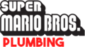
Super Mario Bros. Plumbing
Lowercase characters, as seen in Super Mario Bros. Wonder
The preliminary logo for New Super Mario Bros. used a design drawn from Super Mario Bros. Deluxe


Classic HUD font[edit]

This design was used from Super Mario 64 until Mario and Sonic at the London 2012 Olympic Games for the Nintendo 3DS (although the lowercase "s" is used in "Yoshi's" in the logo for Yoshi's Fruit Cart in Nintendo Land), appearing throughout games on the Nintendo 64, GameCube, and Wii. Some of its distinct features are the pointed, obelisk-shaped "A", the flat, wide "E", and the overall stocky, top-larger-than-bottom measures, giving it a more whimsical appearance if compared to earlier Super Mario typefaces, which were designed in the opposite way.
This typeface was primarily used for in-game text outside of dialogue (i.e HUDs and menus). Given the lack of standardization on the first Super Mario typeface, this one was also often used for placeholder logos, at times when new characters for the first font could not be drawn. It was also used for the logo of Super Mario Sunshine, Super Princess Peach and Dance Dance Revolution: Mario Mix.
Super Mario 64 "Press Start" screen
Super Mario Sunshine logo
Yoshi Topsy-Turvy Japanese logo

Super Princess Peach logo
Dance Dance Revolution: Mario Mix logo

Preliminary logo for Super Mario Galaxy
Super Mario Galaxy "The End" screen
Super Mario Galaxy 2
Mario Sports Mix


Paper Mario font[edit]
A design similar to the classic HUD design above, used for in-game display text in Paper Mario games up to Paper Mario: Sticker Star.
Paper Mario
Paper Mario: The Thousand-Year Door
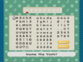
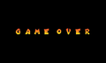
Super Paper Mario
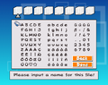
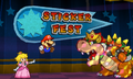
Paper Mario: Sticker Star

The Letter "p", an item in Paper Mario: The Thousand-Year Door


Super Mario Maker typeface[edit]
The Super Mario Maker font is a geometric sans-serif typeface first designed by Nintendo in 2015. It is used for the interface in Super Mario Maker, Super Mario Maker for Nintendo 3DS, and Super Mario Maker 2. It is also used for the logo for Super Mario Bros. 30th Anniversary. The initial variant of the font was titled "MARIO30th" and lacked lowercase characters. It was revised in 2018 to include lowercase letters; this new version is named "MARIOMAKER". The latest revision of the font is version 1.3, revised on November 28, 2018.[1]
Mario Party Textbox[edit]

Mario Party Textbox is used for the interface in the English version of Mario Party.
Mario Party Textbox FR/DE[edit]
Mario Party Textbox FR/DE is used for the interface in the French and German versions of Mario Party.
Mario Party 2/3 Textbox[edit]

Mario Party 2/3 Textbox is, as the name implies, used for the interface in Western versions of Mario Party 2 and 3.
Mario Party 4-7 Textbox[edit]

Mario Party 4-7 Textbox is, as the name implies, used for the interface in Western versions of Mario Party 4, 5, 6, and 7, as well as Dance Dance Revolution: Mario Mix and the European version of Mario Party 8.
Mario Party 4
Mario Party 5
Mario Party 6
Dance Dance Revolution: Mario Mix
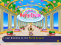
Mario Party 7


Mario Party 8 Textbox[edit]

Mario Party 8 Textbox is, as the name implies, used for the interface in the American version of Mario Party 8. It is based on DF Pop Mix.
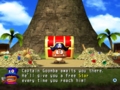
Mario Party 8

Mario Party Hudson[edit]

Mario Party Hudson is used for large text in all Hudson Soft-developed Mario Party installments, including text for Dice Block rolls, coin transactions, timers, board and minigame title cards, minigame announcements and HUD elements (such as placement and Star/coin counts), among others. It appears much more sparingly in Mario Party 8, used for dice rolls, coin transactions, in-scene text during minigames and in Puzzle Pillars. It is also used in Dance Dance Revolution: Mario Mix.
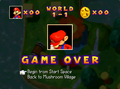
Mario Party

Mario Party 3

Mario Party 4
Mario Party 5
Mario Party 6
Mario Party Advance
Dance Dance Revolution: Mario Mix
Mario Party 7
Mario Party 8
Mario Party DS


Super Mario 64/Mario Party Textbox JP[edit]
Super Mario 64/Mario Party Textbox JP is, as the name implies, used for the interface in the Japanese versions of Super Mario 64 and the first seven games in the Mario Party series. However, in Western versions, it remains for the word "Using" in the Mushroom Bank in Mario Party, for certain uses of numbers in Mario Party 2, for entering a file name in Mario Party 3, for the credits in both Mario Party 2 and 3, and (in English only) for the "Point Total" and "Points Earned" text on the Decathlon Park leaderboard in Mario Party 6.
The GameCube-era variant of the font is less pixelated than the Nintendo 64-era variant.
Mario Golf/Mario Tennis (Nintendo 64) typeface[edit]
An uneven typeface is used in Mario Golf and Mario Tennis.
WarioWare typeface[edit]

A rounded typeface was used in the WarioWare series from WarioWare, Inc.: Mega Microgame$! to WarioWare: D.I.Y. Showcase. Despite no longer being used as the interface font by then, it was still used for the countdown of the Bomb until WarioWare Gold, and it was additionally used for the timer in Puck 'er Up in WarioWare: Get It Together!.
Geometrical WarioWare typeface[edit]

A geometrical typeface was used in WarioWare, Inc.: Mega Party Game$!, WarioWare: Smooth Moves, and WarioWare: D.I.Y. Showcase.
Donkey Konga typeface 1[edit]
A sans-serif display typeface was used in the Donkey Konga series.
Donkey Konga typeface 2[edit]
An uneven typeface was used for the interface in the Donkey Konga series in western languages.
Dr. Mario typeface[edit]
An uneven sans-serif typeface was used in Dr. Mario Online Rx and Dr. Mario Express.
Super Mario Odyssey typeface[edit]
A geometric sans-serif typeface was used for display text in Super Mario Odyssey and its corresponding Nintendo Sound Clock: Alarmo theme.
Rabbids typeface[edit]

A typeface used for the Rabbids series, officially named "Rabbids" and designed by OMSE Type, is used for the interface in Mario + Rabbids Sparks of Hope for display text in western and Russian languages.
Super Mario 256[edit]
Super Mario 256 is a fanmade font designed to replicate the modern Super Mario typeface, and was created by DaFont user fsuarez913.[3] The typeface was first published online in 2012, and quickly became widespread.[4] Compared to the font it imitates, Super Mario 256 is slightly bolder and wider, and several characters are drawn at different angles.
Despite its nature as an unofficial fan project, Super Mario 256 has made its way into official media on multiple occasions. In particular, the covers for Super Mario Manga Mania and Super Mario Compact Disco – 35th Anniversary Edition, the LEGO Super Mario set "Nabbit at Toad's Shop", the logo for LEGO Super Mario Goal and the in-game score, a few social media advertisements for Super Mario 3D World and the Nintendo Switch remake of Super Mario RPG, the European uploads of the Mario & Luigi: Brothership song "Yo-Ho, Bro!" except the Nintendo UK one,[5] and the Japanese Square Enix strategy guide for Super Mario RPG on Nintendo Switch feature the typeface.[6]
The cover for Super Mario Manga Mania
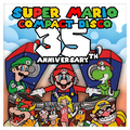
Album cover for Super Mario Compact Disco – 35th Anniversary Edition
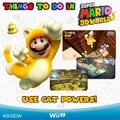
Graphic promoting Super Mario 3D World

LEGO Super Mario. Super Mario 256 is seen in the sign reading "SHOP".
Character card promoting the Super Mario RPG remake
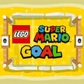
Icon for LEGO Super Mario Goal, using the font for the word "GOAL"


Chlorinap[edit]


Chlorinap is an unofficial font made to replicate the look of the classic Super Mario font, first published as early as 2005.[7] While the available font is outlined, a solid version of it is used in Mario vs. Donkey Kong 2: March of the Minis for the victory screen, and also in the end screen of the game's demo version. It is also used for some display text in Mario vs. Donkey Kong: Minis March Again! in western languages.
Licensed and other external designs[edit]
!Baegmug-Jemogche[edit]
!Baegmug-Jemogche ("!백묵-제목체", !baegmug-jemogche) is a sans-serif typeface for Korean released by Baekmuk. It is used for the interface in the Korean version of Super Smash Bros. Brawl.
Aachen[edit]
Aachen is a slab-serif typeface designed by Colin Brignall for Letraset, first released in 1969.[8] It is used for the logos in the following games:
- Mario Bros. (European-exclusive Nintendo Classics re-release)
- Virtual Boy Wario Land (Japanese)
- Game & Watch Gallery (Australasian)
- Game & Watch Gallery 2 (Australasian)
- Game & Watch Gallery 3 (Australasian)
It is also used in Super Mario Odyssey on the Football Uniform, and in Mario Kart 8, Mario Kart Tour and Mario Kart 8 Deluxe on the logo of the 1-Up Fuel and Mario Super Motor Team businesses.
Mario Bros.

Game & Watch Gallery Australasian logo ("2")

Game & Watch Gallery 2 Australasian logo ("3")
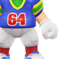
Super Mario Odyssey

Mario Kart 8
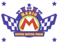
Mario Kart 8


Ad Lib[edit]

Ad Lib is an uneven sans-serif typeface designed by Freeman Craw for the American Type Founders, first released in 1961.[9] It is used for the interface in the following games:
It is also used in the logo for WarioWare, Inc.: Mega Party Game$! as well as in the western instruction booklets for Mario Party 4 and 5.

Used for the "MEGA PARTY GAME$!" text

Adobe Caslon[edit]

Adobe Caslon is a serif typeface designed by Carol Twombly and William Caslon I for Adobe Type, first released in 1990.[10] It is used for the logo for The Legend of Zelda: Battle Quest in Nintendo Land.
Adobe Garamond[edit]
Adobe Garamond is a serif typeface derived from Garamond designed by Robert Slimbach for Adobe Type, first released in 1989.[11] It is used for the Japanese logo for Donkey Kong Country 2: Diddy's Kong Quest, the European logo for Donkey Kong Land 2, and the beta logo for Mario vs. Donkey Kong 2: March of the Minis.
ITC Garamond[edit]
ITC Garamond is a serif typeface derived from Garamond designed by Tony Stan for ITC, first released in 1975.[12] It is used for the amiibo cards for Mario Sports Superstars.
Adsans[edit]
Adsans is a sans-serif typeface designed by Walter Tracy for Bitstream, first released in 1959.[13] It is used for the interface in the following games:
- Dance Dance Revolution: Mario Mix (European languages)
- Donkey Kong Country Returns (European languages, including numbers in all regions)
- Donkey Kong Country Returns 3D (numbers)
It is also used for the stage filter in the stage select screen and the "NEWCOMER" text in The Subspace Emissary in Super Smash Bros. Brawl.
Allegro[edit]

Allegro is a serif typeface designed by Hans Bohn for Ludwig & Meyer, first released in 1936. It is used in Mario Kart 8, Mario Kart Tour and Mario Kart 8 Deluxe on the logo for Fuzzy Battery.
Alternate Gothic[edit]
Alternate Gothic is a sans-serif typeface designed by Morris Fuller Benton and Sol Hess for the American Type Founders, first released in 1903.[14] Alternate Gothic No2 is used for text for player names in Mario Party 4 in western languages. It is also used for the North American and European/Australasian logos for Wario Land: Shake It!
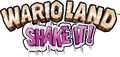
Wario Land: Shake It! ("SHAKE IT!")
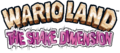
Wario Land: The Shake Dimension ("THE SHAKE DIMENSION")
Amelia[edit]

Amelia is a display typeface created by Stanley Davis circa 1964, later digitized and distributed by Linotype.[15] It is used for the "SECRET ENTRANCE" sign at The Great Tree in the GameCube version of Paper Mario: The Thousand-Year Door.
American Text[edit]

American Text is a blackletter typeface designed by Morris Fuller Benton for the American Type Founders, first released in 1932.[16] It is seen in Mario Kart 8, Mario Kart 8 Deluxe and Mario Kart Tour, where it is featured on the logotype for Tropical Bakery.
American Typewriter[edit]
American Typewriter is a slab-serif typeface designed by Joel Kaden and Tony Stan for ITC, first released in 1974.[17] It is used for the logos for the following games:
- Mario's Picross
- Dr. Mario: Miracle Cure (ITC American Typewriter Pro Bold)

Used for the "Miracle Cure" text

Anito[edit]

Anito (アニト Anito) is a rounded sans-serif typeface designed by Yutaka Satō[18] for Type Labo, first released in 2001.[19] It is used for the interface in Super Mario Maker. The typeface was also used in the tentative logo for that game during E3 2014, then named Mario Maker.
Tentative logo for Super Mario Maker
Antique Olive[edit]
Antique Olive is a humanist sans-serif typeface designed by Roger Excoffon for the Fonderie Olive, first released between 1962 and 1966.[20] It is used in the logo for Yoshi Touch & Go (albeit with a modified "G" glyph) and Mario Tennis: Ultra Smash. It is also used for description text in the North American Super Mario Advance 4: Super Mario Bros. 3 e-Reader cards.
Super Mario Advance 4: Super Mario Bros. 3 e-Reader card
Super Mario Advance 4: Super Mario Bros. 3 e-Reader card
Yoshi Touch & Go logo ("Touch & Go")

Mario Tennis: Ultra Smash ("ULTRA SMASH")


Aokane[edit]

Aokane (あおかね Aokane) is a rounded sans-serif typeface designed by Yoshiharu Ōsaki for Fontworks, first released in 2015.[21] It is used for the interface in Tetris 99, text in WarioWatch in WarioWare Gold, text in Mona and Penny's stages in WarioWare: Get It Together!, and text in the Pool-Party Panic stage in WarioWare: Move It!. It is also used in the Nintendo Switch remake of Paper Mario: The Thousand-Year Door for the "SECRET ENTRANCE" sign at The Great Tree, replacing Amelia. It was also used for the POW Block text in an early model seen in concept art.
A-OTF Folk Pro[edit]

A-OTF Folk Pro (A-OTF フォーク Pro A - OTF Fōku Pro) is a geometric sans-serif typeface from Morisawa. It is used for the interface in Super Smash Bros. Melee, Super Smash Bros. Brawl, and Super Smash Bros. for Nintendo 3DS/Wii U.
A-OTF Jun Pro[edit]
A-OTF Jun Pro (A-OTF じゅん Pro A - OTF Jun Pro) is a rounded sans-serif typeface from Morisawa. It is used for the difficulty slider in Super Smash Bros. Brawl.
A-OTF Maru Folk Pro[edit]
A-OTF Maru Folk Pro (A-OTF 丸フォーク Pro A - OTF Maru Fōku Pro) is a geometric sans-serif typeface from Morisawa. It is used for the units for the distance in Home-Run Contest in Super Smash Bros. Brawl, with a modified version being used for he "Wi-Fi" text in the Nintendo WFC button in the game's menu.
A-OTF Midashi Go MB31 Pro[edit]
A-OTF Midashi Go MB31 Pro (A-OTF 见出ゴMB31 Pro A - OTF Midashi Go MB31 Pro) is a sans-serif typeface from Morisawa. It is used for distance signs in Home-Run Contest in Super Smash Bros. Brawl.
A-OTF Shin Go Pro[edit]

A-OTF Shin Go Pro (A-OTF 新ゴ Pro A - OTF Shin Go Pro) is a geometric sans-serif typeface from Morisawa. Its Latin characters are similar to Eurostile. It is used for the interface in Super Smash Bros. Brawl.
A-OTF Shin Maru Go Pro[edit]
A-OTF Shin Maru Go Pro (A-OTF 新丸ゴ Pro A - OTF Shinmarugo Pro) is a rounded sans-serif typeface from Morisawa. It is used for the logo for Home-Run Contest in Super Smash Bros. Brawl.
AR BiaosongGB[edit]
AR BiaosongGB (文鼎大标宋简 Wén Dǐng Dà Biāo Sòng Jiǎn) is a serif typeface for Simplified Chinese released by Arphic. It is used for the no controller screen in the Simplified Chinese version of Super Smash Bros..
AR HeitiGB[edit]
AR HeitiGB (文鼎中特黑简 Wén Dǐng Zhōng tè Hēi Jiǎn) is a geometric sans-serif typeface for Simplified Chinese released by Arphic. It is used for the Random icon in the stage select screen in the Simplified Chinese version of Super Smash Bros..
AR XingKaiGB[edit]
AR XingKaiGB (文鼎粗行楷体 Wén Dǐng Cū Xíng Kǎitǐ) is a script typeface for Simplified Chinese released by Arphic. It is used for text in the Screen Adjust menu in the Simplified Chinese version of Super Smash Bros..
AR XinYiGB[edit]
AR XinYiGB (文鼎新艺体简 Wén Dǐngxīn Yì Tǐ Jiǎn) is a geometric sans-serif typeface for Simplified Chinese released by Arphic. It is used for the "START" text in the title screen of the Simplified Chinese version of Dr. Mario 64, interface text for modes in the Simplified Chinese version of Mario Kart 64, and display text in the Simplified Chinese version of Paper Mario. It is also used for the logo for Mario Bros in the Simplified Chinese versions of the Super Mario Advance series.
AR YentiGB[edit]
AR YentiGB (文鼎中特圆简 Wén Dǐng Zhōng Tè Yuán Jiǎn) is a rounded sans-serif typeface for Simplified Chinese released by Arphic. It is used for the interface in the Simplified Chinese versions of Mario Kart 64 and Dr. Mario 64, as well as text in How to Play and some interface text in the Simplified Chinese version of Super Smash Bros..
Arial[edit]

Arial is a sans-serif typeface designed by Patricia Saunders and Robin Nicholas for Monotype, first released in 1981.[22] It was used for the HUD of the E3 preview of New Super Mario Bros. Wii.
Arial Black is used in Super Smash Bros. Melee for display text (with a modified 1 for the countdown), as well as some player names in Super Smash Bros. Brawl. It is also used in the logos of Super Mario 64 DS, Dr. Mario Express, and the Game Boy Camera and Game Boy Printer, text in Mini-Game Stadium in Mario Party 2, text in Mario's Puzzle Party in Mario Party 3, the slot machine numbers in Mario Party 4, the "OFF" text in the music selection artwork in Dr. Mario 64 (and its Nintendo Puzzle Collection appearance) when the music options is set to it, the copyright text in the Simplified Chinese version of Super Smash Bros., the Candy's Dance Studio sign in the Game Boy Advance version of Donkey Kong Country, text in Funky's Flights II and numbers in Cranky's Video Game Heroes in the Game Boy Advance version of Donkey Kong Country 2, cutscene text in Mario vs. Donkey Kong, text in the Shuffle minigames in Super Mario 64 DS, text in the puzzle game in Mario & Luigi: Bowser's Inside Story, and text in The Super Mario Bros. Movie. A modified version is also used for the logo for the Game Boy Advance SP and the beta logo for Donkey Kong Barrel Blast. It is also used for the logo for Next Level Games. It is also used for interface text in Nintendo Puzzle Collection, with modifications for some of its appearances.
In Mario Kart DS and Mario Kart Wii, Arial Black is also used for the Dangerous!!! service logo. In Mario Kart Arcade GP, it was used for the Mario Motors advertisements. In Mario Kart Arcade GP 2, it is used on the logos for the following businesses:
- Diamond City (Arial and Arial Black)
- King Castle (Arial Black)
- Mario World (Arial Black)
- Yoshi Company (Arial Black)

Game Boy Camera ("camera")
Super Mario 64 DS ("DS")

Dr. Mario Express ("Express")

"DANGEROUS!!!"

"MARIO MOTORS"

Donkey Kong Barrel Blast early logo for its GameCube iteration, DK Bongo Blast ("Bongo Blast")
"Diamond City", "made in wario WARIO CAMPANY"
"KING CASTLE", "DANGER"
"MARIO WORLD"
"YOSHI COMPANY"


Arial Rounded[edit]


Arial Rounded is a sans-serif typeface derived from Arial. It is used for interface text in Nintendo Puzzle Collection and Mario vs. Donkey Kong 2: March of the Minis. It is also used for the logo of Dr. Mario Online Rx.

Dr. Mario Online Rx ("online")
Arnold Böcklin[edit]

Arnold Böcklin is a serif typeface released in 1904 by the Otto Weisert foundry.[23] It is seen in Mario Kart 8, Mario Kart Tour and Mario Kart 8 Deluxe on the logo for Undead Motors.
Atomic Suck[edit]
Atomic Suck is an uneven typeface designed by Don Synstelien for SynFonts, first released in 1995.[24] A modified version is used for the logo of Nintendo Wi-Fi Connection.
Aurora Grotesk V[edit]
Aurora Grotesk V is a sans-serif typeface designed by Wagner & Schmidt, first released in 1914.[25] It is used for the Japanese logos of the Donkey Kong Country series (including its GBA remakes) and the Japanese logo of Donkey Kong Land. It is also used for the Game & Watch: Mario's Cement Factory logo.
Super Donkey Kong ("DONKEY KONG")
Super Donkey Kong GB ("DONKEY KONG", "GB")
Super Donkey Kong 2: Dixie & Diddy ("DONKEY KONG")
Super Donkey Kong 3: Mysterious Kremis Islands ("DONKEY KONG")
Avenir Next[edit]
Avenir Next is a geometric sans-serif typeface designed by Adrian Frutiger Akira Kobayashi, for Linotype, first released in 2003.[26] It is commonly used on the labels of Nintendo consoles and controllers as well as the text for button displays appearing in-game in various Mario games since the release of the Nintendo DS Lite. It is also used for the SD Card image in the Wii's Photo Channel. Avenir Next Bold is used for the "i" in the Nintendo DSi logo and the "cube" in the second NDcube logo. A modified version with serifs is used for the Luigi's Mansion 2 HD logo.
AZ Cut Script[edit]
AZ Cut Script is a script typeface from Artist of Design, first released in 2011.[27] It is used for Spike's nametag in The Super Mario Bros. Movie.
Baby Pop[edit]

Baby Pop (ベビポップ Bebi Poppu) is a Point of Purchase typeface from Fontworks, first released in 2015.[28] It is used for text in Ashley's stage and Pumpkin Panic in WarioWare Gold, text in the Variety Towers and the logo for High Five in WarioWare: Get It Together!.
Baihushuang[edit]
Baihushuang (白虎爽 Báihǔ Shuǎng) is a script typeface from Koei Signworks. It is used for text in Kat & Ana's stage in WarioWare: Get It Together!.
Banco[edit]

Banco is a sans-serif display typeface designed by Roger Excoffon for the Founderie Olive, first released in 1951.[29] It is used for the Super Mario Bros. Special logo on the boxart for the game.
Bank Gothic[edit]
'Bank Gothic is a geometric sans-serif typeface designed by Morris Fuller Benton for the American Type Founders, first released between 1930 and 1933.[30] Modified versions are used for the logos for the Game Boy Advance line, the Nintendo GameCube, the Game Boy Player, and the Nintendo DS and Nintendo 3DS lines. The regular version is used for the "GET CONNECTED" label on several GBA and GameCube boxarts, as well as the "WAVEBIRD" labeling in the GameCube WaveBird Wireless Controller. It is also used for the "CUBE" in the first NDcube logo.

Game Boy Advance ("ADVANCE")

Nintendo GameCube ("GAMECUBE")

Game Boy Player ("PLAYER")

Nintendo DS ("NINTENDO")

Nintendo 3DS ("NINTENDO")
Basakoro[edit]
Basakoro (バサころ Basa Koro) is a script typeface from Koei Signworks. It is used for text in Kat & Ana's stage in WarioWare: Get It Together!.
Bauhaus[edit]
Bauhaus is a sans-serif typeface designed by Joe Taylor for FotoStar, first released in 1969.[31] It is used in the logo for amiibo, the "new" in the Nintendo 3DS lineup, the logos for Virtual Console, WiiWare, and DSiWare, as well as in the logos for the following games:
- Yoshi's Island: Super Mario Advance 3
- Nintendo Land
- Mini Mario & Friends: amiibo Challenge
- Mario Party: The Top 100 (Bauhaus 93; modified)
- Super Mario Party (ITC Bauhaus Pro Bold; modified)
- Super Mario Party Jamboree (ITC Bauhaus Pro Bold; modified)
It is also used for the HUD in Super Smash Bros. and text in the "SPECIAL ITEM" power-up cards of the Japanese Super Mario Advance 4: Super Mario Bros. 3 e-Reader cards.
it is also seen in Mario Kart Tour and Mario Kart 8 Deluxe on the Green Fuel advertisement posters.
Super Smash Bros.
Yoshi's Island: Super Mario Advance 3 ("3")
Super Mario Advance 4: Super Mario Bros. 3 e-Reader card ("SPECIAL ITEM")

Virtual Console

WiiWare ("Ware")

DSiWare ("Ware")

Nintendo Land
Mini Mario & Friends: amiibo Challenge ("CHALLENGE" lettering along with the "amiibo" logo)
Mario Party: The Top 100 ("THE TOP")
Super Mario Party ("MARIO PARTY")

"Light Your Life" set in Bauhaus

New Nintendo 3DS ("new")
Super Mario Party Jamboree ("MARIO PARTY")


Beaufonte[edit]
Beaufonte is a script typeface from the Morgan Sign Machine Company. It is used for the text for "Stage Select" and "Option" in Super Smash Bros..
Belwe Roman[edit]
Belwe Roman is a serif display typeface designed by Georg Belwe for the Schelter & Giesecke Type Foundry, first released in 1907.[32] It is seen in Mario Kart 8 and Mario Kart 8 Deluxe in the logos for the following businesses:
It is also used in the map in Super Mario Odyssey.


Berlin Sans[edit]


Berlin Sans is a sans serif typeface designed by David Berlow, Lucian Bernhard and Matthew Butterick for the Font Bureau and FontFont, first released in 1992.[33][34] It is used in its heavier variants for the KONG Letters, including DK's Tree House's KONG sign in Donkey Kong Country games starting with Donkey Kong Country Returns. It is also used for text in the opening cutscene for Mario vs. Donkey Kong 2: March of the Minis.
Berthold Block[edit]
Berthold Block is a sans-serif typeface designed by Hermann Hoffmann for H. Berthold, first released in 1908.[35] It is used for the logo for Wario Blast: Featuring Bomberman!.
Binner[edit]
Binner is a sans-serif typeface designed by Joseph W. Phinney for the American Type Founders, first released in 1899.[36] It is used for the Game & Watch: Donkey Kong Jr. logo.
Blackplotan[edit]
Blackplotan is a sans-serif typeface designed by Situjuh Nazara for 7NTypes, first released in 2014.[37] It is used in the logo for The Super Mario Bros. Movie.
Blippo[edit]
- Possible alternatives include: Bauhaus 93.

Blippo is a sans-serif typeface designed by Joe Taylor as a facsimile of Bauhaus and first released by Fotostar in 1969.[38] It is seen in Mario Kart Tour on the badge design for Wendy's Car Interiors.
Blue Global[edit]
Blue Global is a sans-serif typeface designed by Benoit Desprez for T-26, first released in 2001.[39] Blue Global Orbital is used for the logo for WarioWare: Snapped!.
Bodoni[edit]

Bodoni is a serif typeface designed by Giambattista Bodoni.[40] A modified version is used for the international logo of the Dr. Mario series until Dr. Mario Express.
Bodoni Poster[edit]

Bodoni Poster[41] or Poster Bodoni[42] is a serif typeface designed by Chauncey H. Griffith, released by Linotype in 1929.[42]
It is used in Super Mario Odyssey for the logo of New Donk City seen in the New Donk City Festival ad as well as its sticker. It is seen in Mario Kart Tour and Mario Kart 8 Deluxe on the poster for Chase!: Mario's Adventure.
"CHASE!" set in Bodoni Poster in Mario Kart 8 Deluxe

Boink[edit]
Boink is an uneven sans-serif typeface designed by Robert Petrick for ITC, first released in 1994.[43] It is used for the European/Australasian logo for Yoshi Topsy-Turvy.
Bookman Old Style[edit]
Bookman or Bookman Old Style is a serif typeface designed for Miller & Richard, first released in 1869.[44] It is used for the Western Land logo and text within the board in Mario Party 2, and the Bookman Bold font is used for the Peach Castle sponsor in Mario Kart Arcade GP 2.

Western Land logo (Mario Party 2)
Peach Castle (Mario Kart Arcade GP 2).

ITC Bookman[edit]
ITC Bookman is an alternative version of Bookman Old Style designed by Ed Benguiat for ITC, first released in 1975.[45] It is a variant of Bookman and is used in The Adventures of Super Mario Bros. 3 for episode title cards, in its Bold variant. It is also used for the ? Switch in Yoshi's Story.
Broadway[edit]
Broadway is a sans-serif display typeface designed by Morris Fuller Benton for the American Type Founders, first released in 1928.[46] It is used for the display text of "SELECT GAME" in Super Mario All-Stars and the year headings in Super Mario 3D All-Stars on the game-selection screens. It is also used for ranked badges in Mario Kart Tour.
Super Mario All-Stars
Super Mario 3D All-Stars


Brush Script[edit]

Brush Script is a casual script typeface designed by Robert E. Smith for the American Type Founders, first released in 1942.[47]
It is used in Super Mario Odyssey on the Forgotten Isle sticker. In Mario Kart 8, Mario Kart Tour and Mario Kart 8 Deluxe, it is seen in the logo for Wario Billionaires.
"Wario" in Brush Script in Mario Kart 8

Brushstroke 35[edit]
Brushstroke 35 is a script typeface used for the countdown on the bomb in Target Blast in Super Smash Bros. for Nintendo 3DS / Wii U.
ByakkoSou[edit]
ByakkoSou (白虎爽書 Báihǔ Shuǎng Shū) is a script typeface from Koei Signworks. It is used for text in Duelius Maximus in WarioWare: Get It Together!. A heavily modified version is also used for the logos for Duelius Maximus and Rising Star in said game.
Cafeteria[edit]

Cafeteria is a sans-serif typeface designed by Tobias Frere-Jones for Frere-Jones Type, first released in 1993.[48] It is used in the logo for Donkey Kong Country 3: Dixie Kong's Double Trouble!
Calcite[edit]
Calcite is a typeface designed by Akira Kobayashi for Adobe Type, first released in 2000.[49] Calcite Black is used for the logo of Striker Times in Mario Strikers Charged.
Cancun[edit]
Cancun is a sans-serif typeface designed by Howard A. Trafton for Corel, first released in 1992.[50] It is used in the logo for Paper Mario: The Thousand-Year Door.
Carat[edit]
Carat (カラット Karatto) is a typeface from Fontworks, first released in 2010.[51] It is used in the logo for WarioWatch, text in WarioWatch and Cruise Controls, and card letters in the Potluck Gang stage in WarioWare Gold, as well as in Wario's and Dribble & Spitz's levels and in the Play-o-Pedia in WarioWare: Get It Together!, and the logo for Galactic Conquest in WarioWare: Move It!.
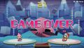
WarioWare: Get It Together! Wario stage
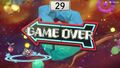
WarioWare: Get It Together! Dribble & Spitz stage
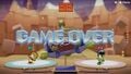
WarioWare: Get It Together! Play-o-pedia


Catchup[edit]

Cathcup is an uneven sans-serif typeface from Bay Animation, first released in 1994. It is used for the interface in Yoshi's New Island in western languages.
Cezanne[edit]
Cezanne (セザンヌ Sezannu) is a sans-serif typeface designed by Toshiyasu Satō for Fontworks, first released in 1993.[52] It is used for text in the Fire Emblem Awakening microgame in WarioWare Gold and text in Mona's stage in WarioWare: Get It Together!.
New Cezanne[edit]

New Cezanne (ニューセザンヌ Nyū Sezannu) is an alternative version of Cezanne, first released in 2008.[53] It is used for text on the Cell Phone thing in Paper Mario: Sticker Star. It is used for text in the Safecracker microgame in WarioWare Gold. It is also used in WarioWare: Get It Together! and WarioWare: Move It! for display text.
Chalk[edit]
Chalk is an uneven typeface. Chalk Condensed is used for the logo for Brownie Brown.
Chiaro[edit]

Chiaro (キアロ Kiaro) is a sans -serif typeface from Fontworks, first released in 1997.[54] It is used for controller setting texts in Luigi's Mansion, the Isle Delfino map in Super Mario Sunshine, the interface in Nintendo Land, and text in the Fire Emblem Awakening microgame in WarioWare Gold.
Cloister Black[edit]
Cloister Black is a script typeface designed by Joseph W. Phinney and Morris Fuller Benton for the American Type Founders, first released in 1904.[55] It is used for display text in the Game Boy Advance version of "Donkey Kong Country 2".
Comet[edit]

Comet (コメット Kometto) is a geometric sans-serif typeface from Fontworks, first released in 2010.[56] It is used for the Japanese logo of Arrow in Game & Wario and the logo for Sly Angle in WarioWare: Get It Together! and the text in the Volcano Wario stage in WarioWare: Move It!.
Comic Sans[edit]
Comic Sans is an uneven sans-serif typeface designed by Vincent Connare for Microsoft, first released in 1994.[57]
In Mario Party, it is used on the logo for Bowser's Magma Mountain, and is also seen in the Mini-Game Stadium circular field and the background graphic for the "START" sign; it is also used for all boards' names when viewing the post-game results. In Nintendo Puzzle Collection, it is used for the "Yoshi's Cookie" story scenery text. In Donkey Konga, it is used for the "TO BEACH" sign in the title screen. In Diddy Kong Racing DS, it is used for interface text. In WarioWare Gold, it is used for text in the Nintendogs microgame. In Super Mario RPG for the Nintendo Switch, it is used on the "Welcome" sign in the Mushroom Castle area.[58] It is also used for description text in the Mario Party-e cards.
Mario Party ("BOWSER'S" in the Bowser's Magma Mountain logo)
Mario Party ("START" in the Mini-Game Stadium)
Nintendo Puzzle Collection
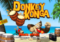
Donkey Konga ("TO BEACH" sign in the title screen)
Mario Party-e


Compacta[edit]
Compacta is a condensed sans-serif typeface designed by Fred Lambert for Letraset, first released in 1963.[59] It is used for display text in Super Smash Bros. Brawl, in addition to a modified version of Compacta Black being used for display text, with a modified 1 for player numbers and indicators, and modified numbers for the coin counter. It is also used in the logos for Super Mario Land 2: 6 Golden Coins, Mario's Tennis along with its pre-release logo, and Donkey Kong Country 2: Diddy's Kong Quest. It is also used for the copyright text in Dr. Mario 64.
Super Mario Land 2: 6 Golden Coins ("6 Golden Coins")
Mario's Tennis
Mario's Tennis early logo
Donkey Kong Country 2: Diddy's Kong Quest ("DIDDY'S KONG QUEST")
Cooper Black[edit]

Cooper Black, released in 1922, is a serif typeface and a heavy weight derivative of Cooper, released in 1919, designed by Oswald Cooper.[60] It is used for Trial Mode in Yoshi's Story and cutscene text in Mario vs. Donkey Kong. It is also used in Mario Kart 8, Mario Kart Tour and Mario Kart 8 Deluxe on the banner ads for Wendy's Car Interiors.
Mario vs. Donkey Kong

Copperplate Gothic[edit]
Copperplate Gothic is a wedge serif typeface designed by Frederic W. Goudy for American Type Founders, first released in 1901.[61] It is used on the Mystery Land logo and text within the board in Mario Party 2.
Corporate[edit]
Corporate is a geometric sans-serif typeface designed by Roc Mitchell for Alphabet Innovations, first released in 1971.[62] It is used for the logo for the Nintendo Entertainment System and its console and controller labels, and various other media related to it, such as the logo for the NES Remix series. It is also used for labels on the original Game Boy. A modified version is also used for "TAP" in the logo for Amiibo tap: Nintendo's Greatest Bits.


Original NES controller ("A", "B", "START" and "SELECT")
"Dogbone" NES controller ("A", "B", "START" and "SELECT")
Original Game Boy ("A", "B", "START" and "SELECT")
Amiibo tap: Nintendo's Greatest Bits logo ("TAP")


Cosmos[edit]

Cosmos is a sans-serif typeface designed by Gustav Jäger for Berthold, first released in 1982.[63] Cosmos Bold is used for the "for" and "NINTENDO" for the logo for Super Smash Bros. for Nintendo 3DS / Wii U.
Cruz Swinger[edit]
Cruz Swinger or Swinger is a decorative typeface designed by Ray Cruz originally published by John N. Schaedler circa 1970.[64] It is used in WarioWare: Touched! for the illustrative title cards seen in many Souvenirs, such as Kitchen Timer, Clacker and Yo-Yo.


Cuckoo[edit]

Cuckoo (カッコウ Kakkō) is a Point of Purchase typeface designed by Tomomi Kanda for Fontworks, first released in 2021.[65] It is used for text in Dribble & Spitz's stage in WarioWare: Move It!.
DF Hai Bao[edit]
DF Hai Bao (華康海報體 Huá kāng Hǎibào Tǐ) is a Point of Purchase typeface for Chinese released by DynaComware. It is generally used in place of the Super Mario font in Chinese localizations of games. Its Simplified Chinese variant, DFP Hai Bao-GB (华康海报体 Huá kāng hǎibào tǐ), is used for the interface in the following games:
- Super Mario 64 DS (title screen buttons; Simplified Chinese language)
- Super Mario Galaxy (Simplified Chinese language)
- New Super Mario Bros. Wii (Simplified Chinese language)
- Donkey Kong Country Returns (Simplified Chinese language)
- Super Mario 3D Land (Simplified Chinese language)
- Mario Tennis Open (Simplified Chinese language)
- New Super Mario Bros. 2 (Simplified Chinese language)
- Paper Mario: Sticker Star (Simplified Chinese language)
- New Super Mario Bros. U Deluxe (Simplified Chinese language)
- Yoshi's Crafted World (Simplified Chinese language)
- Dr. Mario World (Simplified Chinese language)
- Paper Mario: The Origami King (Simplified Chinese language)
- Super Mario 3D World + Bowser's Fury (Simplified Chinese language)
- WarioWare: Get It Together! (Simplified Chinese language)
- Mario vs. Donkey Kong (Nintendo Switch) (Simplified Chinese language)
- Paper Mario: The Thousand-Year Door (Nintendo Switch) (Simplified Chinese language)
Mario & Luigi: Brothership (Simplified Chinese language) Its Traditional Chinese variant, DF Hai Bao-B5 (華康海報體 Huá kāng Hǎibào Tǐ), is used for the interface in the following games:
- New Super Mario Bros. Wii (Traditional Chinese language)
- Super Mario 3D Land (Traditional Chinese language)
- Mario Party 9 (Traditional Chinese language)
- Mario Tennis Open (Traditional Chinese language)
- New Super Mario Bros. 2 (Traditional Chinese language)
- Paper Mario: Sticker Star (Traditional Chinese language)
- Super Mario Run (Traditional Chinese language)
- Super Mario Odyssey (Traditional Chinese language)
- New Super Mario Bros. U Deluxe (Traditional Chinese language)
- Yoshi's Crafted World (Traditional Chinese language)
- Dr. Mario World (Traditional Chinese language)
- Paper Mario: The Origami King (Traditional Chinese language)
- Super Mario 3D World + Bowser's Fury (Traditional Chinese language)
- WarioWare: Get It Together! (Traditional Chinese language)
- WarioWare: Move It! (Traditional Chinese language)
- Mario vs. Donkey Kong (Nintendo Switch) (Traditional Chinese language)
- Paper Mario: The Thousand-Year Door (Nintendo Switch) (Traditional Chinese language)
- Mario & Luigi: Brothership (Traditional Chinese language)

Mario Party 9
Paper Mario: The Origami King

DF Hana Geitai[edit]
DF Hana Geitai (華藝体 Huá Yì Yǐ) is a geometric sans-serif typeface for Traditional Chinese released by DynaComware. It is used for the interface in the Traditional Chinese version of Luigi's Mansion 3.
DF Hei[edit]
DF Hei is a sans-serif typeface for Chinese released by DynaComware. Its Simplified Chinese variant, DFP Hei-GB (华康黑体 Huá kāng Hēitǐ), is used for the interface in the following games:
- Super Mario 3D Land (Simplified Chinese language)
- Mario Kart 7 (Simplified Chinese language)
- New Super Mario Bros. 2 (Simplified Chinese language)
- Super Smash Bros. Ultimate (Simplified Chinese language)
- Super Mario Maker 2 (Simplified Chinese language)
- Mario Kart Tour (Simplified Chinese language)
- Mario Kart Live: Home Circuit (Simplified Chinese language)
- Super Mario 3D World + Bowser's Fury (Simplified Chinese language)
- WarioWare: Get It Together! (Simplified Chinese language; including "2" in multiplayer rankings in the Korean version and "第" in multiplayer rankings in the Traditional Chinese version)
- Mario Strikers: Battle League (Simplified Chinese language)
- WarioWare: Move It! (Simplified Chinese language)
- Super Mario RPG (Nintendo Switch) (Simplified Chinese language)
- Nintendo World Championships: NES Edition (Simplified Chinese language)
Its Traditional Chinese variant, DF Hei-B5 (華康黑體 Huá kāng Hēitǐ), is used for the interface in the following games:
- Super Mario 3D Land (Traditional Chinese language)
- Mario Kart 7 (Traditional Chinese language)
- New Super Mario Bros. 2 (Traditional Chinese language)
- Super Smash Bros. Ultimate (Traditional Chinese language)
- Mario Kart Tour (Traditional Chinese language)
- Mario Kart Live: Home Circuit (Traditional Chinese language)
- Super Mario 3D World + Bowser's Fury (Traditional Chinese language)
- Mario Golf: Super Rush (Traditional Chinese language)
- WarioWare: Get It Together! (Traditional Chinese language)
- Mario Strikers: Battle League (Traditional Chinese language)
- Nintendo World Championships: NES Edition (Traditional Chinese language)
DF Hei-B5 is also used for the interface in the Nintendo 3DS system software in the Traditional Chinese language.
DF Kyo Geki[edit]
DF Kyo Geki (DF京劇体 DF Jīngjù Tǐ) is an uneven sans-serif typeface from DynaComware. It is used for the interface in the following games:
- Mario Party 8 (American and Japanese versions)
- Luigi's Mansion: Dark Moon (Japanese and Russian versions)
- Luigi's Mansion Arcade
- Mario + Rabbids Sparks of Hope (Japanese language)
- Luigi's Mansion 2 HD (Japanese and Russian versions)
Its Traditional Chinese variant, Hua Kangping Theater (華康平劇體 Huá kāngpíng Jù Tǐ), is used for the interface in the Traditional Chinese versions of Luigi's Mansion: Dark Moon and its Nintendo Switch remaster, the logo for Puck 'er Up in the Traditional Chinese version of WarioWare: Get It Together!, and sticker text in the Traditional Chinese version of Mario Party Superstars.
Mario Party 8

DF Li King Hei[edit]
DF Li King Hei (華康儷金黑 Huá kāng Lì Jīn Hēi) is a serif typeface for Traditional Chinese released by DynaComware. It is used for the interface in the Traditional Chinese version of WarioWare: Get It Together!.
DF Li Hei[edit]
DF Li Hei (華康儷黑 Huá kāng Lì Hēi) is a sans-serif typeface for Traditional Chinese released by DynaComware. It is used for the interface in the following games:
- Mario Tennis Aces (Traditional Chinese language)
- Super Mario Maker 2 (Traditional Chinese language)
- WarioWare: Get It Together! (Traditional Chinese language)
- Super Mario RPG (Nintendo Switch) (Traditional Chinese language)
DF Li Yuan[edit]

DF Li Yuan (華康儷圓 Huá kāng Lì Yuán) is a rounded sans-serif typeface for Traditional Chinese released by DynaComware.[66] It is used for the interface in the following games:
- Mario Strikers: Battle League (Traditional Chinese language)
- Princess Peach: Showtime! (Traditional Chinese language)
It is also used for multiplayer rankings in the Traditional Chinese version of WarioWare: Get It Together!, including the "第" in multiplayer rankings in the Simplified Chinese version.
DF Ming[edit]
DF Ming (華康明體 Huá kāngmíng Tǐ) is a serif typeface for Traditional Chinese from DynaComware. It is used for text in the Fire Emblem: Three Houses microgame, dialogue for The Supreme Developer, and the logo for Gotta Bounce and text in Rising Star in the Traditional Chinese version of WarioWare: Get It Together!.
DF Mo[edit]
DF Mo (華康墨字體 Huá kāng Mò Zìtǐ) is a typeface for Traditional Chinese released by DynaComware. It is used for the logo for Balloon Bang in the Traditional Chinese version of WarioWare: Get It Together!.
DF Pop Mix[edit]

DF Pop Mix (DF POPミックス DF Poppu Mikkusu) is a Point of Purchase typeface from DynaComware. It is used for the interface in the following games:
- Mario Party 8 (Japanese language)
- Mario Party DS
- Luigi's Mansion 3 (Japanese language)
DF Tan Li[edit]
DF Tan Li is a script typeface for Chinese released by DynaComware. Both variants, DFP Tan Li-GB (华康唐风隶 Huá kāng Tángfēng Lì) and DF Tan Li-B5 (華康唐風隸 Huá kāng Tángfēng Lì) are used for text in Duelius Maximus in the Simplified and Traditional Chinese versions of WarioWare: Get It Together!, respectively.
DF Taru Gothic[edit]

DF Taru Gothic (DF樽ゴシック体 DF Taru Goshikkukarada) is a display typeface from DynaComware. It is used for the logo of Bowling in Game & Wario. Its Traditional Chinese variant, DF Taru Gothic-B5 (華康酒桶體 Huá kāng Jiǔ Tǒng Tǐ), is used for text in the Traditional Chinese version of WarioWare: Get It Together!.
DF UD Gothic[edit]
DF UD Gothic (華康UD黑 Huá kāng UD Hēi) is a Universal Design sans-serif typeface from DynaComware. It is used for the interface in Super Mario Maker 2 for the Japanese language.
DF Wa Wa[edit]
DF Wa Wa is a typeface for Chinese released by DynaComware. Both variants, DFP Wa Wa-GB (华康娃娃体 Huá kāng Wáwá Tǐ) and DF Wa Wa-B5 (華康娃娃體 Huá kāng Wáwá Tǐ) are used for the logo for High Five in the Simplified and Traditional Chinese versions of WarioWare: Get It Together!, respectively. DFP Wa Wa-GB is also used for the logo for Balloon Bang in the Simplified Chinese version of WarioWare: Get It Together!.
DF Xing Kai[edit]
DF Xing Kai (華康行楷體 Huá kāngxíng Kǎitǐ) or DFP Gyō Kaisho (DFP行楷書 DFP Xíng Kǎishū) is a script typeface from DynaComware.
It is used for text from the Temple of Form in WarioWare: Smooth Moves in Japanese and languages using the Latin script. It is also used in WarioWare: D.I.Y. as one of the font styles available for use in the Super MakerMatic 21, called Calligraphy.
WarioWare: Smooth Moves
WarioWare: Smooth Moves (Japanese version)
WarioWare: D.I.Y.


DF Yan Kai[edit]
DF Yan Kai (華康正顏楷體 Huá kāngzhèng Yán Kǎitǐ) is a script typeface for Traditional Chinese released by DynaComware. It is used for text in Duelius Maximus and in the Traditional Chinese version of WarioWare: Get It Together!. A heavily modified version is also used for the logos for Duelius Maximus and Rising Star in the Traditional Chinese version of said game.
DF Yuan[edit]
DF Yuan (華康圓體 Huá kāng Yuán Tǐ) is a rounded sans-serif typeface for Chinese released by DynaComware. Its Simplified Chinese variant, DFP Yuan-GB (华康圆体 Huá kāng Yuán Tǐ), is used for the interface in the following games:
- Dr. Mario Express (Simplified Chinese language)
- Game & Watch DSiWare games (Simplified Chinese language)
- Paper Mario: Sticker Star (Simplified Chinese language)
- Mario + Rabbids Kingdom Battle (Simplified Chinese language)
- Super Mario Odyssey (Simplified Chinese language)
- Super Mario Party (Simplified Chinese language)
- Dr. Mario World (Simplified Chinese language)
- Luigi's Mansion 3 (Simplified Chinese language)
- Paper Mario: The Origami King (Simplified Chinese language)
- WarioWare: Get It Together! (Simplified Chinese language)
- Mario Party Superstars (Simplified Chinese language)
- Mario Strikers: Battle League (Simplified Chinese language)
- Mario + Rabbids Sparks of Hope (Simplified Chinese language)
- Super Mario RPG (Nintendo Switch) (Simplified Chinese language)
- Princess Peach: Showtime! (Simplified Chinese language)
- Paper Mario: The Thousand-Year Door (Nintendo Switch) (Simplified Chinese language)
- Super Mario Party Jamboree (Simplified Chinese language)
- Mario & Luigi: Brothership (Simplified Chinese language)
Its Traditional Chinese variant, DF Yuan-B5 (華康圓體 Huá kāng Yuán Tǐ), is used for the interface in the following games:
- Mario Party 9 (Traditional Chinese language)
- Paper Mario: Sticker Star (Traditional Chinese language)
- Super Mario Run (Traditional Chinese language)
- Mario + Rabbids Kingdom Battle (Traditional Chinese language)
- Super Mario Odyssey (Traditional Chinese language)
- Super Mario Party (Traditional Chinese language)
- Dr. Mario World (Traditional Chinese languages)
- Paper Mario: The Origami King (Traditional Chinese language)
- Mario Golf: Super Rush (Traditional Chinese language)
- WarioWare: Get It Together! (Traditional Chinese language)
- Mario Party Superstars (Traditional Chinese language)
- Mario + Rabbids Sparks of Hope (Traditional Chinese language)
- Super Mario RPG (Nintendo Switch) (Traditional Chinese language)
- Paper Mario: The Thousand-Year Door (Nintendo Switch) (Traditional Chinese language)
- Super Mario Party Jamboree (Traditional Chinese language)
- Mario & Luigi: Brothership (Traditional Chinese language)
Paper Mario: The Origami King. The font is used for the item names and descriptions.

DFP Craft Sumi[edit]
DFP Craft Sumi (DFPクラフト墨 DFP Kurafuto Sumi) is an uneven typeface from DynaComware. It is used for several business graphics in Mario Kart Wii:
- Fun Flower (returns in Mario Kart 7)
- The Mushroom Moon
- Nintendo Moo Moo Farm
- Tropical Mart
Being also used for interface text in Pikmin games, it is present in WarioWare: Smooth Moves and WarioWare Gold in the microgame Pikmin 2.


DFP Fang Yuan[edit]
DFP Fang Yuan (华康方圆体 Huá kāng Fāngyuán Tǐ) is a Point of Purchase typeface for Traditional Chinese released by DynaComware. It is used for the interface in the Traditional Chinese version of Mario Tennis Open.
DFP Fūun[edit]


DFP Fūun (DFP風雲体 DFP Fēngyún Tǐ) is a typeface from DynaComware. It is seen in Mario Kart Wii in the poster ads for Coco Coffee and Green Fuel for the "with flower-friendly" portion. It is also used for the circular "?" symbol in Wario World, and text in the Iggy cards of the Japanese Super Mario Advance 4: Super Mario Bros. 3 e-Reader cards.
DFP Gothic[edit]

DFP Gothic (DFP華康ゴシック体 DFP Kakō Goshikku-karada) is a sans-serif typeface from DynaComware.[67] It is used for text for the Forms in WarioWare: Smooth Moves in the Japanese language. It is also most prominently used in Super Smash Bros. games, with the exception of Ultimate.
DFP Gothic-EB[edit]
DFP Gothic-EB (DFP特太ゴシック体 DFP Tokubuto Goshikku-karada) is an alternative variant of DFP Gothic used in Melee and Brawl for How to Play in both titles and some interface text for the latter, and the interface in Nintendo 3DS / Wii U. It is also used for text in Jimmy T and Jimmy P.'s stages in in WarioWare: Smooth Moves, background text in Nintendo Badge Arcade, and text in the Bowser cards of the Japanese Super Mario Advance 4: Super Mario Bros. 3 e-Reader cards.
DFP Gothic-EB is also used for the "3" and "U" for the logos for Super Smash Bros. for Nintendo 3DS / Wii U, respectively.
It is also has minor usage in Mario Kart 8 and Mario Kart 8 Deluxe on the Bullet Bill Speed Trials logo.
Super Smash Bros. for Nintendo 3DS / Wii U ("3", "U")

DFP HS Gothic[edit]
DFP HS Gothic (DFP平成ゴシック体 DFP Heisei Goshikku-karada) is an alternative variant of DFP Gothic used in the original Super Smash Bros. for pre-match loading screens in the 1P Game, as well as unlock messages and How to Play. It is also used for text in Mini-Game Island in Mario Party, text in Rules Land in Mario Party 2, text in Darts in WarioWare: Smooth Moves, and WarioWare: D.I.Y. as one of the font styles available for use in the Super MakerMatic 21, called Bold, as well as comics text in the Japanese language. It is also used for some text in the interface in the iQue DSi and the unreleased Wii system software in the Simplified Chinese language.

DFP Hei[edit]
DFP Hei-GB (华康黑体 Huá kāng Hēitǐ) is a sans-serif typeface for Simplified Chinese released by DynaComware. It is used for the interface in Mario Tennis Aces in the Simplified Chinese language. It is also used for some text in the interface in the iQue DSi system software, and the interface in the iQue 3DS and the unreleased iQue Wii system software in the Simplified Chinese language.
DFP Kai[edit]
DFP Kai (华康楷体 Huá kāng Kǎitǐ) is a serif typeface for Simplified Chinese released by DynaComware. It is used for the interface in the unreleased iQue Wii system software in the Simplified Chinese language.
DFP Kai Sho[edit]
DFP Kai Sho (DFP中太楷書体 DFP Zhōng Tài Kǎishū Tǐ) is a serif typeface from DynaComware. It is used for display text in Super Smash Bros. Melee in western languages and the exclamation point icon in Wario World.
DFP Kan[edit]

DFP Kan Tei Ryu (DFP勘亭流 DFP Kāntíngliú) is a script typeface from DynaComware. It is used for the interface in the following games:
- Wario World
- Nintendo Land
It is also used for text in the Japanese Super Mario Advance 4: Super Mario Bros. 3 e-Reader cards.
Its Chinese variants, DFP Kan Ting Liu-GB (华康勘亭流 Huá kāng Kāntíngliú) and DF Kan Ting Liu-B5(華康勘亭流 Huá kāng Kāntíngliú) are used for text in Kat and Ana's stage in the Simplified and Traditional Chinese versions of WarioWare: Get It Together!, respectively, as well as text in Duelius Maximus in the Simplified Chinese version of WarioWare: Get It Together!. A heavily modified version is also used for the logos for Duelius Maximus and Rising Star in the Simplified Chinese version of said game.
DFP Koln[edit]
DFP Koln (DFP康印体 DFP kāng Yìn Tǐ) is a rounded typeface from DynaComware. It is used in WarioWare: D.I.Y. as one of the font styles available for use in the Super MakerMatic 21, called Ghostly.
DFP Lei Ga So[edit]

DFP Lei Ga So (DFP麗雅宋 DFP Lì Yǎ Sòng) is a serif typeface from DynaComware. It is based on Times New Roman. It is used for the interface in the following games:
- Dance Dance Revolution: Mario Mix (American and Japanese languages)
- Mario Party 8 (American and Japanese languages)
It is also used for numbers for bonus results in the results screen in Super Smash Bros..
DFP Li Jin Hei[edit]
DFP Li Jin Hei (华康俪金黑 Huá kāng Lì Jīn Hēi) is a serif typeface for Simplified Chinese released by DynaComware. It is used for the interface in the Simplified Chinese version of WarioWare: Get It Together!.
DFP Li King Hei[edit]
DFP Li King Hei (華康儷金黑 Huá kāng Lì Jīn Hēi) is a serif typeface from DynaComware. It is used for the question mark icon in Wario World.
DFP Maru Gothic[edit]
DFP Maru Gothic (DFP中太丸ゴシック体 DFP-chū Tamaru Goshikku-karada) is a rounded sans-serif typeface from DynaComware. It is used for the interface in the following games:
- Mario Kart Wii (Korean language; including the Mario Kart Channel)
- Mario vs. Donkey Kong: Minis March Again! (Japanese language)
- Donkey Kong Country Returns 3D (Japanese language)
It is also used for numbers in Home-Run Contest in Super Smash Bros. Melee and text in Puck 'er Up and the copyright text in the Simplified and Traditional Chinese versions of WarioWare: Get It Together!. A modified version is used for the logo for Kat and Ana's Sky Patrol in WarioWare: D.I.Y. Showcase,
DFP Maru Moji[edit]
DFP Maru Moji (DFPまるもじ体 DFP Maru-mojitai) is a Point of Purchase typeface from DynaComware. It is used for the interface in the Japanese and Russian versions of Yoshi's New Island, text on the sign in the opening cutscene of Wrecking Crew '98, and text in the Japanese Super Mario Advance 4: Super Mario Bros. 3 e-Reader cards. A modified version is used for the interface in the Japanese version of Diddy Kong Racing for Latin characters.
DFP Mincho[edit]

DFP Mincho (DFP華康明朝体 DFP Huá kāngmíng Cháo Tǐ) is a serif typeface from DynaComware. It is used for the interface in the following games:
- Super Smash Bros. Melee (Japanese language, including the Game Over screen in western languages)
- Super Smash Bros. Brawl
- WarioWare: D.I.Y.
- Super Smash Bros. for Wii U
It is also used for the World of Light subtitle in the Japanese, Simplified Chinese, and Traditional Chinese versions of Super Smash Bros. Ultimate.
DFP HS Mincho[edit]
DFP HS Mincho (DFP平成明朝体 DFP Píngchéng Míng Cháo Tǐ) is an alternative version of DFP Mincho used for the interface in the Japanese version of Super Smash Bros., including some interface text in the European versions, and How to Play, the no controller screen, and the bonus results screen in western languages. It is also used in WarioWare: D.I.Y. as one of the font styles available for use in the Super MakerMatic 21, called Elegant.
DFP Pop[edit]

DFP Pop (DFP POP体 DFP Poppu-tai) is a Point of Purchase typeface from DynaComware. It is used for the interface in the following games:
- Diddy Kong Racing (modified; Japanese language)
- Dance Dance Revolution: Mario Mix (English and Japanese language)
- Mario Kart Arcade GP
- Mario Kart Arcade GP 2
- WarioWare: D.I.Y. Showcase
It is also used for credits text in Super Mario Sunshine. A variant, DFP Pop 2, is used for text in the Lemmy cards of the Japanese Super Mario Advance 4: Super Mario Bros. 3 e-Reader cards. Its Simplified Chinese variant, DFP Pop-GB (华康POP体 Huá kāng POP Tǐ), is used for the interface in the following games:
- Mario Tennis Open (Simplified Chinese language)
- Luigi's Mansion: Dark Moon (Simplified Chinese language)
- Yoshi's Crafted World (Simplified Chinese language)
- WarioWare: Get It Together! (Simplified Chinese language)
- Mario Party Superstars (sticker text; Simplified Chinese language)
- Princess Peach: Showtime! (Simplified Chinese language)
- Luigi's Mansion 2 HD (Simplified Chinese language)
- Super Mario Party Jamboree (reaction text; Simplified Chinese language)
Its Traditional Chinese variant, DF Pop-B5 (華康POP體 Huá kāng POP Tǐ), is used for the interface in the following games:
- Super Mario Galaxy 2 (Traditional Chinese language)
- Yoshi's Crafted World (Traditional Chinese language)
- WarioWare: Get It Together! (Traditional Chinese language)
- Princess Peach: Showtime! (Traditional Chinese language)
- Super Mario Party Jamboree (reaction text; Traditional Chinese language)
DFP Ru Lei[edit]
DFP Ru Lei (DFP流隷体 DFP Liú Lìtǐ) is a script typeface from DynaComware. It is used for the interface in the following games:
- Wrecking Crew '98
- Wario World
DFP Sō Gei[edit]

DFP Sō Gei (DFP綜藝体 DFP Zōngyì Tǐ) is a geometric sans-serif typeface from DynaComware. It is based on Boss. It is used for the interface in the following games:
- Super Smash Bros. Melee
- Mario Superstar Baseball
- Mario Party 8
- Super Smash Bros. Brawl (Multi-Man Brawl and Coin Launcher)
- Mario Super Sluggers
- Super Mario Maker (Japanese and Russian languages)
- Super Mario Maker for Nintendo 3DS (Japanese and Russian languages)
- Super Mario Maker 2 (Japanese language)
- Luigi's Mansion 3 (Japanese language)
It is used on the logo for DK: Jungle Climber. In Mario Superstar Baseball, it is also used for the special move logos.
It is also minorly seen in Mario Kart Arcade GP 2, where it is seen on Lakitu's sign, WarioWare: Smooth Mooves, for text in Darts, WarioWare: D.I.Y. Showcase, for Wario-Man's level title screen, text in Dribble & Spitz's stage, as well as the Diamond Taxi ad screen, and Nintendo Badge Arcade on the "PLAYS" text in the arcade machine.
Its Simplified Chinese variant, DFP Zong Yi-GB (华康新综艺 Huá kāng Xīn Zōngyì), is used for the interface in the following games:
- Super Mario 64 (Simplified Chinese language)
- Mario Kart 8 Deluxe (Simplified Chinese language)
- New Super Mario Bros. U Deluxe (Simplified Chinese language)
- Super Mario Maker 2 (Simplified Chinese language)
- Luigi's Mansion 3 (Simplified Chinese language)
- WarioWare: Get It Together! (Simplified Chinese language)
- Mario Party Superstars (Simplified Chinese language)
- Super Mario Party Jamboree (Simplified Chinese language)
It is also used for some display text in the Simplified Chinese version of Super Mario Advance, the "THANK YOU" text in the ending picture in the Simplified Chinese version of Super Mario 64 DS, and the copyright text in the Simplified Chinese version of Super Mario Galaxy.
Its Traditional Chinese variant, DFP Zong Yi-B5 (華康新綜藝體 Huá kāng xīn Zōngyì Tǐ), is used for the interface in the following games:
- Mario Kart 8 Deluxe (Traditional Chinese language)
- New Super Mario Bros. U Deluxe (Traditional Chinese language)
- Super Mario Maker 2 (Traditional Chinese language)
- Luigi's Mansion 3 (Traditional Chinese language)
- WarioWare: Get It Together! (Traditional Chinese language)
- Mario Party Superstars (Traditional Chinese language)
- Super Mario Party Jamboree (Traditional Chinese language)
Modified versions of both Chinese variants are used for the logos for Friendless Battle in the Simplified and Traditional Chinese versions of WarioWare: Get It Together!, respectively.
Interface text in Mario Superstar Baseball

Killer Ball logo in Mario Superstar Baseball
"Now BROADCASTING" Lakitu sign (Mario Kart Arcade GP 2)
"Wario-Man" (WarioWare: D.I.Y. Showcase)
"GAME OVER" (WarioWare: D.I.Y. Showcase)
"Diamond Taxi" (WarioWare: D.I.Y. Showcase)


DFP Song[edit]
DFP Song (华康宋体 Huá kāng Sòngtǐ) is a serif typeface for Simplified Chinese from DynaComware. It is used for player control indicators in the fighter select screen, How to Play, and backup text in the Simplified Chinese version of Super Smash Bros., and the text in the Fire Emblem: Three Houses microgame, dialogue for The Supreme Developer, text in Rising Star, and the logo for Gotta Bounce in the Simplified Chinese version of WarioWare: Get It Together!.
DFP TF Lei Sho[edit]
DFP TF Lei Sho (DFP唐風隷書体 DFP Tángfēng Lìshū Tǐ) is a script typeface from DynaComware. It is used for text in the Mordon cards of the Japanese Super Mario Advance 4: Super Mario Bros. 3 e-Reader cards.
DFP Ya Yi[edit]
DFP Ya Yi (华康雅艺体 Huá kāngyǎ Yì Tǐ) is a slab-serif for Simplified Chinese released by DynaComware. It is used for the logo for Sly Angle in the Simplified Chinese version of WarioWare: Get It Together!.
DNP Shuei Antique[edit]

DNP Shuei Antique (DNP 秀英アンチック DNP Shūei Anchikku) is a sans-serif typeface designed by Dai Nippon Printing for Fontworks, first released in 2017.[68] It is used for text in Dribble & Spitz's stage in WarioWare: Get It Together!.
Dom Casual[edit]

Dom Casual is a casual script typeface designed by Peter Dom for American Type Founders, first released in 1963.[69] It is used both in The Super Mario Bros. Super Show! and the Donkey Kong Country television series (in its bold variant) for general text, including title cards and credits information. It is also used in the Super Mario World television series for credits only. It is also used for the logo for Balloon Trip Breeze in Nintendo Land.
Dot Gothic12[edit]

Dot Gothic12 (ドットゴシック 12 Dotto Goshikku 12) is a pixelated sans-serif typeface from Fontworks, first released in 2006.[70] it is used in the logo for Sneaky Gamer in WarioWare Gold, text in 9-Volt's stage in WarioWare: Move It! and Patissiere Peach's stage in Princess Peach: Showtime!.
Dot Gothic16[edit]

Dot Gothic16 (ドットゴシック 16 Dotto Goshikku 16) is a pixelated sans-serif typeface from Fontworks, first released in 2006.[71] It is used for text in 9-Volt's stage in WarioWare: Get It Together!.
Duke[edit]
Duke is a serif typeface from Bay Animation, first released in 1994. It is based on Times New Roman. It is used for the interface in the following games:
- Dance Dance Revolution: Mario Mix (European languages)
- Mario Party 8 (European languages)
Eckmann[edit]

Eckmann, Eckmann-Type or Eckmann-Schrift is a typeface designed by Otto Eckmann and first released by Klingspor Type Foundry in 1900.[72] In Mario Kart Tour and Mario Kart 8, it is used in the logo for Blooper's Seafood Bar.
Eclat[edit]
Eclat is a script typeface designed by Doyald Young for Letraset, first released in 1986.[73] It is used for the European/Australasian logo for DK: King of Swing.
El Grande[edit]
El Grande is a sans-serif typeface designed by Jim Parkinson for The Font Bureau, first released in 1993.[74] It is used for the North American logo for Mario & Luigi: Dream Team.
Enge Wotan-Grotesk[edit]
Enge Wotan-Grotesk is a sans-serif typeface developed by German company Wagner & Schmidt circa 1914.[75] It serves as the basis for the logo of Super Mario Land 2: 6 Golden Coins and Wario Land: Super Mario Land 3, with alterations to the bars of the A, E, and the 3, and the bowl of the P, which are angled upward.
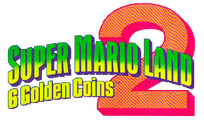
Super Mario Land 2: 6 Golden Coins logo ("SUPER MARIO LAND")
Wario Land: Super Mario Land 3 logo ("SUPER MARIO LAND 3")

Eras[edit]
Eras is a humanist sans-serif typeface designed by Albert Boton and Albert Hollenstein for ITC, first released in 1976.[76] Eras Bold is used in Super Smash Bros. for display text and text in menu backgrounds and the title screen and Super Smash Bros. Melee for the ordinal number suffixes on the winner screen.
Eras Bold is also seen for the number "2" in the end screen of the demo version of Mario vs. Donkey Kong 2: March of the Minis. It is also used for the "Arcade GP" text in the Mario Kart Arcade GP series logo.
Mario Kart Arcade GP logo
The number "2" in the Mario vs. Donkey Kong 2: March of the Minis demo set in Eras Bold.
Estro[edit]
Estro is a serif typeface designed by Aldo Novarese for Nebiolo, first released in 1961.[77] It is seen in Mario Kart 8, Mario Kart Tour, Mario Kart 8 Deluxe and Yoshi's Crafted World for the logo for Princess Orange, and in Tour for the Ludwig Painting logo.

Eurostile[edit]
Eurostile is a geometric sans-serif typeface designed by Aldo Novarese for Nebiolo, first released in 1962.[78] It is used for the Japanese logo of Super Mario World and labels on the Family Computer Disk System. It is also used for the Japanese logo for Mario Paint, and the text on the Game Boy Micro, the latter having gaps in the "A" and "R". It is also used for background text in Super Smash Bros.. A modified version is used for the first logo for Nintendo Power, which was reused for its podcast. It is also used for button labels on the iQue Player and its Multiplayer controller.
Eurostile Condensed is used for the interface in Mario Kart 64 in western languages.
Super Mario World ("SUPER MARIO BROS.")
Mario Paint
Game Boy Micro ("a", "b", "L", "R", "START", "SELECT")

FF CrashBangWallop[edit]

FF CrashBangWallop is a sans-serif typeface designed by Rian Hughes for FontFont, first released in 1970.[79] It is used for the North American/Australasian logo for Mario Hoops 3-on-3.
FF DIN[edit]
FF DIN is a sans-serif typeface derived from DIN 1451 designed by Albert-Jan Pool for FontShop International, first released in 1995.[80] FF DIN Pro Condensed Black is used for the logos for Super Mario Party and Super Mario Party Jamboree. It is also used for text for the score in Darts in WarioWare: Smooth Moves, and text in Foreman Spike's clothing logos in The Super Mario Bros. Movie. It is also used for the AM/PM timezone indicator in the Wii system software and the system clock and the battery percentage in the Nintendo Switch system software.
DIN 2014[edit]

DIN 2014 is a sans-serif typeface derived from DIN 1451 designed by Vasily Biryukov for ParaType, first released in 2014.[81] It is used for the interface in Super Mario Bros. Wonder and Nintendo World Championships: NES Edition.
FF Mark[edit]

FF Mark is a geometric sans-serif typeface designed by Hannes von Döhren and Christoph Koeberlin for FontFont, first released in 2013.[82] It is used for the logo for Super Mario 3D All-Stars. It has also been largely used as the main typeface for Nintendo's branding since the release of the Nintendo Switch, such as the logo for Nintendo Switch Online. It is also used for the interface in Nintendo World Championships: NES Edition.
FF World[edit]
FF World is a geometric sans-serif typeface designed by Neville Brody for FontFont, first released in 1993.[83] A modified version of FF World One It is used for the North American logo for Mario Party Advance.
Fontaine[edit]
Fontaine is a serif typeface from Summitsoft. It is based on Palatino. It is used for the World of Light subtitle in Super Smash Bros. Ultimate.
Founder Bai Zhou Hun Body[edit]
Founder Bai Zhou Hun Body (方正白舟魂心体 Fāngzhèng Bái Zhōu Hún Xīn Tǐ) is a script typeface designed by Hakusyu Fonts for FounderType.[84] It is used for text in Dr. Crygor's stage in WarioWare Gold.
Founder Cu Yuan[edit]
Founder Cu Yuan (方正粗圆 Fāngzhèng Cū Yuán) is a rounded sans-serif typeface for Simplified Chinese from FounderType, first released in 1996.[85] It is used for the interface in the Simplified Chinese version of Mario Kart Arcade GP DX.
Founder Da Biao Song[edit]
Founder Da Biao Song (方正大标宋 Fāngzhèng Dà Biāo Sòng) is a serif typeface for Simplified Chinese from FounderType, first released in 1996.[86] It is used for the "THANK YOU" text in the ending picture in the Simplified Chinese version of Super Mario 64.
Founder Da Hei[edit]
Founder Da Hei (方正大黑 Fāngzhèng Dà Hēi) is a geometric sans-serif typeface for Simplified Chinese from FounderType, first released in 2000.[87] It is used for text in menu backgrounds in the Simplified Chinese version of Super Smash Bros..
Founder Hakusyu Bukotsu Karada[edit]
Founder Hakusyu Bukotsu Karada (方正白舟武骨体 Hōsei Shirafune Bukotsu Karada) is a script typeface designed by Hakusyu Fonts for FounderType.[88] It is used for text in Kat & Ana's stage and Battle Time in WarioWare Gold.
Founder Hakusyu Ohige[edit]
Founder Hakusyu Ohige (方正白舟大髭 Hōsei Shirafune Ōhige) is a script typeface designed by Hakusyu Fonts for FounderType.[89] It is used for the logo for and text in Split Screen in WarioWare Gold.
Founder Liuxing Ti[edit]
Founder Liuxing Ti (方正流行体 Fāngzhèng Liúxíng Tǐ) is a script typeface for Simplified Chinese designed by Sū Yīnghuá for FounderType, first released in 2003.[90] It is used for the "The End" text in the ending picture in the Simplified Chinese version of Super Mario 64, and the clear text in the Simplified Chinese version of Wario Land 4.
Founder Rui Zheng Hei[edit]
Founder Rui Zheng Hei (方正锐正黑 Fāngzhèng Ruì Zhèng Hēi) is a geometric sans-serif typeface for Simplified Chinese designed by Lú Shuài for FounderType, first released in 2015.[91] It is used for the interface in the Simplified Chinese version of Super Mario Bros. Wonder.
Founder Zong Yi[edit]
Founder Zong Yi (方正综艺 Fāngzhèng Zōngyì) is a geometric sans-serif typeface for Simplified Chinese from FounderType, first released in 2000.[92] It is used for some text in menu backgrounds in the Simplified Chinese version of Super Smash Bros., and text in Wario's Homerun Derby in the Simplified Chinese version of Wario Land 4.
Frankfurter[edit]
Frankfurter is a rounded sans-serif typeface designed by Bob Newman for Letraset, first released in 1970.[93] It is used for the Greenhouse game in Game & Watch Collection, and the logo of Super Mario World: Super Mario Advance 2.
Used for the number "2"
Super Mario World: Super Mario Advance 2 Japanese logo ("2")
Super Mario World: Super Mario Advance 2 early logo ("2")
Game & Watch Collection ("GREEN HOUSE")

Frankfurter Highlight[edit]

Frankfurter Highlight is a rounded sans-serif typeface and an extension to Frankfurter designed by Nick Belshaw for Letraset, first released in 1978.[94] It is used in Mario Kart 8 and Mario Kart 8 Deluxe on the logo for Green Service.
Franklin Gothic[edit]

Franklin Gothic is a sans-serif typeface designed by Morris Fuller Benton for the American Type Founders, first released between 1902 and 1967.[95] It is used for the sign in Cranky's Lab in Donkey Kong 64, text in Nintendo Puzzle Collection, and the Donkey Kong and Oil Panic games in Game & Watch Collection. It is also used for cutscene text in Mario vs. Donkey Kong and its Nintendo Switch remake. It is also used for the Game & Watch: Donkey Kong Jr. logo.
Freehand 521[edit]

Freehand 521 is a script typeface from Bitstream and a digital version of 1934's Mandate, which was designed by Robert Hunter Middleton.[96] It is used in Mario Kart Tour and Mario Kart 8 Deluxe for the logo for Daisy's Flower Market.
Friz Quadrata[edit]

Friz Quadrata is a serif typeface designed by Ernst Friz and Victor Caruso for Visual Graphics Corporation, first released in 1965.[97] It is used on the character name text on Super Mario Galaxy trading cards.
Frutiger[edit]
Frutiger is a humanist sans-serif typeface designed by Adrian Frutiger, first released in 1976.[98] It is used for text in Mario's Puzzle Party in Mario Party 3, text for the Hole-In-One Contest in the English version of Mario Golf: Toadstool Tour, and the logos for Donkey Kong Country Returns 3D and Mario Tennis Aces.
Used on "3D"

Used on "Aces"
Futura[edit]

Futura is a geometric sans-serif typeface designed by Paul Renner for the Bauer Type Foundry, first released in 1927.[99]
It is used for display interface text in Mario vs. Donkey Kong 2: March of the Minis, general interface text in the western versions of Mario + Rabbids Kingdom Battle and the Russian version of Mario + Rabbids Sparks of Hope. In Mario Tennis Aces it is used for some interface text (such as HUD numbers), for the "Mario Tennis" logo on the menu background texture, and for character names on light displays on stadium courts. In Mario vs. Donkey Kong, it is used for text in the cutscenes. In Mario Strikers Charged, it is used for jumbotron text. In Super Mario Odyssey, it is used for the "GO CAP CRAZY!" text on the scrolling light up sign on the Crazy Cap building in New Donk City. It is also used for text in The Super Mario Bros. Movie.
It is used in Mario Kart 8, Mario Kart Tour and Mario Kart 8 Deluxe for the ads for:
- Mario Motors
- Boomerang Bros. International Airlines
- Dino Dino Outdoor & Camping Goods
- Morton Construction
- Women of Racing Organization
In Tour, it is also used for the B-Dash ad.
In Live: Home Circuit, it is used for the numbers for the lap gates.
It is the primary font in the western instruction booklets for Super Mario 64, Super Mario Sunshine, Mario Golf: Toadstool Tour, Mario Kart DS, and the Wii version of Mario and Sonic at the London 2012 Olympic Games.
Futura fonts are present on the logos for Mario Discovery and the boxart logos and text of all its games, as well as the Mario Artist series, the logo for the 1992 Nintendo Campus Challenge, the European logo of Mario Hoops 3-on-3 and the Classic NES Series titles. It is also used for the logo for the Classics consoles, Nintendo World Championships: NES Edition, as well as various NES promotional materials. It is also seen on the console and controller labels of the Nintendo GameCube and the labels on Nintendo handhelds such as the Game Boy and from the original Game Boy Advance to the original Nintendo DS. Additionally, it is used for the logo for the 20th Anniversary of Super Mario Bros. and the text to denote years for the Nintendo World Championships. Modified versions of Futura are used for the logo for Super Mario Bros. 3, Picross 2, and the Japanese logo of Mario's Picross. It is also used for the logo for the Wii when it was known under its codename Revolution. A modified version is used for the second logo for Nintendo Power.
Super Mario Bros. 3
Game Boy ("DOT MATRIX WITH STEREO SOUND", "BATTERY", "OFF","ON", "PHONES", "VOL")
NES Cleaning Kit
1992 version of Nintendo Campus Challenge (Letters "C", (first) "L", and (first) "E" in "CHALLENGE")
Mario Discovery
Mario Teaches Words
Mario's Picross ("PICROSS")
Picross 2 ("PICROSS")
Mario Artist ("ARIO ARTIST")
Game Boy Advance ("A", "B", "L", "R", "START", "SELECT", "POWER", "OFF", "ON", "VOL")
Nintendo GameCube ("POWER", "RESET", "OPEN", "SLOT-A", "SLOT-B") and its controller ("A", "B", "X", "Y", "L", "R", "Z", "START/PAUSE", "C")
Mario vs. Donkey Kong ("NEWS")
Mario vs. Donkey Kong ("SOLD OUT!")
Nintendo DS ("A", "B", "X", "Y", "L", "R", "START", "SELECT", "POWER", "MIC.", "VOL")

Happy! Mario 20th
Mario vs. Donkey Kong 2: March of the Minis ("FLOOR 4")
Mario Slam Basketball ("BASKETBALL")

Mario Kart 8
Mario Kart 8
Mario Kart 8
Mario Kart 8
Mario Kart 8 Deluxe
Nintendo World Championships 2015 ("2015")

NES Classic Edition

Nintendo Classic Mini: Nintendo Entertainment System ("NINTENDO CLASSIC MINI")

Nintendo Classic Mini: Super Nintendo Entertainment System ("NINTENDO CLASSIC MINI")
Nintendo World Championships 2017 ("2017")
Super Mario Odyssey ("GO CAP CRAZY!")
Mario Tennis Aces
Mario Kart Tour ("MARIO MOTORS")
Nintendo World Championships: NES Edition ("NES Edition")


Futura Black[edit]
Futura Black is an alternative version of Futura released in 1929.[99] It is used in the localized versions of Mario Kart 64 for the Luigi's logo, as well as signage and scenery text in Funky's Store in Donkey Kong 64.
Futura Condensed[edit]

Futura Condensed is an alternative version of Futura. It is the primary font in most western instruction booklets for Nintendo 64-, Game Boy Color-, and Game Boy Advance-era games, as well as the western instruction booklets for Mario Party 4, Mario Kart: Double Dash!!, and Mario Party 5; the European instruction booklet for Mario Party 6; and the European and Australian instruction booklets for Mario Party 7.
Futura Round[edit]
Futura Round is an alternative version of Futura. Futura Round Extra Bold Condensed is used for the logo for the New Play Control! series.
Gadget[edit]

Gadget is a sans-serif typeface designed by David Berlow for Apple, first released in 1997.[100] It is used for the "PRESS START" text in the title screen of Wario World.
Geometric[edit]
Geometric is a geometric slab-serif typeface designed by Gustave F. Schroeder and William W. Jackson for Central, first released in 1881.[101] A modified version of Geometric Condensed is used for the logo for Tetris and Tetris & Dr. Mario.
Tetris

Tetris & Dr.Mario ("TETRIS")

GigaG[edit]
GigaG (ギガG GigaG) is a geometric sans-serif typeface designed by Kyoko Katsumoto and Shigeru Katsumoto for Visual Design Laboratory (視覚デザイン研究所 Shikaku Dezain Kenkyūjo), first released in 2000.[102] It is used for the interface in Mario Golf: Super Rush for the Japanese, Chinese, and Korean languages.
GigaJr[edit]
GigaJr (ギガJr GigaJr) is a geometric sans-serif typeface designed by Kyoko Katsumoto and Shigeru Katsumoto for Visual Design Laboratory, first released in 2000.[103] It is used for the interface in Nintendo World Championships: NES Edition for display text.
Gill Sans[edit]

Gill Sans is a humanist sans-serif typeface designed by Eric Gill for Monotype, first released in 1928.[104] It is used on the logo for the Game Boy lineup, Gill Sans Medium Italic is used for the original logo and Gill Sans Bold Italic is used for the second logo. Like the product it was based on, it was also used for the logo for the Game Boy Horror in Luigi's Mansion and its Nintendo 3DS remake.
The KONG Letters in the original trilogy of Donkey Kong Country games are formatted in Gill Sans. In Donkey Kong Country, it is used for the text on the sign in the cave below DK's Tree House. In Donkey Kong Country 2: Diddy's Kong Quest and its GBA remake, the decorative alphabet on the wall of Kong Kollege also use this typeface.
The Gill Sans MT Pro Display Extra Bold font is used for the logo for Super Mario Run, as well as the "READY" and "RUN" text that appear in-game.
In Mario Kart 8 and Mario Kart 8 Deluxe, it is used on the logos for:
- Green Shell Taxi (also present in Super Mario Odyssey and Mario Kart Tour)
- Golden Wheel
- Mario Automobile Association
- Tropical Grocery (also present in Mario Kart Tour).

Game Boy (Original logo)

Game Boy (Second logo)
Game Boy Horror
Super Mario Run ("RUN")
Donkey Kong Country 2: Diddy's Kong Quest artwork of Kong Kollege
Mario Kart 8

Mario Kart 8

Mario Kart 8
Mario Kart 8


Gill Kayo[edit]
Gill Kayo is an alternative version of Gill Sans released in 1936.[105] It is used extensively in Donkey Kong Country for interface text (including the "Nintendo presents" splash screen) as well as in-universe scenery text. In Donkey Kong Country 2: Diddy's Kong Quest, it is used once again for interface text, scenery signs, and also for the Cranky's Video Game Heroes screen. The text in Klubba's Kiosk in the GBA remake also used this font. In Donkey Kong Country 3: Dixie Kong's Double Trouble!, it is again used for the "Nintendo Presents" splash screen.
In the Nintendo Switch remake of Mario vs. Donkey Kong, the lettering for the Mario Toy Company logo is based on Gill Kayo.
Donkey Kong Country player selection
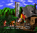
Cranky's Cabin sign
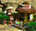
Funky's Flights sign
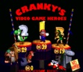
Cranky's Video Game Heroes


Good Girl[edit]
Good Girl is an uneven typeface designed by Cathy Davies. A modified version is used in the North American logo for the Donkey Konga series.
Gospel[edit]
Gospel (ゴスペル Gosuperu) is an uneven serif typeface designed by Takayuki Kuwahara for Fontworks, first released in 2016.[106] It is used for text in Young Cricket & Master Mantis's and Wario Deluxe's stage in WarioWare Gold, text in the Variety Tower stages and Copycat Mirror in WarioWare: Move It!.
Gotham[edit]
Gotham is a geometric sans-serif typeface designed by Tobias Frere-Jones and Jesse Ragan for Hoefler & Frere-Jones, first released in 2000.[107] Gotham Ultra is used for the logo for Super Mario 3D All-Stars. It is also used for the logo for Punch-Out Pizzeria in The Super Mario Bros. Movie. It is also used for the "U" in the logo for the Wii U. Gotham Black is used for the logos of New Super Mario Bros. U, New Super Luigi U, and New Super Mario Bros. U Deluxe.

New Super Mario Bros. U ("U")

New Super Luigi U ("U")
New Super Mario Bros. U Deluxe ("U")

Greco[edit]

Greco (グレコ Gureko) is a serif typeface designed by Toshiyasu Satō for Fontworks, first released in 1994.[108] It is used for the "STAGE CLEAR" text in Super Smash Bros. Melee and the interface in the Wii system software in western and Japanese languages.
Griffin[edit]
Griffin is a geometric sans-serif typeface designed by Rian Hughes for Device, first released in 1997.[109] Griffin Black is used for the logo of Wario: Master of Disguise.
Hakusyu Taiku Intai[edit]
Hakusyu Taiku Intai (白舟太古印体 Shiro Fune Taiko Shirushi-tai) is a script typeface from Fontworks, first released in 2013.[110] It is used for text in Dr. Crygor's stage in WarioWare Gold.
Handel Gothic[edit]
Handel Gothic is a geometric sans-serif typeface designed by Donald J. Handel and Robert Trogman for FotoStar, first released in 1965.[111]
Handel Gothic is also used in the logo for Mario Power Tennis and for the "Mario Tennis" logo displayed on courts in Mario Tennis: Ultra Smash. It is also used for the Super Famicom logo and its console and controller labels, the "NINTENDO" text in the Nintendo GameCube logo and the "XL" subtitle on the Nintendo DS and Nintendo 3DS lineup. A modified version is also used for the logo for the Galactic Strikers Federation in Mario Strikers: Battle League.
In Mario Kart Wii, it is used on the poster ad for Green Fuel with a modified "e" glyph for the "light your life" slogan and the "Green Fuel" logo. In Mario Kart 8, Mario Kart Tour, Mario Kart 8 Deluxe, Super Smash Bros. for Wii U and Super Smash Bros. Ultimate, it is used on the logo for Mushroom Piston.
ITC Handel Gothic is used for the interface in Luigi's Mansion 3 for Western languages. ITC Handel Gothic Heavy is used for the "DS" text on the Itadaki Street DS logo.
Super Famicom ("SUPER FAMICOM", "POWER", "EJECT", "RESET", "USE CASSETTE WITH SUPER FAMICOM MARK ONLY", "1","2") and its controller ("A", "B", "X", "Y", "L", "R", "START", "SELECT")
Nintendo GameCube ("NINTENDO")
Used for the "Power Tennis" text in the logo for Mario Power Tennis
Used on "DS" in the logo for Itadaki Street DS
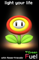
Mario Kart Wii
Mario Tennis: Ultra Smash
Mario Kart 8


Happy Happy Joy Joy[edit]
Happy Happy Joy Joy is an uneven sans-serif typeface designed by Annie de la Vega. It is used on the Bowser Land logo and text within the board in Mario Party 2.

Bowser Land logo
Bowser Item Shop
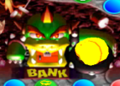
Bowser Bank


Heavy Heap[edit]
Heavy Heap is a display typeface form Typodermic. It is used for text in Memory Match in WarioWare Gold.
Helvetica[edit]
Helvetica is a sans-serif typeface created by Max Miedinger and Eduard Hoffmann, first released in 1957.[112] It is used for the logos of following games:
- Donkey Kong (Helvetica Black Condensed)
- Donkey Kong Jr. (Helvetica Black Condensed)
- Mario Bros. (Helvetica Black Condensed)
- Donkey Kong Jr. Math (Helvetica Black Condensed)
- Pinball (Helvetica Black)
- Golf (Helvetica Black)
- Donkey Kong 3 (Helvetica Black Condensed)
- Wrecking Crew (Helvetica Black Condensed)
- Super Mario Bros. (Helvetica Black)
- Donkey Kong Classics (Helvetica Black)
- Super Mario Bros. 2 (Helvetica Black Condensed)
These would be retained for the logos of their Classic NES Series releases. It is also used for the logos for Ultimate NES Remix, Super Smash Bros. for Nintendo 3DS / Wii U, the Super Nintendo Entertainment System, the Super Game Boy 2, and the logos for Super Mario Land 2: 6 Golden Coins, Wario Land 3, and the Picross NP series.
Its inserat roman variant is used on the European boxarts of the mentioned games above (with the exception of Super Mario Bros. 2) for the games' titles.
Helvetica is also used for the interface in Mario Kart 64, file numbers in the first two Donkey Kong Country games, scenery text in Cranky's room in Donkey Kong Country 2: Diddy's Kong Quest, some text in How to Play, menu backgrounds, and the exclamation mark in Challenger's Approach in Super Smash Bros., the logo for Mini-Game Stadium and the text for "Go" in Bowser Land in Mario Party 2, the timer and damage HUDs (the latter with a modified 1) in Super Smash Bros. Melee, the "M" and "C" coin icons in the results screen in Mario Party 4, some interface text in the European version of Mario Party 8, the ranking for the 2D Events in Mario & Sonic at the Olympic Games Tokyo 2020, dialogue text in Diddy Kong Racing, text in Fortune Street, text in The Super Mario Bros. Movie, in Mario Kart Tour on the logo for the Yoshi business, and in Mario Kart 8, Mario Kart Tour, Mario Kart 8 Deluxe and Super Mario Odyssey on the banner for Rainbow Exploration Agency. It is also used for labels on the Family Computer console and controllers and the labels on the Game Boy Pocket and Game Boy Light, as well as on the Official Nintendo Seal. It is also used for the former logo for Rareware. Helvetica Bold is used for the logo for Club Nintendo and Jukebox numbers in Tetris DS.
In the Mario Kart series, Helvetica Black is used for the letters in the first five multiplayer badges in Tour.
Helvetica Rounded is used for numbers in Mario no Photopi, and for the board logos in the Party and Story Mode menus and the results screen in Mario Party 4 in western languages.
Helvetica Condensed is used for the classic NES E-Reader cards, numbers on the level clear screen in Wario World, and the interface in Mario Kart 64. It is also used in the Nintendo GameCube version of Paper Mario: The Thousand-Year Door for the "PIANTA" boards seen in the Pianta Parlor minigames, and title screen text in "Super Smash Bros Brawl. It is also used for the START button label on the iQue Player and its Multiplayer controller.
Helvetica Condensed Rounded is used in the stamp card in Mario Party 3, heading texts in the Mario Party-e cards, and the "ABC" image in the bonus screen in the Game Boy Advance version of Donkey Kong Country. It is also used for the Game & Watch: Manhole logo.
Family Computer ("POWER", "EJECT", "RESET") and its controllers ("A", "B", "START", "SELECT", "MIC.", "VOLUME")
Official Nintendo Seal ("Official", "Seal")
Donkey Kong
Donkey Kong (European)
Donkey Kong Jr.
Donkey Kong Jr. (European)
Mario Bros.
Mario Bros. (European)
Donkey Kong Jr. Math
Donkey Kong Jr. Math (European)
Pinball
Golf
Golf (European)
Donkey Kong 3
Donkey Kong 3 (European)
Wrecking Crew

Wrecking Crew (European)
Super Mario Bros. (European)
Super Mario Bros. 2

Super Nintendo Entertainment System ("ENTERTAINMENT SYSTEM")
Super Mario Land 2: 6 Golden Coins ("2")
Game Boy Pocket ("A", "B", "START", "SELECT")
Game Boy Light ("A", "B", "POWER")
Super Game Boy 2 ("2")
Picross NP ("NP")
Wario Land 3 ("3")

Mario Party 4
Donkey Kong-e ("DONKEY KONG")
Donkey Kong Jr.-e ("DONKEY KONG JR.")
Donkey Kong 3-e ("DONKEY KONG 3")
Golf-e ("GOLF")
Mario Bros.-e ("MARIO BROS.")
Pinball-e ("PINBALL")
Mario Party-e Daisy card ("Daisy's Rodeo!")

Club Nintendo
Mario Kart 8
Super Smash Bros. for Nintendo 3DS / Wii U ("DS", "Wii")
Ultimate NES Remix ("ULTIMATE")

Mario Kart Tour


Helvetica Neue[edit]
Helvetica Neue is a sans-serif typeface from the Stempel Type Foundry, first released in 1983.[113] It is a variant of Helvetica and is used in The Super Mario Bros. Movie for street names in the map and the on-screen text both seen in the Super Mario Bros. Plumbing commercial.


Nimbus Sans[edit]

Nimbus Sans is a sans-serif typeface designed by URW Studio for URW++, first released in 1999.[114] It is based on Helvetica. It is used for the interface in the following games:
- Mario Strikers Charged (Western languages)
- Super Mario 3D World + Bowser's Fury (Korean language)
HG Soei Kaku Pop[edit]
HG Soei Kaku Pop (HG創英角ポップ体 HG Sōei-kaku Poppu-tai) is a Point of Purchase typeface for the interface for the Yoshi's Cookie portion of Nintendo Puzzle Collection.
Highway Gothic[edit]
Highway Gothic is a sans-serif typeface designed by Theodore W. Forbes for the United States Federal Highway Administration (FHWA), first released in 1948.[115] It is used for text in The Super Mario Bros. Movie.
Hiragino Sans TC[edit]
Hiragino Sans TC (ヒラギノ角ゴ 繁体中文 Hiragino Kakugo Shige-tai Chūbun) is a sans-serif typeface for Traditional Chinese released by Morisawa. It is used for the interface in the Traditional Chinese version of Super Mario Bros. Wonder.
Hobo[edit]
Hobo is a sans-serif display typeface designed by Morris Fuller Benton for American Type Founders, first released in 1910.[116] It is used in Mario Kart 8, Mario Kart Tour and Mario Kart 8 Deluxe on the logos for Dream Gliders and Red Shell Strike Equipment, this last one being also seen in Super Mario Odyssey. It is also used for the logo for Pikmin Adventure in Nintendo Land.

Horatio[edit]
Horatio is a geometric sans-serif typeface designed by Bob Newman for Letraset, first released in 1971.[117] A modified version of Horatio is used as the basis for the logo of the Wii and Wii U consoles (including the Wii mini), as well as the logos for the Mii, Mii Maker, Miiverse, My Nintendo, Nintendo Network and its related services, Nintendo TVii, Wii U Chat, and the current logo the Nintendo eShop. It is also used for the "Nintendo" text in Nintendo Badge Arcade, the "Alarmo" text in the Nintendo Sound Clock: Alarmo, and the placeholder logo for the Nintendo Switch when it was then known under its codename, "NX". It is also used for the logo for Super Mario Advance 4: Super Mario Bros. 3.
Super Mario Advance 4: Super Mario Bros. 3 ("4")

Wii

Mii

Nintendo Network

Wii U

Miiverse

Nintendo Badge Arcade ("Nintendo")

My Nintendo

Nintendo eShop (3DS and Wii U)

Nintendo eShop (Switch)
Hourei[edit]

Hourei (豊隷 Toyore) is a script typeface designed by Kazutoshi Fukuda for Fontworks, first released in 2002.[118] It is used in WarioWare: Move It! for the text for the Forms.
House-a-rama Kingpin[edit]
House-a-rama Kingpin, or Kingpin is a sans-serif typeface from House Industries, first released in 1999.[119] It is used in the North American logo for Yoshi Topsy-Turvy.
Humming[edit]

Humming (ハミング Hamingu) is a rounded sans-serif typeface designed by Shigenobu Fujita for Fontworks, first released in 2004.[120] It is used for most of the text in the following games:
- Wario Land: Shake It!
- Mario & Luigi: Dream Team
- Mario Golf: World Tour
- WarioWare Gold
- Princess Peach: Showtime! (Western, Japanese and Russian versions)
In Super Mario Sunshine, Humming is used for text in the Isle Defino map.
The font natively supports the Dutch ij digraph, to the convenience of the Dutch version of Princess Peach: Showtime!
HY Black Microphone Body Simplified[edit]
HY Black Microphone Body Simplified (汉仪黑咪体简 Hàn Yí Hēi Mī Tǐ Jiǎn) is a rounded typeface for Simplified Chinese released by Hanyi Fonts in 1996.[121] It is used for the "START" text in the title screen in the Simplified Chinese version of Paper Mario.
HY Fang Die Zi Bamboo Slips Simplified[edit]
HY Fang Die Zi Bamboo Slips Simplified (汉仪方叠体简 Hàn Yí Fāng Dié Tǐ Jiǎn) is a sans-serif typeface for Simplified Chinese released by Hanyi Fonts in 1999.[122] It is used for the interface for Mario Kart 64 in the Simplified Chinese language.
HY Fan Li Simplified[edit]
HY Fan Li Simplified (汉仪方隶简 Hàn Yí Fāng Lì Jiǎn) is a script typeface for Simplified Chinese released by Hanyi Fonts in 2002.[123] It is used for the copyright text in the title screen in the Simplified Chinese version of Paper Mario.
HY Gan Lan Simplified[edit]
HY Gan Lan Simplified (汉仪橄榄体简 Hàn Yí Gǎnlǎn Tǐ Jiǎn) is a typeface for Simplified Chinese released by Hanyi Fonts in 1999.[124] It is used for the Simplified Chinese logo for Super Smash Bros..
HY Lingxin[edit]
HY Lingxin (汉仪菱心体简 Hàn Yí Líng Xīn Tǐ Jiǎn) is a geometric sans-serif typeface for Simplified Chinese released by Hanyi Fonts in 2000.[125] Its Latin characters are similar to Eurostile. It is used for the interface in the Simplified Chinese version of Super Smash Bros., and some text in the Simplified Chinese version of Yoshi Touch & Go.
HYPosT[edit]
HYPosT (HY엽서 HYyeobseo) is a typeface for Korean released by HanYang. It was generally used in place of the Super Mario font in Korean localizations of games for the Wii and Nintendo 3DS. It is used for the interface in the following games:
- Super Paper Mario (Korean language)
- Mario Party 8 (Korean language)
- Mario & Sonic at the Olympic Games (Wii) (Korean language)
- New Super Mario Bros. Wii (Korean language)
- Mario & Sonic at the Olympic Winter Games (Korean language)
- Super Mario 3D Land (Korean language)
- Mario Tennis Open (Korean language)
- Mario & Sonic at the London 2012 Olympic Games (Korean language)
- Mario Party 9 (Korean language)
- New Super Mario Bros. 2 (Korean language)
- Paper Mario: Sticker Star (Korean language)
- Mario & Luigi: Dream Team (Korean language)
- Mario Party: Island Tour (Korean language)
- Mario Golf: World Tour (Korean language)
- Puzzle & Dragons: Super Mario Bros. Edition (Korean language)
- Mario & Luigi: Paper Jam (Korean language)
- Mario & Sonic at the Rio 2016 Olympic Games (Nintendo 3DS) (Korean language)
- Super Mario Run (Korean language)
HYRGoThic[edit]
HYRGoThic (HY둥근고딕 HYdung-geungodig) is a sans-serif typeface for Korean released by HanYang. It is used for the interface in the Wii and the Nintendo 3DS and some text in the Nintendo DSi system software in the Korean language, and is used for the interface in the following games:
- Super Mario 3D Land (Korean language)
- Mario Kart 7 (Korean language)
- Mario Tennis Open (Korean language)
- New Super Mario Bros. 2 (Korean language)
- Mario Golf: World Tour (Korean language)
- Super Smash Bros. for Nintendo 3DS (Korean language)
- Super Mario Maker for Nintendo 3DS (Korean language)
- Poochy & Yoshi's Woolly World (Korean language)
- Mario Sports Superstars (Korean language)
HY Super Thick Black Simplified[edit]
HY Super Thick Black Simplified (汉仪超粗黑简 Hàn Yí Chāo Cū Hēi Jiǎn) is a sans-serif typeface for Simplified Chinese released by Hanyi Fonts in 1999.[126] It is used for the select and back labels in the menu of Mario Kart 64 in the Simplified Chinese language.
HY Zhonghei Simplified[edit]
HY Zhonghei Simplified (汉仪中黑 简 Hàn Yí Zhōng Hēi Jiǎn) is a humanist sans-serif typeface for Simplified Chinese released by Hanyi Fonts in 1996.[127] It is used for the interface for Mario Kart 64 in the Simplified Chinese language and some interface text in the Simplified Chinese version of Dr. Mario 64.
Impact[edit]

Impact is a sans-serif typeface designed by Geoffrey Lee for Stephenson Blake, first released in 1965.[128] It is used for the logos for Super Smash Bros. Melee, Mario Tennis: Power Tour, Itadaki Street DS, and Mario vs. Donkey Kong: Mini-Land Mayhem!. It is also used in the splash artwork from the box art for Super Mario Sunshine.
It is also minorly used in Super Smash Bros. for text in the shot of Fox in the opening, Mario Party 4 for the Bowser Game text, Game & Watch Gallery 4 on the boxing ring's "BOXING" logo in the modern version of the Boxing game, Mario Power Tennis for the Versus text, Donkey Kong Country 2 for the Game Boy Advance for the Cranky's Video Game Heroes banner text, Mario & Luigi: Partners in Time for the level up text, Super Smash Bros. Brawl for CPU player indicators and some text in the stage select screen, and Mario Party: Island Tour for ranking and spaces text. It is featured in the North American Super Mario Advance 4: Super Mario Bros. 3 e-Reader cards for the main text.

Super Smash Bros. Melee

Super Mario Advance 4: Super Mario Bros. 3 e-Reader card
Super Mario Advance 4: Super Mario Bros. 3 e-Reader card
Donkey Kong Country 2 (GBA)
Game & Watch Gallery 4

Mario Tennis: Power Tour ("Power Tour")
Itadaki Street DS ("DRAGON QUEST", "SUPER MARIO")
Mario & Sonic at the Olympic Games ("AT THE")
Mario vs. Donkey Kong: Mini-Land Mayhem! ("MINI-LAND MAYHEM!")
Mario Party: Island Tour


.png)


Impress[edit]

Impress is a casual script typeface from Bitstream, first released in 1983.[129] It is used for chapter names in Yoshi's Story in western languages and text in the stamp card in Mario Party 3.
Imprint[edit]
Imprint is a serif typeface from Monotype, first released in 1913.[130] It is used for the logo for iQue.
Insignia[edit]

Insignia is a geometric typeface designed by Neville Brody for Linotype, first released in 1989.[131] It is used for the Blockbuster World Video Game Championship logo found in the Donkey Kong Country Competition Cartridge.
ITC Avant Garde[edit]
ITC Avant Garde, ITC Avant Garde Gothic or simply Avant Garde is a geometric sans-serif typeface designed by Herb Lubalin and Tom Carnas for ITC, first released between 1970 and 1977.[132] It is used for the logos of the Game & Watch and the Family Computer, including the Family Computer Disk System, as well as games that reference these logos:
- Golf: Japan Course
- Famicom Grand Prix: F1 Race
- Famicom Grand Prix II: 3D Hot Rally
- Game & Watch Gallery
- Game & Watch Gallery 2
- Game & Watch Gallery 3
- Game & Watch Gallery 4 (Game & Watch Gallery Advance)
- Game & Watch Collection
- Game & Wario
- Famicom Remix
- Famicom Remix 2
- Famicom Remix 1+2
- Famicom Remix: Best Choice
The Game & Watch logo uses the font's right-leaning variants of "A", "M", and "W"; the Family Computer logo uses the right-leaning variant of "A", but not "M". This is reflected in the logos that reference them. The Game & Watch Gallery Advance logo also uses the right-leaning variant of "V".
Other uses include:
- Game Boy Color (labels)
- Mii Channel (logo; modified)
- Art Style: PiCTOBiTS (interface text, with right-leaning "A")
- Game & Watch DSiWare games (display text)
- Nintendo Land (Octopus Dance)
- Mario Kart 8 (Galaxy Air logo)
- Game & Watch: Super Mario Bros. (box art)
- Nintendo Sound Clock: Alarmo (logo)
- Logos for Super Mario Bros. anniversaries (25th Anniversary, The Year of Luigi, 35th Anniversary)
- Logos for Nintendo's internal divisions such as Nintendo Software Technology
- Logos for official Nintendo stores such as Nintendo New York
- Nintendo Museum
Game & Watch
Family Computer
Golf: Japan Course
Famicom Grand Prix: F1 Race
Famicom Grand Prix II: 3D Hot Rally
Game Boy Color ("A", "B"", "START", "SELECT", "POWER", "COMM.", "VOL", "EXT.", "PHONES", "DC 3V IN")
Game & Watch Gallery

Game & Watch Gallery 2
Game & Watch Gallery 3

Game & Watch Gallery 4

Game & Watch Gallery Advance
Mii Channel

Game & Watch Collection
Art Style: PiCTOBiTS

Super Mario Bros. 25th Anniversary

The Year of Luigi
Game & Wario (US logo)
Game & Wario (Europe and Australia logo)
Game & Wario (Japanese logo)
Famicom Remix
Famicom Remix 2
Famicom Remix 1+2
Famicom Remix: Best Choice

Galaxy Air in Mario Kart 8
Super Mario Bros. 35th Anniversary
Game & Watch: Super Mario Bros.
Nintendo Software Technology

Nintendo New York ("NEW YORK")


ITC Benguiat[edit]
ITC Benguiat is a decorative serif typeface designed by Ed Benguiat for ITC, first released in 1977.[133] It is used in Mario Kart 8, Mario Kart Tour and Mario Kart 8 Deluxe on the logos for Rainbow Exploration Agency and Roy Smooth Sounds.


ITC Galliard[edit]
ITC Galliard is a serif typeface designed by Robert Granjon and Matthew Carter for Linotype, first released in 1978.[134] ITC Galliard Ultra is used in the logo for Super Smash Bros. Melee.
ITC Kabel[edit]

ITC Kabel is a geometric sans-serif typeface designed by Victor Caruso for ITC, first released in 1975.[135] It is a variant of Kabel and is used in Game & Wario in its Ultra variant for display as well as body text. In WarioWare Gold, it is used once again for microgame commands, like in Game & Wario's Gamer. It is also used for the HUD in Donkey Kong Country: Tropical Freeze, scenery text in Frantic Factory and bonus stages in Donkey Kong 64, and the "OPEN" sign in the Excess Express shop in the Nintendo Switch remake of Paper Mario: The Thousand-Year Door.
ITC Kabel is also used prominently in Super Smash Bros., being also present on the game's logo as well as the icons for locked characters and random stages. It is also present on the logos for Mario Kart 64 (Medium), Mario Golf: Toadstool Tour (Ultra), Mario vs. Donkey Kong games (Bold) and Mario & Sonic at the Rio 2016 Olympic Games Arcade Edition (Bold). Additionally, it is used in the western instruction booklets for Super Mario 64 and Mario Party.
The Japanese logos for the Game & Watch Gallery games uses the font (Bold) for the English subtitle.
In Mario Kart 8 and Mario Kart 8 Deluxe, it is seen in the logo for Waluigi Sea Bed.
ITC Kabel Bold was used for an earlier version of the logo for Super Mario World 2: Yoshi's Island and ITC Kabel Ultra was used for the logo for the unreleased English version of Nintendo Puzzle Collection.
Mario Kart 64 ("64")

Super Smash Bros. ("SMASH")
Super Smash Bros.

Mario Golf: Toadstool Tour ("Toadstool Tour")
Mario vs. Donkey Kong ("VS.")

Game & Watch Gallery Japanese logo
Game & Watch Gallery 2 Japanese logo
Game & Watch Gallery 3 Japanese logo
Mario Kart 8
Mario & Sonic at the Rio 2016 Olympic Games Arcade Edition ("ARCADE EDITION")
Super Mario World 2: Yoshi's Island preliminary logo ("SUPER MARIO WORLD 2")
Nintendo Puzzle Collection unused English version logo


ITC Grizzly[edit]

ITC Grizzly is an alternative version of ITC Kabel.[136] It is used in Mario Strikers: Battle League for display text.
ITC Honda[edit]
ITC Honda is a display designed by Ronné Bonder and Tom Carnase for ITC, first released in 1970.[137] It is used for text in the game select screen in Wrecking Crew '98.
ITC Lubalin Graph[edit]
ITC Lubalin Graph is a geometric slab-serif typeface designed by Herb Lubalin, Joe Sundwall, and Tony Di Spigna for ITC, first released in 1974.[138] It is used for the "MOO MOO FARM" sign in Mario Kart 64, and text in the shot of Fox in the opening of Super Smash Bros..
ITC Machine[edit]
ITC Machine is a sans-serif typeface designed by Ronné Bonder and Tom Carnasse for ITC, first released in 1970.[139] It is used in the localized versions of Mario Kart 64 for interface text, as well as the Mario Star business logo.
ITC Machine is also used on the logo for the Super Mario Bros. film and much of the material related to it. It is also used for the European logo of Mario Hoops 3-on-3. It is also used for the logo for the 1991 Nintendo Campus Challenge, and the Blockbuster World Video Game Championship logo found in the Donkey Kong Country Competition Cartridge.
1991 version of Nintendo Campus Challenge ("CAMPUS")
Super Mario Bros. film logo
Super Mario Bros. Devo Chamber box
Super Mario Bros. trading card
Donkey Kong Country Competition Cartridge ("BLOCKBUSTER", "GAME CHAMPIONSHIP II")
Mario Hoops 3-on-3 [European] ("SLAM")


ITC Tiepolo[edit]
ITC Tiepolo is a serif typeface designed by Arthur Baker and Cynthia Hollandsworth for ITC, first released in 1987.[140] It is used for license plate text in The Super Mario Bros. Movie, like the real-life New York license plates.
Jeepney[edit]
Jeepney is a serif typeface designed by Annie de la Vega, first released in 1998.[141] It is used on the Pirate Land logo and text within the board in Mario Party 2.
"PIRATE LAND"
"ITEM"
"BANK", "COIN"


JTC Namiki POP[edit]
JTC Namiki POP (JTCナミキPOP JTC Namiki Poppu) is a Point of Purchase typeface for the interface for Diddy Kong Racing in the Japanese language (as well as placement rankings in the Nintendo DS remake), and the interface for Super Smash Bros. in the Japanese language, though it is also used for the "SCORE" text in the bonus results screen in western languages.
JTC Win[edit]
JTC Win (JTCウイン JTC Uin) is a sans-serif typeface, with its rounded R variant used for the interface for Mario Kart 64 in the Japanese language, though it is also used for the prompts by Lakitu and terrain effect texts in western languages, and its S variant used for the mode select in the same game in the Japanese language, and chapter names in Yoshi's Story in the Japanese language.
Juniper[edit]
Juniper is a serif typeface designed by Joy Redick for Adobe, first released in 1990 as a digital version of the woodtype Painters Roman by Nick Curtis, released by William H. Page & Company and Vanderburgh Wells & Company in 1878.[142] It is used in Mario Kart 64 for the Yoshi business sponsor and the "BOING!" onomatopoeia generated when a kart hops.
Kafu Techno[edit]

Kafu Techno (花風テクノ Hanafū Tekuno) is a geometric sans-serif typeface designed by Arphic for Fontworks, first released in 2012.[143] It is used in the interface in Puzzle & Dragons: Super Mario Bros. Edition, WarioWare Gold in Dribble & Spitz and 18-Volt's stages, the HUD in the Nintendo 3DS remake of Luigi's Mansion, WarioWare: Get It Together! for Dr. Crygor's stage, and WarioWare: Move It! for text in the Volcano Wario stage, Megagame Muscles, and the logo for Dirty Job. It is also used for the logo for Crazy Galaxy in Nintendo Badge Arcade.
Kaufmann[edit]
Kaufmann is a brush script display typeface designed by Max R. Kaufmann for American Type Founders, first released in 1936.[144] It is used for the "The End" text in the ending picture in Super Mario 64.
Kiev[edit]

Kiev is a script typeface from Bay Animation, first released in 1994. It is based on Kaufmann. It is used in Super Mario Odyssey for the text in the Lake Lamode sticker.
Kokin Hige[edit]
Kokin Hige (古今髭 Kokon Hige) is a script typeface designed by KOKIN (Tetsushi Kogane) for Fontworks, first released in 1997.[145] It is used for text in Kat & Ana's stage in WarioWare Gold.
KoreanAH[edit]
KoreanAH (sometimes referred to as "아시아헤드 4종", Asian Heads) is a gothic typeface released by Asiafont in 2017.[146] It is used for the interface in the following games:
- Mario + Rabbids Kingdom Battle (Korean language)
- Mario + Rabbids Sparks of Hope (Korean language)
KoreanAISK[edit]
KoreanAISK (sometimes referred to as "아이스께끼 1종", Ice Cream) is an uneven typeface released by Asiafont in 2010.[147] It is used for the interface in the Korean version of Paper Mario: Sticker Star.
KoreanAMERI[edit]

KoreanAMERI (sometimes referred to as "아메리카노 3종", Americano) is a gothic typeface released by Asiafont in 2013.[148] Its "B" variant is used for almost all text in the Korean version of Princess Peach: Showtime!.
KoreanBB[edit]
KoreanBB (sometimes referred to as "별빛 3종", Starlight) is an uneven typeface released by Asiafont in 1996.[149] It is used for the interface in the Korean version of Luigi's Mansion: Dark Moon and its Nintendo Switch remaster.
KoreanBIG[edit]
KoreanBIG (sometimes referred to as "빅체 2종", Big Sieves) is a gothic typeface released by Asiafont in 1996.[150] It is used for the interface in the Korean version of Super Smash Bros. for Nintendo 3DS. Its round version is used for the clear text in the Korean version of WarioWare: Snapped!.
KoreanBLACK[edit]
KoreanBLACK (sometimes referred to as "블랙 2종", Black) is a gothic typeface released by Asiafont in 2014.[151] It is used for the interface in the Korean version of Mario Strikers: Battle League.
KoreanCHD[edit]
KoreanCHD (sometimes referred to as "정헤드 3종", Jeonghead) is a typeface released by Asiafont in 1996.[152] It is used for text in the Wario Cup in WarioWare: Get It Together!. A modified version is also used for the logo for Friendless Battle in the Korean version of said game.
KoreanCOMA[edit]
KoreanCOMA (sometimes referred to as "컴퓨터 3종", Computers) is a display typeface released by Asiafont in 1999.[153] It is used for the interface in the Korean version of Super Mario Maker 2.
KoreanCM[edit]
KoreanCM (sometimes referred to as "자막체 1종", Subtitle) is an uneven typeface released by Asiafont in 2008.[154] It is used for the interface in the Korean version of Donkey Kong Country Returns 3D.
KoreanDH[edit]
KoreanDH (sometimes referred to as "동화 3종", Fairy Tales) is a script typeface released by Asiafont in 1996.[155] It is used for the logo and text in Snifit or Whifit in the Korean version of Paper Mario: Sticker Star.
KoreanDKB[edit]
KoreanDKB (sometimes referred to as "도깨비 1종", Goblin) is a display typeface released by Asiafont in 2017.[156] It is used for the logo for Balloon Bang in the Korean version of WarioWare: Get It Together!.
KoreanDNR[edit]

KoreanDNR (sometimes referred to as "디나루 3종", Dinaroo) is a rounded gothic typeface released by Asiafont in 1996.[157] It is used for the interface in the following games:
- Super Paper Mario (Korean language)
- Mario Party 8 (Korean language)
- Mario & Sonic at the Olympic Games (Korean language)
- New Super Mario Bros. Wii (Korean language)
- Mario & Sonic at the Olympic Winter Games (Korean language)
- Mario & Sonic at the London 2012 Olympic Games (Nintendo 3DS) (Korean language)
- Mario Party 9 (Korean language)
- Super Mario Run (Korean language)
- Paper Mario: The Origami King (Korean language)
- WarioWare: Get It Together! (Korean language)
KoreanDR[edit]
KoreanDRDS (sometimes referred to as "두리둥실 1종", Duridungsil) is an uneven typeface released by Asiafont in 2010.[158] It is used for the interface in the Korean version of Mario Tennis Open.
KoreanDREAM[edit]
KoreanDREAM (sometimes referred to as "드림고딕 7종", Dream Gothic) is a gothic typeface released by Asiafont in 2013.[159] It is used for the interface in the following games:
- Mario & Sonic at the Rio 2016 Olympic Games (Nintendo 3DS) (Korean language)
- Super Mario Party (Korean language)
- Mario Kart Tour (Korean language)
- Mario Kart Live: Home Circuit (Korean language)
- WarioWare: Get It Together! (Korean language; including "1" for multiplayer rankings in Simplified and Traditional Chinese languages)
- Princess Peach: Showtime! (Korean language)
- Paper Mario: The Thousand-Year Door (Nintendo Switch) (Korean language)
- Nintendo World Championships: NES Edition (Korean language)
- Super Mario Party Jamboree (Korean language)
KoreanERCC[edit]
KoreanERCC (sometimes referred to as "으라차차 1종", Eurachacha) is a pixelated typeface released by Asiafont in 2010.[160] It is used for text in 9-Volt's stage in the Korean version of WarioWare: Get It Together!.
KoreanERIN[edit]
KoreanERIN (sometimes referred to as "어린이날 3종", Children's Day) is an uneven typeface released by Asiafont in 2014.[161] It is used for text in the Variety Towers and Penny's stages in the Korean version of WarioWare: Get It Together!.
KoreanERWJ[edit]
KoreanERWJ (sometimes referred to as "어린왕자 3종", Little Prince) is a display typeface released by Asiafont in 2017.[162] It is used for text in Mona's stage in the Korean version of WarioWare: Get It Together! and for reaction text in the Korean version of Super Mario Party Jamboree.
KoreanGD[edit]
KoreanGD (sometimes referred to as "본문고딕 6종", Text Gothic) is a gothic typeface released by Asiafont in 1996.[163] It is used for the interface in the following games:
- WarioWare: Smooth Moves (Korean language)
- Yoshi's Island DS (Korean language)
- Mario Party 9 (Korean language)
- Puzzle & Dragons: Super Mario Bros. Edition (Korean language)
- Super Mario Run (Korean player names)
- Mario Kart 8 Deluxe (Korean language)
- New Super Mario Bros. U Deluxe (Korean language)
- WarioWare: Get It Together! (Korean language)
It is also used for the interface in the Wii system software in the Korean language.
KoreanGD1[edit]
KoreanGD1 (sometimes referred to as "고딕1 시리즈 10종", Gothic 1) is a gothic typeface released by Asiafont in 2015.[164] It is used for the interface in the following games:
- Mario Tennis Aces (Korean language)
- Yoshi's Crafted World (Korean language)
- Super Mario Maker 2 (Korean language)
- Dr. Mario World (Korean language)
- Mario Kart Tour (Korean language)
- Mario Party Superstars (Korean language)
- Nintendo World Championships: NES Edition (Korean language)
KoreanGID[edit]
KoreanGID (sometimes referred to as "고인돌 1종", Dolmen) is a display typeface released by Asiafont in 2015.[165] It is used for the interface in the Korean version of Mario Party: Star Rush. and the logo for High Five in the Korean version of WarioWare: Get It Together!.
KoreanGESP[edit]
KoreanGESP (sometimes referred to as "가을소풍 2종", Fall Picnics) is a display typeface released by Asiafont in 2014.[166] It is used for the interface in the following games:
- Mario Sports Superstars (Korean language)
- Super Smash Bros. Ultimate (Korean language)
- WarioWare: Get It Together! (Korean language)
KoreanGEUDH[edit]
KoreanGEUDH (sometimes referred to as "가을운동회 2종", Fall Sports Events) is a display typeface released by Asiafont in 2014.[167] It is used for text in Dr. Crygor's stage in the Korean version of WarioWare: Get It Together!.
KoreanGRHD[edit]
KoreanGRHD (sometimes referred to as "굴림헤드 3종", Rolling Heads) is a gothic typeface released by Asiafont in 1996.[168] It is used for the interface in the following games:
- Mario Strikers Charged (Korean language)
- Mario Party DS (Korean language)
- Mario & Sonic at the Olympic Games (Korean language)
- Mario & Sonic at the London 2012 Olympic Games (Wii) (Korean Language)
- Club Nintendo Picross (Korean Language)
It is also used for the header of the Wii's Wii Shop Channel and the Photo Channel in the Korean language.
KoreanGRP[edit]
KoreanGRP (sometimes referred to as "그래픽 2종", Graphics) is a humanist typeface released by Asiafont in 1996.[169] It is used for the interface in the following games:
- Tetris DS (Korean language)
- Mario Party 8 (Korean language)
- Wario Land: Shake It! (Korean language)
KoreanGWS[edit]
KoreanGWS (sometimes referred to as "가위손 3종", Scissor Hands) is a serif typeface released by Asiafont in 2011.[170] It is used for the World of Light subtitle in the Korean version of Super Smash Bros. Ultimate.
KoreanHAN[edit]
KoreanHAN (sometimes referred to as "한글사랑 3종, Korean Language Love) is a gothic typeface released by Asiafont in 2001.[171] It is used for the interface in the Korean version of Super Smash Bros. Brawl.
KoreanHDRI[edit]
KoreanHDRI (sometimes referred to as "헤드라인 3종", Headlines) is a typeface released by Asiafont in 2011.[172] It is used for text in Wario and Dribble & Spitz's stages and the Play-o-Pedia in the Korean version of WarioWare: Get It Together!.
KoreanHH[edit]
KoreanHH (sometimes referred to as "환희 3종", Joy) is a serif typeface released by Asiafont in 1996.[173] It is used for the interface in the following games:
- Super Smash Bros. Brawl (Korean language)
- Super Smash Bros. for Nintendo 3DS (Korean language)
KoreanHSE[edit]

KoreanHSE (sometimes referred to as "한글세상 3종", Hangul World) is a serif typeface released by Asiafont in 2003.[174] It is used for text in the Korean version of Mario Party 8. and text in Rising Star in the Korean version of WarioWare: Get It Together!.
KoreanHYGR[edit]
KoreanHYGR (sometimes referred to as "하얀구름 1종", White Cloud) is a display typeface released by Asiafont in 2016.[175] It is used for the interface in the Korean version of Yoshi's Crafted World, and text in Showdown and the logo for Frenemy Frenzy in the Korean version of WarioWare: Get It Together!.
It is also used for the Korean logo of the Nintendo Switch remake of Mario vs. Donkey Kong.
KoreanIS[edit]
KoreanIS (sometimes referred to as "인사동 1종", Insadong) is a script typeface released by Asiafont in 1999.[176] It is used for the interface in the Korean version of the Nintendo 3DS remake of Luigi's Mansion.
KoreanKRSM[edit]
KoreanKRSM (sometimes referred to as "카리스마 3종", Charisma) is a display typeface released by Asiafont in 2015.[177] It is used for the interface in the Korean version of WarioWare: Get It Together!.
KoreanMB[edit]
KoreanMB (sometimes referred to as "물레방아 3종", Watermills) is a serif typeface released by Asiafont in 1999.[178] It is used for the interface in the Korean version of Mario Party: Island Tour.
KoreanMJ[edit]
KoreanMJ (sometimes referred to as "본문명조 6종", Main Text) is a serif typeface released by Asiafont in 1996.[179] It is used for text in the Fire Emblem: Three Houses microgame and the dialogue for The Supreme Developer in the Korean version of WarioWare: Get It Together!.
KoreanMMMJ[edit]
KoreanMMMJ (sometimes referred to as "먹물명조 3종", Ink and Inkstone) is a serif typeface released by Asiafont in 1998.[180] It is used for text in Duelius Maximus in the Korean version of WarioWare: Get It Together!.
KoreanMST[edit]
KoreanMST (sometimes referred to as "몬스터 1종", Monster) is a display typeface released by Asiafont in 2017.[181] It is used for text in the Remix stages in the Korean version of WarioWare: Get It Together!.
KoreanNGD[edit]
KoreanNGD (sometimes referred to as "뉴고딕 4종", New Gothic) is a gothic typeface released by Asiafont in 2011.[182] It is used for the interface in the Korean version of Mario Party: Star Rush.
KoreanNGL[edit]
KoreanNGL (sometimes referred to as "뉴굴림 4종", New Rolls) is a graphical typeface released by Asiafont in 2018.[183] It is used for the interface in the following games:
- Super Mario Odyssey (Korean language)
- Luigi's Mansion 3 (Korean language)
KoreanPKS[edit]
KoreanPKS (sometimes referred to as "피카소 1종", Picasso) is a graphical typeface released by Asiafont in 2018.[184] It is used for the interface in the following games:
- WarioWare: Get It Together! (Korean language)
- WarioWare: Move It! (Korean language)
- Mario & Luigi: Brothership (Korean language)
It is also used for the Korean logo for WarioWare: Get It Together!.
KoreanPONM[edit]
KoreanPONM (sometimes referred to as "피오피네모 2종", P.O.Pinemo) is an uneven typeface released by Asiafont in 2013.[185] It is generally used in place of the Super Mario font in Korean localizations of games since the release of the Nintendo Switch. It is used for the interface in the following games:
- New Super Mario Bros. U Deluxe (Korean language)
- Dr. Mario World (Korean language)
- Paper Mario: The Origami King (Korean language)
- Super Mario 3D World + Bowser's Fury (Korean language)
- WarioWare: Get It Together! (Korean language)
- Mario vs. Donkey Kong (Nintendo Switch) (Korean language)
- Paper Mario: The Thousand-Year Door (Nintendo Switch) (Korean language)
KoreanPST[edit]
KoreanPST (sometimes referred to as "포스터 2종", Posters) is a gothic typeface released by Asiafont in 2018.[186] It is used for the Korean logo for Nintendo World Championships: NES Edition.
KoreanRO[edit]
KoreanRO (sometimes referred to as "로미오 3종", Romeo) is a gothic typeface released by Asiafont in 2000.[187] It is used for the interface in the Korean version of Wario Land: Shake It!.
KoreanSDNR[edit]
KoreanSDNR (sometimes referred to as "신디나루 2종", Sindinaru) is a rounded gothic typeface released by Asiafont in 2002.[188] It is used for the interface in the following games:
- Super Mario Galaxy (Korean language)
- Super Smash Bros. Brawl (difficulty slider; Korean language)
- Mario Kart Wii (Korean language; including the Mario Kart Channel)
- Super Mario Galaxy 2 (Korean language)
- Mario & Luigi: Dream Team (Korean Language)
- Mario & Luigi: Paper Jam (Korean Language)
- Mario & Luigi: Brothership (Korean language)
KoreanSGCK[edit]
KoreanSGCK (sometimes referred to as "뉴고딕 4종", Small Friend) is an uneven typeface released by Asiafont in 2008.[189] It is used for the interface in the Korean version of Yoshi's New Island.
KoreanSHD[edit]
KoreanSHD (sometimes referred to as "신헤드 1종", New Head) is a typeface released by Asiafont in 1998.[190] It is used for sticker text in the Korean version of Mario Party Superstars.
KoreanSJ[edit]
KoreanSJ (sometimes referred to as "수정 3종", Modifications) is a serif typeface released by Asiafont in 1996.[191] It is used for the logo and text in The Subspace Emissary in the Korean version of Super Smash Bros. Brawl.
KoreanSJSR[edit]
KoreanSJSR (sometimes referred to as "세종실록 2종", Sejong Sillok) is a rounded typeface released by Asiafont in 2017.[192] It is used for text in the Wario Bug stage in the Korean version of WarioWare: Get It Together!.
KoreanSMI[edit]
KoreanSMI (sometimes referred to as "스마일 3종", Smiles) is a gothic typeface released by Asiafont in 2014.[193] It is used for the interface in the Korean version of the Nintendo 3DS remake of Luigi's Mansion.
KoreanSMJ[edit]
KoreanSMJ (sometimes referred to as "순명조 1종", Pure Water) is a serif typeface released by Asiafont in 1996.[194] It is used for the logo for Gotta Bounce in the Korean version of WarioWare: Get It Together!.
KoreanSNM[edit]
KoreanSNM (sometimes referred to as "소나무 3종", Pine Trees) is a gothic typeface released by Asiafont in 2019.[195] It is used for the interface in the Korean version of the Nintendo Switch Remake of Super Mario RPG.
KoreanSWGI[edit]
KoreanSWGI (sometimes referred to as "시월구일 4종", October 9th) is a gothic typeface released by Asiafont in 2021.[196] It is used for the interface in the Korean version of Super Mario Bros. Wonder.
KoreanTBSM[edit]
KoreanTBSM (sometimes referred to as "태백산맥 1종", Taebaek Mountain Range) is a script typeface released by Asiafont in 2012.[197] It is used for text in Kat & Ana's stage and Duelius Maximus in the Korean version of WarioWare: Get It Together!. A heavily modified version is also used for the logos for Duelius Maximus and Rising Star in the Korean version of said game.
KoreanTITGD[edit]
KoreanTITGD (sometimes referred to as "타이틀고딕 5종", Title Gothic) is a gothic typeface released by Asiafont in 2017.[198] It is used for the interface in the following games:
- Mario + Rabbids Kingdom Battle (Korean language)
- Mario Golf: Super Rush (Korean language)
- WarioWare: Get It Together! (Korean language)
- Mario Strikers: Battle League (Korean language)
KoreanTYGD[edit]
KoreanTYGD (sometimes referred to as "소꼽친구 1종", Desertion Gothic) is a gothic typeface released by Asiafont in 2008.[199] It is used for the interface in the Korean version of Mario Golf: World Tour.
KoreanUJSN[edit]
KoreanUJSN (sometimes referred to as "우주소년 1종", Space Boy) is a display typeface released by Asiafont in 2016.[200] It is used for the interface in the Korean version of Luigi's Mansion 3.
KoreanYNMYT[edit]
KoreanYNMYT (sometimes referred to as "옛날목욕탕 3종", Old Bathhouses) is a typeface released by Asiafont in 2011.[201] It is used for the logo for Sly Angle in the Korean version of WarioWare: Get It Together!.
KoreanYNSJG[edit]
KoreanYNSJG (sometimes referred to as "옛날사진관 5종", Old Photo Studios) is a gothic typeface released by Asiafont in 2015.[202] It is used for the interface in the Korean version of the Nintendo Switch remake of Super Mario RPG.
KoreanYS[edit]
KoreanYS (sometimes referred to as "예서체 2종", Caligraphy Font) is an uneven slab-serif typeface released by Asiafont in 1996.[203] It is used for the interface in the Korean version of WarioWare: Smooth Moves.
Kurokane[edit]

Kurokane (くろかね Kurokane) is a geometric sans-serif typeface designed by Yoshiharu Ōsaki for Fontworks, first released in 2008.[204] It is used for the sticker text in Mario Party Superstars for the Japanese language. It is also widely used in WarioWare games starting from WarioWare Gold, as well as in Rhythm Heaven Megamix. It is also used in the Nintendo Switch remake of Paper Mario: The Thousand-Year Door for the "PIANTA" boards seen in the Pianta Parlor minigames, replacing Helvetica Condensed.
KyoMurasaki[edit]
KyoMurasaki (京紫 Kyō Murasaki) is a script typeface from Fontworks, first released in 2014.[205] It is used for text in Wario's stages in WarioWare Gold.
LineG[edit]
LineG (ラインG RainG) is a geometric sans-serif typeface designed by Kyoko Katsumoto and Shigeru Katsumoto for Visual Design Laboratory, first released in 2000.[206] It is used for the interface in Super Mario Bros. Wonder for the kanji.
Lithos[edit]
Lithos is a sans-serif typeface designed by Carol Twombly for Adobe Type, first released in 1989.[207] The font, in its Black variant, is employed for certain display text in Donkey Kong Country 3: Dixie Kong's Double Trouble!, Donkey Kong Land III, Diddy Kong Racing and its DS remake and Wario Land 3 and for general interface text and some scenery texr in Donkey Kong 64. A modified version is used for interface text in the GBA versions of the Donkey Kong Country series. Mario's Game Gallery also features Lithos Black for the game's title on the main menu, and Super Mario 64 uses it for the "COURSE" text on course icons.
More recently, it has been used for the logo of the Mario & Sonic games, in Mario Kart 8, Mario Kart Tour and Mario Kart 8 Deluxe on the logo of the Coconut Cafe business (in the form of Lithos Black in these cases), and also in Super Mario Odyssey as part of the Mount Volbono sticker.
Lithos Black was also employed for the pre-release Japanese logo for Super Mario Advance. It was also originally used in the interface in Yoshi's Woolly World before being replaced by New Rodin in the final release.
Wario Land 3
Donkey Kong Country 3: Dixie Kong's Double Trouble! Game Over screen

Super Mario 64
Mario's Game Gallery main menu
Used for the "OLYMPIC GAMES" text in the logo for Mario & Sonic at the Olympic Games
"CAFE" in Lithos Black in Mario Kart 8

"MARIO ADVANCE" in Lithos Black


LogoG[edit]
LogoG (ロゴG RogoG) is a geometric sans-serif typeface designed by Kyoko Katsumoto and Shigeru Katsumoto for Visual Design Laboratory, first released in 2000.[208] Its Latin characters are similar to Eurostile. It is used for the interface in Super Mario Bros. Wonder for the kana.
Logona[edit]

Logona (ロゴナ Rogona) is a geometric sans-serif typeface designed by Kyoko Katsumoto and Shigeru Katsumoto for Visual Design Laboratory, first released in 2015.[209] Its Latin characters are similar to Eurostile. It is used for the interface in Mario Golf: Super Rush for the Japanese language and the interface in the Nintendo Switch remake of Super Mario RPG for display text. Being used for the interface in Pikmin 4, it is also used for its corresponding Nintendo Sound Clock: Alarmo theme.
Lucida Grande[edit]
Lucida Grande is a humanist sans-serif typeface designed by Charles Bigelow and Kris Holmes, first released in 1999.[210] Lucida Grande Bold is used for the logos of the Nintendo DS and Nintendo 3DS systems, and being used for these logos, it is also used for the logo of Tetris DS. It is also used for cutscene text in the Nintendo Switch remake of Mario vs. Donkey Kong, and the "ND" in the second NDcube logo.
Maiandra[edit]
'Maiandra is a typeface designed by Dennis Pasternak by Galapagos.[211] It is used for the year text in the logo for the Nintendo Campus Challenge.
Manito LP[edit]
Manito LP is an uneven typeface designed by Garrett Boge for LetterPerfect, first released in 1990.[212] It is used for the logo for Donkey Kong's Crash Course in Nintendo Land.
Matisse[edit]
Matisse (マティス Matisu) is a serif typeface from Fontworks designed by Toshiyasu Satō for Fontworks, first released in 1992.[213] It is used for the logo of the Super Smash Bros. series since Super Smash Bros. Brawl. It is also used in the series for various interface text in Brawl. It is also used for text in the file select and results screen of Luigi's Mansion, the Isle Defino maps in Super Mario Sunshine, background text in the Luigi's Card Games minigame in Super Mario 64 DS, interface text in Game & Wario, and text in Rising Star in WarioWare: Get It Together!.
Matisse Eleganto[edit]
Matisse Eleganto (マティスえれがんと Matisu Ereganto) is an alternative version of Matisse designed by Yutaka Sato for Type Labo, first released in 1997.[214] It is Matisse with Eleganto Kana. It is used for text in Mona's stage and the icon denoting locked unlockables in WarioWare Gold and text in Jimmy T.'s stage in WarioWare: Move It!.
Matisse V[edit]
Matisse V (マティスV Matisu V) is an alternative version of Matisse designed by Toshiyasu Satō, first released in 1992.[215] It is Matisse with V Type Kana. It is used for text for winner names and Challenger's Approach in Super Smash Bros. Melee, text for the song lyrics in Super Smash Bros. Brawl, and the logo for Super Hard in WarioWare Gold.
Mystery[edit]
Mystery (ミステリ Misuteri)is an alternative version of Matisse released in 1998.[216] It is used for the location name HUD in Luigi's Mansion and text in 9-Volt's stage in WarioWare: Move It!.
Luigi's Mansion

Comic Mystery[edit]

Comic Mystery (コミックミステリ Komikkumisuteri) is an alternative version of Mystery released in 2008.[217] It is used for text for Bowser's invitation in Mario Superstar Baseball, text in Ashley in Game & Wario, text in Ashley's stage, Pumpkin Panic, and the logo for Sneaky Gamer in WarioWare Gold, and the interface in the Nintendo 3DS remake of Luigi's Mansion.
Méridien[edit]
Méridien is a serif typeface designed by Adrian Frutiger for Deberny & Peignot, first released in 1957.[218] It is used for the "D.K." sign on Donkey Kong's Treehouse in Donkey Kong Country.
Mingo Gothic SG[edit]
Mingo Gothic SG is a geometric sans-serif typeface designed by Jim Spiece for Spiece Graphics, first released in 1991.[219] A modified version is used for the logo for Nintendo PowerFest '94.
Mini Janet Bold[edit]
Mini Janet Bold (迷你简特粗黑体 Mínǐ Jiǎn Tè Cū Hēitǐ) is a geometric sans-serif typeface for Simplified Chinese used for course names and the copyright text in the Simplified Chinese version of Mario Kart 64.
Mode Mincho A[edit]
Mode Mincho A (モード明朝A Mōdo Minchō A) is a serif typeface designed by Shigenobu Fujita for Fontworks, first released in 2010.[220] It is used for the credits text in the Super Mario 3D All-Stars version of Super Mario 64.
Modula Serif[edit]

Modula Serif is a slab-serif typeface designed by Zuzana Licko for Emigre, first released in 1985.[221] It is used for the logo for Nintendo Challenge.
Monaco[edit]
Monaco is a monospaced sans-serif typeface designed by Susan Kare for Apple Inc, first released in 1984.[222] It is used for pause text in Super Smash Bros. Melee.
Moore Computer[edit]
Moore Computer is a geometric typeface designed by James H. Moore for VGC, first released in 1968.[223] A modified version is used for text in the stage select screen in "Super Smash Bros. Melee".
MOSuuji[edit]
MOSuuji is a numeral-only typeface from Morisawa. It is used in Super Smash Bros. Brawl, with its H A DGn variant used for numbers in ruleset settings, its H C AFn variant used for numbers in the aspect ratio settings, its H C IDn variant used for the stage select cursor in online mode in the Japanese language, its H E AAn variant used for general number text, its H D AJn variant used for the coin HUD in Spectator Mode, and its H D JHn variant used for the distance in Home-Run Contest.
MP ARUD JingxiheiGb4[edit]
MP ARUD JingxiheiGb4 is a sans-serif typeface designed by Arphic for Morisawa. It is used for the interface in the Traditional Chinese version of the Nintendo Switch remake of Mario vs. Donkey Kong.
MS Gothic[edit]
'MS Gothic is a sans-serif typeface designed by RICOH for Microsoft, first released in 1993.[224] It is used for the interface in Yoshi's Woolly World for the Japanese language.
Myriad[edit]
Myriad is a humanist sans-serif typeface designed by Robert Slimbach and Carol Twombly for Adobe Type, first released in 1992.[225] It is used for the logos for the Nintendo 64, including the "64" in the Nintendo 64DD logo, Super Mario 64 and its DS remake, and StreetPass Mii Plaza. It is also used for How to Play and Training Mode text in Super Smash Bros. in western languages and stat text in European languages. It is also used for text in the ending advertisement in Wario Land 4 and text in Punch-Out Pizzeria in The Super Mario Bros. Movie.
Super Mario 64 ("64")
Super Mario 64 ("64")

StreetPass Mii Plaza ("StreetPass", "PLAZA")
Nadianne[edit]
Nadianne is a humanist typeface designed by Aldo Novarese for Monotype, first released in 1994.[226] It is used for text in opponent screens in Super Smash Bros..
Neo Sans[edit]

Neo Sans is a geometric sans-serif typeface designed by Sebastian "Seb" Lester for Monotype, first released in 2004.[227] Neo Sans Pro is used for the interface in Mario & Sonic at the Olympic Games Tokyo 2020 for Western languages.
Neuland[edit]
- Possible alternatives include: Nueland.

Neuland is a display typeface designed by Rudolf Koch for Klingspor, first released in 1923.[228]
It is used in Donkey Kong Country Returns and Donkey Kong Country: Tropical Freeze for display text, such as menu titles and level titles on the map and loading screens, as well as menu text in Returns.
In Mario Kart 8, Mario Kart Tour and Mario Kart 8 Deluxe, it is used in the logo for Bullet Bill Speed Trial, Wild Yoshi Sanctuary and Yoshi Runners.
Mario Kart 8
Mario Kart 8
Mario Kart 8


New Cinema[edit]
New Cinema (ニューシネマ Nyūshinema) is a slab-serif typeface designed by Hideo Satō for Fontworks, first released in 2007.[229] It is used for text in Ashley's stage in Game & Wario.
New Inspiration - Crazy Style[edit]
New Inspiration - Crazy Style (新灵感-狂草体 Xīn Línggǎn-kuángcǎo Tǐ) is a script typeface used for the logo and text for Foiled! in WarioWare Gold.
New Rodin[edit]

New Rodin (ニューロダン Nyū Rodan) is a geometric sans-serif typeface from Fontworks, first released in 2002.[230] Its Latin characters are similar to Eurostile. It is used for the interface in the following games:
- Tetris DS
- Mario & Sonic at the Olympic Games
- Mario Super Sluggers (credits text)
- Club Nintendo Picross (hint icon)
- Mario & Luigi: Dream Team
- Mario Kart Arcade GP DX
- NES Remix games
- Mario Kart 8
- Club Nintendo Picross+ (hint icon)
- Dr. Mario: Miracle Cure
- Yoshi's Woolly World
- Mario Tennis: Ultra Smash
- Mario & Luigi: Paper Jam
- Mario Sports Superstars
- Mario Kart 8 Deluxe
- Mario & Luigi: Superstar Saga + Bowser's Minions
- Mario Tennis Aces
- WarioWare Gold
- Super Mario Party
- Mario & Luigi: Bowser's Inside Story + Bowser Jr.'s Journey
- New Super Mario Bros. U Deluxe (Korean language)
- Mario Kart Tour
- Mario Kart Live: Home Circuit
- Mario Golf: Super Rush (Western languages)
- WarioWare: Get It Together!
- Mario Party Superstars
- Nintendo World Championships: NES Edition
- Super Mario Party Jamboree
It is also used for the interface in the Mii Channel, text on the Cell Phone thing in Paper Mario: Sticker Star, and in the Japanese logo of Fortune Street. It is also used for chapter names in the Wii Virtual Console Japanese version of Yoshi's Story.
News Gothic[edit]

News Gothic is a sans-serif typeface designed by Morris Fuller Benton for the American Type Founders, first released in 1908.[231] It is used in Mario Strikers: Battle League for body text.
Noyh[edit]

Noyh is a geometric sans-serif typeface designed by Chatnarong Jingsuphatada for Typesketchbook, first released in 2015.[232] It is used in Mario + Rabbids Sparks of Hope in its R Medium variant for body text in western and Russian languages.
OL Butterfly[edit]

OL Butterfly is a sans-serif typeface designed by Dennis Ortiz-Lopez, first released in 2003.[233] It is used for heading text on the Mario Party-e cards. A modified version is used in the western logos for Mario & Luigi: Superstar Saga + Bowser's Minions.
Mario & Luigi: Superstar Saga + Bowser's Minions ("Bowsers Minions")
![Mario & Luigi: Superstar Saga + Bowser's Minions [French] ("Les sbires de Bowser")](https://mario.wiki.gallery/images/thumb/4/4e/M%26LSSBM_French_logo.png/250px-M%26LSSBM_French_logo.png)
Mario & Luigi: Superstar Saga + Bowser's Minions [French] ("Les sbires de Bowser")
![Mario & Luigi: Superstar Saga + Bowser's Minions [Spanish] ("Secuaces de Bowser")](https://mario.wiki.gallery/images/thumb/7/70/MLSS_BM-ESEULogo.png/250px-MLSS_BM-ESEULogo.png)
Mario & Luigi: Superstar Saga + Bowser's Minions [Spanish] ("Secuaces de Bowser")
![Mario & Luigi: Superstar Saga + Bowser's Minions [German] ("Bowsers Schergen")](https://mario.wiki.gallery/images/thumb/b/b0/MLSS_BM-GermanyLogo.png/250px-MLSS_BM-GermanyLogo.png)
Mario & Luigi: Superstar Saga + Bowser's Minions [German] ("Bowsers Schergen")
![Mario & Luigi: Superstar Saga + Bowser's Minions [Spanish] ("Secuaces de Bowser")](/File:MLSS_BM-ESEULogo.png)
![Mario & Luigi: Superstar Saga + Bowser's Minions [German] ("Bowsers Schergen")](/File:MLSS_BM-GermanyLogo.png)
Optima[edit]
Optima is a humanist sans-serif typeface designed by Hermann Zapf for the Stempel Type Foundry, first released in 1958.[234] It is used for the logo for Princess Peach: Showtime!.
Orbit-B[edit]
'Orbit-B is a geometric typeface designed by Stan Biggenden for VGC, first released in 1972.[235] It is used for the "Select" text in the background of the fighter select screen in Super Smash Bros. Melee.
Overmuch[edit]
Overmuch is a rounded sans-serif typeface from Digital Graphic Labs, first released in 1998. It is used for the closing screen in the demo of Mario vs. Donkey Kong 2: March of the Minis, with modifications to characters, such as the "Y" and "!".
Oz Handicraft[edit]
Oz Handicraft is a sans-serif typeface designed by George Ryan for Bitstream, first released in 1991.[236] It is used on the logo for the Game & Watch Gallery series' and its games' logos, and is also used for text on the boxarts of the first two installments.
PalRamune[edit]

PalRamune (パルラムネ ParuRamune) is a Point of Purchase typeface designed by Akiko Ochi for Fontworks, first released in 2017.[237] It is used for the logo for Balloon Bang in WarioWare: Get It Together! and text in Mona's stage in WarioWare: Move It!.
PalRetron[edit]

PalRetron (パルレトロン ParuRetoron) is a typeface designed by Akiko Ochi for Fontworks, first released in 2019.[238] It is used for the logos for Medusa March and Copycat Mirror in WarioWare: Move It!.
Park Avenue[edit]
Park Avenue is a script typeface designed by Robert E. Smith for the American Type Founders, first released in 1933.[239] It is used for song lyrics in the English version of Super Smash Bros. Brawl.
Peachy Keen JF[edit]
Peachy Keen JF is a sans-serif typeface designed by Jason Walcott for Jukebox Type, first released in 2008.[240] It is used for the "Jamboree" text in the Super Mario Party Jamboree logo.
Phosphate[edit]

Phosphate is a sans-serif typeface designed by Steve Jackaman and Jakob Erbar for Red Rooster.[241] Its Inline variant is used for the "Gold" text in the WarioWare Gold logo.
PiePie[edit]
PiePie is a sans-serif typeface designed by Ryoichi Tsunekawa for Dharma Type, first released in 2014.[242] It is used for the logo for WarioWare: Get It Together!
Placard[edit]

Placard is a sans-serif typeface from Monotype, first released in 1937.[243] A modified version of Placard Condensed is used in the international logo for Mario Paint.
Pop Fury[edit]
Pop Fury (Popフューリ Pop Fyūri) is a Point of Purchase typeface from Fontworks, first released in 1998.[244] It is used for the controller setting label and the letters labeling the controller buttons in Luigi's Mansion and the wanted posted text in the Wanted minigame in Super Mario 64 DS.
Pop Happiness[edit]
Pop Happiness (Popハッピネス Pop Happinesu) is a Point of Purchase typeface from Fontworks, first released in 1997.[245] It is used for the interface in the following games:
- Luigi's Mansion
- Super Mario Sunshine (Western languages)
- Mario Power Tennis
- Donkey Kong: Jungle Beat
- Donkey Kong Barrel Blast
- Super Mario Galaxy (Western languages)
- Super Mario Galaxy 2 (Western languages)
- Mario Tennis Open
- Mario Kart Arcade GP DX
- WarioWare Gold
- Luigi's Mansion (Nintendo 3DS)
- WarioWare: Move It!
It is also used for the logos for the following games:
- Luigi's Mansion
- Donkey Kong Country (Game Boy Color) (Japanese logo)
- Luigi's Mansion: Dark Moon
- Luigi's Mansion 3
- Luigi's Mansion 2 HD
It is used for display text or some interface text in the following games:
- Mario Tennis (Nintendo 64) (on the court selection screen when listing ball speed and bounce)
- Mario Golf: Toadstool Tour
- Mario Kart: Double Dash!! (credits text)
- Mario Golf: Advance Tour (hole data and shot names in end of hole animations)
- Yakuman DS
- Mario Superstar Baseball (item names and Diddy Kong's team names)
- Mario Tennis: Power Tour (display text and disconnect screen)
- Nintendo Land (Luigi's Ghost Mansion)
Luigi's Mansion
Super Mario Sunshine
Super Mario Sunshine
Mario Power Tennis
Donkey Kong: Jungle Beat
Super Mario Galaxy
Super Mario Galaxy 2

Hole, yard and par info in Pop Happiness in Mario Golf: Advance Tour
Mario Golf: Advance Tour


Pop Joy[edit]
Pop Joy (Popジョイ Pop Joi) is a rounded Point of Purchase typeface from Fontworks, first released in 1998.[246] It has been most prominently used as the Western-language text font for the Paper Mario series since Paper Mario: The Thousand-Year Door. It is also used for interface text in Dr. Mario 64 (including the Dr. Mario portion in Nintendo Puzzle Collection), decorative text in the Super Mario Sunshine Guide Book (the Gelato Beach, Pinna Park, Pianta Village, and Corona Mountain pages), interface text in Mario Golf: Toadstool Tour, some text in Dr. Mario & Puzzle League, interface text in DK: Jungle Climber, and text in Penny's stage in WarioWare Gold.
Dr. Mario 64
Super Mario Sunshine ("Gelato Beach")
Super Mario Sunshine ("Pinna Park", "WELCOME!")
Super Mario Sunshine ("Pianta Village")
Super Mario Sunshine ("Spectacular!")
Mario Golf: Toadstool Tour ("Fairway Rest 284.7 Yards")
Paper Mario: The Thousand-Year Door
Dr. Mario & Puzzle League
Super Paper Mario
DK: Jungle Climber
Paper Mario: Sticker Star
Paper Mario: Color Splash

WarioWare Gold
Paper Mario: The Origami King
Paper Mario: The Thousand-Year Door (Nintendo Switch)


Poppins[edit]
Poppins is a sans-serif typeface designed by Jonny Pinhorn and Ninad Kale for the Indian Type Foundry, first released in 2014.[247] A modified version of the font is used in the logo for Mario Strikers: Battle League.
Also used on "FOOTBALL" in the European and Australasian logo
Present[edit]
Present is a script typeface designed by Friedrich Karl Sallwey for Linotype, first released in 1974.[248] It is used for the logo for Takamaaru's Ninja Castle in Nintendo Land.
Princetown[edit]
Princetown is a geometric slab-serif typeface designed by Dick Jones for Letraset, first released in 1981.[249] It is used in the logo for Nintendo Campus Challenge. Princetown Solid is used for jerseys in Super Mario Strikers and Mario Strikers Charged.
Super Mario Strikers ("1" on Mario's jersey)

Super Mario Strikers ("2" on Luigi's jersey)
Super Mario Strikers ("10" on Peach's jersey)

Super Mario Strikers ("9" on Daisy's jersey)
Super Mario Strikers ("8" on Yoshi's jersey)
Super Mario Strikers ("55" on DK's jersey)
Super Mario Strikers ("00" on Wario's jersey)
Super Mario Strikers ("0" on Waluigi's jersey)


Pritchard[edit]
Pritchard is a sans-serif typeface designed by Martin Wait for Letraset, first released in 1970.[250] It is used for the logo of Super Smash Bros..
Puffin Display Soft[edit]
Puffin Display Soft is a sans-serif display typeface designed by Pieter van Rosmalen for Bold Monday, first released in 2021.[251] Its Black font is used for the logo for Super Mario Bros. Wonder.
Pump[edit]
Pump is a sans-serif typeface designed by Bob Newman for Letraset, first released in 1970.[252] It is used for the logos for the following games:
- Mario Bros. (Atari 2600) (Pump Bold)
- Super Mario World 2: Yoshi's Island (Pump Demi)
- New Super Mario Bros. 2 (Pump Bold)
- Mario and Donkey Kong: Minis on the Move (Pump Medium; modified)
- Nintendo Badge Arcade (Pump Bold)
It is also used for the logo for the Game Boy Micro. A modified version is used for the logo for the Nintendo DS Lite (Pump Light) and the North American logo for Punch-Out on the Nintendo Entertainment System, which is used for the logo for Punch-Out Pizzeria in The Super Mario Bros. Movie.
Mario Bros.
Super Mario World 2: Yoshi's Island ("2")
New Super Mario Bros. 2 ("2")
Mario and Donkey Kong: Minis on the Move ("MINIS ON THE MOVE")
Nintendo Badge Arcade ("BADGE ARCADE")
The Super Mario Bros. Movie


Quagmire[edit]
Quagmire is a geometric sans-serif typeface designed by Rian Hughes for Device, first released in 1997.[253] It is used in the logo for Wario: Master of Disguise.
Raijin[edit]
Raijin (雷神 Léishén) is a script typeface from Koei Signworks. It is used for text in Duelius Maximus in WarioWare: Get It Together!.
Rat Fink Gothic[edit]

Rat Fink Gothic is a display typeface designed by Ed "Big Daddy" Roth for House Industries.[254] It is used in the beta logo for Mario vs. Donkey Kong 2: March of the Minis.
Rat Fink Heavy[edit]

Rat Fink Heavy is an uneven serif typeface designed by Ken Barber and Ed "Big Daddy" Roth for House Industries, first released in 1993.[255] It is used for the English-language Animal Crossing logo, which appears in the logo for Animal Crossing: Sweet Day in Nintendo Land, and as the starting banner of the Animal Crossing course in Mario Kart 8 and Mario Kart 8 Deluxe.
Revue[edit]
Revue is a sans-serif typeface designed by Colin Brignall for Stephenson Blake, first released in 1968.[256] Its bold font is used for the logo of Mario Kart: Double Dash!! and the PocketCamera of the Nintendo 64DD, and in Mario Kart 8, Mario Kart Tour and Mario Kart 8 Deluxe on the logos of 100% Organic Antifreeze and Bowser Oil (also seen in Super Mario Odyssey).
Super Mario Odyssey
Mario Kart 8

Mario Kart 8


Riffic[edit]
Riffic is a sans-serif typeface designed by Nini Prower for Ink Type, first released in 2016.[257] It is used on the logo for the Mario + Rabbids Kingodom Battle DLC, Donkey Kong Adventure.
Rio2016[edit]
Rio2016 is a script typeface from Dalton Maag, designed in 2010. As the name implies, was used as the typeface for the 2016 Summer Olympics and was used for the interface for the Wii U version of Mario & Sonic at the Rio 2016 Olympic Games in western languages.
Rockwell[edit]
Rockwell is a slab-serif typeface from Monotype, first released in 1934.[258]
Rockwell Extra Bold is used for the logo for Mario Superstar Baseball.
In Mario Kart 8, Mario Kart Tour and Mario Kart 8 Deluxe, Rockwell Bold is used on the logo of 1-Up Mushroom Car Insurance Group.
In Super Mario Odyssey, Rockwell Condensed is used for the text in the Bonneton sticker.
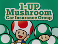
Mario Kart 8

Super Mario Odyssey


Rodin[edit]
Rodin (ロダン Rodan) is a sans-serif typeface designed by Toshiyasu Satō for Fontworks, first released in 1990.[259] It is used for text in the Switch Cards of the Japanese Super Mario Advance 4: Super Mario Bros. 3 e-Reader cards and the interface in the Game & Watch DSiWare games.
Rodin Cattleya[edit]
Rodin Cattleya (ロダンカトレア Rodan Katorea) is an alternative version of Rodin designed by Toshiyasu Satō, first released in 1995.[260] It is Rodin with Cattleya kana. It is used for the interface in the following games:
- Super Mario Strikers
- Tetris DS
- WarioWare Gold
It is also used for text in Jimmy T's stage in WarioWare: Get It Together!.
Rodin Happy[edit]
Rodin Happy (ロダンハッピ Rodan Happi) is an alternative version of Rodin designed by Yutaka Satō for Type Labo, first released in 1995.[261] It is Rodin with Happy kana. It is used for the logos for Micro Golf Open and Micro Golf Tour in WarioWare Gold.
Rodin Maria[edit]
Rodin Maria (ロダンマリア Rodan Maria) is an alternative version of Rodin released in 1995.[262] It is Rodin with Maria kana. It is used for the interface in the following games:
- Luigi's Mansion (Japanese language)
- Super Mario Sunshine (Japanese language)
- Yoshi Topsy-Turvy
- Super Mario Galaxy (Japanese language)
- Super Mario Galaxy 2 (Japanese language)
- Mario Sports Mix
- Game & Wario
- Mario Party 10 (Japanese language)
- WarioWare Gold(Japanese language)
It is also used for text in the Mario vs. Donkey Kong e-Reader cards.
Rodin NTLG[edit]

Rodin NTLG (ロダンNTLG Rodan NTLG) is an alternative version of Rodin designed by Yutaka Satō for Type Labo, first released in 1997.[263] It is Rodin with New Type Labo Gothic kana. The kana stroke ends are horizontal or vertical. Rodin NTLG is the system font on Nintendo GameCube, Wii, Nintendo DSi, Nintendo 3DS, Wii U and the Classics consoles in western and Japanese languages, including its built-in software and several of those softwares' logos. It is used for the interface in the following games:
- Super Mario Sunshine (opening cutscene)
- Wario World
- Donkey Konga (video and save data menu)
- Mario Superstar Baseball
- Yoshi's Island DS (Western languages)
- WarioWare: Smooth Moves (Dribble & Spitz's stage)
- Wario: Master of Disguise (alongside modified rounded version; Western languages)
- Mario Strikers Charged
- Mario & Sonic games from Mario & Sonic at the Olympic Games to the Nintendo 3DS version of Mario & Sonic at the Rio 2016 Olympic Games for Western languages and the Wii U version of Mario & Sonic at the Rio 2016 Olympic Games for the Japanese language
- Super Smash Bros. Brawl
- Dr. Mario Online Rx
- Mario Kart Wii
- Bird & Beans
- Paper Airplane Chase
- Dr. Mario Express
- New Super Mario Bros. Wii (scores)
- Mario Kart 7
- Fortune Street
- Mario Party 9
- Mario Tennis Open
- Nintendo Land
- New Super Mario Bros. U (scores)
- Luigi's Mansion: Dark Moon (Japanese language)
- Mario and Donkey Kong: Minis on the Move (player names)
- NES Remix games
- Dr. Luigi
- Mario Golf: World Tour
- Super Smash Bros. for Nintendo 3DS
- Nintendo Badge Arcade
- Mario vs. Donkey Kong: Tipping Stars
- Dr. Mario: Miracle Cure
- Super Mario Maker
- Mario Tennis: Ultra Smash
- Mini Mario & Friends: amiibo Challenge
- Amiibo tap: Nintendo's Greatest Bits
- Super Mario Maker for Nintendo 3DS
- Poochy & Yoshi's Woolly World
- Mario Sports Superstars
- Mario + Rabbids Kingdom Battle (Japanese language)
- Super Mario Odyssey
- WarioWare Gold (Japanese language)
- Super Smash Bros. Ultimate
- Super Mario Maker 2 (scores in the New Super Mario Bros. U theme)
- Super Mario 3D World + Bowser's Fury
- WarioWare: Get It Together!
- Mario Strikers: Battle League (Japanese and Russian languages)
- Super Mario Bros. Wonder (player names)
- WarioWare: Move It!
- Mario vs. Donkey Kong (Nintendo Switch)
- Luigi's Mansion 2 HD (Japanese language)
In Mario Kart 8, it is used on various signs in tracks, such as in Super Bell Subway. It is also used for text on the D-Cell Battery Thing and the end screen for the Curling Stone Thing, as well as the "REPLAY" text that appears when using the Bowling Ball Thing in Strike Lake in Paper Mario: Sticker Star, and Thing text and Replica Card labels in Paper Mario: Color Splash. It is also used for the logos for Mini Mario & Friends: amiibo Challenge and the first logo for the Nintendo eShop. It is also used on the Japanese amiibo cards for Mario Sports Superstars. Being used for the interface in Ring Fit Adventure, it is also used for its corresponding Nintendo Sound Clock: Alarmo theme.
Rodin Rose[edit]
Rodin Rose (ロダンローズ Rodan Rōzu) is an alternative version of Rodin released in 1995.[264] It is Rodin with Rose kana. It is used for the interface in Princess Peach: Showtime! for display text.
Rodin Wanpaku[edit]
Rodin Wanpaku (ロダンわんぱく Rodan Wanpaku) is an alternative version of Rodin designed by Yutaka Satō for Type Labo, first released in 1998.[265] It is Rodin with New Wanpaku Gothic kana. It is used for the interface in the following games:
- Mario Super Sluggers
- Wario Land: Shake It! (cutscene subtitles)
- Donkey Kong Country Returns (Japanese language)
- Mario Party 9 (Japanese language)
- Mario Party: Island Tour
- Donkey Kong Country: Tropical Freeze (Japanese language)
- Yoshi's Crafted World
- WarioWare: Get It Together!
- WarioWare: Move It!
Raglan[edit]
Raglan (ラグラン Raguran) is an alternative version of Rodin released in 1995.[266] It is an Ultra Bold derivative of Rodin. It is used for text in Darts in WarioWare: Smooth Moves.. It is also used for interface text in DK: Jungle Climber and Yoshi's Woolly World and its Nintendo 3DS port. In Paper Mario: Sticker Star, it is used for text on the Soda Thing. In WarioWare Gold, it is used in the logos for Cruise Controls and for text in Dancing Team and Orbulon's stages. In WarioWare: Get it Together!, it is used for the title screen logo for Frenemy Frenzy. In WarioWare: Move It!, it is used for text in Dr. Crygor's stage and text in Switching Gears.
WarioWare: Get it Together! Frenemy Frenzy

Raglan Punch[edit]
Raglan Punch (ラグランパンチ Raguranpanchi) is an alternative version of Raglan released in 2011.[267] It is used for interface text in Captain Toad: Treasure Tracker (except the Nintendo 3DS version). In Paper Mario: Color Splash, it is used for the logo of Snifit or Whiffit: Seabed Edition. In Mario Sports Superstars, it is used for ranks in horse riding races. In WarioWare Gold, it is used in the logos for Wario Interrupts and for text in Wario Deluxe and the Wario Interrupts stages. In WarioWare: Get it Together!, it is used for text in Orbulon's stage, the Showdown stage, and for the title screen logo for Puck 'er Up.
Railway[edit]

Railway (レイルウェイ Reiruwei) is an outlined sans-serif typeface designed by Toshiyasu Satō for Fontworks, first released in 1995.[268] It is based on Rodin. It is used for text in Ski in Game & Wario, and text in Jimmy T.'s and the Dancing Team stages in WarioWare Gold.
Reggae[edit]
Reggae (レゲエ Regē) is a typeface from Fontworks, first released in 1995.[269] It is based on Rodin. It is used for the credits text in Luigi's Mansion. It is also used in Mario Superstar Baseball for Bowser Jr.'s team logos. It is also used for text in the Japanese Super Mario Advance 4: Super Mario Bros. 3 e-Reader cards.
Comic Reggae[edit]

Comic Reggae (コミックレゲエ Komikku Regē) is an alternative version of Reggae released in 2008.[270] It is used for the logo of Thrill Ride in WarioWare Gold.
RocknRoll[edit]

RocknRoll (ロックンロール Rokkunrōru) is a Point of Purchase typeface from Fontworks, first released in 1995.[271] It is based on Rodin. It is used for the interface in Mario Party 10 for Western languages, text in party minigames in WarioWare: Get It Together!, and text in Showdown in WarioWare: Move It!. It is also used for text in the Ludwig cards of the Japanese Super Mario Advance 4: Super Mario Bros. 3 e-Reader cards.
Rowdy[edit]

Rowdy (ロウディ Rōdi) is a sans-serif typeface designed by Toshiyasu Satō for Fontworks, first released in 1995.[272] It is based on Rodin. It is used for the interface in the following games:
- Donkey Kong Barrel Blast
- Game & Wario
- Mario Party: Star Rush
- Mario Party: The Top 100
- Mario & Luigi: Brothership
In Super Mario Sunshine, Rowdy is used for text in the Isle Defino map. In Mario Tennis: Power Tour, it is used for the HUD numbers for score and time. In Mario Superstar Baseball, it is used for the logos for Princess Peach's and Princess Daisy's teams. In Wario Land: Shake It!, it is used for the "G" on Coin Bags and also for the "ON" and "OFF" on Certainty Switches in the Japanese version only. In WarioWare Gold, it is used for text in Dirbble & Spitz's and the Potluck Gang stage, and the logo for Pumpkin Panic. In WarioWare: Move It!, it is used for text in Wario's stage. It is also used for the "Puzzle & Dragons" portion of the Puzzle & Dragons: Super Mario Bros. Edition logo, and the "Arcade Edition" portion of the logo for Mario & Sonic at the Olympic Games Tokyo 2020 - Arcade Edition. It is also used for text in the Japanese Super Mario Advance 4: Super Mario Bros. 3 e-Reader cards.
In Mario Kart Wii, it is used for the logos of the following sponsors:
- Yoshi Kart
- Luigi Kart
- Mario Grand Prix
- Yoshi (reappears in Mario Kart 7)
It is also used for text in Mario Circuit in the game.
Super Mario Advance 4: Super Mario Bros. 3 e-Reader card

Peach Roses in Mario Superstar Baseball

Daisy Lillies in Mario Superstar Baseball
Mario Tennis: Power Tour

Yoshi Kart in Mario Kart Wii
Luigi Kart in Mario Kart Wii

Mario Grand Prix in Mario Kart Wii
Yoshi in Mario Kart Wii
Wario Land: Shake It! (The "G" on the Coin Bag)
Yoshi in Mario Kart 7
Puzzle & Dragons: Super Mario Bros. Edition ("PUZZLE & DRAGONS")
Mario & Sonic at the Olympic Games Tokyo 2020 - Arcade Edition ("ARCADE EDITION")
Mario Party: The Top 100
WarioWare Gold
Mario & Luigi: Brothership


Script Bold[edit]

Script Bold is a script typeface designed by Fritz Max Steltzer for Monotype, first released in 1931.[273] It is used for Bowser and Princess Peach's wedding posters seen in Super Mario Odyssey.
Seagull[edit]

- Possible alternatives include: Bitstream Seagull, EF Seagull, Seagull SB, TS Seagull and URW Seagull.
Seagull is a serif typeface designed by Adrian Williams an Bob McGrath for Fonts/Ingrama, first released in 1978.[274] It is used in Mario Kart 8 and Mario Kart 8 Deluxe on the logo for Peach & Daisy Royal Patisserie.
Serpentine[edit]
Serpentine is a geometric typeface designed by Dick Jensen for the Visual Graphics Corporation, first released in 1972.[275] It is used in the European and Australasian logo for Donkey Kong Barrel Blast. It is also used for the "PRESS ANY BUTTON" text in the title screen of Super Smash Bros. Brawl.
Super Smash Bros. Brawl ("PRESS ANY BUTTON")

Seurat[edit]

Seurat (スーラ Sūra) is a rounded sans-serif typeface from Fontworks, first released in 1993.[276] It is used for the interface in the following media:
- Mario no Photopi
- Mario Artist series
- Luigi's Mansion
- Mario Golf: Toadstool Tour (credits text)
- Donkey Konga (Japanese language)
- Donkey Konga 2
- Donkey Konga 3 JP
- WarioWare: Smooth Moves (Mona's stage)
- Dr. Mario Online Rx
- Bird & Beans (locked mode)
- Game & Watch DSiWare games
- New Super Mario Bros. Wii
- New Super Mario Bros. Wii Coin World
- Super Mario 3D Land
- Mario Party 9 (Japanese language; including some text in western languages)
- New Super Mario Bros. 2
- Club Nintendo Picross
- New Super Mario Bros. U
- Paper Mario: Sticker Star (Japanese language, including the "9" on the Billiard Ball and its end banner in western languages)
- Photos with Mario
- New Super Luigi U
- Super Mario 3D World
- Dr. Luigi
- Mario Golf: World Tour
- Captain Toad: Treasure Tracker
- Mario Party 10
- Puzzle & Dragons: Super Mario Bros. Edition
- Dr. Mario: Miracle Cure
- Yoshi's Woolly World
- Mario & Luigi: Paper Jam
- Paper Mario: Color Splash (Japanese language)
- Mario Party: Star Rush
- Super Mario Run
- Mario Sports Superstars
- Mario & Luigi: Superstar Saga + Bowser's Minions
- Mario Party: The Top 100
- WarioWare Gold
- Mario & Luigi: Bowser's Inside Story + Bowser Jr.'s Journey
- New Super Mario Bros. U Deluxe
- Dr. Mario World
- Paper Mario: The Origami King (Japanese language)
- Super Mario Bros. 35
- WarioWare: Get It Together!
- Mario Strikers: Battle League (Japanese and Russian languages)
- Mario + Rabbids Sparks of Hope (Japanese and Russian languages)
- WarioWare: Move It!
- Super Mario RPG (Nintendo Switch)
- Nintendo Sound Clock: Alarmo
- Mario & Luigi: Brothership
It is also used for text in the Japanese Super Mario Advance 4: Super Mario Bros. 3 e-Reader cards.
Mario & Luigi: Brothership

Seurat Capie[edit]
Seurat Capie (スーラキャピー Sūra Kyapī) is an alternative version of Seurat designed by Yutaka Satō for Type Labo, first released in 1995.[277] It is Seurat with Capie kana. It is used for the interface in the following games:
- Paper Mario: The Thousand-Year Door (Japanese language)
- Super Paper Mario (Japanese language)
- Donkey Kong Barrel Blast
- Paper Mario: The Thousand-Year Door (Nintendo Switch) (Japanese language; including the "?" in the quiz games and the rankings in the Pianta Parlor minigames in all languages; The Letter "p" in western languages)

The Letter "p" in Paper Mario: The Thousand-Year Door (Nintendo Switch)
Slump[edit]
Slump (スランプ Suranpu) is an alternative version of Seurat released in 1995.[278] It is used for subtitles in Super Mario Sunshine, pop-up boxes and player numbers in Mario Kart: Double Dash!!, display text in Donkey Kong: Jungle Beat, interface text in Wario Land: Shake It!, the logo and text in Snifit or Whifit in Paper Mario: Sticker Star, text in the Wario Bug stage in WarioWare: Get It Together!, and text in Pyoro W and subtitles in the credits in WarioWare: Move It! to denote characters and locations. In WarioWare: Smooth Moves and WarioWare Gold, it is used for text in Ashley's and Orbulon's levels respectively. It is also used for heading text in the Japanese Super Mario Advance 4: Super Mario Bros. 3 e-Reader cards.
Super Mario Advance 4: Super Mario Bros. 3 e-Reader card
Super Mario Advance 4: Super Mario Bros. 3 e-Reader card
Super Mario Advance 4: Super Mario Bros. 3 e-Reader card
Super Mario Sunshine
Mario Kart: Double Dash!!

Donkey Kong: Jungle Beat
WarioWare: Smooth Moves
WarioWare Gold
WarioWare: Move It!


Shermlock[edit]

Shermlock is an uneven display typeface from Gaut Fonts. It is used for the interface in Mario & Luigi: Bowser's Inside Story.
Showcard Gothic[edit]
Showcard Gothic is a sans-serif typeface designed by Jim Parkinson for The Font Bureau, first released in 1993.[279] It is used for the logos for the following games:
- Super Mario RPG: Legend of the Seven Stars
- DK: King of Swing (North American logo)
- Photos with Mario
It is also seen in Mario vs. Donkey Kong 2: March of the Minis on its victory screen.
Used for the "LEGEND OF THE SEVEN STARS" text
Used for the "KING OF SWING" text

Used for the PHOTOS WITH text
"YOU WON!!!" in Mario vs. Donkey Kong 2: March of the Minis


Skip[edit]

Skip (スキップ Sukippu) is a humanist sans-serif typeface designed by Shigenobu Fujita for Fontworks, first released in 2003. An updated version with multiple weights called Skip Pro was released in 2019.[280] It is used for the interface in the following games:
- WarioWare: Get It Together!
- WarioWare: Move It!.
Snell Roundhand[edit]

Snell Roundhand is a script typeface designed by Matthew Carter for Linotype, first released in 1966.[281] It is used in Super Mario Odyssey in the Bubblaine sticker.
Snyder Speed Brush[edit]

Snyder Speed Brush is a script typeface designed by Pat Snyder, first released in 1992.[282] It is used for the interface in Mario Kart 64.
Sofachrome[edit]
Sofachrome is a geometric sans-serif typeface designed by Ray Larabie for Typodermic.[283] It is used for the logo for Retro Studios.
Souvenir[edit]
- Possible alternatives include: ITC Souvenir and Souvenir Graphic.
Souvenir is a serif typeface designed by Morris Fuller Benton for ATF, first released in 1920.[284] It is used in Mario Kart 8, Mario Kart Tour and Mario Kart 8 Deluxe on the logo of Toad City Sightseeing.
Steadfast[edit]
Steadfast is a geometric sans-serif typeface designed by Todd Masui for T-26, first released in 1998.[285] It is used on the North American logo for Donkey Kong Barrel Blast, albeit with a modified "R" glyph.
Stencil[edit]


Stencil is a serif display typeface designed by Gerry Powell for American Type Founders, first released in 1937.[286]
It is seen in the Japanese boxart for Super Mario All-Stars, and also in Super Mario Odyssey, where it is used on the sticker for the Steam Gardens, albeit with a modified "R" glyph.
Stick[edit]

Stick (ステッキ Sutekki) is a typeface from Fontworks, first released in 2009.[287] It is used for text in Shutter in Game & Wario. It is used for text in Dribble & Spit's stage in WarioWare: Move It!.
Stop[edit]
Stop is a sans-serif typeface designed by Aldo Novarese and first released by Nebiolo in 1970 or 1971.[288] It is seen in Mario Kart Tour and Mario Kart 8 Deluxe on the logo of Green Fuel.
Stymie[edit]
Stymie is a slab-serif typeface designed by Morris Fuller Benton for the American Type Founders, first released in 1931.[289] It is used in the international logo for NES Open Tournament Golf.
Sui Generis[edit]
Sui Generis is a geometric sans-serif typeface designed by Ray Larabie for Larabie Fonts, first released in 2000.[290] It is used for car text in The Super Mario Bros. Movie.
Superstar[edit]
Superstar is a geometric slab-serif typeface designed by Colin Brignall for Letraset, first released in 1970.[291] A modified version is used for the logo for Mario Party: The Top 100.
Surface Rough[edit]
Surface Rough is a display typeface used for the logo of Super Smash Bros..
Suske & Wiske[edit]
Suske & Wiske is a rounded sans-serif typeface used on the Horror Land logo and text within the board in Mario Party 2, as well as general board text in Mario Party 3.

Horror Land Logo
Introduction's background

Item Shop
Koopa Bank


Sweet Sans[edit]
Sweet Sans is a geometric sans-serif typeface designed by Mark van Bronkhorst for MVB Fonts, first released in 2013.[292] It is used for the logo of amiibo tap: Nintendo's Greatest Bits.
Taberna Serif[edit]

Taberna Serif is a serif typeface designed by Jorge Cisterna and Rodrigo Fuenzalida for Latinotype, first released in 2016.[293] Its Black variant is used for the "Brothership" subtitle of the Mario & Luigi: Brothership logo.
Tarzan[edit]
Tarzan is an uneven typeface from FontBank, first released in 1993. It is used on the international logo for Mario Kart: Super Circuit.
Tekton[edit]

Tekton is a handwriting-style typeface designed by David Siegel and first released in 1989. It is used in Hotel Mario for some interface text, Yoshi's Story for Trial Mode, and interface text in Donkey Kong 64. Its bold condensed variation also replaces Kyo Geki in the European localizations of Mario Party 8, being used for selectable panels and player tags.
Telop Mincho[edit]

Telop Mincho (テロップ明朝 Teroppu Minchō) is a serif typeface designed by Shigenobu Fujita for Fontworks, first released in 2015.[294] It is used for text in the Fishy Felines and Fire Emblem: Three Houses microgames, and the dialogue for The Supreme Developer in WarioWare: Get It Together!.
Fishy Felines
Fire Emblem: Three Houses


Tempo[edit]
Tempo is a geometric sans-serif typeface designed by Robert Hunter Middleton for Ludlow, first released in 1930.[295] A modified version of Tempo Heavy Condensed is used for the logo for Baseball.
The Bold Font[edit]
The Bold Font is a geometric sans-serif typeface designed by Sven Pels, first released in 2015.[296] It is used in The Super Mario Bros. Movie for the logo for Super Mario Bros. Plumbing and location names in the Super Mario Bros. Plumbing commercial.
Used for "PLUMBING" on the Super Mario Bros. Plumbing logo
The Super Mario Bros. Movie
The Super Mario Bros. Movie
TheSans[edit]

TheSans is a sans-serif typeface designed by Lucas de Groot for LucasFonts, first released in 1994.[297] A version of this typeface, TheSans Rio 2016, is used for the interface in the Wii U version of Mario & Sonic at the Rio 2016 Olympic Games for Western languages.
Thrills[edit]
Thrills is an uneven sans-serif typeface designed by John Roshell for Comicraft, first released in 2005.[298] Thrills Regular is used for the beta logo for New Super Mario Bros..
Times New Roman[edit]
Times New Roman is a serif typeface designed by Stanley Morison and Victor Lardent for Monotype, first released in 1937.[299]
It is also used for the logos for Wario Land II and Mario & Luigi: Partners in Time. It is also used for the English in-game logo for Donkey Kong Country 3: Dixie Kong's Double Trouble!, the "Donkey Kong Island" text in the Donkey Kong Island map in Donkey Kong Country, the "KI HERE" sign in the Krazy Kremland map in Donkey Kong Country 2: Diddy's Kong Quest, the "?" icon in the Item Box in Mario Kart 64, the "BANK" and "COIN" text in Western Land in Mario Party 2 (albeit without a serif on the "K"), the number identifiers on the Family Computer controllers, the room numbers in the Excess Express in Paper Mario: The Thousand-Year Door and its Nintendo Switch remake, and text in The Super Mario Bros. Movie. It is also used for the former logo for the Super Mario Club.
Wario Land II ("II")

Donkey Kong Country 3: Dixie Kong's Double Trouble! ("DOUBLE TROUBLE")

Mario & Luigi: Partners in Time ("PARTNERS IN TIME")

Trade Gothic[edit]

Trade Gothic is a sans-serif typeface designed by Jackson Burke for Linotype, first released in 1948.[300] It is used for the "STAGE CLEAR!" text in The Subspace Emissary in Super Smash Bros. Brawl. A modified version is used on the logo for Alleyway.
TS Hoboken[edit]

Hoboken is a serif typeface designed by Morris Fuller Benton for TypeShop Collection.[301] It is used in Mario Kart 8, Mario Kart Tour and Mario Kart 8 Deluxe on the logo of Bob-omb Plugs.
Tsukushi A Maru Gothic[edit]
Tsukushi A Maru Gothic (筑紫A丸ゴシック Chikushi A Maru Goshikku) is a rounded sans-serif typeface designed by Shigenobu Fujita for Fontworks, first released in 2008.[302] It is used for the HUD in the Nintendo 3DS remake of Luigi's Mansion.
Tsukushi A Old Mincho[edit]
Tsukushi A Old Mincho (筑紫Aオールド明朝 Chikushi A Ōrudo Minchō) is a serif typeface designed by Shigenobu Fujita for Fontworks, first released in 2012.[303] It is used for text in Autograph! in WarioWare Gold.
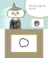
WarioWare Gold

Tsukushi C Midashi Mincho[edit]
Tsukushi C Midashi Mincho (筑紫C見出ミン Chikushi C Midashi Min) is a serif typeface designed by Shigenobu Fujita for Fontworks, first released in 2016.[304] It is used for the "PERFECT TEATIME" text in the Fire Emblem: Three Houses microgame in WarioWare: Get It Together!.
UD Kakugo[edit]

UD Kakugo (UD角ゴ UD Kakugo) is a Universal Design sans-serif typeface from Fontworks, first released in 2015.[305] Its Latin characters are classified as humanist. It is used for the interface in Super Mario Maker 2, Tetris 99, and Princess Peach: Showtime! for Western languages. It is also used for the sticker text in Mario Party Superstars for Western languages, advertisements in Rainbow Galleria in Super Mario Party Jamboree, and the logo for The "Who's in Control?" Show in WarioWare: Move It!.
Super Mario Maker 2

UD Marugo[edit]

UD Marugo (UD丸ゴ UD Marugo) is a Universal Design rounded sans-serif typeface from Fontworks, first released in 2015.[306] It is used for the interface in Super Mario Party for Western languages and for text in Pyoro W in WarioWare: Move It!.
UD Mincho[edit]

UD Mincho (UD明朝 UD Minchō) is a Universal Design serif typeface from Fontworks, first released in 2015.[307] It is used for the logo for Gotta Bounce in WarioWare: Get It Together!.
UD Shin Go[edit]

UD Shin Go (UD新ゴ UD Shingo) is a Universal Design sans-serif typeface from Morisawa. Its Latin characters and numerals come from ClearTone SG, a humanist sans serif typeface also from Morisawa, with slight modifications, particularly in the letter "J". In UD Shin Go, "J" sits on the baseline; while in ClearTone SG, "J" descends below the baseline. UD Shin Go has full character sets for hiragana, katakana, kanji, hanzi, hangul, and Cyrillic characters. UD Shin Go modified with a single story "g" from Latin small letter script g is the system font on Nintendo Switch and is used as the typeface for Super Smash Bros. Ultimate, Super Mario 3D All-Stars, Mario Golf: Super Rush, Nintendo World Championships: NES Edition, achievement notification text in Super Mario Party Jamboree, the classic game applications for Nintendo Switch Online, the player names on many Mario games on the console, the Chinese and Korean versions of Tetris 99 and Super Mario Bros. 35, and the Simplified Chinese and Korean version of the Nintendo Switch remake of Mario vs. Donkey Kong. It is also used for the word "Play" in the title screen of Super Mario RUN since the Fall 2017 update. The unmodified UD Shin Go with a double story "g" is used for the interface in Mario & Sonic at the Olympic Games Tokyo 2020.
Univers[edit]
Univers is a large sans-serif typeface designed by Adrian Frutiger, first released in 1957.[308]
It is used for the Canadian, French, Dutch, Italian, and Australasian logos of certain NES games:
- Golf (Univers Black)
- Wrecking Crew (Univers Bold Condensed)
- Super Mario Bros. (Univers Bold Condensed)
It is used for the logo of WarioWare, Inc.: Mega Microgame$! and the Game Boy Pocket.
Its bold condensed variant is used for the logo for Super Mario Bros. 2 and the Australasian logos for Game & Watch Gallery, Game & Watch Gallery 2, and Game & Watch Gallery 3. It is also used for the logo for Dr. Mario 64 and the console and controller labels on the SNES and N64. It is also used for the numbers in the logos for Donkey Kong Country 2 and Donkey Kong Country 3 in western languages. It is also used for the large exclamation points in a cutscene in Mario vs. Donkey Kong and its Nintendo Switch remake.
Univers Extra Black is used for the logo for the Nintendo 64, including the "DD" in the Nintendo 64DD logo.
Modified versions of Univers Condensed are used for the logos for the Super Nintendo Entertainment System, the Super NES Classic Edition, the Super Scope, the Virtual Boy, and the Nintendo 64 under its original name, the Ultra 64.
Golf
Wrecking Crew
Super Mario Bros.
Super Mario Bros. 2
Super Nintendo Entertainment System ("SUPER NINTENDO")
Super Nintendo Entertainment System ("POWER", "RESET", "EJECT", "ON", "OFF") and its controller ("A", "B", "X", "Y", "L", "R", "START", "SELECT")
Donkey Kong Country 2 ("2")
Virtual Boy

Nintendo 64 ("NINTENDO")
Nintendo 64 ("POWER", "RESET", "MEMORY EXPANSION", "ON", "OFF") and its controller ("A", "B", "C", "START")
Donkey Kong Country 3 ("3")
Game & Watch Gallery ("GAME BOY GALLERY")
Game & Watch Gallery 2 ("GAME BOY GALLERY")
Game & Watch Gallery 3 ("GAME BOY GALLERY")

Dr. Mario 64 ("64")
WarioWare, Inc.: Mega Microgame$! ("MEGA MICROGAME$!")

Super NES Classic Edition ("CLASSIC EDITION" along with "SUPER NINTENDO")


VAG Rounded[edit]

VAG Rounded is a widely used rounded sans-serif typeface designed by Gerry Barney for Volkswagen, first released between 1978 and 1979.[309] It is used for the interface in the following games:
- Mario vs. Donkey Kong: Minis March Again!
- Mario vs. Donkey Kong: Mini-Land Mayhem!
- Donkey Kong Country: Tropical Freeze
In Super Mario Odyssey, it is used on the Honeylune Ridge sticker. In Mario Pinball Land, it is used for the ? Block and the Question mark. It is also used for the logo for Tetris & Dr. Mario. It is also used for the logo for Mario & Luigi: Bowser's Inside Story + Bowser Jr.'s Journey and the Japanese logos for the Mario vs. Donkey Kong series up to Tipping Stars. It is also used for headers in the European versions of Dance Dance Revolution: Mario Mix.
Van Dijk[edit]
Van Dijk is a handwritten-style typeface designed by Peter O'Donnel and Jan van Dijk, published by ITC in 1986.[310] Its bold variation is used in the localized logo for Mario Golf: Advance Tour.
Verdana[edit]
Verdana is a humanist sans-serif typeface designed by Matthew Carter for Microsoft, first released in 1996.[311] It is used on the Eternal Star logo in Mario Party, the Space Land logo and text within the board in Mario Party 2, and the "EXIT" image in the bonus screen in the Game Boy Advance version of Donkey Kong Country.
Space Land Logo
Introduction's background
Item Shop
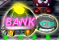
Koopa Bank


Virginia[edit]
Virginia is a geometric sans-serif typeface designed by Russell Bean for Lettergraphics, first released in 1970.[312] It is used for cutscene text in Mario vs. Donkey Kong.
WBX Komik[edit]

WBX Komik is an uneven sans-serif typeface designed by WolfBainX for the Vigilante Typeface Corporation. It is used for the "THANKS FOR PLAYING" text in the credits picture in Mario vs. Donkey Kong.
Xcelsion[edit]
Xcelsion is a geometric sans-serif typeface designed by Daniel Zadorozny for Typodermic, first released in 2003. It is used for the logo for Retro Studios.
Yuruka[edit]
Yuruka (ユールカ Yūruka) is a Point of Purchase typeface from Fontworks, first released in 2012.[313] It is used for the interface in the following games:
- NES Remix games (except Ultimate NES Remix)
- Dr. Mario: Miracle Cure
- Yoshi's Woolly World
- Poochy & Yoshi's Woolly World
- WarioWare Gold
- Luigi's Mansion (Nintendo 3DS)
- Yoshi's Crafted World
- WarioWare: Get It Together!
- WarioWare: Move It!
- Super Mario Party Jamboree (reaction text)
- Mario & Luigi: Brothership
Notably, it is used for the "13" on 13-Amp's hat. It is also used for the logo for Dr. Mario World and the Japanese logo for WarioWare: Get It Together!.
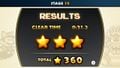
NES Remix 2
Yoshi's Crafted World

WarioWare: Get It Together! (Japanese)
Mario & Luigi: Brothership


References[edit]
- ^ a b MARIO Font GitHub repository
- ^ Nintendo of America (May 19, 2023). Game Boy Advance – May 2023 Game Updates – Nintendo Switch Online + Expansion Pack. YouTube. Retrieved May 19, 2023.
- ^ fsuarez913 | dafont.com. dafont.com. Retrieved January 31, 2024. (Archived February 1, 2024, 02:16:18 UTC via Wayback Machine.)
- ^ Super Mario 256 - comments | dafont.com. dafont.com. Retrieved January 31, 2024. (Archived July 18, 2012, 192826 UTC via Wayback Machine.)
- ^ Nintendo DE (November 27, 2024). Yo Ho, Bro! Ein Schunkel-Shanty – Mario & Luigi: Brothership (Nintendo Switch). YouTube (German). Retrieved November 27, 2024. The typeface is used for the line "Mario and Lui—geez!"
- ^ @MikeLuckas (January 31, 2024). Post. X. Retrieved February 9, 2024. (Archived January 9, 2024, 17:50:57 UTC via archive.today.)
- ^ DaFont. (2011) Chlorinap. https://www.dafont.com/pt/chlorinap.font. Retrieved June 30, 2024.
- ^ Fonts In Use. Aachen in use. https://fontsinuse.com/typefaces/1585/aachen. Retrieved June 29, 2024.
- ^ Wikipedia. (2024). Ad Lib (typeface). https://en.wikipedia.org/wiki/Ad_Lib_(typeface). Retrieved June 13, 2024.
- ^ Fonts In Use. Adobe Caslon in use. https://fontsinuse.com/typefaces/65/adobe-caslon. Retrieved September 8, 2024.
- ^ Fonts In Use. Adobe Garamond in use. https://fontsinuse.com/typefaces/4081/adobe-garamond. Retrieved September 21, 2024.
- ^ Fonts In Use. ITC Garamond in use. https://fontsinuse.com/typefaces/1772/itc-garamond. Retrieved November 1, 2024.
- ^ Fonts In Use. Adsans in use. https://fontsinuse.com/typefaces/13121/adsans. Retrieved November 1, 2024.
- ^ Fonts In Use. Alternate Gothic in use. https://fontsinuse.com/typefaces/1591/alternate-gothic. Retrieved July 21, 2024.
- ^ Fonts In Use. Amelia in use. https://fontsinuse.com/typefaces/1138/amelia. Retrieved July 21, 2024.
- ^ Fonts In Use. American Text in use. https://fontsinuse.com/typefaces/12501/american-text. Retrieved June 19, 2024.
- ^ Wikipedia. (2024). American Typewriter. https://en.wikipedia.org/wiki/American_Typewriter. Retrieved June 13, 2024.
- ^ Fontworks. Yutaka Sato. https://en.fontworks.co.jp/company/designer/sato-y/. Retrieved June 15, 2024.
- ^ Type Labo. https://www.type-labo.jp/. Retrieved June 15, 2024.
- ^ Wikipedia. (2024) Antique Olive. https://en.wikipedia.org/wiki/Antique_Olive. Retrieved June 13, 2024.
- ^ Fontworks. あおかね Std. https://lets.fontworks.co.jp/fonts/309. Retrieved June 15, 2024.
- ^ Wikipedia. (2024). Arial. https://en.wikipedia.org/wiki/Arial. Retrieved June 13, 2024.
- ^ Fonts In Use. Arnold Böcklin in Use. https://fontsinuse.com/typefaces/1142/arnold-boecklin. Retrieved June 29, 2024.
- ^ Fonts In Use. AtomicSuck in use. https://fontsinuse.com/typefaces/14183/atomic-suck. Retrieved July 27, 2024.
- ^ Fonts In Use. Annonce / Aurora-Grotesk V in use. https://fontsinuse.com/typefaces/13730/annonce-aurora-grotesk-v. Retrieved September 21, 2024.
- ^ Wikipedia. (2024). Avenir Next. https://en.wikipedia.org/wiki/Avenir_(typeface). Retrieved July 16, 2024.
- ^ Fonts In Use. AZ Cut Script in use. https://fontsinuse.com/typefaces/14317/az-cut-script. Retrieved September 8, 2024.
- ^ Fontworks. ベビポップ Std. https://lets.fontworks.co.jp/fonts/220. Retrieved June 15, 2024.
- ^ Wikipedia. (2024) Banco (typeface). https://en.wikipedia.org/wiki/Banco_(typeface). Retrieved June 21, 2024.
- ^ Wikipedia. (2024). Bank Gothic. https://en.wikipedia.org/wiki/Bank_Gothic. Retrieved July 19, 2024.
- ^ Wikipedia. (2024). Bauhaus (typeface). https://en.wikipedia.org/wiki/Bauhaus_(typeface). Retrieved June 13, 2024.
- ^ Wikipedia. (2024). Belwe Roman. https://en.wikipedia.org/wiki/Belwe_Roman. Retrieved June 21, 2024.
- ^ Wikipedia. (2024). Berlin Sans. https://en.wikipedia.org/wiki/Matthew_Butterick. Retrieved June 23, 2024.
- ^ Fonts In Use. Berlin Sans in Use. https://fontsinuse.com/typefaces/2178/berlin-sans. Retrieved June 23, 2024.
- ^ Wikipedia. (2024). Berthold Block. https://en.wikipedia.org/wiki/Berthold_Block. Retrieved September 15, 2024.
- ^ Fonts In Use. Binner in use. https://fontsinuse.com/typefaces/4880/binner. Retrieved September 21, 2024.
- ^ 7NTypes. Blackplotan. https://7ntypes.com/blackplotan-font/. Retrieved June 20, 2024.
- ^ Fonts In Use. Blippo in use. https://fontsinuse.com/typefaces/3801/blippo. Retrieved June 29, 2024.
- ^ MyFonts. (2024). Blue Global. https://www.myfonts.com/collections/blue-global-font-t-26. Retrieved July 15, 2024.
- ^ Wikipedia. (2024). Bodoni. https://en.wikipedia.org/wiki/Bodoni. Retrieved July 26, 2024.
- ^ My Fonts. Bodoni Poster. https://www.myfonts.com/collections/poster-bodoni-font-linotype. Retrieved June 21, 2024.
- ^ a b Wikipedia. (2021). Chauncey H. Griffith. https://en.wikipedia.org/wiki/Chauncey_H._Griffith. Retrieved June 21, 2024.
- ^ Fonts In Use. Boink in Use. https://fontsinuse.com/typefaces/7958/boink. Retrieved July 24, 2024.
- ^ Wikipedia. (2024). Bookman (typeface). https://en.wikipedia.org/wiki/Bookman_(typeface). Retrieved June 21, 2024.
- ^ Wikipedia. (2024). Bookman (typeface). https://en.wikipedia.org/wiki/Bookman_(typeface). Retrieved June 19, 2024.
- ^ Wikipedia. (2024). Broadway (typeface). https://en.wikipedia.org/wiki/Broadway_(typeface). Retrieved June 20, 2024.
- ^ Wikipedia. (2024). Brush Script. https://en.wikipedia.org/wiki/Brush_Script. Retrieved June 19, 2024.
- ^ TypeNetwork. (2024). Cafeteria. https://store.typenetwork.com/foundry/frerejonestype/fonts/cafeteria. Retrieved July 26, 2024.
- ^ Fonts In Use. (2024). Calcite. https://fontsinuse.com/typefaces/3839/calcite. Retrieved July 18, 2024.
- ^ Fonts In Use. (2024). Cancun. https://fontsinuse.com/typefaces/32025/cancun. Retrieved June 20, 2024.
- ^ Fontworks. カラット Std. https://lets.fontworks.co.jp/fonts/158. Retrieved June 19, 2024.
- ^ Fontworks. セザンヌ Pro. https://lets.fontworks.co.jp/fonts/81. Retrieved July 23, 2024.
- ^ Fontworks. ニューセザンヌ Pro. https://lets.fontworks.co.jp/fonts/84. Retrieved July 23, 2024.
- ^ Fontworks. キアロ Std. https://lets.fontworks.co.jp/fonts/196. Retrieved June 19, 2024.
- ^ Fonts In Use. Cloister Black in use. https://fontsinuse.com/typefaces/7875/cloister-black. Retrieved November 5, 2024.
- ^ Fontworks. コメット Std. https://lets.fontworks.co.jp/fonts/160. Retrieved June 19, 2024.
- ^ Wikipedia. (2024). Comic Sans. https://en.wikipedia.org/wiki/Comic_Sans. Retrieved June 15, 2024.
- ^ Shesez (December 1, 2024). Out of Bounds Secrets. YouTube. Retrieved June 15, 2024.
- ^ Wikipedia. (2024). Compacta (typeface). https://en.wikipedia.org/wiki/Compacta_(typeface). Retrieved June 19, 2024.
- ^ Fonts In Use. Cooper Black in Use. https://fontsinuse.com/typefaces/7357/cooper-black. Retrieved June 29, 2024.
- ^ Wikipedia. (2024). Copperplate Gothic. https://en.wikipedia.org/wiki/Copperplate_Gothic. Retrieved June 21, 2024.
- ^ Fonts In Use. Corporate in use. https://fontsinuse.com/typefaces/42847/corporate. Retrieved July 17, 2024.
- ^ Fonts In Use. Cosmos in use. https://fontsinuse.com/typefaces/16972/cosmos. Retrieved July 17, 2024.
- ^ Fonts In Use. Cruz Swinger in Use. https://fontsinuse.com/typefaces/17158/cruz-swinger. Retrieved June 21, 2024.
- ^ Fontworks. カッコウ Std. https://lets.fontworks.co.jp/fonts/3371. Retrieved June 19, 2024.
- ^ DFLiYuan(華康儷圓). DynaComware. Retrieved 21 June 2024.
- ^ Fontworks. DFゴシック体 Pro. https://lets.fontworks.co.jp/fonts/645. Retrieved June 20, 2024.
- ^ Fontworks. DNP 秀英アンチック Std. https://lets.fontworks.co.jp/fonts/261. Retrieved June 19, 2024.
- ^ Wikipedia. (2024). Dom Casual. https://en.wikipedia.org/wiki/Dom_Casual. Retrieved June 19, 2024.
- ^ Fontworks. ドットゴシック 12 Std. https://lets.fontworks.co.jp/fonts/182. Retrieved June 19, 2024.
- ^ Fontworks. ドットゴシック 16 Std. https://lets.fontworks.co.jp/fonts/184. Retrieved June 19, 2024.
- ^ Fonts In Use. (2024). Eckmann in use. https://fontsinuse.com/typefaces/6802/eckmann. Retrieved June 27, 2024.
- ^ Fonts In Use. (2024). Eclat. https://fontsinuse.com/typefaces/40345/eclat. Retrieved June 20, 2024.
- ^ TypeNetwork. (2024). El Grande. https://store.typenetwork.com/foundry/designerstudio/fonts/el-grande. Retrieved July 4, 2024.
- ^ @Letter_Library. (December 4, 2017).Enge Wotan-Grotesk. (2017). X. Retrieved June 30, 2024.
- ^ Wikipedia. (2024). Eras (typeface). https://en.wikipedia.org/wiki/Eras_(typeface). Retrieved June 19, 2024.
- ^ Fonts In Use. (2024). Estro in use. https://fontsinuse.com/typefaces/7862/estro. Retrieved June 29, 2024.
- ^ Wikipedia. (2024). Eurostile. https://en.wikipedia.org/wiki/Eurostile. Retrieved July 22, 2024.
- ^ Fonts In Use. (2024). FF CrashBangWallop. https://fontsinuse.com/typefaces/17039/ff-crashbangwallop. Retrieved July 10, 2024.
- ^ Wikipedia. (2024). FF DIN. https://en.wikipedia.org/wiki/FF_DIN. Retrieved July 16, 2024.
- ^ Wikipedia. (2024). DIN 2014. https://en.wikipedia.org/wiki/DIN_1451#Third-party_adaptations. Retrieved June 19, 2024.
- ^ HvD Fonts. (2024). FF Mark. https://www.hvdfonts.com/fonts/ff-mark. Retrieved June 20, 2024.
- ^ Fonts In Use. FF World in use. https://fontsinuse.com/typefaces/30943/ff-world. Retrieved October 19, 2024.
- ^ 方正字库 FounderType. 方正白舟魂心体. https://www.foundertype.com/index.php/FontInfo/index/id/5474. Retrieved September 20, 2024.
- ^ 方正字库 FounderType. 方正粗圆. https://www.foundertype.com/index.php/FontInfo/index/id/179. Retrieved October 27, 2024.
- ^ 方正字库 FounderType. 方正大标宋. https://www.foundertype.com/index.php/FontInfo/index/id/126. Retrieved November 10, 2024.
- ^ 方正字库 FounderType. 方正大黑. https://www.foundertype.com/index.php/FontInfo/index/id/127. Retrieved November 10, 2024.
- ^ 方正字库 FounderType. 方正白舟武骨体. https://www.foundertype.com/index.php/FontInfo/index/id/5475. Retrieved September 16, 2024.
- ^ 方正字库 FounderType. 方正白舟大髭. https://www.foundertype.com/index.php/FontInfo/index/id/5473. Retrieved September 16, 2024.
- ^ 方正字库 FounderType. 方正流行体. https://www.foundertype.com/index.php/FontInfo/index/id/142. Retrieved October 26, 2024.
- ^ 方正字库 FounderType. 方正锐正黑家族. https://www.foundertype.com/index.php/FontInfo/index/id/239. Retrieved September 15, 2024.
- ^ 方正字库 FounderType. 方正综艺. https://www.foundertype.com/index.php/FontInfo/index/id/178. Retrieved November 22, 2024.
- ^ Fonts In Use. Frankfurter in use. https://fontsinuse.com/typefaces/1762/frankfurter. Retrieved July 15, 2024.
- ^ Fonts In Use. Frankfurter Highlight in use. https://fontsinuse.com/typefaces/39486/frankfurter-highlight. Retrieved June 29, 2024.
- ^ Wikipedia. (2024). Franklin Gothic. https://en.wikipedia.org/wiki/Franklin_Gothic. Retrieved July 15, 2024.
- ^ Fonts In Use. Mandate in use. https://fontsinuse.com/typefaces/10135/mandate. Retrieved June 29, 2024.
- ^ Wikipedia. (2024). Friz Quadrata. https://en.wikipedia.org/wiki/Friz_Quadrata. Retrieved June 30, 2024.
- ^ Wikipedia. (2024). Frutiger (typeface). https://en.wikipedia.org/wiki/Frutiger_(typeface). Retrieved July 15, 2024.
- ^ a b Wikipedia. (2024). Futura (typeface). https://en.wikipedia.org/wiki/Futura_(typeface). Retrieved June 19, 2024.
- ^ Fonts In Use. (2024). Gadget in use. https://fontsinuse.com/typefaces/19734/gadget. Retrieved July 25, 2024.
- ^ Fonts In Use. Geometric in use. https://fontsinuse.com/typefaces/264/geometric. Retrieved July 18, 2024.
- ^ Adobe Fonts. VDL-GigaG. https://fonts.adobe.com/fonts/vdl-gigag. Retrieved July 11, 2024.
- ^ Adobe Fonts. VDL-GigaJr. https://fonts.adobe.com/fonts/vdl-gigajr. Retrieved July 11, 2024.
- ^ Wikipedia. (2024). Gill Sans. https://en.wikipedia.org/wiki/Gill_Sans. Retrieved June 19, 2024.
- ^ Wikipedia. (2024). Gill Kayo. https://en.wikipedia.org/wiki/Gill_Sans#Gill_Kayo. Retrieved June 19, 2024.
- ^ Fontworks. ゴスペル Std. https://lets.fontworks.co.jp/fonts/315. Retrieved June 19, 2024.
- ^ Wikipedia. (2024). Gotham (typeface). https://en.wikipedia.org/wiki/Gotham_(typeface). Retrieved June 19, 2024.
- ^ Fontworks. グレコ Std. https://lets.fontworks.co.jp/fonts/92. Retrieved June 19, 2024.
- ^ Fonts In Use. Griffin in use. https://fontsinuse.com/typefaces/1363/griffin. Retrieved July 13, 2024.
- ^ FONTPLUS. 白舟太古印体. https://fontplus.jp/font-list/hakusyukointaibold. Retrieved September 20, 2024.
- ^ Wikipedia. (2024). Handel Gothic. https://en.wikipedia.org/wiki/Handel_Gothic. Retrieved June 19, 2024.
- ^ Wikipedia. (2024). Helvetica. https://en.wikipedia.org/wiki/Helvetica. Retrieved June 27, 2024.
- ^ Wikipedia. (2024). Helvetica Neue. https://en.wikipedia.org/wiki/Helvetica#Neue Helvetica. Retrieved June 19, 2024.
- ^ Wikipedia. (2024). Nimbus Sans. https://en.wikipedia.org/wiki/Nimbus_Sans. Retrieved July 11, 2024.
- ^ Wikipedia. (2024). Highway Gothic. https://en.wikipedia.org/wiki/Highway_Gothic. Retrieved June 19, 2024.
- ^ Wikipedia. (2024). Hobo (typeface). https://en.wikipedia.org/wiki/Hobo_(typeface). Retrieved June 28, 2024.
- ^ Fonts In Use. Horatio in use. https://fontsinuse.com/typefaces/1793/horatio. Retrieved July 19, 2024.
- ^ Fontworks. 豊隷 Std. https://lets.fontworks.co.jp/fonts/302. Retrieved June 19, 2024.
- ^ Fonts In Use. House-a-rama Kingpin in use. https://fontsinuse.com/typefaces/39638/house-a-rama-kingpin. Retrieved July 15, 2024.
- ^ Fontworks. ハミング. https://lets.fontworks.co.jp/fonts/142. Retrieved June 19, 2024.
- ^ Hanyi Fonts. 汉仪黑咪体简. https://www.hanyi.com.cn/productdetail.php?id=613&type=0. Retrieved October 26, 2024.
- ^ Hanyi Fonts. 汉仪方叠体简. https://www.hanyi.com.cn/productdetail.php?id=611&type=0. Retrieved September 15, 2024.
- ^ Hanyi Fonts. 汉仪方隶简. https://www.hanyi.com.cn/productdetail.php?id=440&type=0. Retrieved October 26, 2024.
- ^ Hanyi Fonts. 汉仪橄榄体简. https://www.hanyi.com.cn/productdetail.php?id=640&type=0. Retrieved July 19, 2024.
- ^ Hanyi Fonts. 汉仪菱心体简. https://www.hanyi.com.cn/productdetail.php?id=544&type=0. Retrieved October 19, 2024.
- ^ Hanyi Fonts. 汉仪超粗黑简. https://www.hanyi.com.cn/productdetail.php?id=534&type=0. Retrieved November 10, 2024.
- ^ Hanyi Fonts. 汉仪中黑 简. https://www.hanyi.com.cn/productdetail.php?id=554&type=0. Retrieved November 10, 2024.
- ^ Wikipedia. (2024). Impact (typeface). https://en.wikipedia.org/wiki/Impact_(typeface). Retrieved June 19, 2024.
- ^ Fonts In Use. Impress (Bitstream) in use. https://fontsinuse.com/typefaces/12050/impress-bitstream. Retrieved July 18, 2024.
- ^ Wikipedia. (2024). Imprint (typeface). https://en.wikipedia.org/wiki/Imprint_(typeface). Retrieved September 8, 2024.
- ^ Fonts In Use. Insignia in use. https://fontsinuse.com/typefaces/1154/insignia. Retrieved July 18, 2024.
- ^ Wikipedia. (2024). ITC Avant Garde. https://en.wikipedia.org/wiki/ITC_Avant_Garde. Retrieved June 29, 2024.
- ^ Wikipedia. (2024). ITC Benguiat. https://en.wikipedia.org/wiki/ITC_Benguiat. Retrieved June 28, 2024.
- ^ Wikipedia. (2024). Galliard (typeface). https://en.wikipedia.org/wiki/Galliard_(typeface). Retrieved July 12, 2024.
- ^ Wikipedia. (2024). ITC Kabel. https://en.wikipedia.org/wiki/Kabel_(typeface)#ITC Kabel. Retrieved June 19, 2024.
- ^ Wikipedia. (2024). ITC Grizzly. https://en.wikipedia.org/wiki/Kabel_(typeface)#ITC Kabel. Retrieved June 19, 2024.
- ^ Fonts In Use. ITC Honda in use. https://fontsinuse.com/typefaces/7859/itc-honda. Retrieved Novemer 19, 2024.
- ^ Fonts In Use. ITC Lubalin Graph in use. https://fontsinuse.com/typefaces/68/itc-lubalin-graph. Retrieved July 19, 2024.
- ^ Fonts In Use. ITC Machine in use. https://fontsinuse.com/typefaces/1840/itc-machine. Retrieved June 28, 2024.
- ^ Fonts In Use. ITC Tiepolo in use. https://fontsinuse.com/typefaces/1937/itc-tiepolo. Retrieved July 24, 2024.
- ^ Fontspace. Jeepney. https://www.fontspace.com/jeepney-font-f289. Retrieved July 24, 2024.
- ^ Fonts In Use. Juniper in use. https://fontsinuse.com/typefaces/8055/juniper. Retrieved June 21, 2024.
- ^ Fontworks. 花風テクノ Std. https://lets.fontworks.co.jp/fonts/279. Retrieved June 19, 2024.
- ^ Wikipedia. (2024). Kafumann (typeface). https://en.wikipedia.org/wiki/Kaufmann_(typeface). Retrieved October 26, 2024.
- ^ Fontworks. 古今髭 Std. https://lets.fontworks.co.jp/fonts/289. Retrieved July 15, 2024.
- ^ KoreanAH. Asiafont. Retrieved 21 July 2024.
- ^ KoreanAISK. Asiafont. Retrieved 15 July 2024.
- ^ KoreanAMERI. Asiafont. Retrieved 20 June 2024.
- ^ KoreanBB. Asiafont. Retrieved 15 July 2024.
- ^ KoreanBIG. Asiafont. Retrieved 15 July 2024.
- ^ KoreanBLACK. Asiafont. Retrieved 24 July 2024.
- ^ KoreanCHD. Asiafont. Retrieved 5 September 2024.
- ^ KoreanCOMA. Asiafont. Retrieved 21 July 2024.
- ^ KoreanCM. Asiafont. Retrieved 15 July 2024.
- ^ KoreanDH. Asiafont. Retrieved 3 November 2024.
- ^ KoreanDKB. Asiafont. Retrieved 4 September 2024.
- ^ KoreanDNR. Asiafont. Retrieved 13 July 2024.
- ^ KoreanDRDS. Asiafont. Retrieved 15 July 2024.
- ^ KoreanDREAM. Asiafont. Retrieved 15 July 2024.
- ^ KoreanERCC. Asiafont. Retrieved 28 July 2024.
- ^ KoreanERIN. Asiafont. Retrieved 4 September 2024.
- ^ KoreanERWJ. Asiafont. Retrieved 28 July 2024.
- ^ KoreanGD. Asiafont. Retrieved 13 July 2024.
- ^ KoreanGD. Asiafont. Retrieved 15 July 2024.
- ^ KoreanGID. Asiafont. Retrieved 15 July 2024.
- ^ KoreanGESP. Asiafont. Retrieved 15 July 2024.
- ^ KoreanGEUDH. Asiafont. Retrieved 28 July 2024.
- ^ KoreanGRHD. Asiafont. Retrieved 13 July 2024.
- ^ KoreanGRP. Asiafont. Retrieved 13 July 2024.
- ^ KoreanGWS. Asiafont. Retrieved 23 November 2024.
- ^ KoreanHAN. Asiafont. Retrieved 15 July 2024.
- ^ KoreanHDRI. Asiafont. Retrieved 19 September 2024.
- ^ KoreanHH. Asiafont. Retrieved 3 November 2024.
- ^ KoreanHSE. Asiafont. Retrieved 20 June 2024.
- ^ KoreanHYGR. Asiafont. Retrieved 21 July 2024.
- ^ KoreanIS. Asiafont. Retrieved 23 July 2024.
- ^ KoreanKRSM. Asiafont. Retrieved 28 July 2024.
- ^ KoreanMB. Asiafont. Retrieved 15 July 2024.
- ^ KoreanMJ. Asiafont. Retrieved 28 July 2024.
- ^ KoreanMMMJ. Asiafont. Retrieved 4 September 2024.
- ^ KoreanMST. Asiafont. Retrieved 4 September 2024.
- ^ KoreanNGD. Asiafont. Retrieved 15 July 2024.
- ^ KoreanNGL. Asiafont. Retrieved 16 July 2024.
- ^ KoreanPKS. Asiafont. Retrieved 11 July 2024.
- ^ KoreanPONM. Asiafont. Retrieved 15 July 2024.
- ^ KoreanNGD. Asiafont. Retrieved 25 July 2024.
- ^ KoreanRO. Asiafont. Retrieved 13 July 2024.
- ^ KoreanSDNR. Asiafont. Retrieved 13 July 2024.
- ^ KoreanSGCD. Asiafont. Retrieved 15 July 2024.
- ^ KoreanSHD. Asiafont. Retrieved 14 September 2024.
- ^ KoreanSJ. Asiafont. Retrieved 3 November 2024.
- ^ KoreanSJSR. Asiafont. Retrieved 4 September 2024.
- ^ KoreanSMI. Asiafont. Retrieved 15 July 2024.
- ^ KoreanSMJ. Asiafont. Retrieved 4 September 2024.
- ^ KoreanSNM. Asiafont. Retrieved 24 July 2024.
- ^ KoreanSWGI. Asiafont. Retrieved 24 July 2024.
- ^ KoreanTBSM. Asiafont. Retrieved 28 July 2024.
- ^ KoreanTITGD. Asiafont. Retrieved 21 July 2024.
- ^ KoreanTYGD. Asiafont. Retrieved 15 July 2024.
- ^ KoreanUJSN. Asiafont. Retrieved 21 July 2024.
- ^ KoreanYNMYT. Asiafont. Retrieved 4 September 2024.
- ^ KoreanYNSJG. Asiafont. Retrieved 24 July 2024.
- ^ KoreanYS. Asiafont. Retrieved 24 July 2024.
- ^ Fontworks. くろかね Std. https://lets.fontworks.co.jp/fonts/312. Retrieved June 19, 2024.
- ^ FONTPLUS. 京紫(SBTH-KyoMurasaki-E). https://fontplus.jp/font-list/kyomurasakistd-e. Retrieved September 20, 2024.
- ^ Adobe Fonts. VDL-LineG. https://fonts.adobe.com/fonts/vdl-lineg. Retrieved July 11, 2024.
- ^ Wikipedia. (2024). Lithos. https://en.wikipedia.org/wiki/Lithos. Retrieved June 19, 2024.
- ^ Adobe Fonts. VDL-LogoG. https://fonts.adobe.com/fonts/vdl-logog. Retrieved July 11, 2024.
- ^ Adobe Fonts. VDL-Logona. https://fonts.adobe.com/fonts/vdl-logona. Retrieved July 11, 2024.
- ^ Wikipedia. (2024). Lucida Grande. https://en.wikipedia.org/wiki/Lucida_Grande. Retrieved July 18, 2024.
- ^ Fonts In Use. Maiandra in use. https://fontsinuse.com/typefaces/1034/maiandra. Retrieved July 20, 2024.
- ^ Fonts In Use. Manito LP in use. https://fontsinuse.com/typefaces/10282/manito-lp. Retrieved September 8, 2024.
- ^ Fontworks. マティス Pro. https://lets.fontworks.co.jp/fonts/72. Retrieved June 19, 2024.
- ^ Fontworks. マティスえれがんと Pro. https://lets.fontworks.co.jp/fonts/244. Retrieved July 26, 2024.
- ^ Fontworks. マティスV Pro. https://lets.fontworks.co.jp/fonts/252. Retrieved July 26, 2024.
- ^ Fontworks. ミステリ Std. https://lets.fontworks.co.jp/fonts/192. Retrieved June 19, 2024.
- ^ Fontworks. コミックミステリ Std. https://lets.fontworks.co.jp/fonts/176. Retrieved July 13, 2024.
- ^ Wikipedia. (2024). Méridien (typeface). https://en.wikipedia.org/wiki/Méridien_(typeface). Retrieved November 5, 2024.
- ^ Fonts In Use. Mingo Gothic SG in use. https://fontsinuse.com/typefaces/23862/mingo-gothic-sg. Retrieved September 15, 2024.
- ^ Fontworks. モード明朝A Std. https://lets.fontworks.co.jp/fonts/129. Retrieved October 26, 2024.
- ^ Fonts In Use. Modula Serif in use. https://fontsinuse.com/typefaces/8938/modula-serif. Retrieved July 18, 2024.
- ^ Wikipedia. (2024). Monaco (typeface). https://en.wikipedia.org/wiki/Monaco_(typeface). Retrieved November 10, 2024.
- ^ Fonts In Use. Moore Computer in use. https://fontsinuse.com/typefaces/7324/moore-computer. Retrieved September 14, 2024.
- ^ Fonts In Use. MS Gothic in use. https://fontsinuse.com/typefaces/141612/ms-gothic. Retrieved July 13, 2024.
- ^ Wikipedia. (2024). Myriad (typeface). https://en.wikipedia.org/wiki/Myriad_(typeface). Retrieved July 19, 2024.
- ^ Fonts In Use. Nadianne in use. https://fontsinuse.com/typefaces/5033/nadianne. Retrieved July 17, 2024.
- ^ Wikipedia. (2024). Neo Sans. https://en.wikipedia.org/wiki/Neo_Sans. Retrieved June 19, 2024.
- ^ Wikipedia. (2024). Neuland. https://en.wikipedia.org/wiki/Neuland. Retrieved June 19, 2024.
- ^ Fontworks. ニューシネマA Std. https://lets.fontworks.co.jp/fonts/305. Retrieved July 13, 2024.
- ^ Fontworks. ニューロダン Pro. https://lets.fontworks.co.jp/fonts/78. Retrieved June 20, 2024.
- ^ Wikipedia. (2024). News Gothic. https://en.wikipedia.org/wiki/News_Gothic. Retrieved June 19, 2024.
- ^ MyFonts. (2024). Noyh. https://www.myfonts.com/collections/noyh-font-typesketchbook. Retrieved June 20, 2024.
- ^ MyFonts. (2024). OL Butterfly. https://www.myfonts.com/collections/olbutterfly-font-dennis-ortiz-lopez. Retrieved July 15, 2024.
- ^ Wikipedia. (2024). Optima. https://en.wikipedia.org/wiki/Optima. Retrieved June 19, 2024.
- ^ Fonts In Use. Orbit-B in use. https://fontsinuse.com/typefaces/12054/orbit-b. Retrieved November 10, 2024.
- ^ Fonts In Use. Oz Handicraft in use. https://fontsinuse.com/typefaces/12056/oz-handicraft. Retrieved June 28, 2024.
- ^ Fontworks. パルラムネ Std. https://lets.fontworks.co.jp/fonts/154. Retrieved June 19, 2024.
- ^ Fontworks. パルレトロン Std. https://lets.fontworks.co.jp/fonts/156. Retrieved June 19, 2024.
- ^ Fonts In Use. Park Avenue in use. https://fontsinuse.com/typefaces/12057/park-avenue. Retrieved July 13, 2024.
- ^ Fonts In Use. (2024). Peachy Keen JF. https://fontsinuse.com/typefaces/40071/peachy-keen-jf. Retrieved June 20, 2024.
- ^ Fonts In Use. (2024). Phosphate. https://fontsinuse.com/typefaces/5969/phosphate. Retrieved July 15, 2024.
- ^ Fonts In Use. (2024). PiePie. https://fontsinuse.com/typefaces/38671/piepie. Retrieved June 20, 2024.
- ^ Fonts In Use. Placard in use. https://fontsinuse.com/typefaces/4979/placard. Retrieved July 22, 2024.
- ^ Fontworks. Popフューリ Std. https://lets.fontworks.co.jp/fonts/206. Retrieved June 19, 2024.
- ^ Fontworks. Popハッピネス Std. https://lets.fontworks.co.jp/fonts/208. Retrieved June 19, 2024.
- ^ Fontworks. Popジョイ Std. https://lets.fontworks.co.jp/fonts/204. Retrieved June 19, 2024.
- ^ Fonts In Use. Poppins in use. https://fontsinuse.com/typefaces/45323/poppins. Retrieved July 13, 2024.
- ^ Fonts In Use. Present in use. https://fontsinuse.com/typefaces/3484/present. Retrieved September 8, 2024.
- ^ Fonts In Use. Princetown in use. https://fontsinuse.com/typefaces/3948/princetown. Retrieved July 18, 2024.
- ^ Fonts In Use. Pritchard in use. https://fontsinuse.com/typefaces/3496/pritchard. Retrieved July 13, 2024.
- ^ Bold Monday. (2024). PuffinDisplaySoft. https://www.boldmonday.com/typeface/puffin/. Retrieved June 20, 2024.
- ^ Fonts In Use. (2024). Pump. https://fontsinuse.com/typefaces/1886/pump. Retrieved June 20, 2024.
- ^ Fonts In Use. Quagmire in use. https://fontsinuse.com/typefaces/1403/quagmire. Retrieved July 13, 2024.
- ^ Fonts In Use. Rat Fink Gothic in use. https://fontsinuse.com/typefaces/40982/rat-fink-gothic. Retrieved July 22, 2024.
- ^ Fonts In Use. Rat Fink Heavy in use. https://fontsinuse.com/typefaces/129923/rat-fink-heavy. Retrieved July 16, 2024.
- ^ Wikipedia. (2023). Stephenson Blake. https://en.wikipedia.org/wiki/Stephenson_Blake. Retrieved June 29, 2024.
- ^ Fontspring. Riffic. https://www.fontspring.com/fonts/inky-type/riffic. Retrieved July 26, 2024.
- ^ Wikipedia. (2024). Rockwell (typeface). https://en.wikipedia.org/wiki/Rockwell_(typeface). Retrieved June 19, 2024.
- ^ Fontworks. ロダン Pro. https://lets.fontworks.co.jp/fonts/75. Retrieved July 10, 2024.
- ^ Fontworks. ロダンカトレア Pro. https://lets.fontworks.co.jp/fonts/232. Retrieved July 15, 2024.
- ^ Fontworks. ロダンハッピ Pro. https://lets.fontworks.co.jp/fonts/230. Retrieved July 15, 2024.
- ^ Fontworks. ロダンマリア Pro. https://lets.fontworks.co.jp/fonts/222. Retrieved June 19, 2024.
- ^ Fontworks. ロダンNTLG Pro. https://lets.fontworks.co.jp/fonts/236. Retrieved June 19, 2024.
- ^ Fontworks. ロダンローズ Pro. https://lets.fontworks.co.jp/fonts/224. Retrieved June 19, 2024.
- ^ Fontworks. ロダンわんぱく Pro. https://lets.fontworks.co.jp/fonts/238. Retrieved July 16, 2024.
- ^ Fontworks. ラグラン Std. https://lets.fontworks.co.jp/fonts/214. Retrieved June 19, 2024.
- ^ Fontworks. ラグランパンチ Std. https://lets.fontworks.co.jp/fonts/216. Retrieved November 3, 2024.
- ^ Fontworks. レイルウェイ Std. https://lets.fontworks.co.jp/fonts/200. Retrieved July 13, 2024.
- ^ Fontworks. レゲエ Std. https://lets.fontworks.co.jp/fonts/194. Retrieved June 21, 2024.
- ^ Fontworks. コミックレゲエ Std. https://lets.fontworks.co.jp/fonts/174. Retrieved July 15, 2024.
- ^ Fontworks. ロックンロール Std. https://lets.fontworks.co.jp/fonts/188. Retrieved June 19, 2024.
- ^ Fontworks. ロウディ Std. https://lets.fontworks.co.jp/fonts/212. Retrieved June 19, 2024.
- ^ Fonts In Use. Monotype Script Bold in use. https://fontsinuse.com/typefaces/7358/monotype-script-bold. Retrieved July 22, 2024.
- ^ Fonts In Use. (2024). Seagull in use. https://fontsinuse.com/typefaces/317/seagull. Retrieved June 29, 2024.
- ^ Fonts In Use. Serpentine in use. https://fontsinuse.com/typefaces/1220/serpentine. Retrieved July 13, 2024.
- ^ Fontworks. スーラ Pro. https://lets.fontworks.co.jp/fonts/87. Retrieved June 19, 2024.
- ^ Fontworks. スーラキャピ Pro. https://lets.fontworks.co.jp/fonts/242. Retrieved June 19, 2024.
- ^ Fontworks. スランプ Std. https://lets.fontworks.co.jp/fonts/190. Retrieved June 19, 2024.
- ^ TypeNetwork. (2024). Showcard Gothic. https://store.typenetwork.com/foundry/designerstudio/fonts/showcard-gothic. Retrieved July 4, 2024.
- ^ Fontworks. スキップ Pro. https://lets.fontworks.co.jp/fonts/144. Retrieved June 19, 2024.
- ^ Fonts In Use. (2024). Snell Roundhand. https://fontsinuse.com/typefaces/58/snell-roundhand. Retrieved June 20, 2024.
- ^ Fontspace. Snyder Speed Brush. https://www.fontspace.com/snyder-speed-brush-font-f9518. Retrieved July 13, 2024.
- ^ Fonts In Use. Sofachrome in use. https://fontsinuse.com/typefaces/28321/sofachrome. Retrieved September 14, 2024.
- ^ Fonts In Use. Souvenir in use. https://fontsinuse.com/typefaces/31473/souvenir. Retrieved June 29, 2024.
- ^ Fonts In Use. Steadfast in use. https://fontsinuse.com/typefaces/28679/steadfast. Retrieved July 26, 2024.
- ^ Wikipedia. (2024). Stencil (typeface). https://en.wikipedia.org/wiki/Stencil_(typeface). Retrieved June 19, 2024.
- ^ Fontworks. ステッキ Std. https://lets.fontworks.co.jp/fonts/164. Retrieved June 19, 2024.
- ^ Fonts In Use. (2024). Stop in use. https://fontsinuse.com/typefaces/6943/stop. Retrieved June 29, 2024.
- ^ Fonts In Use. Stymie in use. https://fontsinuse.com/typefaces/4509/stymie. Retrieved July 18, 2024.
- ^ Fonts In Use. Sui Generis in use. https://fontsinuse.com/typefaces/28950/sui-generis. Retrieved July 24, 2024.
- ^ Fonts In Use. Superstar in use. https://fontsinuse.com/typefaces/1923/superstar. Retrieved July 17, 2024.
- ^ Fonts In Use. Sweet Sans in use. https://fontsinuse.com/typefaces/6396/sweet-sans. Retrieved July 13, 2024.
- ^ MyFonts. (2024). Taberna. https://www.myfonts.com/collections/taberna-font-latinotype. Retrieved June 20, 2024.
- ^ Fontworks. テロップ明朝 Pro. https://lets.fontworks.co.jp/fonts/137. Retrieved July 28, 2024.
- ^ Fonts In Use. (2024). Tempo in use. https://fontsinuse.com/typefaces/4539/tempo. Retrieved July 19, 2024.
- ^ Fonts In Use. (2024). The Bold Font. https://fontsinuse.com/typefaces/48054/the-bold-font. Retrieved June 20, 2024.
- ^ Fonts In Use. (2024). TheSans. https://fontsinuse.com/typefaces/4715/thesans. Retrieved June 20, 2024.
- ^ MyFonts. (2024). Thrills. https://www.myfonts.com/collections/thrills-font-comicraft. Retrieved July 24, 2024.
- ^ Wikipedia. (2024). Times New Roman. https://en.wikipedia.org/wiki/Times_New_Roman. Retrieved June 19, 2024.
- ^ Wikipedia. (2024). Trade Gothic. https://en.wikipedia.org/wiki/Trade_Gothic. Retrieved July 23, 2024.
- ^ Fonts In Use. TS Hoboken in use. https://fontsinuse.com/typefaces/21038/ts-hoboken. Retrieved June 29, 2024.
- ^ Fontworks. 筑紫A丸ゴシック Std. https://lets.fontworks.co.jp/fonts/56. Retrieved July 15, 2024.
- ^ Fontworks. 筑紫Aオールド明朝 Pr6. https://lets.fontworks.co.jp/fonts/31. Retrieved July 15, 2024.
- ^ Fontworks. 筑紫C見出ミン Std. https://lets.fontworks.co.jp/fonts/44. Retrieved July 28, 2024.
- ^ Fontworks. UD角ゴ_ラージ Pro. https://lets.fontworks.co.jp/fonts/107. Retrieved June 19, 2024.
- ^ Fontworks. UD丸ゴ_ラージ Pro. https://lets.fontworks.co.jp/fonts/120. Retrieved June 19, 2024.
- ^ Fontworks. UD明朝 Pro. https://lets.fontworks.co.jp/fonts/103. Retrieved June 19, 2024.
- ^ Wikipedia. (2024). Univers. https://en.wikipedia.org/wiki/Univers. Retrieved July 15, 2024.
- ^ Wikipedia. (2024). VAG Rounded. https://en.wikipedia.org/wiki/VAG_Rounded. Retrieved June 19, 2024.
- ^ MyFonts. Van Dijk. https://www.myfonts.com/collections/van-dijk-font-itc#aboutThisFont. Retrieved July 10, 2024.
- ^ Wikipedia. (2024). Verdana. https://en.wikipedia.org/wiki/Verdana. Retrieved July 24, 2024.
- ^ Fonts In Use. Virginia in use. https://fontsinuse.com/typefaces/30471/virginia. Retrieved July 20, 2024.
- ^ Fontworks. ユールカ Std. https://lets.fontworks.co.jp/fonts/218. Retrieved June 19, 2024.