The 'Shroom:Issue 167/Palette Swap
Director's Notes
Hi, everybody! Welcome to the February issue of The 'Shroom!
Where I live it's turned COLD, which is bumming me out. I can't walk outside when it gets that cold, so I'm stuck in my basement doing zumba for now. Can't wait for warmer temperatures so I can get back out there and start meeting my distance goals.
How about that Nintendo Direct? I'm really excited to see what they come up with for the DLC of Hyrule Warriors, and those LoZ joycons look absolutely gorgeous. I'm glad that I haven't gotten a second pair at this point because I so want a pair of those to go along with Skyward Sword HD. What was your favorite part?
I'm happy to announce that we have a new section starting this month! Our Fake News director, Doomhiker (talk), is starting a new monthly column looking at various mods for Sonic Robo Blast 2. It's been a long time since we've had a section talking about mods, so I'm glad to see this topic make a return! Welcome to Palette Swap, we're very happy to have you here with us!
This month we've got a lot of great sections for you! I know everyone has worked hard on their sections and I won't keep you from reading them any longer!
~FunkyK38
Section of the Month
Last month's race was a pretty close one! In first place, we have Yoshi876 (talk)'s What's on the Box? covering the boxart of Mario Kart Wii! Congratulations! Next up, we have Magolor04726 (talk)'s newest chapter of World of PLight featuring Mii Gunner and Wario. Coming in third is winstein (talk)'s Drawn and Pressed looking at the history of Dark Side of the Horse. Thank you so much to everyone who voted, and please keep it up for this month!
| Palette Swap SECTION OF THE MONTH | ||||
|---|---|---|---|---|
| Place | Section | Votes | % | Writer |
| 1st | What's on the Box? | 13 | 38.24% | Yoshi876 |
| 2nd | World of Plight | 11 | 32.35% | Magolor04726 |
| 3rd | Drawn and Pressed | 10 | 29.41% | winstein |
What's on the Box?
Hello readers, and welcome back to What's on the Box.
This month we're no longer advancing with boring boxarts, as we're looking at a boxart for a Game Boy Advance game, and other then when it came to Mario Kart the GBA actually had some pretty decent boxarts. Today we're looking at a boxart for a remake of a game, but what was also the beginning of a series of remakes of NES and SNES titles for the GBA, Super Mario Advance.
The boxart for Super Mario Bros. 2 is not very interesting, but what's kind of cute is that the boxart for Super Mario Advance is almost a callback to that came, with Mario attempting to pull a turnip out of the ground. The boxart for Super Mario Bros. 2 has Mario jumping through the air after pulling the turnip out, so perhaps the boxart for this game is set moments before, when Mario is still pulling it out.
I'll admit that this theory is perhaps a little bit of a stretch, given that Mario is on solid ground here, while in the other boxart, he was already jumping through the air, but it's still a possibility!
The logo for the game also features of lot of Super Mario Bros. 2 theming along with several more turnips, some carrots, a door, a bomb and Birdo. Given the multitude of new characters in Super Mario Bros. 2 like Wart, Mouser and even Pidgits, it might be a bit strange putting Birdo in the logo, but given that she would go on to become a recurring character, perhaps this is why she's featured some prominently. There is also the Birdo variation, Robirdo, which could be the reason why she's featured prominently.
It is a little weird not to see something like a Shy Guy or Pokey featuring, given how they'd become recurring enemies at that point already, but let's be real, having a Pokey or Shy Guy on the boxart isn't entirely thrilling.
I'd say my only issue with this boxart is the same issue I would've had with the Super Mario Bros. 2 boxart (and perhaps we'll do an in-depth look at that in a future section) in that given there's plenty of characters to choose from, only Mario is on the boxart. I think it would've been great to see someone like Princess Peach or even Toad featuring somewhere in the background, maybe Princess Peach is floating over to defeat a Pidgit or something, just to show that variety.
But overall, the GBA had some great boxarts, and Super Mario Advance really advanced the console's quality – yes, I did have to shoehorn in another advanced joke like that.
Mod of the Month
Welcome to Mod of the Month, where I review a mod for Sonic Robo Blast 2, every month. Shocking, I know.
In case if you are not aware, Sonic Robo Blast 2 is a fangame which brings the Classic Sonic gameplay to 3D - quite successfully, at that. The game has been developed for over two decades, and thus the current version is a high-quality, polished, and enjoyable game. It's not complete yet; which is mainly noticeable in the Red Mountain Zone which only has one act as of this issue, but it is nonetheless fantastic, and would be one of my favorite Sonic games if it were official. There's still plenty of good content, even if it's unfinished; there's eight main zones, emblems hidden in each, six playable characters: the usual trio of Sonic, Knuckles and Tails (playable on his own or just as a sidekick) plus Metal Sonic, Nack from Sonic Triple Trouble, and Amy Rose, bonus levels which, while not as good as the main ones do give you more to do, and, most importantly for this section, the ability to be modded. The game has a thriving community, and plenty of mods which, due to being a free game playable on home computers (the game is played with a keyboard and mouse, which takes time to get used but ultimately works), are extremely easy to add.
There are different types of mods. For this section, I'll be primarily be looking at the level and character mods. Links to these mods will be given, though download and use these mods at your own risk.
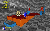
This month's mod is Super Ball Zone, made by a user named Mang. This level mainly uses a gimmick from Red Mountain Zone, being the "Rollout Rock". This is a round ball that the main character can jump on, then giving them full control of the rock. In the vanilla game, Rollout Rocks are used to travel on lava; the player also dodges streams of lava, bubbles of lava, and fire fly badniks (named Pyre Flies). This stage, however, instead uses Rollout Rocks purely for platforming. The stage is essentially a series of challenges which takes the gimmick to its extreme. You have bouncing on spring after spring on the rock. You have jumping off of the rock in midair. There's also a type of spring which can only be used by or when on a Rollout Rock, used for certain situations. In my favorite part of the stage, you start by rolling the rock into a set of spring, then jumping off of it before it actually touches the springs, then you jump on a different set of spring until you land back on the rock in midair, and then finally jump off it again in midair. While this may sound like something that you'd see in a Kaizo Mario challenge, the Rollout Rocks actually control quite well, allowing for these tricks to be easily accomplished. The level has frequent checkpoints, making the challenge fair. It's pretty short, though quite sweet.
My only major complaint is the visuals of the stage. The stage just doesn't look remotely natural, having wide open areas without much decoration and little to fill in the space, and the textures are the same throughout the entire level, leading to something which looks quite generic and doesn't have the same level of graphical variety that the main game has. The level is also better off with Sonic on his own, as noted by the creator; Tails can sometimes get in the way of the Rollout Rocks. This isn't a complaint, as this stage is clearly designed for Sonic and Sonic only. It's just something to note.
As a whole, this is quite an enjoyable stage. It's short, it's linear, but it takes a fun mechanic and uses its full potential. It gave me a solid ten minutes of fun for free, which counts for something.
World of Plight
Written by: Magolor04726 (talk)
(Special thanks to Hooded Pitohui for teaching me wiki coding, uploading my story when I’m late, and running the ‘Shroom in general! You’ve been a great help!)
Magolor04726
The time had come to tell the others what I had found. As I walked up and down the halls of Smash, I dropped notes in each Fighter’s room and reviewed what was soon to happen in my head.
The alley. Waluigi. The missing Fighters, even. Hopefully we’ll see the end of this horrible series of events soon.
The next day, I stood outside Smash on the lawn out back. A few Fighters had started to show up: Dr. Mario, Wario, Pit, and a few others. After a few minutes of bouncing on my heels, I decided to start. I stepped up on a nearby box and took a breath. “If I may have your attention, everyone,” I said, over the low rumble of the small crowd, my voice cracking during the “if.” I cleared my throat and tried again, steadying my breathing. “As you all surely know,” I continued. “numerous occurrences have happened recently, all of suspicious nature. Equipment from the hospital has gone missing, Ganondorf has lost some of his power to the point he can’t perform certain attacks, and King Dedede, Isabelle, and Luigi have all gone missing. Evidence would suggest that Waluigi is responsible for these events, along with some help from one - possibly two or three - other accomplices. Who they are and where everyone has gone remains to be seen.
“BUT!
“Today, I would like to announce that I have found something else, something we need to act on right away. Now, you may have heard that Waluigi was sighted shortly after I confronted him about his role in these events. One of Princess Peach’s Toad’s was fortunate enough to spot him, but wasn’t able to catch him. He disappeared down an alley around here and, on Halloween, Luigi was kidnapped and his costume was found near that very alley! I did some looking around, and I discovered something! If you will follow me, please.” With that, I hopped off the box and headed for the alley. There were about a dozen Fighters present, whispering amongst themselves. I turned into the alley with the dumpster and faced the group.
“Well?” Pit asked. “What’d you find?”
I turned to the wall to my right and scanned it, looking for a specific brick. “A puzzle.” I found the brick and used my fingers to pry it from the wall as the Fighters murmured in confusion.
“How does that help?” Meta Knight inquired.
“This brick,” I said, holding it up. “Is so loose, it comes away from the wall. That in itself isn’t special, unless you realize that this wall,” I continued, pointing to the dead end, “has a missing brick behind the dumpster.” I leaned behind it and slid the brick inside. “That hole is a key hole, and that brick is the key.” I explained. Suddenly, a low rumbling could be heard. The wall opposite of the one with the loose brick began to shake, the bricks coming loose and pulling themselves away. As they spun around, they realigned themselves in an opening just behind the wall. When the rumbling stopped, we were looking at a darkened set of stairs leading downwards. Before I could step inside, a sound played that made me jump. I stopped and listened to the whole thing. It was a familiar jingle. “That’s a clever touch,” I mumbled before turning to the group and holding up a flashlight. “Now, who wants to thwart some bad guys?”
We walked down the stairs, everyone following me. My flashlight beam lit the way, showing electric lights lining the walls that were broken or flickering.
“What is this place?” Brawler asked as we continued our downwards trek.
I looked through the window of a rusted door and saw several broken boards and a piece of yellowed paper that said “To Smash.”
“If I had to guess,” Link said, looking through another door, “this was once a storage place, but became forgotten over time.”
I shook my head. “Whatever it is, we should keep going.”
“Wait, you don’t know?” Wario blurted. “I thought you’ve been here before!”
“Um, well, no,” I confessed. “I haven’t been here before. I didn’t want to throw myself in harm’s way without someone at least knowing where I was going.”
Everyone seemed to grumble at this, so I simply swallowed hard and moved on. The stairs ended not much farther down and various doors stood ajar here and there, the handles broken off on all of them. Cocking my head, I could vaguely hear a dull thumping noise coming from deeper in.
Wario stepped to the front of the group and held up a hand, sniffing the air. I sniffed too, trying to figure out what he was smelling for. He walked a little further in, letting his nose guide him. “I smell…” he whispered. A snicker arose from the back of the group. “I smell garlic.” Everyone behind me rolled their eyes and sighed, but after I took a deep breath, I realized something. “Guys,” I said, turning around. “He’s right. Something smells of garlic.” Everyone slowly moved forward. We came to a larger passage, with several boxes stacked nearby. The thumping noise was definitely louder now, and it seemed to be coming from the next corner. Slowly, we approached the corner.
“WAIT!” Meta Knight hissed. We all turned to him and saw he had Galaxia drawn. “Be on your guard.” He hurried to the front and peeked around the box as the others drew their weapons.
“What is it?” Dr. Mario whispered.
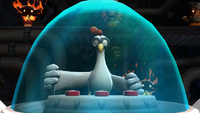
“It’s…” he said, staring at the source of the noise. “… a… chicken in a robot stomping on garlic burritos.”
Wario gasped and looked around the corner too. “My garlic burritos!”
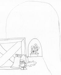
“Wait a-” I looked over a box that was at the corner and couldn’t believe my eyes. In a large open area, a large wooden tub sat in the center of the room. Several massive piles of tin foil littered the floor nearby and there, in the center of the tub, was Colonel Pluck, a resident of Donkey Kong Island, piloting the StompyBot 3000 in a trance. He was crushing what must have been hundreds of burritos underfoot. The mashed up food was fed through a tube in the side, which disappeared down a hall behind him. We all stared ahead, not believing our eyes. “And I thought it was crazy when he was stomping Donkey Kong’s bananas!” I muttered. Ducking down, I realized something. “Wario, I think this is where all your burritos have been going.”
“OK,” Link whispered. “We need a plan. Should we keep going?”
“Of course we should!” Dr. Mario answered. “All this leaves us is more questions than answers.”
“OK,” Mii Brawler said. “Then how do we get past Stompy?”
My face lit up. “Do you guys see those spikes on the underside?” I asked. “When he fought Donkey Kong, after attempting to stomp him, Pluck would pilot that thing into the air and the spikes would come loose and reveal chains underneath. DK grabbed hold of those and then starting beating on the bot. After a bit, the whole thing exploded and he flew the cockpit around. It’s a little tricky to time though.” I turned back to them. “That’s one way you could-” I stopped. Pit, Dr. Mario, Meta Knight, Kirby, Villager, Mii Brawler, Link, and Mr. Game & Watch looked back at me. Someone was missing… “Guys? Where’s Wario?”
A sudden revving sound pricked my ears and I turned just in time to see Wario’s motorcycle hurtling at Colonel Pluck and the StompyBot. “Oh- quick!” I yelled. “Get after him!” As the group pelted after Wario, I gave a sharp whistle and Dr. Mario, Link, and Pit, who were at the back stopped and looked back at me. I held up a hand to stop them and ran past them, beckoning them to follow me.
Wario’s bike flew through the air with him on it, straight for the cockpit of the StompyBot. Colonel Pluck looked up just in time to see the bike come flying towards him. With enough force to knock over a wall, the front wheel SLAM!med into the chest of the vehicle, causing the whole machine to rock. Colonel Pluck flew against the back glass before comically sliding down it. He quickly got up, adjusted his goggles, and threw two levers, igniting jets under the feet of the mech, which propelled into the air. At this point, Link, Dr. Mario, Pit and I had slipped by him and followed the tube down the hall behind him.
“That works,” I muttered.
We progressed further into the underground area. More doors that stood open lined the walls, as did a few flickering lights.
“Do you really think there’s someone else down here?” Pit asked.
I shook my head. “I hope there is, but at the same time…” I let my sentence go unfinished as we followed the tube of mashed up garlic burritos.
Eventually, we walked so far in that the sounds of battle had died away and the only thing we could hear was our footsteps resonating off the walls. The scent of something musky hung in the air, like something ancient had died down here, but it might have just been the garlic.
Suddenly, Pit stopped. “Do you guys hear that?” We stopped as well, listening. A mechanical whirr could distantly be heard. We tiptoed down the hall, totally silent. As we walked along, I noticed random pieces of scrap started to line the walls. Eventually, entire machines were cast aside, most missing components. “Doc?” I asked as I squatted in front of a particularly large machine. “Does, uh, this look familiar?”
He stepped over to me and gasped. “This is-a the missing hospital equipment!”
“Looks like someone’s been scavenging for parts,” I said.
“And they’ve been using the hospital equipment for… what?” Pit asked. Nobody answered. We kept walking.
A bit of light could be seen up ahead at a corner, and I turned off my flashlight. The whirr became more prominent in our ears as we peeked around the corner. A large room spread before us, the light almost missing the ceiling. Shy Guys, Waddle Dees, and several other kinds of minions bustled around, completing various jobs. The tube was fed towards a big container against a wall. Next to it was another container filled with a swirling blue liquid that resembled a lava lamp. Both spilled into a large vat, which was fed into an even bigger container in the center of the room. On the other side of the room, a large screen was visible. It rotated through displaying a list of the Fighters – and Dedede, Isabelle, and Luigi had X’s across their names – a screen of statistics of some kind, and a meter that was barely filled. In front of the screen a decent ways away stood an odd machine of some kind, with pipes and tubes leading everywhere. In front of the screen stood some sort of robot who was observing it. And there, next to him, stood Waluigi.
Hey guys! Thanks for reading my latest issue of World of Plight! And guess what! This is World of Plight’s first anniversary! Last year in February, this story got kicked off when Link wrote me my very first entry and that turned into the story I’m presenting here today! I would like to thank everyone who has contributed to the story with editing, writing, and general support! Thanks for reading, and I’ll see you next month for the continuation of this cliffhanger! Oh yeah, don’t forget to check out the Super Mario Boards where I’ve put up a special poster for this story, featuring the cast of the past year!
If you have any questions or leads for me to follow, contact me on the Super Mario Boards!
From the labyrinth,
Magolor04726,
Sleuth Supreme
Drawn and Pressed
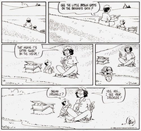
There is something comfy and wholesome about the comic strip Rose is Rose. This comic strip's focus on optimism could even been seen as a breath of fresh air compared to a lot of cartoons that focus on the pessimistic side of things. This unusual trait, especially in a modern comic strip, is even mentioned by Wikipedia[1]. Created by Pat Brady, this comic strip came to life in April 1984.
Similar to many cartoonists, the artist's well-known work isn't their first. Prior to Rose is Rose, Pat Brady had a short run with a comic strip on Graves, Inc. starting in the early 1980's[2], which is ironically a comic strip about the pessimism of the office environment with a tyrannical boss surnamed Graves and his sycophantic underlings in the titular company. Perhaps the lack of demand for pessimistic office life then (until Dilbert made it fashionable) is the reason the author worked on something that veers into the opposite direction to greater success. Interestingly, the author wouldn't mind continuing if the previous comic strip even had one newspaper picking it up[3], but perhaps it's for the best that it ended its life short.
The comic strip's primary characters include the titular Rose Gumbo, her husband Jimbo Gumbo, their son Pasquale and their cat Peekaboo. Rose is a mother who is shy in public situations, but is rather loving, pleasant to have around, and well-read. She also imagines herself as Vicky the Biker, basically her alter-ego who is adventurous and more daring and looks different to the reader due to the biker attire and rose tattoo. Jimbo is basically the supportive husband who is a handyman, and one interesting thing about him is that he is into women on the bulky side, to Rose's dismay when he would encourage her to get heavy. Even then, the couple is clearly in love with each other. Peekaboo is the house pet of the Gumbo family, notable for the diamond on her forehead, and is essentially a standard cat with some quirky behaviours such as an affinity for minty-fresh breath.
Special mention goes to Pasquale, who is named after the author's nickname given by a family priest, a name that is in turn from a character in a radio programme Life with Luigi (not THE Luigi, obviously). Given how Pasquale is a child, he has simple likes and fears; likes such as reading comic books with 3-D glasses and learning as evidenced by liking school unlike his other classmates; fears that include the monster in the closet and the bathtub. One of the notable things about Pasquale is that he has a guardian angel who looks like him who he interacts when he's basically alone, and the angel could even transform into a giant warrior whenever some sort of disturbance happens. There are quite a few other characters besides them, including Rose's mother who basically looks like Rose but plump, Pasquale's selfish cousin Clem (the closest thing this comic strip has for a villain), the next door neighbours Corky & Abby and their infant daughter Mimi, and Ms. Harris the teacher.
One of the biggest highlights in this cartoon is the aforementioned positive vibes within its universe, where innocence is abound. Indeed, typical uncomfortable or dark subjects are not touched upon in this comic strip, nor do life-changing calamities happen to the characters. I suppose the format of a comic strip is quite suitable for providing bite chunks of positivity as to not be overwhelming. Another notable thing about this comic is the vivid imagination by the characters represented in visual form. For example, when Rose and Jimbo are experiencing their inner child, they would be depicted as little children instead of the adults they are. Another example is when Rose is feeling grumpy, she would be depicted as being alone in the "dungeon of resentment". The imaginative scenes are best represented by not only Rose, but also Pasquale. One such activity that best exemplifies this is when Pasquale rides the "dreamship", a ship he rides in when he dreams (hence the name), and he would travel to all sorts of places while not being actually there. One thing is quite clear: the detailed artwork from the earlier comic strip carried over to the new comic strip, and the cartoon is better for it.
If you look back at the archives of this comic strip, it should be pointed out that early on in the comic strip, the characters are portrayed as younger: Pasquale can only talk in phonetics ("seema freggelz?" instead of "see my freckles?") which is a sign that he's too young to articulate proper words. Plus, Rose told Pasquale that she was 32 years old[4]. Later on, Pasquale is able to properly say words and go to school, and the neighbour child Mimi talked in phonetics (previously she talked in "peeps").
After about 20 years since the comic strip began, Pat Brady must have felt ready to move on from the daily commitments in working on this comic strip, which include promoting the comic strip, working on books and merchandise designs for his cartoon. As such, a successor was appointed to continue drawing for this comic strip since 2004, who is the author's friend named Don Wimmer. Wimmer is a seasoned artist, for he drew the Ripley's Believe It or Not! comic strip for 14 years prior to taking over this comic strip[5]. The art style transitioned decently, but I can't help but notice that as time passes by, the artwork become much simpler. I suppose this is rather noticeable when I read a lot of these comic strips in a short time, and it's also quite common among artists to refine their art style when they're doing it for years.
At times the positivity could feel like too much, but I can appreciate a comic strip that embraces the positive aspect of life. In a way, this reminded me of what I liked about Garfield's decision to keep away from politics or social commentary, which is a way to give a strip an identity as they don't conform to standards. It helps that the cartoon is written well so that it doesn't feel like the smiles or love is used as a crutch. Indeed, I kind of preferred it because Rose is Rose ended up being a much better read and had left an impression on me when I was younger.
Rose is Rose's comic strips can be read at https://www.gocomics.com/roseisrose. The archives may only go back to 1986 and not all Sunday comic strips are available, but it's the best collection online we could get.
Thank you for reading.
References
Site Seeing
Written by: Lakituthequick (talk)
Hello dear readers and welcome to Site Seeing, in which I'll go over some of the websites Nintendo releases to inform the public about their games and series!
This month, a site that is very Nintendo, but not actually by Nintendo! It is the Super Nintendo World site from Universal Studios Japan!
Overview
This site is set up differently from traditional landing pages. Instead of a page you scroll down for info, this site lets you fly through Super Nintendo World to show the main hotspots and features. It lets you do this by either scrolling, or swiping horizontally.
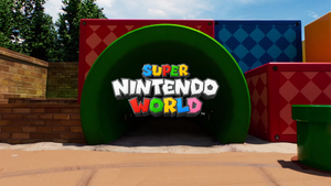
Let's start at the beginning though; we start outside of the park area, in front of the Warp Pipe used in earlier promotional material. We are then immediately warped inside.
As of writing this, the experience is interrupted by a modal window informing the visitor that the grand opening (originally at 4 February) has been postponed, which is because of the current COVID-19 measures in Osaka, Japan.
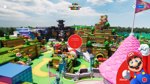
This is where the interactivity begins. We start with an overview of the park, featuring Mario artwork. By scrolling or swiping, the camera pans over to the following focus of the tour.
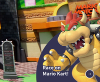
In order, we visit the Mario Kart: Koopa's Challenge (Bowser), Yoshi's Adventure (Yoshi), the world being a playground, showing the Piranha Creeper (Bowser Jr.), restaurants, showing Kinopio's Cafe (Chef Toad), and gift shops, showing 1-UP Factory (Princess Peach), before warping around to the overview.
Each of these hotspots have a button in the bottom right, which can be clicked or tapped for more information about them. The pages they lead to are more traditional information pages which you can scroll down, and on the bottom is a large button to the next page.
The first of these, the about page, could be considered the 'regular' version of the site's home, as it features a blurb for and link to all other pages along with the character art listed above.
This page opens with a big image of the park, looking down from the north. Scrolling down, we encounter the park slogan #WeAreMario, a welcoming message with Mario, and then a few videos. We then come across a bit talking about fast entry tickets.
The following three parts introduce the two attractions and the interactivity of the park itself, each with a big image of the attraction and aforementioned little blurb and character.
The last two parts are again for restaurants and merchandise. These are a bit more minimalistic, featuring their character alongside a smaller image of food or merch.
The next page is all about Mario Kart: Koopa's Challenge, which opens with a big impression of the attraction. Underneath that, there is a bit of information about the ride and some height requirements, decorated with art from Mario Kart 8, interestingly.
It then repeats the information about tickets, before showing a gallery of the queue, followed by advertising Power-Up Bands for an enhanced experience in the attraction.
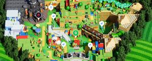
The last thing on this page before the footer is an interactive map of the entire park, with markers for attractions, food, and merch. Beyond showing the locations of these things and their names, the map doesn't provide info or links to info.
The third page is for the Yoshi's Adventure attraction. This one follows much the same formula as the one for Mario Kart, but of course with more fitting imagery. Instead of a gallery of the queue, this one features a generic treasure map presented by Captain Toad.
Next, a page titled "The whole world is your playground!", or "The whole land is your playground!", depending on where you read. This page tells more about the interactions visitors have in the open area of the park. It features a model of the park, a gallery of interactive elements in the park, and another reminder for the tickets.
More prominently present are more information about the Power-Up Band, with images thereof, and the official app for Universal Studios Japan, which has its own section for this park in which one can see their progress. The page then goes into the challenge Bowser Jr. provides, who has stolen the Golden Mushroom. This challenge consists of collecting five keys, which in turn open up a final confrontation.
On the penultimate page, we learn about Kinopio's Cafe. This page has a unique layout showing a selection of foodstuffs available in the cafe. Of course, everything is Mario themed. Following that is info on other facilities with snacks, such as popcorn, noodles, and milkshakes
Finally, merchandising! No theme park can go without. A selection of goods is shown here, but also noted is where the Power-Up Bands can be purchased.
Design
Super Nintendo World represents Mario, a very colourful series, and as such there are quite a few friendly colours in use. Upon entering, red is the primary colour, but as we continue, we see colour more fitting to the attractions and characters representing them. Yoshi's Adventure uses green, Bowser Jr.s playground uses blue, Chef Toad tomato red, and Princess Peach uses pink. Even Bowser, who uses a dark colour, still has this be an inviting low-saturation version of blue.
The site has a loading screen, which shows how much of the home page has loaded. For this it uses a circle with Mario's face in it, which fills up as the site loads. For engagement, a sliver spins around this circle and the park slogan is shown.
This same loading indicator bar slogan is used when all follow-up pages load as well (with their respective character), but smaller and located in the bottom right of the screen.
The main gimmick of the site is of course the flyover through the park on the home screen. This is a pre-rendered video, which plays and loops on the right times. It is entirely CGI, as the park is seen from angles that would show roofs and contraptions if seen in the real world.
Because of the looping, everything in view has to move at the same speed, which caused a few liberties, such as the speed and amount of vehicles in Yoshi's Adventure.
A few other tricks are used as well, for instance, the angle of the sun changes for each attraction to make it look better. This is mostly a subtle transition so you don't notice, except for the transition between playground and Kinopio's Cafe.
The video looks very good, a lot of attention was put into it. The only drawback is the fairly static movements of the animatronics; this may simply emulate their actual moment in the park, but looks off here.
Overlaid on the video for each attraction is a bubble with a character and text, clicking or tapping each leads us to the page with more info about the attraction. When we click, the bubble expands to fill the screen with a solid colour, and when the page has loaded this colour wipes up.
When we want to go to an attraction on the homepage that is not the next one in the cycle, the screen does a circle wipe to the colour of the destination, before opening again there.
The pages themselves are laid out more traditionally, with a couple sections of information and graphics. Sections are separated either diagonally or horizontally.
As mentioned earlier, all pages start with a large image. This is followed by a logo and tagline, in a section with the background in the corresponding colour.
Plenty of artworks used on the site use a bit of a parallax effect when we scroll, giving depth to them. This is most notable with the vehicles used in Mario Kart and Yoshi's Adventure.
There are also various buttons to other pages. These use the colour of their destination. When hovering over them, they fill up with white; a simple but neat effect.
On mobile screens, the home screen has been adjusted to have the half circle button fill up the bottom of the screen, instead of being in the bottom right corner. Additionally, the visitor can swipe on touchscreens (not just on phones).
As expected, elements that would be side-to-side on larger screens are now underneath each other. Buttons are slightly larger to make it easier to touch them.
Tech
This part may not be of interest to everyone, or may you even understand any of it. But it can be interesting to some people who are curious about some of the technology used to create this site.
In summary, this is a single-page application built in Angular, uses a single pre-rendered video file for the overview flyover, and is hosted with Akamai Technologies.
Let's first talk about single-page applications. I've previously mentioned single-page applications, or SPA for short, in my article on the Super Mario website. What a SPA does is make sure that you only load a site or application once, and don't need to load new pages afterwards as all the resources are already there. While you may think you are going to a new page when you click menu options or links, the page only needs to show different content, without needing to load it.
Now, this is not entirely true for this website. This site primarily uses the technique to provide smooth transitions between pages, but still needs to load images before showing the new page.
Now about Angular. Angular is one of several popular SPA frameworks. To enable clean code, it separates components, presentation, logic, and services into separate files and folders. You would use services to get data from servers for example.
The park flyover consists of a single pre-rendered video file, with a length of 1 minute and 18 seconds, at 24 frames per second. Or well, single, there is a landscape variant intended for desktop visitors, and a smaller portrait version for mobile, which share the same length. The one used depends on the aspect ratio of the browser window.
Using a video file instead of frames or rendering the scene live is very efficient; the file is optimised for downloading, and rendering and buffering is all handled by the browser, which ensures that the thing displays smooth, even on mobile devices. Regardless of the method, it does come at the cost of a large file to download; the desktop file is 28.5 MB, the mobile one is 5.3 MB. Considering the internet speed and data plans the intended audience has, this is probably forgivable though. When the loading takes long, the site does offer a button to go to a light-weight version instead, which uses static images instead of a video.
To actually properly play the right sections of the file, there is an index of pages in the code with start and ending timestamps for each. When the video has reached the end time, it is immediately set back to the start time, causing the scene to loop. When the user goes to the next section, it is instead set to the end time, and plays from there; the times between the last section's end time and next section's start time are when the camera moves to the next spot. The cycle then repeats again.
Going to a previous scene obviously doesn't have footage, which is why it behaves the same as going to any other scene.
The website is hosted using services from Akamai Technologies. Akamai is a cloud hosting company, and has among others a content delivery network, with servers all across the world. This means that while the domain ends with .jp (for Japan), the server you are connected to is probably in your country or just a few over. This increases the speed with which the site loads, as the distance is smaller. Besides simple hosting, they offer security, performance and media hosting.
An example of media and performance that this website uses, is the Image & Video Manager. You'll see that there are a lot of artworks on this website; depending on which browser you use, you may receive either a PNG or a WebP version of it. WebP is a more modern image format which compresses better than PNG, although it can do this both lossless and lossy. Unfortunately, this site's WebPs fall in the latter category, meaning that the quality is lower than what PNGs would have offered.
Conclusion
Initially, I had to get used to this site. It was a bit extra, so to say. However, the more time I spent on this site, the more I started to love it. Now, I'm in love with it. It's a flashy site yet fairly performant, and gives a good impression of the park. I already wanted to visit the park before this site launched, but now I definitely want to go. Mission accomplished USJ, well done!
That concludes this edition of Site Seeing! See you again next time!
| The 'Shroom: Issue 167 | |
|---|---|
| Staff sections | Staff Notes • The 'Shroom Spotlight |
| Features | Fake News • Fun Stuff • Palette Swap • Pipe Plaza • Critic Corner • Strategy Wing |
| Specials | Feedback Survey • Super Mario 3D World + Bowser's Fury Photo Contest |
