MarioWiki:Featured images: Difference between revisions
Damariogamr (talk | contribs) |
(→Oppose) |
||
| Line 648: | Line 648: | ||
====Oppose==== | ====Oppose==== | ||
#{{User|Raphaelraven497}} Quality is not good, slightly faded, and it's a bit too small. | #{{User|Raphaelraven497}} Quality is not good, slightly faded, and it's a bit too small. | ||
#{{User|Lemmy Koopa Fan}} This has been nominated already... and also per me at that time (I opposed) and Raphaelraven497. | |||
====Comments==== | ====Comments==== | ||
Revision as of 23:00, April 6, 2010
At the Super Mario Wiki, Featured Images are those quality, intriguing, witty, provocative, rare, important, and otherwise simply interesting images that can be found throughout the site's articles. Users are encouraged to submit and vote on nominations for the Featured Image displayed on the Main Page. Every week (on Thursdays at 17:00 GMT), a new image is selected to be featured. This is done by subtracting the number of oppose votes from the number of support votes in each nomination - the image with the most "points" at the end of the week will be featured. Any image with a negative amount of points at the end of a week (that is a nomination with a majority of opposes) is removed from the selection process. The only condition for nominated images is that they must be in an actual mainspace article on the wiki. No personal images or images from non-mainspace pages are allowed. New image nominations can be added to the Featured Image Nominations section below.
Archived nominations of images that were featured in the past are found here.
A gallery of all Featured Images can be found here.
This page follows the No-Signature Policy.
Example Nomination
Description of Image (Ex: 1-Up Mushroom from New Super Mario Bros.)
- Subject: Main subject of image; include a link to the article it is included in. (Example: 1-Up Mushroom)
- Nominated by: If you nominate the image, place your name here.
Support
Oppose
Comments
Place some comments here if you want to explain why you think this image should or should not be featured. Note: it is very important to include <br clear=all> at the end of the comments section!
Featured Image Nominations
Krem Quay
- Subject: Artwork of Krem Quay from Donkey Kong Country 2: Diddy's Kong Quest
- Nominated by: Fawfulfury65 (talk)
Support
- Fawfulfury65 (talk) Awesome picture! Nice size, and a lot of detail. I LOVE this picture!
- I was wondering when a DK snapshot would appear! Lu-igi board
- Lemmy Koopa Fan (talk) Interesting, high quality, good colouring... need I say more?
- Zero777 (talk) I am Zero! Not bad, it's a nice big image. Zero signing out.
- YoshiDaisyfan1 (talk) Per everyone. Dixie looks adorable btw. ;D
- Panchito It's good, despite the fact it's yet another DK image.
- Koopsrules (talk) Very excellent picture. Truly unique!
- Papero (talk) DKC images are a rarity. This one's rather interesting.
- KS3 (talk) Looking at the image again, the picture doesn't look faded at all, and the characters don't look weird.
- LeftyGreenMario (talk) It's not faded anymore! What's wrong with my eyes!!!??? Anyway, the "fading" was really letting the picture down. Since I see no more fading, the picture is great (good quality, colorful, no white backdrops, pretty interesting). P.S. Diddy Kong looks like he is made out of wood. Check out his wrists. :P
- Raphaelraven497 (talk) I change my vote. It's a good pic. BUt why is Diddu wearing a fur sweater?
- Nintendude (talk) Great image, very good use of backdrop and I am a fan of donkey kong.
Oppose
- McQueenMario (talk) - I just don't like it.
- MATEOELBACAN (talk) - Per McQueenMario...
- lpsc00l (talk) I agree with McQueenMario, The animations are just real bad. they both look like demented muppets!!
- Marioguy1 (talk) - Per LGM (in the support section). I don't realize why people support if they can see any problem with the image. These images are no different from FAs - they are to be the best on the wiki. If you can find a single problem with the image, oppose as it will not properly represent the wiki's quality and that will defeat the entire purpose of having an FI system in the first place. For example, in this image, the colors are faded and it basically represents no action! Why feature it? It has problems and does not properly represent the images of the wiki. There are many other votes like this strewn across the page (and the archives) that support just because a certain character is in it or because everyone else supports. That is not a good thing to do and I hope people stop doing it.
- Mariofanatic64 (talk) I felt a sudden urge to vomit
- Commander Code-8 (talk) Not good quality... That's just one in the list
- Beecanoe (talk) I could nominate a picture of my poop and I bet it would do better! It looks so strange.
Comments
I don't know what to say about this picture. It's good quality and a nice size, but it's faded and IMO looks boring. Plus, why are Diddy Kong and Dixie Kong always have the same expression, no matter what the situation? BabyLuigiOnFire (talk)
@Raphealraven497 - Umm... It actually has many dark colors and shades of green to fit into the swampy theme. Brown isn't really the main color of this picture. Fawfulfury65 (talk)
Hmm, can't decide. I don't like the color scheme, but the quality is good. Karinmij (talk)
MG1: Woah, calm down. I think these people think that the flaws are too minor to be considered, and it still looks great on the main page. Maybe other people won't see it as faded. Maybe they will. But still, no one is forced to add a reason why they like it. I don't know why, but rules are rules. BabyLuigiOnFire (talk)
- Sorry, I just have seen so many votes where the reason gives a bad point and for some reason, people think that these are any different than FAs. FIs represent the best images, FAs represent the best articles. In the FAs, people won't let an article be featured because there is a tag on it, here they're letting something with a logo go by. In the FAs, people won't let an article with no images be featured, here they'll let an image with no background be featured. Those are both practically the same thing yet people think of it differently because of the rules. IMO, if they can't put a good reason - don't vote (like I did for the hand-drawn one) Marioguy1 (talk)
I don't understand what's so bad in this image. It doesn't look faded at all to me either. Fawfulfury65 (talk)
- Go here and look for a slight mist all over the picture - that's not mist, it's fading. Marioguy1 (talk)
Too bad Featured Images cannot be improved easily, unlike articles. One has to find a better picture and reupload that. Otherwise, no one can really improve an image. LeftyGreenMario (talk)
I still don't see where it fades. I don't know where else to get a better version or anything either. Fawfulfury65 (talk)
@MarioGuy1: There is no such thing as a "Perfect Image". People are allowed to nominate whatever they want. Garlic Man (talk)
- First off, "Perfect Image" was theoretical - it wasn't meant to mean a perfect image. I meant it should be a very good image with almost no visible problems, good size, no logo, not blurry or misty, a nice background, lots of color and action, etc. And Secondly, I never said they weren't. I asked them to look at the images before they nominate them to make sure that they really think the pictures are as perfect as they can get them and not just do it because they like the image. I agree liking the image is a nice thing but chances are, if there's a problem but you like it, other users won't. Marioguy1 (talk)
Don't know if it helps the nomination, but I've uploaded a bigger version of the image. Grandy02 (talk)
Bowser Striker
- Subject: Bowser's artwork from Mario Strikers Charged Football.
- Nominated by: Fawfulfury65 (talk)
Support
- Fawfulfury65 (talk) - Although this is character artwork, its big, high quality, and seems to have a lot of action in it! It's also extremely detailed and you can tell it was drawn by a pro artist!
- Lu-igi board lol at bowser! truly the coolest footballer the world has ever seen :P
- Lemmy Koopa Fan (talk) I don't know why, but Bowser looks mighty aerodynamic when he's like that.
- Time Q (talk): I like it. Great quality.
- Zero777 (talk) I am Zero! Ok, I guess I'll support it, it's a nice big image. Zero signing out.
- lpsc00l (talk) Sure it is a character artwork, but it is a character that stars in most, if not, all Mario games. And strikers artwork is nicely drawn and creative which fits the descriptions of "FEATURED IMAGE". Oh, Lemmy Koopa Fan, nice use of the word "aerodynamic"!
- Karinmij (talk) High quality, in my opinion almost as good as the picture from this game that has been featured last year's august.
- Dark boo (talk) this is just plain awesome looking
- Dark Bowser (talk) Wow..... I support....
- Gamefreak75 (talk) Extremely detailed artwork.
- Marioguy1 (talk) - The detail in this is nice and the action, epic!
- Pie Shroom (talk) Per all.
- MATEOELBACAN (talk) Per Time Q in the comments section, now I see how nice it is :F.
- KS3 (talk) Per all.
- FireBabyLuigi11 (talk) This image is so cool! It shows what Mario Strikers Charged is about:violent soccer.
- Beecanoe (talk) I could probably think of a few reasons to oppose this, but it just looks too cool to do so!
Oppose
- BabyLuigiOnFire (talk) Though it is about everything Fawful said, it's still just single-character artwork.
- McQueenMario (talk) Per BabyLuigiOnFire.
- Raphaelraven497 (talk) Per all.
- Panchito Wow, you people would oppose any other single character artwork but when it's Bowser it's good?
- LeftyGreenMario (talk) Ew. It's just single character artwork. Why was Luigi put down, but this one, a lot of people seem to support? Not a very interesting picture, IMO. Per all.
- Papero (talk) Despite being called "epic" and "detailed," there's nothing going on in the picture, and it's hardly unique since everyone other character shares the same artwork style.
- Garlic Man (talk) -- Great image
- Yoshi Koshi Moshi (talk) although the art style is and Bowser is awsome but as per above it's only a single character artwork.
- Nintendude (talk) I think there can be a more efficient image of bowser.
Comments
What's wrong with it being simple character artwork? It meets the requirements to be a FI, doesn't it? Fawfulfury65 (talk)
At the Super Mario Wiki, Featured Images are those quality, intriguing, witty, provocative, rare, important, and otherwise simply interesting images that can be found throughout the site's articles.
The ones in bold is in where the image you nominated doesn't really meet its requirements. BabyLuigiOnFire (talk)
Well, it is simply interesting and intriguing to me. As for rare, its uncommon to see such a unique art style. I'm not sure if any of the FIs are much of witty, though. Fawfulfury65 (talk)
Eh, we have different opinions, so it's ok :) BabyLuigiOnFire (talk)
@Panchito: No. It's good because it's a great drawing style, it's extremely detailed, the glow of the football looks brilliant, there's not even just white background. It simply looks good. Time Q (talk)
- Actually, there is a white background, but the tan coloring also makes up the background. Still, I think it would be perfect if there were more characters. BabyLuigiOnFire (talk)
Garlic Man, your comment in the oppose section says "Great image". KS3 (talk)
- This is the second time he made that mistake. Maybe it's not a mistake. Maybe he lives in Opposite Land! LeftyGreenMario (talk)
- Or maybe it's the sarcasm chasm he's in. BabyLuigiOnFire (talk)
- Don't worry, I fixed it. Rabidchomp (talk)
- Or maybe it's the sarcasm chasm he's in. BabyLuigiOnFire (talk)
Commander Code-8 (talk) I'm completly confused about all this single-character artwork thing so I'm just removing my vote and leaving myself out of this one.
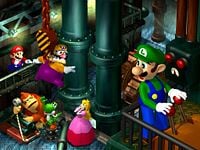
Luigi's Engine Room
- Subject: Luigi and friends in Mario Party.
- Nominated by: Fawfulfury65 (talk)
Support
- Fawfulfury65 (talk) This image is incredibly huge, detailed, and interesting. I'm not sure why Mario would have the guts to save Wario there, but it's a pretty nice picture. Also, even if you're "sick of MP images", does it really matter? We're paying attention to the quality and creativity of the picture and all that, not what game it was from!
- Baby Mario Bloops (talk) - Per FF65 in the comments and the fact that the MP1 groups pictures are amazing!
- BabyLuigiOnFire (talk) I don't care if it's ANOTHER Mario Party image; they're all good (except Wario's Battle Canyon and Mario's Girly Rainbow Castle)
- Lemmy Koopa Fan (talk) Per Fawfulfury65. I don't care what game it's from. As long as I like it!
- Zero777 (talk) I am Zero! Well I wasn't sure to post this when I posted several MP1 images but this one is good. Zero signing out.
- Marioguy1 (talk) - I would per someone but nobody so far has put up a reason. You people spoke about how you don't like it when people put up dumb reasons? Well so far there are no reasons save for "It's Good/Nice". I think the quality is surprisingly good for an MP image where most of them have DK with a deformed face and Peach's red+pink dress is less prominent in this one.
- LeftyGreenMario (talk) Panchito: Mario Party 1 images are awesome. This picture has great quality. It's colorful, big, and nice to look at. If you hate Mario Party images so much, try finding a much more awesome picture in the wiki.
- Pie Shroom (talk) What the- I could have sworn I put my vote under the support section. How'd it end up in oppose? Well, per all.
- KS3 (talk) Per all.
- Tucayo (talk) - Remembers me the Truoble Center... RIP
- Beecanoe (talk) This image shows the whole playable cast of Mario Party in one of the party boards. Good image!
Oppose
- Panchito Seriously? Quit suggesting Mario Party 1 images, we have featured numerous group images from this game already.
- Lu-igi board I'm afraid these mp pics are getting worse....
- Raphaelraven497 per Lu-igi Board
- MATEOELBACAN (talk) Another MP Picture with werid characters faces...
- lpsc00l (talk) OMG!! what is with these bad MP pictures!!! This one has to be one of the most demented yet!!!
- Commander Code-8 (talk) Looks too pixelated in the size it would be used in
- FireBabyLuigi11 (talk) I just don't think this would be a good FI.
Comments
@Panchito: Did you even read my support? We don't feature images because of the game, we feature it because it's interesting, creative, high quality, anything, but not what game it's from. If this image were for a different game, would you still oppose? Fawfulfury65 (talk)
The reason why we nominate to feature them is because they are all awesome to look at. BabyLuigiOnFire (talk)
Panchito, your oppose is invalid. The source of the image, as long as it is official, has no criteria for becoming featured. Garlic Man (talk)
- Actually, Panchito's vote is valid; no one is forced to give a reason. I, though, dislike it when people give out a stupid reason why they hate it. BabyLuigiOnFire (talk)
- That's stupid... his vote doesn't even say WHY he doesn't like it, just that he's sick of MP images. That's the worst possible reason you can give and it's really more of a fan vote. I think I should make a proposal on that, but I have a feeling it'll just be brought down for some random reason. Fawfulfury65 (talk)
Guys, please stop opposing images just because they're Mario Party. Pie Shroom (talk)
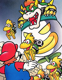
Mario vs. Bowser
- Subject: Mario fighting Bowser and Mecha-Koopas in Super Mario World.
- Nominated by: Garlic Man (talk)
Support
- Garlic Man (talk) -- Great quality and size, depicting a great moment in Mario's history.
- MATEOELBACAN (talk) One of the best SMW pics, a great moment in the Mario series and it's a lot colorful.
- Lemmy Koopa Fan (talk) Good quality, interesting, epic... need I say more?
- Lu-igi board I can imagine it in motion
- Time Q (talk): Yes, I'm biased when it comes to SMW pictures.
- Grandy02 (talk) Great moment of a great game.
- Papero (talk) This was back when the artwork wasn't so noticable, and I like that.
- Tucayo (talk) - SUch great memories.....
- Beecanoe (talk) Image from a good game of an epic battle. One of the best!
- nintendude (talk) I am both a huge fan of both super mario world and hand drawn mario artwork. I think this would mke a great featured image.
Oppose
- Fawfulfury65 (talk) Mario looks a little bit goofy and there really isn't that much color. Too plain for me.
- BabyLuigiOnFire (talk) The shading is awful. I mean, the Koopa Clown Car is all shady and stuff, but Bowser isn't? I don't think it's colorful either. The majority of this picture is gray and beige, which are Toadworth's favorite colors (boring). I think it's also boring overall.
- Marioguy1 (talk) - I'm afraid I must vote oppose. While the colors are nice I think they're a little too pale and honestly, I just don't like the weird animated Bowser and Mario...
- lpsc00l (talk) ehhhhhh.... It not my favorite.
- Zero777 (talk) I am Zero! This was already nominated and turn down in the past. Zero signing out.
- KS3 (talk) Mario is too fat, The Mecha Koopas are too fishy, The Koopa Clown Car is too shady, The background is too gray, and Bowser is too Bowser.
- Commander Code-8 (talk) I change my vote. I realise I don't like drawn images.
- FireBabyLuigi11 (talk) It looks terrible. Bowser should be as shady as the Koopa Clown Car and Mario looks fat and it doesn't look very good.
- Raphaelraven497 (talk) Bye bye!
- Damariogamr (talk) The Clown Car gets shaded but not Bowser?!! What the heck?!!
Comments
Wasn't this put down one time? LeftyGreenMario (talk)
- Yes it was, though that doesn't mean it can't be featured some time later. Just look at the presumable next FI. Time Q (talk)
Nice quality, but the picture is slightly faded. There is also something about this picture I don't like, but I'm not going to oppose. LeftyGreenMario (talk)
@MarioGuy1: It's a still image. They aren't animated ^^;; --Garlic Man (talk)
- No, I mean that's how they look when they're animated. Mario's too fat and Bowser's just not evil enough. Marioguy1 (talk)
- I guess this is based on your imagination then. BabyLuigiOnFire (talk)
@KS3: Bowser is too Bowser? Hmmm... that doesn't make much sense. Lemmy Koopa Fan (talk)
@Raphaelraven497: What do you mean by "Bye bye!"?
— The preceding unsigned comment was added by Lemmy Koopa Fan (talk).
- Probably that the image will be gone by Thursday if no support votes come in until then. Time Q (talk)
- Actually, if there's no more support or opposes by Thursday, it would still stay since it's a tie. --Marcelagus (talk)
The Kong Family
- Subject: The Kong family from Donkey Kong 64.
- Nominated by: Fawfulfury65 (talk)
Support
- Fawfulfury65 (talk) Extra big and detailed pic of the Kongs. I have it as my desktop wallpaper ;D
- BabyLuigiOnFire (talk) Super detailed (look at the fur, you can see every little bit of it), plus awesome resolution. It also came from my favorite Donkey Kong game (it's the only one too, so it's my least favorite as well), Donkey Kong 64, which makes this picture more awesome.
- Raphaelraven497 (talk) The DK pics are getting better. i like it.
- Lemmy Koopa Fan (talk) Per all.
- Lu-igi board i like this alot
- LeftyGreenMario (talk) Great resolution and detail. The picture is also filled up with color. I say this is FI worthy.
- Marioguy1 (talk) - A non-blurry kongs image!
- PT PRANA (talk) - There's an orangutan, so its got to be a yes!
- Yoshi Koshi Moshi (talk) - I really like this image. It's not very popular.
- KS3 (talk) Per all. except the one on the top right corner
- Beecanoe (talk) The only image from DK64 that would be better than this would be the boxart in my opinion.
Oppose
- MATEOELBACAN (talk) I just don't like the Kongs (not Diddy and Donkey) characters faces :/...
- Garlic Man (talk) -- I like this image. Nice and colorful.
- McQueenMario (talk) - Boring.
- Commander Code-8 (talk) Too Dark in some areas
- lpsc00l (talk) God no!!! They look like cheap McDonald toys!! I don't like it at all!!!!
Comments
Garlic Man: If you like this image, why do you oppose it? BabyLuigiOnFire (talk)
- Fixed. Rabidchomp (talk)
@KS3: Why are they smiling? Wouldn't YOU smile if you were in a group picture? Lemmy Koopa Fan (talk)
- I said Smiling Weirdly. Toad smiles weirdly too. KS3 (talk)
- Sorry, I missed the word "weirdly" :/ Lemmy Koopa Fan (talk)
Blooper Squirting Luigi
- Subject: Blooper squirting Luigi in Mario Kart DS.
- Nominated by: McQueenMario (talk)
Support
- McQueenMario (talk) - I love this image for a few reasons. One, it's funny. Two, you don't see it very often. And Three, it's just plain awesome!
- MATEOELBACAN (talk) - I like it, colorful, funny and high quality.
- MeritC (talk) - Per all.
- Zero777 (talk) I am Zero! Nice image though I never saw this one it's awesome. Zero signing out.
- KS3 (talk) This is a great picture! Perfect picture, good resolution, no logo, not boxart, etc. Lol luigi - he is getting squirted by a blooper.
- Papero (talk) Luigi, living up to what he's made for: getting the short end of the stick.
- Raphaelraven497 (talk) I dont know why, i just like it
- Mariofanatic64 (talk) I think the white background just works. It's also got that 'Luigi comedy' that Nintendo have been doing a lot in the last few years...
- tonym101101 (talk) Per all.
- Bowser 5 (talk)This is Funny!Good AND detailed.
- FireBabyLuigi11 (talk) HaHaHaHaHa(etc.)!It's funny and it pwns!A little plain with the white bkgd,but still awesome.
- lpsc00l (talk) I love this picture!!! It is soo funny.When you actually look at what is going on, you don't even notice the white background!!!!
Oppose
- Fawfulfury65 (talk) Its just too... plain.
- BabyLuigiOnFire (talk) I would like this picture if (1) there was a scenery, (2) it is a JPG file instead of a PNG so you can have more resolution, and (3) if Luigi didn't look crazy and get blinded by super glue from that Blooper.
- Lemmy Koopa Fan (talk) White background... and I think Mario, not Luigi, looks weird in this.
- Pixlfreak (talk) there should at least be scenery
- Lu-igi board at first I couldn't even make out blooper
- Homestar Runner (talk) Per all.
- Commander Code-8 (talk) A REAL backround would be nice
Comments
*rolls eyes* About how many pictures nominated are there now that has Luigi getting beaten up, looking stupid, or the like? There's that avalanche one, Luigi's mansion, the Mario Party beach image, Sweet Basket, the Melee picture (IMO), and now this one. I think Nintendo maybe just likes seeing Luigi having all the bad luck. BabyLuigiOnFire (talk)
- Says the user, named 'BabyLuigiOnFire'! Waluigi Guy (talk).
- What "Melee picture"? Also, the reason why Luigi is like that in all the pictures is because that's the sort of character Luigi is. Cowardly, weak, etc. Even in the Mario Kart Wii intro, he's seen getting hit by a blue shell right as he gains first place. He isn't what you would really call "Glorified". Garlic Man (talk)
I had wanted to nominate this picture, but I had a feeling it would be put down because of "a lack of background" and some variation of "luigi has bad luck." (And BiscuitLagoonOnFire, Luigi didn't look stupid in the Melee group art. He just looked like a wacko. But not stupid.) LeftyGreenMario (talk)
- ^That's just IMO, genius. GM: I don't think Luigi's that weak. Even if he was weak and cowardly, I really don't think he deserves it. BabyLuigiOnFire (talk)
Is this going to turn into a war just like Avalanche!? LeftyGreenMario (talk)
- No. Avalanche! only has one vote. KS3 (talk)
Gangplank Galleon
- Subject: Gangplank Galleon artwork from Donkey Kong Country 2: Diddy Kong's Quest.
- Nominated by: Raphaelraven497 (talk)
Support
- Raphaelraven497 (talk) i love it!!!!!!! Big, colorful, great all-around DK image, and it is NOT FADED!!!!!! DK images are running out, and this one is great!!!!
- Time Q (talk): Wow. Awesome quality. I support despite the fact that all the characters are on the right side of the picture.
- Lemmy Koopa Fan (talk) Per Raphaelraven497.
- Fawfulfury65 (talk) I was thinking of nominating this, but I actually thought that other people wouldn't like it. But whatever, its a nice pic.
- Lu-igi board yay
- Grandy02 (talk) I like it.
- Zero777 (talk) I am Zero! Kremlings are well detailed, nice image. Zero signing out.
- KS3 (talk) Per all.
- FireBabyLuigi11 (talk) It looks like Planet Of The Apes mixed with Pirates Of The Carribean (although I have never seen either of those movies) and it looks epic!
Oppose
- Garlic Man (talk) -- Hard to tell what's going on. All the colors seem to blend into each other and difficult to distinguish outlines.
- Waluigi Guy (talk) I just don't like this picture, and why is the kremling all bloody? Do you realy want little children seeing this???
- BabyLuigiOnFire (talk) I think the image focuses waayy too much on that Kremling and though detail is nice, I think it's WAAYY too detailed. Besides, why the heck are Diddy Kong and Dixie Kong smiling? Do they want to be the new Toad or something?
- MATEOELBACAN (talk) - Per all.
- Mariofanatic64 (talk) Everytime i see a donkey kong picture i feel sick. The color of the Kremlings doesn't help either.
- LeftyGreenMario (talk) The kremling LOOKS like he's bleeding. It's kind of disturbing to me and my eyes. It also makes me want to barf.
- Commander Code-8 (talk) The smaller Kremling looks far too bright
- lpsc00l (talk) Per LeftyGreenMario. The kremling does look like it is bleeding!!!
Comments
@KS3: YOu dont know what the green things are? then you clearly have never played a game that stars Donkey Kong before. They are Kremlings, the main enimies of Donkey Kong. Raphaelraven497 (talk)
- The one on the bottom left of the pic is Klomp and the Kremling next to him is Kutlass. Fawfulfury65 (talk)
@Waluigi Guy: That Kremling isn't bloody, that's just part of his hat. Fawfulfury65 (talk)
- I think he's talking about the big one in the center, which really does quite disturbing. BabyLuigiOnFire (talk)
Oh I see. But he's not bleeding, its just the texture on his skin. Fawfulfury65 (talk)
Ugh, another title mishap. It's called Diddy's Kong Quest. Not Diddy Kong's Quest. Three people I know (including me) already made that mistake. BabyLuigiOnFire (talk)
@walugi Guy: The youngest user on this website is 9. No "little children" will see this Raphaelraven497 (talk)
He's not bleeding! Fawfulfury65 (talk)
- Of course he's not bleeding. Any fool can see that. It just LOOKS like he is bleeding, according to other users. BabyLuigiOnFire (talk)
@MATELABACON: Why'd you change your vote? it IS better than the N64 one... Raphaelraven497 (talk)
- Because I was thinking about that red background, and I was thinking that it would look werid in the main page. MATEOELBACAN (talk)
@Commander Code-8: usually images are opposed for being too dark. Raphaelraven497 (talk)
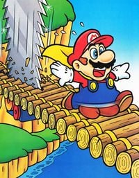
Attack of the Saws
- Subject: Mario running away from one of those saw enemies in Super Mario World.
- Nominated by: Fawfulfury65 (talk)
Support
- Fawfulfury65 (talk) - This is a nice image, has a reasonable size, and is really uh... yeah. I like it!
- MATEOELBACAN (talk) - I love this SMW Pics! they're a lot colorful and detailed!
- BabyLuigiOnFire (talk) CHAINSAWS!! I LOVE CHAINSAWS!!! And this picture is nice and colorful. It looks so weird, with those chainsaws moving by themselves. I like it.
- Lu-igi board oh Mario, how do you get into these situations.....
- Time Q (talk)
- Flipnote Hatena Fan (talk)
- FireBabyLuigi11 (talk) CHAINSAWS ROCK!Those feet do look like his butt, but (BUTT BUTT HA HA HA!)I love it. DIE MARIO DIE!!!! VOTE YES IF YOU LIKE CHAINSAWS!
- Mr bones (talk) A very funny picture.I love it!
- Damariogamr (talk) This is hilarious. CHAINSAWS RULE!!!
Oppose
- KS3 (talk) Mario is fat, again... It looks like that he is a wearing a blue dress, not overalls.
- Lemmy Koopa Fan (talk) I would support if it didn't do that blurry-shoes thing.
- Commander Code-8 (talk) I didn't know Mario had 4 legs
- Raphaelraven497 (talk) I truly dont mean to be rude here, but are those his KNUTS???
- Karinmij (talk) Hmm don't like it.
Comments
@Raphaelraven497: No, those are his feet. Fawfulfury65 (talk)
- Still, the blurry effect ruins it. BUt i agree with MATELOBACAN< SMW pics are USUALLY great! Raphaelraven497 (talk)
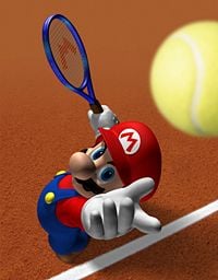
Mario from Mario Power Tennis
- Subject: Mario from Mario Power Tennis.
- Nominated by: Marcelagus (talk)
Support
- Marcelagus (talk) -- Great image. High quality and great artwork.
- MATEOELBACAN (talk) - Why not? It would look great on the main page.
- KS3 (talk) Per all.
- Mariofanatic64 (talk) A little JPEG'd, but overall a awesome action picture.
- Fawfulfury65 (talk) Yea.
- Lu-igi board I can see it in motion
- BabyLuigiOnFire (talk) I don't care if it's no action; Wikipedia's FI has no "action" either, and same goes for that Bowser Strikers picture. It's awesome quality, and it would look outstanding on the main page.
- LeftyGreenMario (talk) It's a great picture. Why can't pictures focusing on one picture be featured? And also, why would this image be opposed for nothing happening when the Bowser one is basically the same problem, but still supported?
- Commander Code-8 (talk) Good Quality, Not too bright. Why Not
- Karinmij (talk) Per the nominator.
- lpsc00l (talk) cool!!!
Oppose
- Time Q (talk): Uh, nothing really happens here.
- Lemmy Koopa Fan (talk) Per Time Q. Also, I can see pixelated outlines whenever the colours in the picture change.
- Dark Bowser (talk) Yup.... There's nothing going on here...
- Gamefreak75 (talk) - Bland, boring, ball is too fuzzy. Per Time Q.
Comments
Oh, come on. This one has no action and everyone still supports it, while the Avalanche! pic has lots of action and still everyone seems to hate. KS3 (talk)
- The problem about the Avalanche pic is that you keep nominating it every few weeks. People get bored of it. Wait at least some months before you nominate it again. Time Q (talk)
Mario and Light Yoshi
- Subject: Mario and Light Yoshi in Super Mario Galaxy 2.
- Nominated by: Fawfulfury65 (talk)
Support
- Fawfulfury65 (talk) The image has a nice size and looks pretty. Even the black background looks good because the Yoshi glows in the center of it. And just look at that light around the characters! It looks very realistic!
- Commander Code-8 (talk)Pure Brilliance!
- McQueenMario (talk) - This is just to awesome!
- Baby Mario Bloops (talk) - Come on! This is way better than that Ice or Fire Mario from the first SMG that we passed. The halo around Yoshi makes a wonderful touch, and I actually love this drawing!
- tonym101101 (talk) Per all.
- Mariofanatic64 (talk) Per all.
- Nintendude (talk) This would make an awesome featured image, it would give a sort of preview of something in SMG2 but why does it look like it`s on a trophy?
- Lu-igi board epic. simply epic
- lpsc00l (talk) Amazing!!
- KS3 (talk) This is better than the other SMG2 pics with black backgrounds.
- Damariogamr (talk) I hate pics with no backgrounds, but Light Yoshi makes it reasonable.
Oppose
- BabyLuigiOnFire (talk) I don't like the white outlines on the characters. Plus, there's still only two characters. Plus, it comes from an almost-atrocious game (and I don't think that glow looks very realistic either. Halos are supposed to come from the sun hitting cirrus clouds to produce that effect, but you can't compare Mario to the real-world, so it doesn't matter)
- LeftyGreenMario (talk) What the heck is this?? Mario looks tired and that butt-faced Yoshi looks even stupider! The white outlines and low is even lamer and the lack of a background really destroys this thing. (Next time, Mario should just use Kirby. Kirby can light up the WHOLE room. And IMO, Super Mario Galaxy 2 and everything about it, especially Yoshi, was a huge mistake).
- Lemmy Koopa Fan (talk) Per all. And I'm not really using this as a reason to oppose, but I hate Yoshi too!
- Gamefreak75 (talk) Black background < White Background. Per all.
- MATEOELBACAN (talk) - Single Character Artwork.
- Zero777 (talk) I am Zero! Even though I could support, the point is that the game is coming in two months, wait until it's close to the release date. Zero signing out.
Comments
@KS3: OMG! I LOVE PIE!!! xD!!!! Fawfulfury65 (talk)
- You know that there is another proposal to revive the pie button??? KS3 (talk)
- It's gone, unfortunately, before I had time to log in this wiki! Ugh. BabyLuigiOnFire (talk)
MATOELBACAN: It's technically not single character artwork, but Yoshi is just.....I can't seem to put it into words. BabyLuigiOnFire (talk)
@Zero: Why should I wait until the release date is close? Fawfulfury65 (talk)
The Mario Ship
- Subject: The Mysterious Mario Ship in Super Mario Galaxy 2.
- Nominated by: Commander Code-8 (talk)
Support
- Commander Code-8 (talk) This image is great! I love the light shades on the ocean, It just looks brilliant!
- Mariofanatic64 (talk) Per Commander Code-8.
Oppose
- KS3 (talk) Even though I am dying for SMG2 to come out, the picture have too much of the ocean showing, and why is there a black dot on the Mario Head's nose?
- BabyLuigiOnFire (talk) Unlike KS3, SMG2 can just get sucked in by a black hole. Anyway, the screenshot is boring, low resolution, and nothing special going on. It's just a random planet in the mediocre game.
- Gamefreak75 (talk) It's just...meh. Nothing special.
- Fawfulfury65 (talk) Oh my gosh! Mario's head looks so fantastic floating in space!!!! Bleh...
- Zero777 (talk) I am Zero! Even though I could support, the point is that the game is coming in two months, wait until it's close to the release date. Zero signing out.
- Lemmy Koopa Fan (talk) This is just not big or interesting enough.
- LeftyGreenMario (talk) What's with all of these Super Mario Galaxy 2, one of the few Mario games I am ACTUALLY not excited about, pictures anyway? This is a screenshot. Screenshots most of the time are never exciting.
- Lu-igi board horrible picture....
- Damariogamr (talk) Good pic, but what we need is a close-up.
Comments
If you're wondering, the black dot is a Yoshi egg sitting on a nest. Commander Code-8 (talk) 09:36 2 April 2010
- The Yoshi egg makes the starship look like Mickey Mouse. KS3 (talk)
- And the hat from far away looks like Bowser's shell. KS3 (talk)
- The Yoshi Egg looks more like a pimple than Mickey's nose. BabyLuigiOnFire (talk)
@BLOF It's not just a random planet, it is Mario's Starship. Mariofanatic64 (talk) 11:14 2 April 2010
- Starship? Though I can't say it's NOT a starship, it doesn't look like a starship to me. I don't see any wings, boosters, cockpits; heh, it just reminds me of Spore where a ship doesn't need any of those stuff to be considered a ship :). Still, it doesn't matter. BabyLuigiOnFire (talk)
- Says the user, named BabyLuigiOnFire. Winston Churchill (Talk)
- WTF, why are people saying that. O.O BabyLuigiOnFire (talk)
- Says the user, named BabyLuigiOnFire. Winston Churchill (Talk)
- Starship? Though I can't say it's NOT a starship, it doesn't look like a starship to me. I don't see any wings, boosters, cockpits; heh, it just reminds me of Spore where a ship doesn't need any of those stuff to be considered a ship :). Still, it doesn't matter. BabyLuigiOnFire (talk)
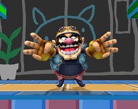
Wario in the WarioWare Stage
- Subject: Wario doing one of his taunts in the WarioWare Stage.
- Nominated by: Commander Code-8 (talk)
Support
- Commander Code-8 (talk) Wario wears his awesome biker outfit and taunts. Great!
Oppose
- BabyLuigiOnFire (talk) *nominates screenshot of LGM and I fan-smacking two Warios* Better screenshot. Anyway, Wario smells (really bad, you should know that) and it would give a REALLY REEKING bad scent to our wiki. Don't be so nosy about it, because it smells fishy in here.
- KS3 (talk) @BWOF: Wrong Wario. Who likes pie??? There was a proposal, but Revesinator came here and ruined everything April Fools Day. Topeka
- McQueenMario (talk) NEVER!
- MATEOELBACAN (talk) - This in the main page? ._.
- Gamefreak75 (talk) Though Wario is cool, (Yes, I said it!), there is nothing special about this. Per all.
- Zero777 (talk) I am Zero! Nothing special about this, and SSBB is a little old now. Zero signing out.
- Nintendude (talk) I would support this image but it does noth look like it is a official nintendo image.
- Lemmy Koopa Fan (talk) FACT: All this image shows is Wario taunting. Boring. FALSE: This image is interesting.
- Lu-igi board not great as a FI
Comments
Eh, both Warios smell horribly, figuratively and literally. No offense, people who actually LIKE Wario. BabyLuigiOnFire (talk)
- No they don't. Only the one in the Mario Series. KS3 (talk) The one in the Wario series? Here's an analogy: Wario (Mario Series):Twilight (Stephanie Meyer's)::Wario (Wario Series)(AKA Willy)(AKA Bob):Super Mario Sunshine.
- I like the one in the
Wario seriesWilly series, not the one in the Mario series. KS3 (talk) (and yes, I said it!)
Gamefreak75: OMG you actually said it! ;D BabyLuigiOnFire (talk)
- Yup. ;) Gamefreak75 (talk)
@nintendude: Actually, it is. --Grandy02 (talk)
Rock Mario
- Subject: Rock Mario from Super Mario Galaxy 2.
- Nominated by: McQueenMario (talk)
Support
- McQueenMario (talk) - I almost flipped when I saw this artwork. Just about all the Super Mario Galaxy artworks or Mario got featured so why not this one. It's awesome anyway.
- BabyLuigiOnFire (talk) It's probably about time I supported something from such a mediocre game. Anyway, I like the texture of the cardboard cut-out of a boulder. And it doesn't have that Yoshi poo-poo.
- Lu-igi board lol!
- lpsc00l (talk) Nice!!!
Oppose
- MATEOELBACAN (talk) - Single Character Artwork, black background.
- KS3 (talk) Make the background white and I will support.
- Fawfulfury65 (talk) Ugly.
- Mariofanatic64 (talk) The idea of Rock Mario just doesn't fit with me. How can i support it?
- Zero777 (talk) I am Zero! Even though I could support, the point is that the game is coming in two months, wait until it's close to the release date. Zero signing out.
- Lemmy Koopa Fan (talk) It's just a picture of Mario dressed like a rock. Not even as interesting as a normal picture of Mario would be. (IMO).
- Commander Code-8 (talk) Mario's dressed as a rock. Wow! (Sarcasm)
- Gamefreak75 (talk) Per all, too boring. Mario + the Pokemon Golem = this. Mario used Rollout. It's not very effective.' Sorry, I just had to say that.
Comments
Glimmer's Galleon
- Subject: The only artwork for Donkey Kong Land 2.
- Nominated by: Fawfulfury65 (talk)
Support
- Fawfulfury65 (talk) Good size and detailed. I like it!
- Zero777 (talk) I am Zero! Not a bad image even though there has been a flood of DK images coming in. Zero signing out.
- Lu-igi board hooray! a good one!
Oppose
- KS3 (talk) The logo ruins it.
- Time Q (talk): Logo, bad quality.
- McQueenMario (talk) ENOUGH WITH THE DIDDY KONG IMAGES! THEY SUCK!
- lpsc00l (talk) NO,NO,NO,NO,NO,NO,NO,NO,NO!!!!!!! STOP THE KONG PICTURES, IF THEY WEREN'T NOMINATED FOR FEATURED IMAGE BEFORE WHAT MAKES YOU THINK THAT THEY ARE GOING TO NOMINATED NOW!!
- Lemmy Koopa Fan (talk) This is too low quality.
- Karinmij (talk) Per Time Q.
- Commander Code-8 (talk) I can barely see what's chasing them.
- BabyLuigiOnFire (talk) It looks awesome, if only Baby Luigi didn't place that logo and curse that image with low resolution.
Comments
1) The logo is shiny and looks pretty in the corner and 2) other Donkey Kong images HAVE been nominated. I don't understand what's wrong with this image. Fawfulfury65 (talk)
- Hello?? The logo ruins it, and it doesn't look pretty. I nominated one with a logo and it got put down. KS3 (talk)
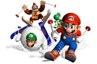
Avalanche! from Mario Party 4
Support
- KS3 (talk) Great resolution: 4535 × 3000, depicts of the characters skiing through snow. (If you enlarge it, you can actually see the tracks made by Mario.)
Oppose
- Gamefreak75 (talk) What...the...HECK?!? This is the third time already! NO, just no. Really, REALLY boring now.
- Fawfulfury65 (talk)
- Zero777 (talk) I am Zero! This has already been nominated in the past. Zero signing out.
- Lemmy Koopa Fan (talk) What the... this is the third time this has been nominated 2 times in the past... and the last one was by you, KS3. What makes you think we're going to support it this time?
- Raphaelraven497 (talk) What the FUDGE KS3! Just because there are new people voting for FI doesnt mean you should nominate this AGAIN!
- Karinmij (talk) what should i say, again ?!?
- Commander Code-8 (talk) White backround? = Lame
- BabyLuigiOnFire (talk) Wario likes to shake his butt. Ew.
Comments
@BabyLuigiOnFire: Uhhh... What? Lemmy Koopa Fan (talk)
Damariogamr (talk) LOL Poor Luigi...
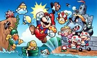
Super Mario Bros. Artwork
- Subject: Artwork from Super Mario Bros.
- Nominated by: BabyLuigiOnFire (talk)
Support
- BabyLuigiOnFire (talk) It's a good classic image that I feel should go on the main page, despite its cuckoo-looking characters (but they're supposed to be like that back then, so it's ok)
- Commander Code-8 (talk) It's good enough for me.
- Mariofanatic64 (talk) Per all.
- Grandy02 (talk) The artwork shows a very important part of Mario's history, it's how Mario became Super Mario. It is interesting to see how Mr. Miyamoto once envisioned the characters and how they differ from the later designs.
- Time Q (talk): Per Grandy. We NEED this on the Main Page.
- Lemmy Koopa Fan (talk) Per all. Especially Grandy02.
- McQueenMario (talk) Per all. Great image!
- Mr bones (talk) You know on second thought.This is a classic image.It deserve to be on the main page.It shows the birth of Bowser,Peach,Hammer bros,spinies etc.
- Damariogamr (talk) Looks great and all, but why are the Toads smiling? The princess is getting kidnapped right behind them!!
Oppose
- KS3 (talk) The characters are all cuckoo, Mario is fat, Bowser looks like Dry Bowser, the hammer bros. look like vultures, the toads are happy for some reason, Peach's body looks like it is composed of a pink ? block, and
where the hell is yoshiMario is dancing happily ever after when Peach is about to be kidnapped by a rhinolike looking Dry Bowser - Raphaelraven497 (talk) Per KS3
- LeftyGreenMario (talk) Quality is an issue here.
Comments
@KS3: Yoshi wasnt in Super Mario Bros. Raphaelraven497 (talk)
Toads are supposed to be happy. Their faces are stuck like that. And Yoshi fails too hard to be in this image AKA he wasn't even INVENTED yet. It's an old image, stop bashing it. BabyLuigiOnFire (talk)
@KS3: No offense, but i'm getting tired of your constant excuse, 'Mario is fat'. And how do you come to think the princess' body was made of a ? block? It is pretty clearly a dress and i cant see a ?. Mariofanatic64 (talk)
@KS3: I don't understand your complaints about the appearance of the characters. The artwork is from 1985 and is 25 years old now, older than most of the users, of course the characters look different from today. --Grandy02 (talk)
I uploaded a new version of this image with improved contrast and fixed size (used scans of the Japanese box as a reference). Does this one look better? @LeftyGreenMario: How does it exactly lack in quality? The only problem I saw were the a bit too dark colours. --Grandy02 (talk)
You can tell the image is slightly faded when you look at it closely. LeftyGreenMario (talk)
@LeftyGreenMario it's all about perspective... Mariofanatic64 (talk)
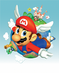
Mario's Wing Cap
Subject: Mario flys around the globe with his Wing cap.
Nominated by: Commander Code-8 (talk)
Support
- Commander Code-8 (talk) This image is great, no too dark or too bright areas, good resolution (The enemies in the backround might look a bit goofy but that's how it was).
Oppose
- Raphaelraven497 (talk) Quality is not good, slightly faded, and it's a bit too small.
- Lemmy Koopa Fan (talk) This has been nominated already... and also per me at that time (I opposed) and Raphaelraven497.
