The 'Shroom:Issue 134/Palette Swap
Director's Notes
Greetings, all! I hope your May has been splendid so far!
Mine has been awesome. I have a Donkey Kong Country game where I can play as Funky Kong. How could I not be happy with this?? To be honest, I'm still working on it. I want to get all the KONG letters, but it's a slow process. Let me tell you, I have the original Donkey Kong Country on Virtual Console on my 3DS, and I didn't even make it to Funky's shop in that game, so you know how terrible I am at these games. But with all the little things they've added to Funky mode to make this impossible game easier, I'm feeling a bit more confident while playing.
Anyways, this month, we have some great reads for you, so I won't keep you. Until next time!
~FunkyK38
Section of the Month
Another win for Yoshi876 (talk) for his section on Mario Golf: Toadstool Tour's box art. Congratulations to everyone, and thank you to everyone who voted! Please keep it up!
| Palette Swap SECTION OF THE MONTH | ||||
|---|---|---|---|---|
| Place | Section | Votes | % | Writer |
| 1st | What's on the Box? | 11 | 44% | Yoshi876 |
| 2nd | Mario's Boombox | 9 | 36% | Hooded Pitohui |
| 3rd | Ongoing Fan Projects | 3 | 12% | The Pyro Guy |
| 4th | Take Cover! | 2 | 8% | Henry Tucayo Clay |
What's on the Box?
Hello readers, and welcome back to What's on the Box.
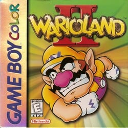
Last month might have been an almost decent boxart, but I'm afraid this edition has brought up back into the world of mediocre game box arts. This month, we'll be taking a look at the boxart for Wario Land II, and if you've already looked at the picture on the right, which I'm sure many of you already have, then I'm sure you'll already know why it's boring.
It features, Wario performing a dash attack, and other than the swirling vortex he appears to be in there's nothing else to point out. Even Wario looks annoyed that the boxart for his game is so boring. I really wish there was something else for me to mention, but sadly there is not.
So let's just move on to the bit that I'm sure you readers are now well accustomed to, in which I rant about how this boxart could have been improved. For starters, we could have had a hint as to what the game's plot is. If you want to keep some form of surprise, then maybe just scatter a few coins around and a few Pirate Gooms. Obviously, Captain Syrup would be ideal, but if the developers wanted to keep her appearance secret, having her absent from the boxart is understandable. And perhaps we could have gotten a look at some of the worlds in the game. Even though one of the game's main features is the amount of secret exits and branching paths, these might be hard to communicate through the boxart, so again, I could understand why they weren't put there.
So to summarise, Wario Land II seems to suffer from many of the same issues that many of our recent boxarts have suffered from. A nice block image, with absolutely nothing else. A disappointment from a man who has his own castle.
| The 'Shroom: Issue 134 | |
|---|---|
| Staff sections | Staff Notes • The 'Shroom Spotlight |
| Features | Fake News • Fun Stuff • Palette Swap • Pipe Plaza • Critic Corner • Strategy Wing |


