User:Wildgoosespeeder/sandbox/Screenshot comparisons
From the Super Mario Wiki, the Mario encyclopedia
Jump to navigationJump to search
Screenshot comparisons
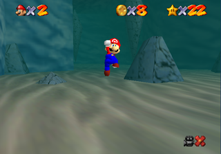
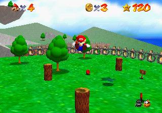
It is common to take poor N64 screenshots in an emulator. Be sure to follow each plug-in recommended settings closely.
See how the HUD elements look ugly with black outlining if improperly filtered? Mario's shadow is missing as well. Click to enlarge to see the full picture.

