MarioWiki:Featured images/Archive
Nominations of images that were featured in the past are found here.
Add following nominations until there are 20 in the page.
| FI archive
|
|---|
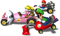
June 10, 2010: Blooper Squirting Luigi
17-13
- Subject: Blooper squirting Luigi in Mario Kart DS.
- Nominated by: McQueenMario (talk)
Support
- McQueenMario (talk) - I love this image for a few reasons. One, it's funny. Two, you don't see it very often. And Three, it's just plain awesome!
- MATEOELBACAN (talk) - I like it, colorful, funny and high quality.
- MeritC (talk) - Per all.
- Zero777 (talk) I am Zero! Nice image though I never saw this one it's awesome. Zero signing out.
- KS3 (talk) This is a great picture! Perfect picture, good resolution, no logo, not boxart, etc. Lol luigi - he is getting squirted by a blooper.
- Papero (talk) Luigi, living up to what he's made for: getting the short end of the stick.
- Raphaelraven497 (talk) I dont know why, i just like it
- Mariofanatic64 (talk) I think the white background just works. It's also got that 'Luigi comedy' that Nintendo have been doing a lot in the last few years...
- tonym101101 (talk) Per all.
- Bowser 5 (talk)This is Funny!Good AND detailed.
- FireBabyLuigi11 (talk) HaHaHaHaHa(etc.)!It's funny and it pwns!A little plain with the white bkgd,but still awesome.
- lpsc00l (talk) I love this picture!!! It is soo funny.When you actually look at what is going on, you don't even notice the white background!!!!
- Kingboo8 (talk) This Pic Is So Cool AND Funny.Ya It Has To Win.It PWNS!
- Commander Code-8 (talk) I'm changing my vote beacuse there have been white backround FIs before
- Hatena Kid (talk) Funny is this good, and Blooper pees on Luigi!
- Geniusguy445 (talk) Mario looks horrified.
- New Super Mario (talk)Awesome! Don't see pics like that often!
Oppose
- Fawfulfury65 (talk) Its just too... plain.
- BabyLuigiOnFire (talk) I would like this picture if (1) there was a scenery, (2) it is a JPG file instead of a PNG so you can have more resolution, and (3) if Luigi didn't look crazy and get blinded by super glue from that Blooper.
- Lemmy Koopa Fan (talk) White background... and I think Mario, not Luigi, looks weird in this.
- Pixlfreak (talk) there should at least be scenery
- Lu-igi board at first I couldn't even make out blooper
- Homestar Runner (talk) Per all.
- superluigiatl (talk)Poor me...
- Time Q (talk): Really boring.
- Edofenrir (talk) - I dislike the Blooper in this image for various reasons, and therefore I oppose.
- Gamefreak75 (talk) This is technically incorrect. Squids' mouths aren't located in the front, but rather on the bottom and it is a beak. Per all.
- Mario jc (talk) Why is it always Luigi? This is just an image for Luigi-haters.
- LeftyGreenMario (talk) Let's see what those racers are driving on. White paper? Hardened milk? White ceiling? An eyeball? White Kirby? Vanilla à la mode? Yoshi's butt? Waluigi's big pink barbie dress that accidentally fell in bleach? Or all of the above? What do you think?
- Phoenix Rider (talk) Much too plain. It's not visually appealing.
Comments
*rolls eyes* About how many pictures nominated are there now that has Luigi getting beaten up, looking stupid, or the like? There's that avalanche one, Luigi's mansion, the Mario Party beach image, Sweet Basket, the Melee picture (IMO), and now this one. I think Nintendo maybe just likes seeing Luigi having all the bad luck. BabyLuigiOnFire (talk)
- Says the user, named 'BabyLuigiOnFire'! Waluigi Guy (talk).
- What "Melee picture"? Also, the reason why Luigi is like that in all the pictures is because that's the sort of character Luigi is. Cowardly, weak, etc. Even in the Mario Kart Wii intro, he's seen getting hit by a blue shell right as he gains first place. He isn't what you would really call "Glorified". Garlic Man (talk)
I had wanted to nominate this picture, but I had a feeling it would be put down because of "a lack of background" and some variation of "luigi has bad luck." (And BiscuitLagoonOnFire, Luigi didn't look stupid in the Melee group art. He just looked like a wacko. But not stupid.) LeftyGreenMario (talk)
- ^That's just IMO, genius. GM: I don't think Luigi's that weak. Even if he was weak and cowardly, I really don't think he deserves it. BabyLuigiOnFire (talk)
Is this going to turn into a war just like Avalanche!? LeftyGreenMario (talk)
- No. Avalanche! only has one vote. KS3 (talk)
@Gamefreak75: Such an "incorrect" mouth for squids and especially octopi is very common in Japanese popular culture. Look at Gooper Blooper, Gunion or Template:BP, for example. --Grandy02 (talk)
- LOL, Grandy, I already knew that, I just wanted to sound "scientific". The added info was for the lulz as one might say. Gamefreak75 (talk)
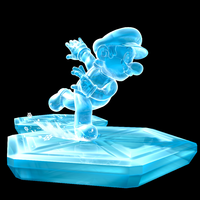
June 17, 2010: Ice Mario
11-2
- Subject: Ice Mario Power-up from Super Mario Galaxy
- Nominated by: LeftyGreenMario (talk)
Support
- LeftyGreenMario (talk) I didn't nominate this previously taken down image because it's exciting or it's a scene. It has beautiful detail and resolution. You can see the reflection on the ice and the transparency of ice Mario. If Fire Mario and Mario Power Tennis Mario got featured, why not this? Besides, the black background contrasts well with the ice.
- Tucayo (talk) - I love it
- Commander Code-8 (talk) I couldn't find anything wrong with it even though I really wanted to
- Mariofanatic64 (talk) Every SMG artwork is great (exept spring mario, shoot me if i ever support it) so i'll support.
- Dark Bowser (talk) It's a shame Nintendo didn't put this in SMG2, but then I look at the Cloud Flower and Rock Mushroom and forget about it... I support.
- Phoenix Rider (talk) I voted for this last time it was up. It's simplistic, sure, but it illustrates a concept quite nicely.
- Gamefreak75 (talk) Beautiful detail and it's blue, so it's perfect. Per all.
- McQueenMario (talk) Nice! To bad it's not in Galaxy 2...
- Platitudinous (talk) It does have a beautiful detail and resolution.
- GalacticPetey (talk) This is..... AWESOME! Feel the ice!
- Pixlfreak (talk) don't ask me why I like it, I just do
Oppose
- Damariogamr (talk) It just seems too plain.
- Fawfulfury65 (talk)
Comments
I'd swear this was already proposed and voted against. Or is my memory messed up ? Koopalmier 23:51, 9 June 2010 (UTC)
- By this, I mean that if it was already taken down once, I doubt it'd be nominated this time. Koopalmier 23:56, 9 June 2010 (UTC)
- Don't worry about your memory; it's fine. I even said that it was nominated before in the vote. The volley-ball image and the Super Princess Peach image were taken down once, but are now featured. Just because it was passed down before doesn't mean it can't be featured. LeftyGreenMario (talk)
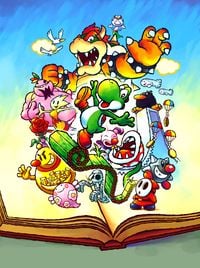
June 24, 2010: Yoshi Universal Gravitation Picture
9-0
Subject: Artwork from Yoshi's Universal Gravitation
Nominated by: LeftyGreenMario (talk)
Support
- LeftyGreenMario (talk) A great, high-quality, colorful picture from an otherwise crappy game :P Or what those reviewers think because I never played the game.
- Fawfulfury65 (talk) Bowser looks awesome.
- Commander Code-8 (talk) That is... AWESOME!!!!!!
- Lu-igi board :D
- Platitudinous (talk) A unique art style.
- New Super Mario (talk) It is a little bit confusing to look at, but I like the awsomeness
- Pixlfreak (talk) I've never even heard of the game, but this image reminds me of Yoshi's Story for the N64, it's got the same pop-up book artwork style (andt there's probably a reason for that)
- Dark Bowser (talk) Awesome-ness achieved...
- GalacticPetey (talk) Love it! Love it!
Oppose
Comments
Why is it called "fartwork"?? Mario jc (talk)
- Lol, that was intended LeftyGreenMario (talk)
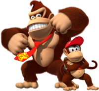
July 1, 2010: DK and Diddy
14-4
- Subject: Donkey Kong and Diddy Kong in Donkey Kong Country Returns.
- Nominated by: Platitudinous (talk)
Support
- Platitudinous (talk) I think this is a high-quality and detailed image of two iconic characters.
- Fawfulfury65 (talk) And I always thought Dixie Kong's Double Trouble! was the end of the series! Great image, I like their poses. Diddy looks awesome!
- Lemmy Koopa Fan (talk) I would normally vote no because of the white background, but I'll make an exception for this one, great quality!
- MrConcreteDonkey (talk) Legend rebirth FTW!
- BabyLuigiOnFire (talk) DONKEY!!!!!! LOL, I just KO'd Donkey Kong yesterday in Mario Kart Wii and Super Smash Bros. Anyway, I love the detail!
- Lu-igi board yeah! DK's back :D
- New Super Mario (talk) Yeah this would be cool
- Zero777 (talk) I am Zero! Not bad, they are in awesome poses. Zero signing out.
- Commander Code-8 (talk) Pretty cool seeing as the game just got announced.
- LeftyGreenMario (talk) The only downside to this image is how long it takes to load this image!
- Frostyfireyoshi (talk) I don't like the Kongs, but that is a great piece of artwork!
- MATEOELBACAN (talk) - Per all.
- Bowser's luma (talk) Per all.
- Dry dry bones (talk)That's awsome!
Oppose
- Mariofanatic64 (talk) I just don't like Donkey Kong...
- DonPianta (talk) I find that an image of two characters that really don't have a lot to do with Mario (anymore) is rather boring for a featured image.
- Pixlfreak (talk) I hate to say, but I agree with DonPianta... Donkey Kong isn't really in Mario games anymore, not as a major character anyways. Besides, this image is just two characters posing in front of a white backround, not something that belongs on the main page
- GalacticPetey (talk) BOOO!
Comments
Platitudinous (talk) @MrConcreteDonkey: That is so true! Donkey Kong Country for GBA was my first video game and is still one of my favorite games today. I'm glad they're making another one now.
@BabyLuigiOnFire: How can you KO Donkey Kong in Mario Kart Wii? MrConcreteDonkey (talk)
- I make his life miserable in Battle Mode and VS Mode. He sounds funny. That's all. BabyLuigiOnFire (talk)
@DonPianta: What? They have A LOT to do with Mario. They both appeared in several Mario games, and they both are part of the Donkey Kong series, which is closely related to the Mario series. Fawfulfury65 (talk)
Pixlfreak: Donkey Kong isn't playable in Mario Sports Mix, Mario Super Sluggers, and Mario Kart Wii!? I didn't know that! Maybe you mean mainstream platformers, but when is the last time Donkey Kong made a major appearance in a mainstream Mario platformer? Mario vs. Donkey Kong (or the other way around) doesn't count. LeftyGreenMario (talk)
Also, he isn't playable from Mario Party 5 on. Pixlfreak (talk)
donpianta: he is playable in the all 3 of the games you just mentioned....Lu-igi board
- Donpianta didn't mention any games. Also, I recently discovered that Mario isn't playable either in those three games. LeftyGreenMario (talk)
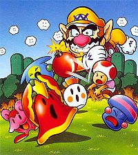
July 8, 2010: Promotional Artwork from Wario's Woods
12-10
Subject: Promotional Artwork of Wario's Woods.
Nominated by: Pichufan93 (talk)
Support
- Pichufan93 (talk) I find this picture both colorful and enjoyable to look at. I personally enjoyed the game as well. It features a classic background and shows the two classic Mario characters, Toad and Wario. Personally, I like the image and I think it is quite nice to be featured. It also effectively illustrates the scene of how the game plays.
- Bowser's luma (talk) I like it. I've never played Wario's Woods and I have no idea what half those things are, but it is making me want to find out. It's a little small but that is ok for this specific image.
- Lu-igi board (talk) love it
- MagicalToadette (talk) it's colorful and pretty. Plus, it stars Toad.
- Zero777 (talk) I am Zero! Not bad of a size, and it's not bad of a picture. Zero signing out.
- Platitudinous (talk) I like it.
- McQueenMario (talk) Not bad, I'll support.
- New Super Mario (talk) Per MagicalToadette, nice color and it stars Toad
- Propeller Toad (talk) This should get featured! I know it's nice to have new images but really we should give some older ones a chance too! Nowadays, it's mostly the new game pics anyways. It looks pretty classic to me and Toad himself rarely gets attention anyways. The game gets rarely attention itself so this could help it quite a bit.
- Skitty02 (talk)Awwww....Toad's sooo cute! Its my favourite pic so far in this voting.
- BluePikminKong497 (talk) I like it.
- Papero (talk) The quality is no longer a problem, so I can't see anything wrong with this one anymore. It's unique, depicts a game not everyone knows of, and it shows off the game features.
Oppose
- Vellidragon (talk) - I like the artwork, but the picture is rather small and far from good in terms of image quality...
- BabyLuigiOnFire (talk) What's with all those diagonal bars. It's like a new trend these days. Bottom line: Horrible quality, and low resolution for me.
- Lemmy Koopa Fan (talk) Per Vellidragon and BLOF.
- LeftyGreenMario (talk) Two words: terrible quality.
- Commander Code-8 (talk) I agree with the other opposers. The resolution isn't great.
- Mario jc (talk) Not very good quality (per all). The only time you see Toad angry.
- Fawfulfury65 (talk) Small and low quality.
- Superboo922 (talk) Per all. I thoght that the only time Toad isn't smiling is when Bowser was invading Peach's Castle (and I'm nomally right). I agree with Propeller Toad but I just don't think this image sould be featured. P.S. Per Zafum
- Zafum (talk) - I think that it looks way too cluttered. It would look better if there was more contrast.
- Booderdash (talk) looks like its been painted by a 2nd grader. A very good artist second grader but still a second grader.
Comments
Also, *alliteration alert* what's wrong with Wario? He's almost 10 million times larger than Toad (he's lingering over the round thingies and trees, how did he get so large?). Also, why the super silicon graphics chips is he smiling when his minions are getting defeated? I thought Toad was the smiling smile simile smileybutt (and Toad is not even smiling!). Also, Wario is fat. *hyperventilates*. Sorry for my rant. Don't take it personally, supporters and nominators. BabyLuigiOnFire (talk)
@Booderdash: Simple-designed characters, objects with faces and other things of "cheerful" nature are commonly seen in the Mario series. I don't think that makes Mario games look like being made by a 2nd grader. --Grandy02 (talk)
Yay, this is going to be the next featured image... LeftyGreenMario (talk)
BLOF: None taken we all know Wario is fat :). Superboo922 (talk)
I uploaded a new version of the image found at MobyGames. Do you think it looks better now? --Grandy02 (talk)
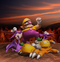
July 15, 2010: Wario kicks butt
6-2
- Subject: Wario's defeated enemies fall at his feet
- Nominated by: Lu-igi board (talk)
Support
- Lu-igi board (talk) WOOT! classic :P
- Booderdash (talk) Actually good quality. especially that pteryadactl.
- Lemmy Koopa Fan (talk) This is an awesome picture! It's great quality and I like Wario, and this picture tells you he rules. Although I expect this to get bashed for it being "boring" and for their dislike of Wario.
- BabyLuigiOnFire (talk) It's kind of dark, but I'll let it slip this time. I feel sympathy for the good guys, though. I mean, the villain of this game killed them!
- Superboo922 (talk)I can't say no to this image. It's amazing, triumphant, but it is a little dark.
- Platitudinous (talk) I like it.
Oppose
- Zero777 (talk) I am Zero! Nominated in the past and Wario looks like an early 3D model while the enemies are too cartoonish. Zero signing out.
- Zafum (talk) - The various parts of the image really don't go well together. There's a realistic sky and group of hills, behind an ugly two dimensional fire, behind a cartoony Wario and monsters, which look like they've been cut and pasted onto the floor. In other words, it doesn't look good. It's also just a boring picture.
Comments
after a previous argument I was involved in, I would like people to focus on the image quality, NOT there hatred of Wario.
The preceding unsigned comment was added by Lu-igi board (talk).
How can those dinosaurs support Wario? LeftyGreenMario (talk)
Same reason the ground can support Chunky Kong and the other fat gorillas in that other pic. Booderdash (talk)
- Hm. Actually, Wario isn't even standing on the dinosaurs. He was just posing for a picture, but the artist decided to draw those defeated dinosaurs around Wario to make Wario look more awesome. LeftyGreenMario (talk)
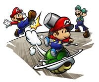
July 22, 2010: Green Shell Artwork
13-9
Nominated by: BluePikminKong497 (talk)
Subject: Green Shell
Support
- BluePikminKong497 (talk) Wow! Look at that quality! It's big, and an awesome scene overall.
- Dark Bowser (talk) Was about to put this one up... Anyways, Per BPK497...
- Bowser's luma (talk) Love it - he's coming right out at us!
- Pixlfreak (talk) this was my favorite scene EVER from Partners in Time
- Lu-igi board (talk) love it
- Superboo922 (talk)Per BPK497. This is awesome and has a perfect mixture of action and quality. But when you think of it LGM and MT sort of have a point.
- Baby Mario Bloops (talk) - Okay, my vote was partly based off of Baby Mario in the picture, but it is very detailed and epic that has the right to be a FI.
- Platitudinous (talk) This looks funful!
- GalacticPetey (talk) Not bad, not bad at all
- New Super Mario (talk) I love Baby Mario
- Shadow1567 (talk) Best Nominated Picture this time around
- Yoshi Koshi Moshi (talk) All M&L2 artwork is worth featuring.
- Windspyro (talk) This picture is in a great style, has great content and action, and generally looks great!
Oppose
- LeftyGreenMario (talk) This picture is kind of meh compared to the other Mal pits. I know it's great quality and all, but...
- MagicalToadette (talk) It looks rather strange to me. I mean look at luigi's foot.
- Propeller Toad (talk) I'm not saying that it is a bad pic but the background being all scratched up like that makes the overall pic (excluding the characters) to look rather odd.
- Pichufan93 (talk) Looks rather choppy in my opinion and it doesn't seem to hold on its own.
- Skitty02 (talk) Per MT.
- Commander Code-8 (talk) Per LeftyGreenMario. It isn't that great.
- DaisyRox02 (talk) It's a good picture but Baby Luigi and Luigi in the background are blurred and the erasing on the sides is distracting. Plus, there's a blank background.
- Zafum (talk) - It's depicted rather dull and dry.
- Rooster17780 (talk)WHAT THE ?!? This makes no sense at all. Its really hard to tell whats happening.
Comments
You know what? This image should be on a 3DS. O.O BabyLuigiOnFire (talk)
That would be so awesome BLOF. This is really one of the first images I supported. Superboo922 (talk)
Why does Baby Mario have a HAMMER while on that shell? That doesn't make any sense. Booderdash (talk)
- Yah, I agree with that. He NEVER carried that hammer while on a shell in Mario & Luigi: Partners in Crime. Maybe there's an enemy out there he REALLY doesn't like. BabyLuigiOnFire (talk)
Lol Blof. Partners in crime? Superboo922 (talk)
Let's just hope Baby Mario doesn't slip! Sgt.Boo (talk)
Its probably beta. I remember a beta attack thats a Spiny Shell that the babies used that needed hammers... Booderdash (talk)
This picture is odd.I cant figure out what that shadow is... Rooster17780 (talk)
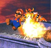
July 29, 2010: Bowser Attack
11-9
- Subject: Bowser attacking Mario.
- Nominated by: Fawfulfury65 (talk)
Support
- Fawfulfury65 (talk) High quality and great. Go Bowser!
- Zero777 (talk) I am Zero! Nice quality and a big image, nice, but what is that ball on the bottom-right corner. Zero signing out.
- Baby Mario Bloops (talk) - Ahhh. Familiar, funny, awesome memories, and the quality as it was when it was the generation of the Nintendo 64. Every time I see this, I think of the final battle against Bowser, and how challenging he was on that last toss. I Love it.
- Pixlfreak (talk) I like classic stuff like this.
- Commander Code-8 (talk) I've been wanting to nominate this one for a while. I love it.
- Grandy02 (talk) I like it, and it has high resolution for its age.
- Bowser's luma (talk) Per all.
- Sacorguy79 (talk) It's pretty funny to see Mario's rear end on fire, Bowser owns!
- MrConcreteDonkey (talk) Very funny and great quality. Go Bowser!!
- Luigia (talk) Hehe funny
- Beecanoe (talk) Any image of Bowser pwning Mario is great in my book. Bowser rules!
Oppose
- Booderdash (talk)Not low quality, but Mario looks like hes 10 years old. Plus, it looks like both of them are dolls. And actually Super Mario 64's ingame sprite is better than this picture.
- LeftyGreenMario (talk) Mario looks cuckoo.
- Superboo922 (talk) Is it just me, or did Bowser get a haircut? Good quality but it... Wow. Everybody already said everything.
- GalacticPetey (talk) I would rather have 14 game overs than have this featured.
- DaisyRox02 (talk) I would agree with Booderdash if Mario didn't have a moustache. I don't think this picture would be FI quality if it were nominated the first day the pic was completed.
- New Super Mario (talk)Me personally don't like 64 animation
- Zafum (talk) - The image would be good, if it wasn't so crowded and/or cut off.
- Fuzzipede27 (talk) - Per GalacticPetey and LeftyGreenMario. Good fire with a bad image.
- Sgt.Boo (talk) - Umm... No. I'm not saying this because I'm a fan of Mario or anything, but this image is low quality, Just plain boring background, and Mario looks like he's made of wax, Bowser does too, though...
Comments
Why is Mario putting his hands in his pants? Booderdash (talk)
- Because his overalls burn, and it's hot? Also, about "dolls", the image simply shows what 3D models in the Mario series looked like back then. --Grandy02 (talk)
- I don't know how this isn't high quality. And how does Mario look 10? I don't know of any 10 year olds with mustaches. Fawfulfury65 (talk)
- Ok, how is this low quality? I really want to know why. Just because they look like dulls doesn't mean its low quality, that's just how it's drawn. Fawfulfury65 (talk)
- Well, if you look close up, you can see some of the pixels. At least I can see it. And remove the mustache and he looks ten. The angle of his lower left mouth isn't with the rest of his face. My 12 year old friend can draw better than that. Off topic, but I had a little mustache when I was 10. Booderdash (talk)
- You can see some of the pixels in just about any image if you look really close to it. So that doesn't really call this image low quality. Fawfulfury65 (talk)
- The image is made up of pixels, so of course one can see them. And you could remove Mario's moustache from any artwork to make him look "younger." --Grandy02 (talk)
- Well, if you look close up, you can see some of the pixels. At least I can see it. And remove the mustache and he looks ten. The angle of his lower left mouth isn't with the rest of his face. My 12 year old friend can draw better than that. Off topic, but I had a little mustache when I was 10. Booderdash (talk)
- Ok, how is this low quality? I really want to know why. Just because they look like dulls doesn't mean its low quality, that's just how it's drawn. Fawfulfury65 (talk)
- I don't know how this isn't high quality. And how does Mario look 10? I don't know of any 10 year olds with mustaches. Fawfulfury65 (talk)
Sorry for asking, but what game is this? And Booderdash has a good point. Superboo922 (talk)
......Looks like mario has a case of butt burn.Rooster17780 (talk)
Looks like Bowsers breathing fire from his NOSE... Booderdash (talk)
Yay. ANOTHER Bowser image is going to be featured because "he is awesome". Hooray for fan voting. LeftyGreenMario (talk)
