MarioWiki:Featured images
At the Super Mario Wiki, Featured Images are those quality, intriguing, witty, provocative, rare, important, and otherwise simply interesting images that can be found throughout the site's articles. Users are encouraged to submit and vote on nominations for the Featured Image displayed on the Main Page. Every week (on Thursdays at 17:00 GMT), a new image is selected to be featured. This is done by subtracting the number of oppose votes from the number of support votes in each nomination - the image with the most "points" at the end of the week will be featured. Any image with a negative amount of points at the end of a week (that is a nomination with a majority of opposes) is removed from the selection process. The only condition for nominated images is that they must be in an actual mainspace article on the wiki. No personal images or images from non-mainspace pages are allowed. New image nominations can be added to the Featured Image Nominations section below.
Archived nominations of images that were featured in the past are found here.
A gallery of all Featured Images can be found here.
This page follows the No-Signature Policy.
Example Nomination
Description of Image (Ex: 1-Up Mushroom from New Super Mario Bros.)
- Subject: Main subject of image; include a link to the article it is included in. (Example: 1-Up Mushroom)
- Nominated by: If you nominate the image, place your name here.
Support
Oppose
Comments
Place some comments here if you want to explain why you think this image should or should not be featured. Note: it is very important to include <br clear=all> at the end of the comments section!
Featured Image Nominations
Wario Land Shake It!! Cover Art
- Subject: Cover art for Wario Land Shake it.
- Nominated by: LeftyGreenMario (talk)
Support
- LeftyGreenMario (talk) Ugh. Where to start. The quality and resolution of this picture is very stunning (if viewed on the highest resolution.) If anyone is going to oppose this for boxart, well, this is the full image. The boxart cuts some of it.
- BabyLuigiOnFire (talk) Dunno what to say. I'll support anyhow.
- KS3 (talk) Great pic with great resolution and great quality.
- MATEOELBACAN (talk) - Colorful, Why Not :P?
- Lu-igi board lol at Wario
- Gamefreak75 (talk) YES! Now that's an image. I actually think the waves give it a unique look. Per all.
- McQueenMario (talk) Nice!
- New Super Mario (talk) I wonder what would happen if Wario was actually skinny?...... Can't see that happening!
- Zero777 (talk) I am Zero! This is a nice colorful picture. Zero signing out.
- Lemmy Koopa Fan (talk) This image really makes me laugh for some reason. Also, it's good quality and colourful, the waves are just to emphasize the "shaking" effect, and it's exciting! I can't find a single thing wrong with this image.
- Platitudinous (talk) I like it.
Oppose
- Turkishcoffee (talk) Awful picture. The background "waves" are too distracting. The characters seem to be in a different art style than the background. The eye is pulled to the top right corner (due to the aforementioned "waves") and then just falls down into the negative space by the garlic. The colors are oversaturated, and not in a way that works for it. The shading on the chest looks strange to me, more when compared to the shading on the coins in the pile (creating an impossible scenario , as the chest does match Wario, unless light has different properties in the Mushroom Kingdom). Also the blur effect with the enemy looks wonky to me. Not sure why. Picture is "Stunning" in a bad way.
- Mr bones (talk) Per Turkishcoffee.
- Fawfulfury65 (talk) Wario is one fat man.
- Homestar Runner (talk) Per all.
- Dark Boo (talk) I'd like to add something but theres nothing left to be said. Per Turkishcoffee.
- Phoenix Rider (talk) I'm generally against having boxart as FI. It just makes it seem like we're running out of ideas.
- Bowser's luma (talk) Per all (except maybe FawfulFury)
- Superboo922 (talk) 100% per all
- Commander Code-8 (talk) I know I was supporting this but then I looked at this image again and saw what the opposers were seeing. Per all.
- MagicalToadette (talk) The picture looks rather boring to me. Too much things to look at too!
- Propeller Toad (talk) Per MagicalToadette, there's alot going on. The problem with that is that the characters and items appear to be everywhere and make a rather confusing scene for your eyes to adjust to before understanding the pic.
- Pichufan93 (talk) I personally dislike the image due to it's overcrowding apperance and those wavy lines look awful. Also Wario himself looks too faded in comparison to the background.
Comments
@Turkishcoffee too distracting? until you pointed it out i didn't even notice them. Mariofanatic64 (talk)
That last supporting comment didn't really say anything about why he/she liked the picture. They could have just commented.DaisyRox02 (talk)
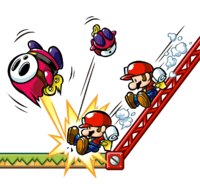
Mario Vs. Donkey Kong: Mini-land Mayhem! Artwork
Subject: Artwork of upcoming Mario Vs. Donkey Kong game
Nominated by: Dark Bowser (talk)
Support
- Dark Bowser (talk) The other artwork for this upcoming game (well, I thought so) was already seen too many times already, so I decided to put this one up. It's a nice picture with a couple of Mini Marios taking down some Shyguys...
- Platitudinous (talk) Yes.
- Lu-igi board I like it. simple yet effective
- New Super Mario (talk) I like the Shy Guys coming out like a 3-D movie. The pic has nice quality and color.
- Pixlfreak (talk) as much as I agree with waiting until the game comes out, I just can't not support this picture!
- MATEOELBACAN (talk) - Colorful, funny and nice resolution, Per all.
- Hellomynameis2 (talk)- per New Super Mario and... IT'S AWESOME!!!
- ChillGuy (talk) - Shy Guys.
- Dry dry bones (talk) Awsome! Iv been looking forwards to this game.
- McQueenMario (talk) - White background, but what the heck, it's awesome!
Oppose
- Baby Mario Bloops (talk) - Nothing personal with this image, but believe me when I say that we should wait. Let's not have a SMG2 FI situation with this picture and a possible better one.
- Commander Code-8 (talk) I think we should wait until a game's realease date before Featuring an image of it.
- Fawfulfury65 (talk) What a great image!!!
- LeftyGreenMario (talk) Great resolution and quality, but I think we have a little too much great quality single artwork featured in a row.
- MrConcreteDonkey (talk) Per all except LeftyGreenMario.
- Bowser's luma (talk) Per CC-8. With the release there may be better art and images available.
- quietwyatt (talk) it looks ok but it need somthing in the background is boring who want borin white boring maby blue
- MagicalToadette (talk) Like the others, we should wait till the game is out first.
- Propeller Toad (talk) Per all, I say we should wait till the game is close to it's release date or even upon the date. It's a bit early to start showing a pic of it right now especially by the fact that there might be more pics coming out for the game as well later on.
- Pichufan93 (talk) Per Commander Code-8 and Propeller Toad
Comments
FawfulFury - either wrong section or horrible sarcasm. Get serious please. Bowser's luma (talk)
- Aw, we can't have a little fun here? LeftyGreenMario (talk)
- Yeah but at least put a smile or something :) Bowser's luma (talk)
- I agree with all. Can't decide to support or not. Superboo922 (talk)
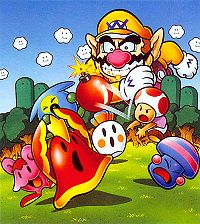
Promotional Artwork from Wario's Woods
Subject: Promotional Artwork of Wario's Woods.
Nominated by: Pichufan93 (talk)
Support
- Pichufan93 (talk) I find this picture both colorful and enjoyable to look at. I personally enjoyed the game as well. It features a classic background and shows the two classic Mario characters, Toad and Wario. Personally, I like the image and I think it is quite nice to be featured. It also effectively illustrates the scene of how the game plays.
- Bowser's luma (talk) I like it. I've never played Wario's Woods and I have no idea what half those things are, but it is making me want to find out. It's a little small but that is ok for this specific image.
- Lu-igi board (talk) love it
- MagicalToadette (talk) it's colorful and pretty. Plus, it stars Toad.
- Zero777 (talk) I am Zero! Not bad of a size, and it's not bad of a picture. Zero signing out.
- Platitudinous (talk) I like it.
- McQueenMario (talk) Not bad, I'll support.
- New Super Mario (talk) Per MagicalToadette, nice color and it stars Toad
- Propeller Toad (talk) This should get featured! I know it's nice to have new images but really we should give some older ones a chance too! Nowadays, it's mostly the new game pics anyways. It looks pretty classic to me and Toad himself rarely gets attention anyways. The game gets rarely attention itself so this could help it quite a bit.
Oppose
- Vellidragon (talk) - I like the artwork, but the picture is rather small and far from good in terms of image quality...
- BabyLuigiOnFire (talk) What's with all those diagonal bars. It's like a new trend these days. Bottom line: Horrible quality, and low resolution for me.
- Lemmy Koopa Fan (talk) Per Vellidragon and BLOF.
- LeftyGreenMario (talk) Two words: terrible quality.
- Commander Code-8 (talk) I agree with the other opposers. The resolution isn't great.
- Mario jc (talk) Not very good quality (per all). The only time you see Toad angry.
- Fawfulfury65 (talk) Small and low quality.
- Superboo922 (talk) Per all. I thoght that the only time Toad isn't smiling is when Bowser was invading Peach's Castle (and I'm nomally right). I agree with Propeller Toad but I just don't think this image sould be featured.
- Zafum (talk) - I think that it looks way too cluttered. It would look better if there was more contrast.
Comments
Also, *alliteration alert* what's wrong with Wario? He's almost 10 million times larger than Toad (he's lingering over the round thingies and trees, how did he get so large?). Also, why the super silicon graphics chips is he smiling when his minions are getting defeated? I thought Toad was the smiling smile simile smileybutt (and Toad is not even smiling!). Also, Wario is fat. *hyperventilates*. Sorry for my rant. Don't take it personally, supporters and nominators. BabyLuigiOnFire (talk)
Yoshi eating a Cookie
Nominated by: New Super Mario (talk)
Subject: Pic from "Yoshi's Cookie"
Support
- New Super Mario (talk) I thought this was just too cute. You don't see much pics of Yoshi eating a Cookie! Also I like the waves of his chewing, his shadow, and the crumbs falling.
- Platitudinous (talk) I like it.
- Bowser's luma (talk) It's the simplicity that makes it better. Eat up Yoshi!
- Pixlfreak (talk) it has been a while since I've seen something simple and cute on the main page
Oppose
- Commander Code-8 (talk) Not the greatest image in terms of quality.
- BabyLuigiOnFire (talk) Nominated already, and put down by a majority vote. It's just a picture of Yoshi eating a cookie in a white background.
- LeftyGreenMario (talk) This is what Yoshi is supposed to look like: a dinosaur! Otherwise, nothing is really special in this image, sorry.
- Zero777 (talk) I am Zero! Nominated in the past and tooked down as CC-8 said. Zero signing out.
- Superboo922 (talk) Per B.L.O.F. Sure he's cute, but the image is so plain and there is little action displayed. I oppose.
- MagicalToadette (talk) Too plain and it's just yoshi eating a cookie.
- Lemmy Koopa Fan (talk) Per all.
- Lu-igi board (talk) per all
- Propeller Toad (talk) I like Yoshi however this specific picture, while it is cute is not that very interesting in the end.
Comments
Platitudinous (talk) You didn't format the section for this image right.
- Commander Code-8 (talk) I've just fixed the formatting of this nomination so you don't need to worry.
- Platitudinous (talk) Okay.
Green Shell Artwork
Nominated by: BluePikminKong497 (talk)
Subject: Green Shell
Support
- BluePikminKong497 (talk) Wow! Look at that quality! It's big, and an awesome scene overall.
- Dark Bowser (talk) Was about to put this one up... Anyways, Per BPK497...
- Bowser's luma (talk) Love it - he's coming right out at us!
- Pixlfreak (talk) this was my favorite scene EVER from Partners in Time
- Lu-igi board (talk) love it
- Superboo922 (talk)Per BPK497. This is awesome and has a perfect mixture of action and quality. But when you think of it the opposers sort of have a point.
Oppose
- LeftyGreenMario (talk) This picture is kind of meh compared to the other Mal pits. I know it's great quality and all, but...
- MagicalToadette (talk) It looks rather strange to me. I mean look at luigi's foot.
- Propeller Toad (talk) I'm not saying that it is a bad pic but the background being all scratched up like that makes the overall pic (excluding the characters) to look rather odd.
- Pichufan93 (talk) Looks rather choppy in my opinion and it doesn't seem to hold on its own.
Comments
You know what? This image should be on a 3DS. O.O BabyLuigiOnFire (talk)
That would be so awesome BLOF. This is really one of the first images I supported. Superboo922 (talk)
Dinomighty Battle
Nominated by: Lemmy Koopa Fan (talk)
Subject: Dinomighty fight from Wario World.
Support
- Lemmy Koopa Fan (talk) This image has really good quality, isn't boring and not to mention, it's from a quite unfamous game. Just saying.
- Lu-igi board (talk) I can see the actoin :P
- Fawfulfury65 (talk) Wario about to be killed by some giant, green monster. Just want I wanted!
- BabyLuigiOnFire (talk) It's a unique image with good enough quality to feature on the main page! Also, per Fawfulfury65. Hope the monster doesn't eat him, though...
- LeftyGreenMario (talk) Good luck Wario, you'll need it.
Oppose
- Superboo922 (talk) It does have good quality but you can't get a good veiw of the action and I couldn't even tell that the image was focused on Dinomighty. At first look I couldn't even tell who that was in the foreground and Wario is just posing looking like he's not going to do anything while he is being attacked. It's not a good camera angle (although I'm not sure there is one) and just oppose. This image should not be featured.
- Pixlfreak (talk) it's too dark. can't see what's going on
- Zafum (talk) - Aside from the facts that Superboo gave, the picture is just really boring. There's nothing interesting about anything in it.
- Propeller Toad (talk) It's a nice picture and it is certainly exciting, however the picture is a tad too dark in my opinion. Aside from Wario and perhaps Dinomighty, everything else seems to be covered with darkness.
- Pichufan93 (talk) Per Pixlfreak
Comments
Lol Fawfulfury. Come on, some people like Wario. But then again I don't... But when you... You just... *sigh* Whatever, I lost my point. Forget this. Anybody out there a Wario fan? If so comment. Superboo922 (talk)
- Whoa, that's unbelievable that some people actually LIKE Wario. O_O No offense, though. BabyLuigiOnFire (talk)
SuperBoo: Wario looks like he's telling the monster to bring it on. (In other words, he's asking to die.) LeftyGreenMario (talk)
Pixlfreak and Propeller Toad: Too dark? I can see everything perfectly. Lemmy Koopa Fan (talk)


