MarioWiki:Featured images
At the Super Mario Wiki, Featured Images are those quality, intriguing, witty, provocative, rare, important, and otherwise simply interesting images that can be found throughout the site's articles. Users are encouraged to submit and vote on nominations for the Featured Image displayed on the Main Page. Every week (on Thursdays at 17:00 GMT), a new image is selected to be featured. This is done by subtracting the number of oppose votes from the number of support votes in each nomination - the image with the most "points" at the end of the week will be featured. Any image with a negative amount of points at the end of a week (that is a nomination with a majority of opposes) is removed from the selection process. The only condition for nominated images is that they must be in an actual mainspace article on the wiki. No personal images or images from non-mainspace pages are allowed. New image nominations can be added to the Featured Image Nominations section below.
Archived nominations of images that were featured in the past are found here.
A gallery of all Featured Images can be found here.
This page follows the No-Signature Policy.
Example Nomination
Description of Image (Ex: 1-Up Mushroom from New Super Mario Bros.)
- Subject: Main subject of image; include a link to the article it is included in. (Example: 1-Up Mushroom)
- Nominated by: If you nominate the image, place your name here.
Support
Oppose
Comments
Place some comments here if you want to explain why you think this image should or should not be featured. Note: it is very important to include <br clear=all> at the end of the comments section!
Featured Image Nominations
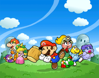
Thousand-Year Picture
Nominated by: LeftyGreenMario (talk)
Subject: Title Screen artwork from Paper Mario: The Thousand-Year Door.
Support
- LeftyGreenMario (talk) Exceptional quality picture!
- BabyLuigiOnFire (talk) It's better than the other nominations and it looks right on the main page. Besides, I uploaded it, AND I was about to nominate it.
- Fawfulfury65 (talk) The sky is pretty.
- Its-a-me Yoshi! (talk) It looks so... epic.
- Dry dry bones (talk) best paper mario pic yet!
- Commander Code-8 (talk) Great.
- Homestar Runner (talk) Per all.
- Superboo922 (talk) Amazing quality. Per all.
- DaisyRox02 (talk) It's so cute and the background is so pretty!
- MrConcreteDonkey (talk) A colourful picture that has great quality.
- Bowser's luma (talk) Per all.
- Yoshi Koshi Moshi (talk) Cute art style ;) Per all
- Luigia (talk) Paper Mario: The thousand year door rocks!!!
Oppose
- Propeller Toad (talk) It's a nice image but the characters seem to be rather small. The background seems too big for the characters (ie the sky).
- Pichufan93 (talk) The shading seems to be off and per Propeller Toad. Also that one odd section of some characters having a brighter light upon them seems odd (check from peach to the right to some characters).
- Skitty02 (talk) No offence but we already had two paper mario artworks similar to this one already featured (SPM and PM)..
- Booderdash (talk) This is stupid, its EXACTLY the main title screen except photoshopped into some kind of weird blue sky. The main title screen is better looking. The characters are much too small.
- BluePikminKong497 (talk) Ugly, and hard to see.
- Baby Mario Bloops (talk) - The quality of the characters are great, but it is too unbalance with the sky. I think it would be better with the title than without it.
- Zero777 (talk) I am Zero! Per BMB. Zero signing out.
- Pixlfreak (talk) even though I love paper mario as much as I do, this thing needs a title. the sky's becoming to much of an issue, and it looked better with the title in the first place
- GalacticPetey (talk) per all
- New Super Mario (talk) To small. Per all
- Fuzzipede27 (talk) Per all.
- Lu-igi board (talk) I didn't know this was ripped. That has put me off the image....
Comments
Propeller Toad: Well, this image originally came from the title screen, so that's where the title was supposed to go. BabyLuigiOnFire (talk)
Ah I see! The title would definately complete the pic though I still don't completely support it with the big blotch in the sky (no title) though it is still a rather colourful and nice piece of art. Propeller Toad (talk)
This isn't photoshopped; it is ripped. LeftyGreenMario (talk)
However, when this image has a title, people are going to complain and say that the title looks ugly! points to Mario Party 6 artwork. LeftyGreenMario (talk)
- I complained about the Mario Party 6 artwork because it didn't need a title. It had characters in a good spot. Also, the title covered much of the characters that it blocked a lot of the interesting stuff. The title with be above the main stuff, filling in the sky that has nothing in it. Baby Mario Bloops (talk)
- I like the sky. It's pretty. 0.0 BabyLuigiOnFire (talk)
- Its pretty much the main thing about the picture. Booderdash (talk)
- The New Super Mario Bros. Wii has a lot of ground in the picture, yet barely anyone opposed. LeftyGreenMario (talk)
- I never saw that one. Booderdash (talk)
- The New Super Mario Bros. Wii has a lot of ground in the picture, yet barely anyone opposed. LeftyGreenMario (talk)
- Its pretty much the main thing about the picture. Booderdash (talk)
- I like the sky. It's pretty. 0.0 BabyLuigiOnFire (talk)
- I complained about the Mario Party 6 artwork because it didn't need a title. It had characters in a good spot. Also, the title covered much of the characters that it blocked a lot of the interesting stuff. The title with be above the main stuff, filling in the sky that has nothing in it. Baby Mario Bloops (talk)
Take a look. Not a very good featured image. The resolution can be much bigger, but anyway, there is so much GROUND! LeftyGreenMario (talk)
- Ew, how did that become featured image? Anyways at least thats actual artwork from the cover. The Paper Mario ttyd thing appears to be fanwork. Booderdash (talk)
- it's not fanwork!! someone just removed the title, that's all. Pixlfreak (talk)
- Yes, someone ELSE other than the official nintendo removed the title thus its not official or fanwork. Booderdash (talk)
- No, where I got it from, it is pieced together. It's like ripping textures. BabyLuigiOnFire (talk)
- It's ripped, what BowserLicksOnlyFish said. LeftyGreenMario (talk)
- No, where I got it from, it is pieced together. It's like ripping textures. BabyLuigiOnFire (talk)
- Yes, someone ELSE other than the official nintendo removed the title thus its not official or fanwork. Booderdash (talk)
- it's not fanwork!! someone just removed the title, that's all. Pixlfreak (talk)
- Ew, how did that become featured image? Anyways at least thats actual artwork from the cover. The Paper Mario ttyd thing appears to be fanwork. Booderdash (talk)
Ripped by who? Booderdash (talk)
- By someone in the The Spriter's Resource, which is a sprite website. LeftyGreenMario (talk)
The game and characters are cool Luigia (talk)
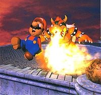
Bowser Attack
- Subject: Bowser attacking Mario.
- Nominated by: Fawfulfury65 (talk)
Support
- Fawfulfury65 (talk) High quality and great. Go Bowser!
- Zero777 (talk) I am Zero! Nice quality and a big image, nice, but what is that ball on the bottom-right corner. Zero signing out.
- Baby Mario Bloops (talk) - Ahhh. Familiar, funny, awesome memories, and the quality as it was when it was the generation of the Nintendo 64. Every time I see this, I think of the final battle against Bowser, and how challenging he was on that last toss. I Love it.
- Pixlfreak (talk) I like classic stuff like this.
- Commander Code-8 (talk) I've been wanting to nominate this one for a while. I love it.
- Grandy02 (talk) I like it, and it has high resolution for its age.
- Bowser's luma (talk) Per all.
- Dry dry bones (talk) Its an awesome action shot, and it has the classic orange skin Bowser! My favorite! Bowser wins again!
- Sacorguy79 (talk) It's pretty funny to see Mario's rear end on fire, Bowser owns!
- MrConcreteDonkey (talk) Very funny and great quality. Go Bowser!!
- Luigia (talk) Hehe funny
- Beecanoe (talk) Any image of Bowser pwning Mario is great in my book. Bowser rules!
Oppose
- Booderdash (talk)Not low quality, but Mario looks like hes 10 years old. Plus, it looks like both of them are dolls. And actually Super Mario 64's ingame sprite is better than this picture.
- LeftyGreenMario (talk) Mario looks cuckoo.
- Superboo922 (talk) Is it just me, or did Bowser get a haircut? Good quality but it... Wow. Everybody already said everything.
- GalacticPetey (talk) I would rather have 14 game overs than have this featured.
- DaisyRox02 (talk) I would agree with Booderdash if Mario didn't have a moustache. I don't think this picture would be FI quality if it were nominated the first day the pic was completed.
- New Super Mario (talk)Me personally don't like 64 animation
- Zafum (talk) - The image would be good, if it wasn't so crowded and/or cut off.
- Fuzzipede27 (talk) - Per GalacticPetey and LeftyGreenMario. Good fire with a bad image.
- Sgt.Boo (talk) - Umm... No. I'm not saying this because I'm a fan of Mario or anything, but this image is low quality, Just plain boring background, and Mario looks like he's made of wax, Bowser does too, though...
Comments
Why is Mario putting his hands in his pants? Booderdash (talk)
- Because his overalls burn, and it's hot? Also, about "dolls", the image simply shows what 3D models in the Mario series looked like back then. --Grandy02 (talk)
- I don't know how this isn't high quality. And how does Mario look 10? I don't know of any 10 year olds with mustaches. Fawfulfury65 (talk)
- Ok, how is this low quality? I really want to know why. Just because they look like dulls doesn't mean its low quality, that's just how it's drawn. Fawfulfury65 (talk)
- Well, if you look close up, you can see some of the pixels. At least I can see it. And remove the mustache and he looks ten. The angle of his lower left mouth isn't with the rest of his face. My 12 year old friend can draw better than that. Off topic, but I had a little mustache when I was 10. Booderdash (talk)
- You can see some of the pixels in just about any image if you look really close to it. So that doesn't really call this image low quality. Fawfulfury65 (talk)
- The image is made up of pixels, so of course one can see them. And you could remove Mario's moustache from any artwork to make him look "younger." --Grandy02 (talk)
- Well, if you look close up, you can see some of the pixels. At least I can see it. And remove the mustache and he looks ten. The angle of his lower left mouth isn't with the rest of his face. My 12 year old friend can draw better than that. Off topic, but I had a little mustache when I was 10. Booderdash (talk)
- Ok, how is this low quality? I really want to know why. Just because they look like dulls doesn't mean its low quality, that's just how it's drawn. Fawfulfury65 (talk)
- I don't know how this isn't high quality. And how does Mario look 10? I don't know of any 10 year olds with mustaches. Fawfulfury65 (talk)
Sorry for asking, but what game is this? And Booderdash has a good point. Superboo922 (talk)
......Looks like mario has a case of butt burn.Rooster17780 (talk)
Looks like Bowsers breathing fire from his NOSE... Booderdash (talk)
Donkey and Diddy Feeling the Beat!
Nominated by: Lindsay151 (talk)
Subject: Donkey and Diddy enjoying fun on the beach.
Support
- Lindsay151 (talk) High quality and it great.
- Fawfulfury65 (talk) Awesome
- LeftyGreenMario (talk) Feel the beat!! This image is unique and colorful.
- Zero777 (talk) I am Zero! Feel the beat, nice big, colorful image. Zero signing out.
- Platitudinous (talk) Feel the awesomeness!
- DaisyRox02 (talk) I can't say no to this! It looks like the cover of a brochure! It's hilarious!
- New Super Mario (talk) Very colorful
- Bowser's luma (talk) It's...different, but it catches my eye. Colorful, and unique, to say the least. I like it.
- Dry dry bones (talk) Thats cool, its colorful and creative.
- SuperTeeter64 (talk) I think this is the perfect picture for summer. The picture is also nice and colorful.
Oppose
- Lu-igi board MY EYES! THEY BURN!!!!!!!!!!!!!!!!!
- GalacticPetey (talk) Per Lu-igi board
- Superboo922 (talk) Look at it in highest resolution. The words are way too distracting, DK's left (his left, your right) fist is way to big you can see the straight lines, and the right palm tree looks akward compared to the rest of the picture.
- Booderdash (talk) Dk and diddy look like they've been copy and pasted in there. Did the Dk and diddy drawing even debut there?
- Pixlfreak (talk) too bright
- Commander Code-8 (talk) This looks like a cartoon drawing!!
- Zafum (talk) - I like the art style, but the words make it look unofficial.
- Its-a-me Yoshi! (talk) Per all.
- BluePikminKong497 (talk) Ugly.
- Fuzzipede27 (talk) (Throwns Up), per Lu-igi board and BluePikminKong497
- Sgt.Boo (talk) - Why have words? I mean WAAY too distracting, make people focus on the image. Plus, everything looks looks like crude paintings.
Comments
LOL, feel the beat on the main page? That's funny. BabyLuigiOnFire (talk)
- Who said the wiki can't have a main page summer dance party DK thing? Might look good... Bowser's luma (talk)
- It can remind all those who enter the Wiki to feel the beat. :p Fawfulfury65 (talk)
What's this even from? Wierd.
The preceding unsigned comment was added by Beecanoe (talk).
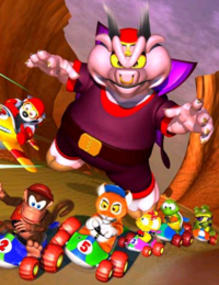
DKR Racers against Wizpig
Nominated by: BabyLuigiOnFire (talk)
Subject: Racers driving away from Wizpig.
Support
- BabyLuigiOnFire (talk) Well, I nominated this picture because there's action going on, has a background, a pretty uncommon image, and we don't have any good Diddy Kong Racing pictures as featured.
- Zero777 (talk) I am Zero! Not bad, very dramatic image. Zero signing out.
- Commander Code-8 (talk) A good game, a good image.
- Booderdash (talk) Never seen him before ever, but Wiz pig however he is looks awesome.
- New Super Mario (talk) Per Zero777
- LeftyGreenMario (talk) We need more epic images. This is probably one of the best we have to offer right now.
- Fuzzipede27 (talk) EPIC! GREAT image!
Oppose
- Lu-igi board there's just something I don't like about this image....
- GalacticPetey (talk) I agree with Lu-igi board, also who is Wiz Pig?!
- BluePikminKong497 (talk) Per Lu-igi board
- Bowser's luma (talk) Although DKR is technically (have I spelled that right?) related to Mario, I see no reason why an image that only has a slight Mario reference should be on the Main Page and Featured.
- Dry dry bones (talk) Wiz pig looks weird to me, its a dark image,(like the background and stuff}} and the only thing it really has to do with Mario is Diddy Kong.
- Superboo922 (talk) Per Bowser's Luma and Lu-igi board.
Comments
@GalacticPetey: Wizpig is Wizpig a racer in Diddy Kong Racing. BluePikminKong497 (talk)
- No he isn't. He's the villain. In Diddy Kong Racing DS, HOWEVER... BabyLuigiOnFire (talk)
If this has a slight Mario reference, then why is there an article about it? The image doesn't look dark to me. LeftyGreenMario (talk)
LOL, evil giant piggy is terrorizing a race!
Sgt.Boo (talk)
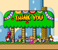
SMW ending
Nominated by: Dry dry bones (talk)
Subject: The ending of Super Mario World
Support
- Dry dry bones (talk) I think this image is exciting, colorful, and classic.
- Bowser's luma (talk) It is small, but that does not really affect the quality of the image. Very colorful. Per DDB.
- Lemmy Koopa Fan (talk) I tried zooming in on this as much as I could, but there's no pixel out of place. Also, this is colourful and it's a classic!
- Zero777 (talk) I am Zero! No opposer should say it is too small, it is the perfect size for the feature images. Zero signing out.
- Lu-igi board per all
- Booderdash (talk) ... This is the best one besides the pig so...
- Luigia (talk) I like it. Very colorful and pretty
- Sgt.Boo (talk) Not bad. We could do without the words, though...
Oppose
- LeftyGreenMario (talk) Terrible.
- BabyLuigiOnFire (talk) I don't like the words on the house. Plus, it's a JPEG sprite image, so it isn't the best quality. If it has better quality, I should be able to fully fill in Yoshi with one color, but it isn't. Plus, the resolution is tiny. This is at its largest, so it shouldn't go in the main page.
- Mario jc (talk) Per BLOF...
- Superboo922 (talk) I just don't like it. But I can't exactly tell why...
- Baby Mario Bloops (talk) - I love it and all, but the resolution is WAY too small. That is my only complain.
- Fawfulfury65 (talk) Small
- Beecanoe (talk) NEVER use ending pics. It has spoiler written all over it. I own a copy of Super Mario World: Super Mario Advance 2.
- Vellidragon (talk) Small screenshot (and this is the largest it can be without artificially stretching it, even) with nothing particularly stunning about it. It doesn't help that the game it's from has rather bland graphics imo (even/especially for SNES standards) with inconsistent styles and shading (Peach's sprite here being among the worst offenders; it looks like it came from a completely different game). Pointless black line at the bottom of the image, too.
- New Super Mario (talk) Are those Yoshis? Cause they look more like small colorful rocks with a big white smudge. :D
Comments
This image is JPG'd. Which means it has terrible quality. LeftyGreenMario (talk) Terrible quality? It looks like it, but if you click on it, it has perfect quality. its nice and clear. Dry dry bones (talk)
- It is bad quality. You're not supposed to save sprites as JPEG, since it loses color data. PNG is the preferred format for sprites. Right now, I can't fill in the tree with a single color (without the shades). BabyLuigiOnFire (talk)
- It's not clear. If I try to recolor it in paint, the paint bucket should fill in one color within one click. However, when I recolor this image with the paint bucket, there are actually different colors. It means it's not sprite quality. PNGs, not JPGs, are the way to go with sprites. LeftyGreenMario (talk)
- Oh, well never mind then.Dry dry bones (talk)
- It's not clear. If I try to recolor it in paint, the paint bucket should fill in one color within one click. However, when I recolor this image with the paint bucket, there are actually different colors. It means it's not sprite quality. PNGs, not JPGs, are the way to go with sprites. LeftyGreenMario (talk)
So all JPG images are automatically bad? What about the image on this:thats jpgBooderdash (talk)
- It's not that they're bad, but they can be a little better. Of course, I don't know too much about image stuff, so I could be wrong. Fawfulfury65 (talk)
- I don't see the differences between JPG and PNG. Though I think Gifs are the best. Booderdash (talk)
- JPG is a type of file extension used to compress colors. It makes the image use up less space and is less complex, but you lose color data. PNG is when color is more complex and color data isn't lost, but it takes up more space. That's why you should save small images as PNG and large images as JPG. BabyLuigiOnFire (talk)
- I don't see the differences between JPG and PNG. Though I think Gifs are the best. Booderdash (talk)
It's PNG,, now, but it's still awful LeftyGreenMario (talk)
- Why? Now you should be able to fill in the tree. I don't know what could be done better, it's pixel-perfect. --Grandy02 (talk)
- I'm not saying the quality is bad, I'm just saying the picture itself is bad. LeftyGreenMario (talk)
- The quality isn't bad, but seriously, it's way too small. You can barely tell the characters apart. Fawfulfury65 (talk)
- I'm not saying the quality is bad, I'm just saying the picture itself is bad. LeftyGreenMario (talk)
Mario and Luigi Against Bowser Jr. and Bowser in Mario Kart Double Dash!!
Nominated by: LeftyGreenMario (talk)
Subject: What the title says.
Support
- LeftyGreenMario (talk) White background, yes, but this picture has amazing quality and resolution. Check out the reflections!
- Lu-igi board I'll give it a chance
Oppose
- BluePikminKong497 (talk) Nominated before, bad quality.
Comments
How is this bad quality? And why is "nominated before" a reason to oppose? LeftyGreenMario (talk)


